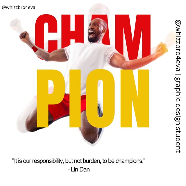
Edited with Canva
Greetings erudite Steemians, it's my honour to be a participant in this engagement challenge. So far this course has really gone well thanks to the lecturer, Mr @lhorgic. With this, I find graphic design which I thought difficult to be an easy going course. Without further ado, let's get into the details.
From the announcement post, the lecturer asked us to create a replica of his already made design. Because of this, I created it with the following steps.
 |  |  |
|---|
| Picture 1 | Picture 2 | Picture 3 |
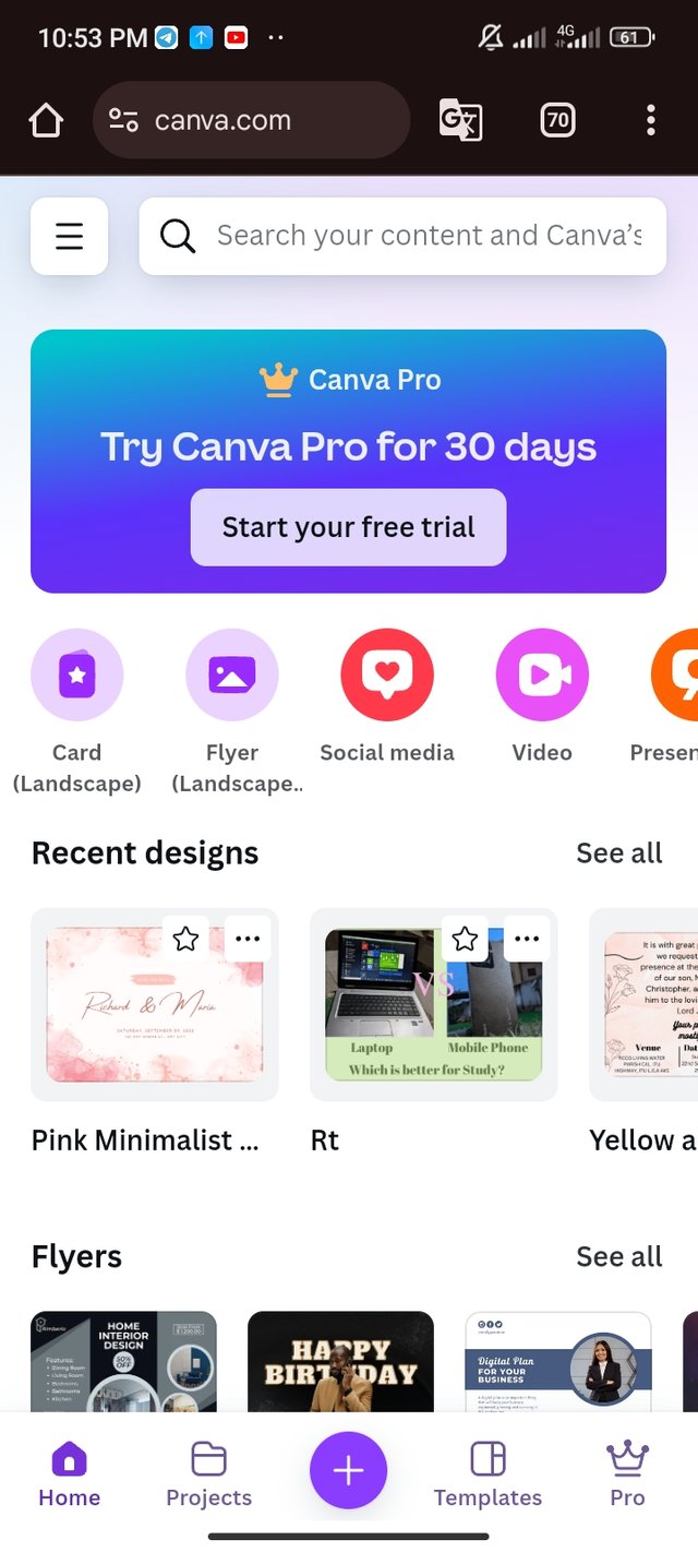
- First thing first, I launched the canva application using my web browser (chrome).
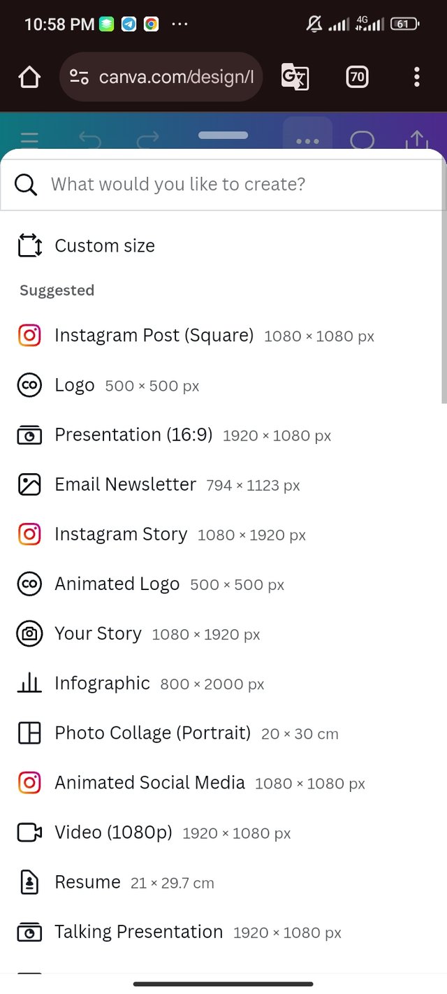
- Then I prepared my workspace where I selected an Instagram post (square). The estimated measurement for this workspace is 1080 x 1080 px.
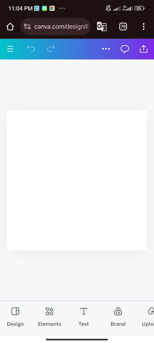
- The workspace is set and ready for work.
 |  |  |  |
|---|
| Picture 1 | Picture 2 | Picture 3 | Picture 4 |
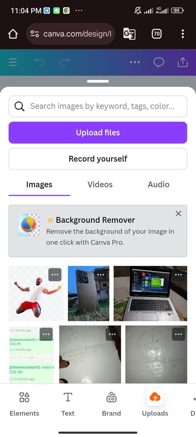
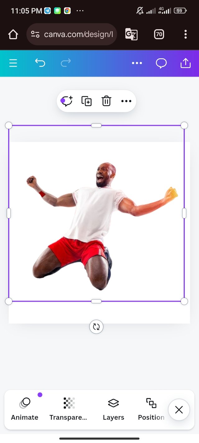
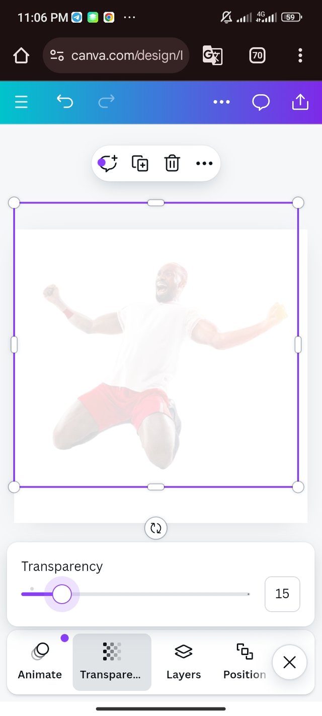
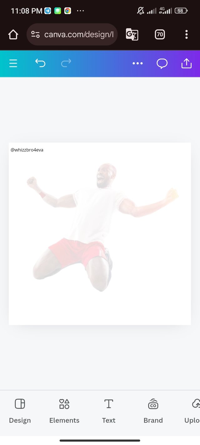
We can see a faint image on the background of the design. To achieve this, here are the steps
- I had imported the picture from my gallery since I downloaded it from the announcement post.
- Importing it, I had to make sure that it's the right position and size
- To create a shadowy image, I highlight the image to display a menu. On the menu, I adjusted the transparency to 15%. I had to use my username as a watermark.
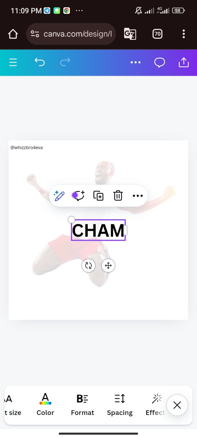 | 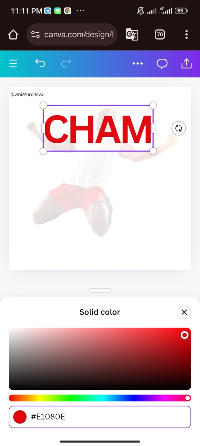 | 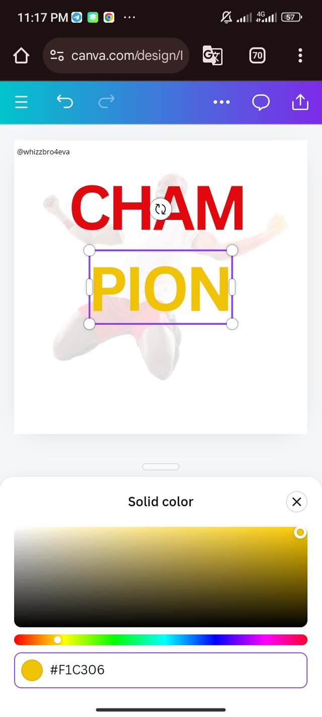 | 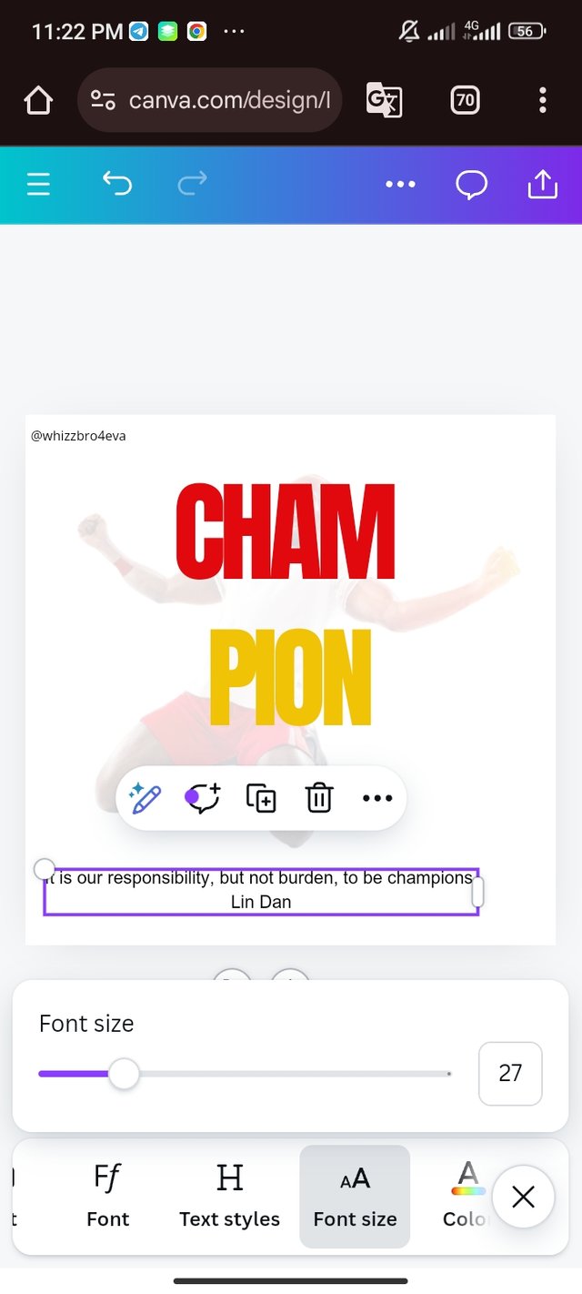 |
|---|
| Picture 1 | Picture 2 | Picture 3 | Picture 4 |
- Selecting the title, I typed CHAM
- Using the knowledge from hex code lecture, I select the colour red and bolden the word.
- The word PION was also typed and I selected the proposed colour.
- My derived quote was also typed and properly placed.
 |  |  |
|---|
| Picture 1 | Picture 2 | Picture 3 |
The Picture Masterpiece Editing |
|---|
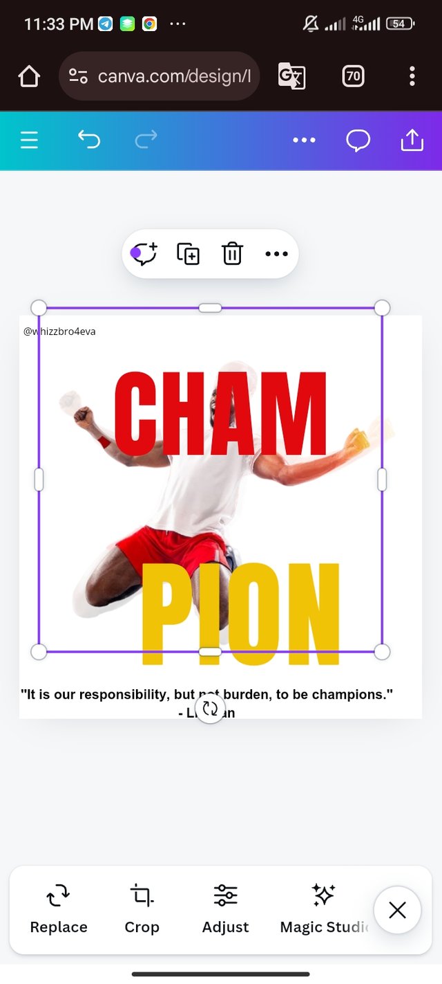
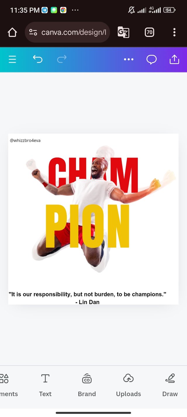
- As usual, I imported the picture from my gallery to the workspace.
- To bring the image to front, I clicked on the menu and click on position. I initiated "To Back" and the magic was done.
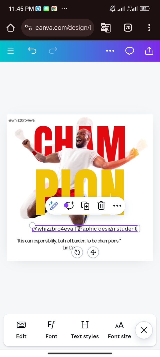
- I input the word "@whizzbro4eva | graphic design student" and edit it for the final result.
| My final result |  |
|---|
Honestly, I didn't expect that I could do this design. Lectures like hex codes, complementary colours, etc has helped in the process of this design. Since it's my first time of trying out graphic design, please I am open to corrections 🙏.
Inviting @bossj23, @patjewell and @alexanderpeace to this contest.


💯⚜2️⃣0️⃣2️⃣4️⃣ This is a manual curation from the @tipu Curation Project
@tipu curate
Upvoted 👌 (Mana: 2/6) Get profit votes with @tipU :)