SEC20/WK5: Graphic Design Hands - On practical 2
Assalamu Alaikum!
I hope you are doing great by the grace of Allah. I’m so happy to participate in this contest. In this way, I also learn new skills. Canva is a useful tool for beginners. I’ve practiced Canva before. However, I’ve not used many free tools or options in Canva. Luckily, when I create this design, I use many options.
Step 1
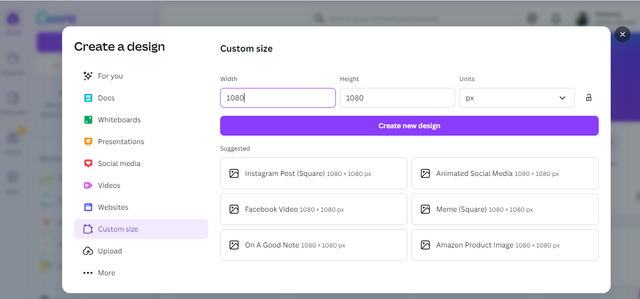
- 1st I go to the Canva website.
- Then I click on Create Design and give a customized dimension (1080x1080) of this design.
Step 2
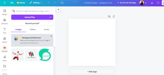
- Before I upload the picture, I remove this picture background from the picture background remove the website.
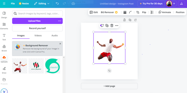
- After that, I upload this image and then drag it onto the canvas. Set this image in the in the middle position.
Step 3
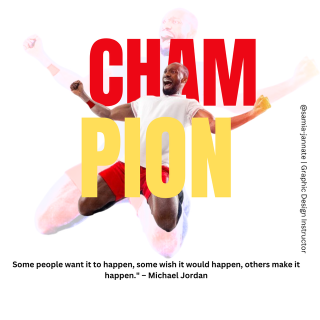
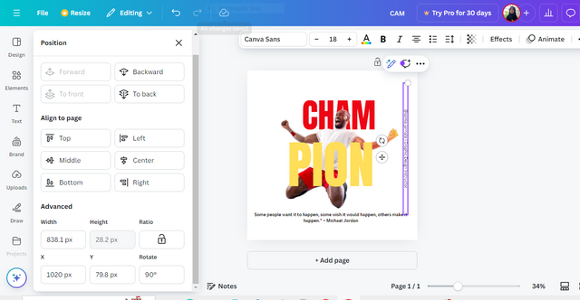
Click on the text option. Select headline I type “CHAM” then select font size and also select ANTON font style. And choose red color.
Again, click the text option, select headline, then type “PION.“ I selected the font size is 250 and chose the yellow color of this font; I also selected the Anton font style.
Step 4
- I rearrange this image and text as per the tutorial image.
Step 5
- I add another text box by clicking Text, then selecting Add a subheading.
Type this quote:
"Some people want it to happen, some wish it would happen, others make it happen." Michael Jordan. - I changed the font to something simple like Open Sans or Lato, set it to a small size, and positioned it below the main text, centered on the canvas.
Step 6
- Create a small text box for the watermark. I can add @samia-jannate | Graphic Design Instructor.
Step 7
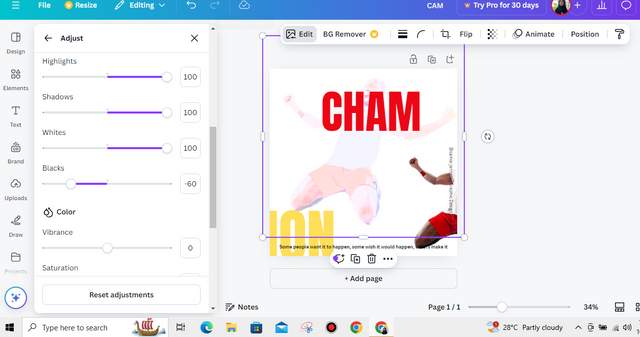
Again, I drag this uploaded image onto Canvas and then select the edit option.
After that, I click the adjust option and set black-20%transparency; I also remodify the other option.
Then I set this image in the background.
And again I rearrange the font, images,quota .
Briefly talk about the principle you engaged in your design.
Balance
Balance occurs in my design such that the text and the picture of the person are equally spread out so that no portion of the design will be overweight or underweight.
Hierarchy
Hierarchy is accomplished by making the strong text stand out, rather like the setting of the person in an overwhelming central position, directing the viewer's eye to what is most vital first.
Color Theories
I've also used basic color theories to create the most impact visually, with bold and striking colors like ruddy and yellow, so that the text pops out against the picture.
Dimension
The size and dimension for this design are done in such a way as to fit in all the key elements without compromising readability and center so that no portion of the layout would appear cluttered or overflowing.
I took this screenshot to show the progress of my work.
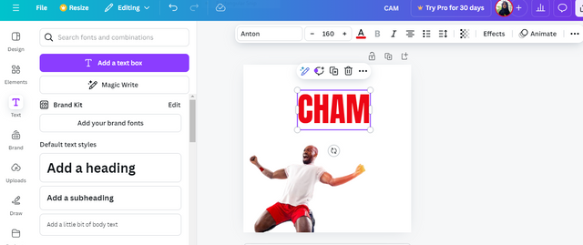
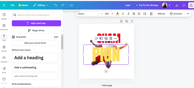
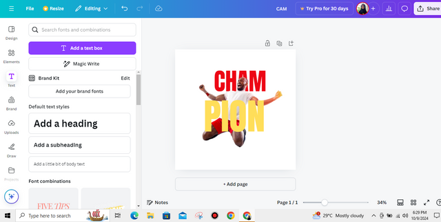
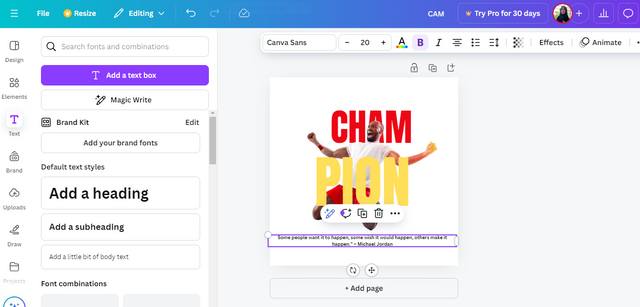
Your designs help visualize each step and your use of Canva demonstrates a solid understanding of design tools It's great that you're experimenting with transparency and text placement to create a balanced visual sequence Best wishes to you.
Thank you so much!
I'm glad you liked the design. I’ve been applying what I learned from this class and will keep practicing to improve my work. I truly appreciate your support and encouragement!
@samia-jannate thank you so much dear,For inviting me and I will definitely participate in the contest🤝
Thank you so much! I’m happy you’re interested.
Best of luck!
Wc sister
Thank you so much. I'm really glad that you upvoted my post. It's a great pleasure for me.