"SEC20/WK5: Graphic Design Hands - On practical 2"
Assalamu alaikum wa rahmatullah hope everyone is well, I am late to participate in Srijan Kari's fifth week of graphic design competition. Graphics design is one of my favorite platforms and it has made our work easier with canva software.I have divided my post into seven levels from the first level to present seven levels to you . Anyway, let's go my friend to share the topics that should be discussed in our teaching competition for your interest.
Step- 1
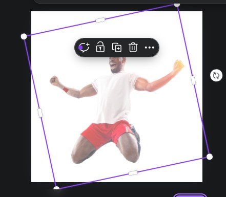
I know all the canva users here are very experienced, I mentioned the important points and uploaded the image in the first step, then on the page I made the image a little transparent from the tanspar option so that the image looks dim. Also, I have rotated the image so that the image looks better when viewed straight on. On the first layer I completed them and placed the image in the middle of the page and placed it on the first layer.
Step- 2
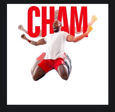
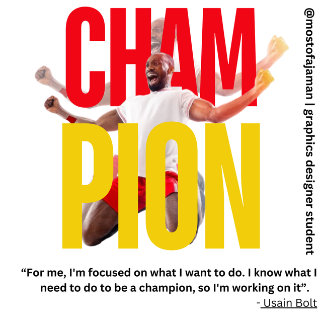
In the second player I brought the text “CHAM” and enlarged it by selecting the front and placed it on the layer above the transparent image. I enlarged it and made it red in color to match the contest image.
Then I again took the assigned image of the contest and placed it above the text “CHAM” and rotated it to match the previous image I am sitting on.
Step- 3
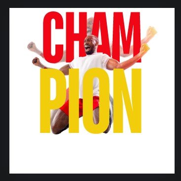
In the third step I took the text "PION" and put it on the front layer first. Then I resized it and made the color yellow. I hope everyone knows how to do them so I am not mentioning the details here.
Step- 4
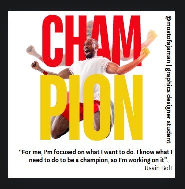
In the fourth step I wrote the famous person in small front and wrote graphic designer student with my username. After writing them, I rotated one to the center of the right side and wrote the famous Usain Bolt quote below and bolded it to make the text appear darker.
Step- 5 & final
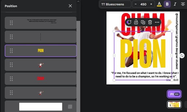
This is how I completed my design and after completing the design I presented the layers here in front of you. Part by part layers are shown here, hope you will not have any problem to understand here because it is very easy work. After completing the design, you can see here that the design has been made full and final.
- Emphasis - As the image is made for victory celebration, it must be shown as a strong strong victory. The color combination and focus is red and yellow which is very attractive. The text is made in large size so that it can be easily understood and seen from a distance and is a symbolic image of victory celebration. The film is exhilarating and conveys a powerful moment of triumph.
- Balance Color balancing and color selection is very important in a graphic design and it is very important to make the design stand out. The color of the background and the color of the content depends on how much the image will be accepted and people will like it. Always red is an active and favorite color which is easily read by human eyes, on the other hand yellow color is exactly the same. While designing an image, the measurements of the image must be set correctly because it increases the quality of the image. The measurements must be made by yourself and by serving your own unique measurements there, the picture quality is full and the acceptance is more. When it comes to graphic design, we must be aware of the fact that if you make an exception to some measurement, it will block the eye and it will reveal incompleteness and failure. I measured this image with a combination of black and white and yellow, which I kept very nicely in the middle.
- hierarchy - The red and yellow colors and white color of the background have been used to make the image look beautiful and majestic, it looks really great. If the background was black then it would have stood out or looked better after using a white background. If we change the red and yellow colors it doesn't look as great as it looks and its color combination is something we must keep in mind when designing a graphic. Mainly the emphasis here is on the text and on the person so I have made it very large and attractive.
- Color contrast- I have already said that color combination is a very important part of graphic design and it depends on how beautiful the image will be. Of course you have to focus on the color combination and design and you have to take an idea from yourself and check how well it complements your design. How vibrant and fun you want the text to be depends on the colors so red and yellow are really great as I told you earlier.
- typography - Typography is one of the more important for a graphics design. Many times we refer to various important texts in graphics where we need to make small and large size to focus on the main points. Since we need to highlight the word “CHAMPION” it has taken a beautiful front and enlarged the shape of the front. Also, we shortened the famous person quotes and my username text because they are not as important as what is important to us as a champion and presentation to the audience. So we must always try to make the thing that we want to highlight big and beautiful. Through different color combinations.
- Design size - Wow this is a great topic for graphic design. One thing of course to note is that we have to decide the size depending on our requirements. I have taken 1080px × 1080px here to create the design. While creating our design we must take care for what purpose our design will be used and size is of course very important to us. Of course we can customize the designs as per our wish so it is not difficult to design as per our requirement.
- Alignment – Meanwhile, I have tried to make it in a way where the subject of Vijayullahsh comes to everyone's attention and for that I have made the writing much bigger and I have kept an eye on the color. Balanced the colors and tried to design the texts and images in balance. While designing we must balance the content as the main focus of the image represents the quality and visual beauty of the design.
Above all attention has been paid to color and balance to make the design beautiful and attractive to the viewer. Besides, we kept the background white to make the design more beautiful and elegant. I really want to thank the organizer of the contest, @lhorgic who gave this design an opportunity to present its importance and inspiration. A perfect example of how we can divide the graphic design into several stages and present it to the audience in a beautiful and attractive way.

Thanks to everyone here is an invitation @abdul-rakib @solaymann & @mahadisalim
X promotion link
https://x.com/mostofajaman55/status/1845181560259215813
Congratulations! - Your post has been upvoted through steemcurator06
Curated by : @rosselena - Selective Team
Thank you so much @rosselena for your support.
Upvoted. Thank You for sending some of your rewards to @null. It will make Steem stronger.