"SEC20/WK5: Graphic Design Hands - On practical 2"
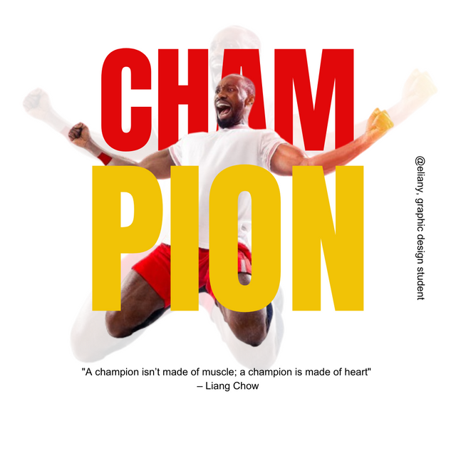
Oh! it's another week of learning graphic design and it was fun although while learning. This week is another practical week, I so much enjoyed how this lessons are organised. This practical week help us to practise what we've learnt and do it ourselves, so as to be perfect with the skill we are learning.
HOMEWORK TASK
In this homework task, we are asked to replicate a graphic design by the teacher so to carry out mine, I login to the canva app then created a work space. I used 1080×1080 so as to get the design well.
Step 1; Create work space and add background image
 1 1 | 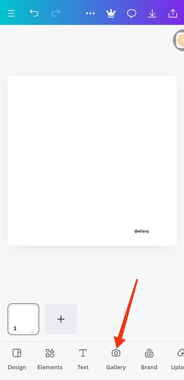 2 2 | 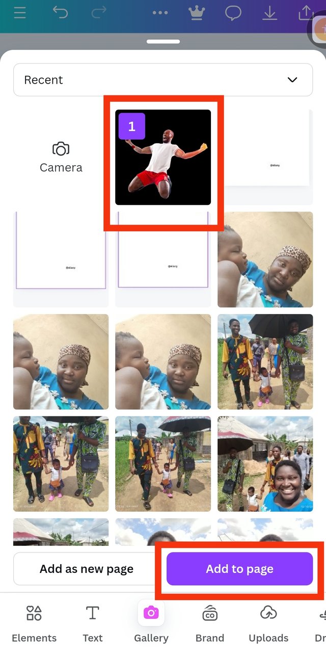 3 3 |
|---|
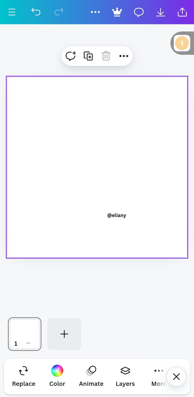
I created a work space of 1080×1080 dimension
I proceeded to add background image by clicking this image icon
I selected my already downloaded photo from the lesson course outline. Select it then clicked on Add to page.
Step 2; Adding of effects to the background
 1 1 | 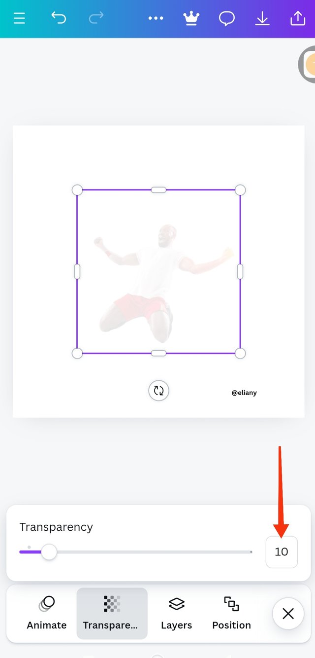 2 2 | 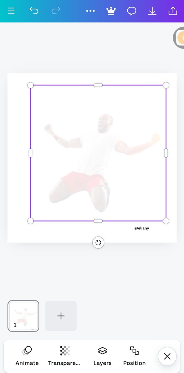 3 3 |
|---|
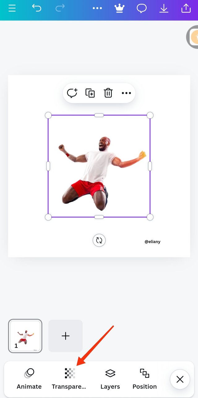
This image shows my background image on my work space, I clicked on transperacy to add effect of o it.
I adjusted the the slide till the transparency was set at 10 as seen in the photo
I enlarged the image to cover the background as I saw in the image I'm replicating.
Step 3; Adding of first text and applying typeface/font
 1 1 | 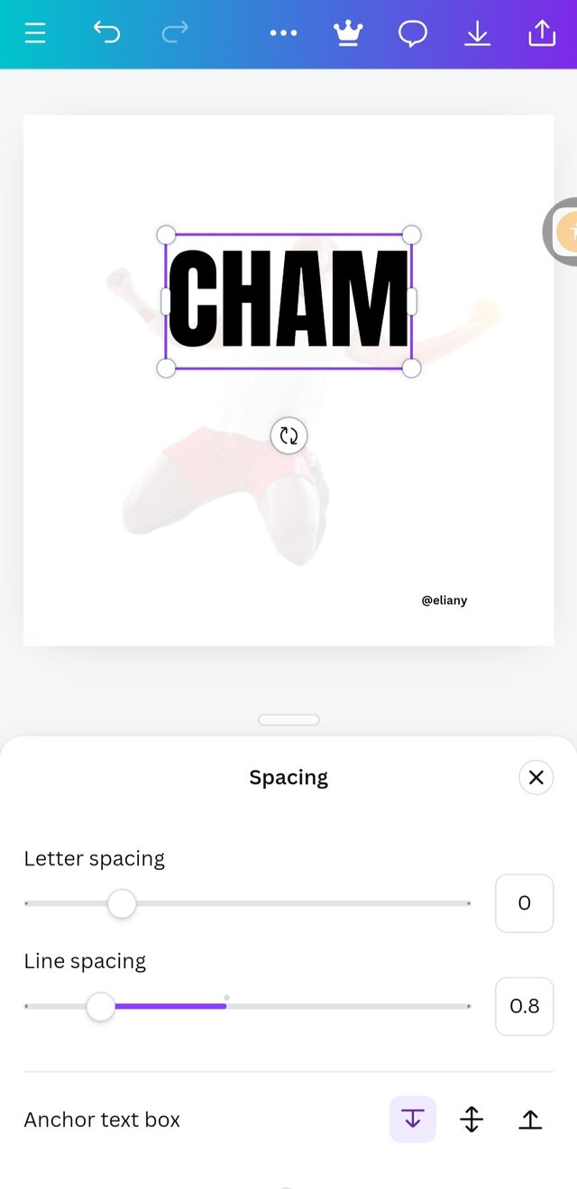 2 2 | 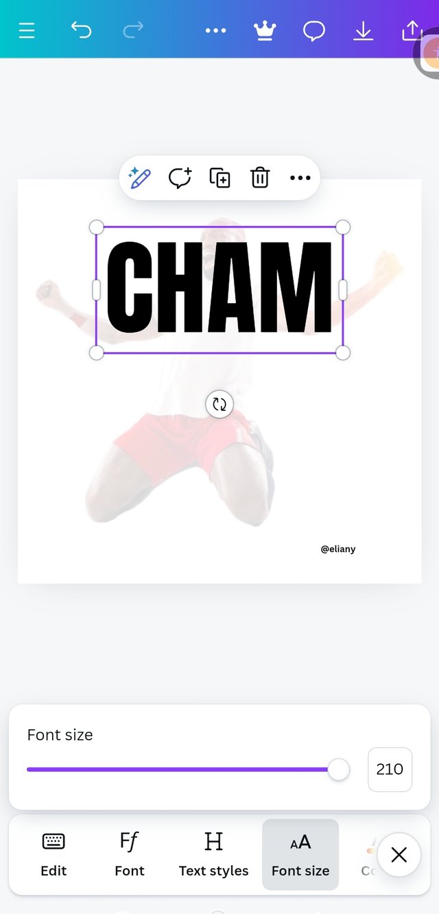 3 3 |
|---|
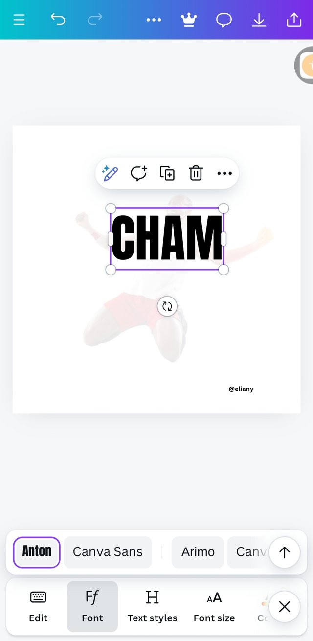
The text in this design is CHAMPION written as two words so I typed the first word CHAM applied Anton as my font.
Letter spacing 0.8
Font size of 210 then I placed the text well as seen in the image I'm replicating.
Step 4; Addition of image and positioning of the text/colour
 1 1 | 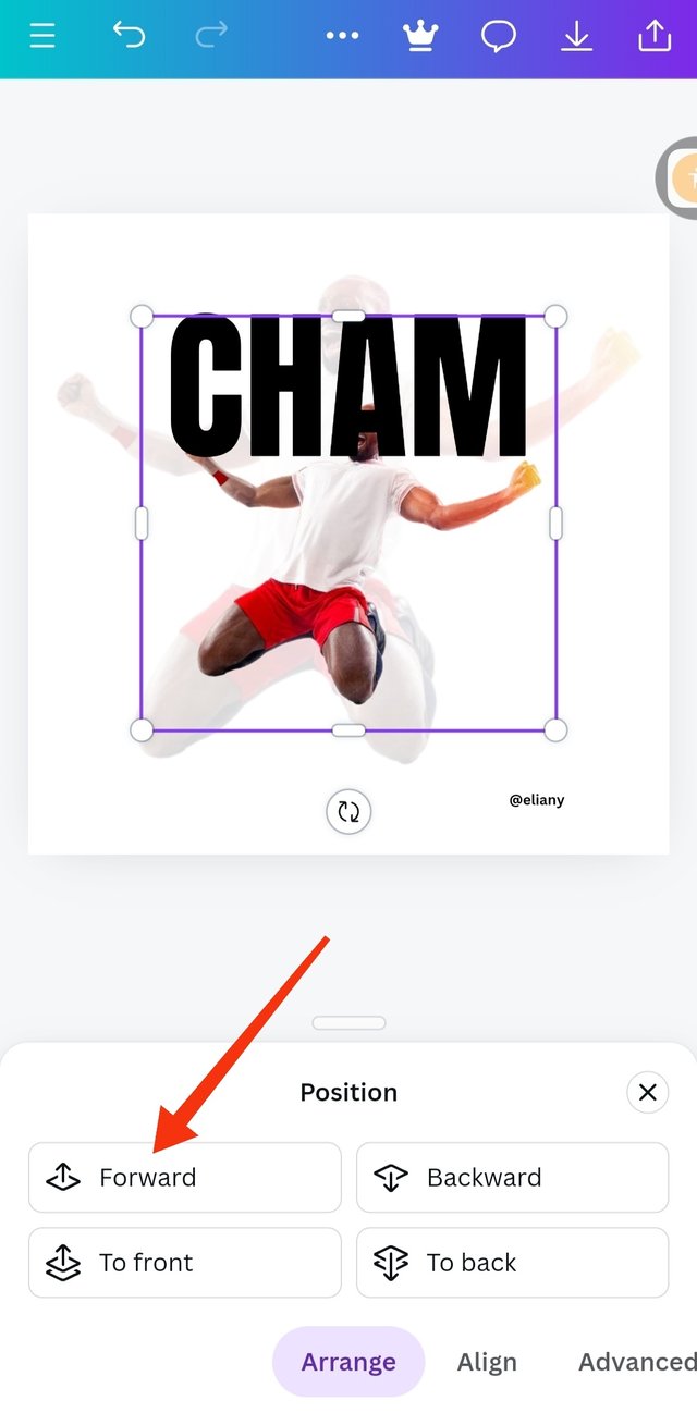 2 2 | 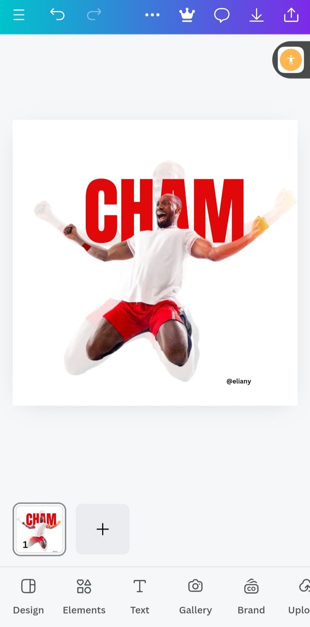 3 3 |
|---|
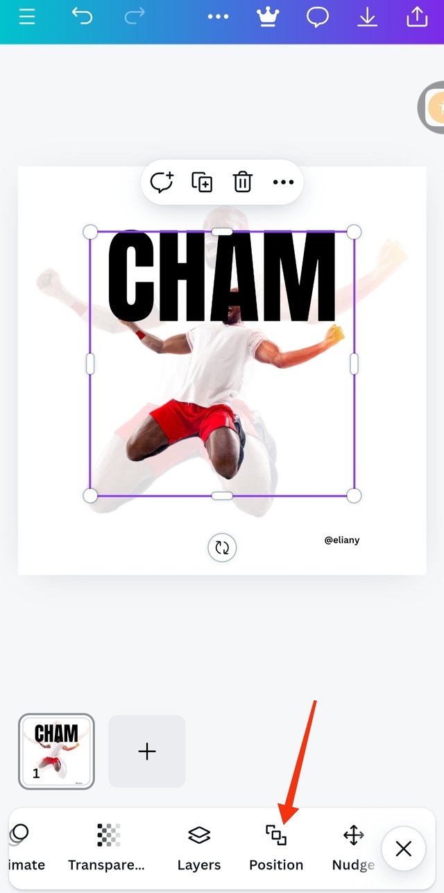
So I use the term method of adding image to the page I demonstrated previously in step 1 pictures 1 and 2 to add the image as seen. I proceeded to positioning the text by clicking on position as seen in the image.
As you can see the image is behind the text so I have to bring it forward by highlighting the image and clicked on this forward option
Using the colour wheel, I selected the colour for text which hex code is #e1080a, it is a variant of red colour. It matches with the image.
Step 5; adding of the second text, colour and adjustments
 1 1 | 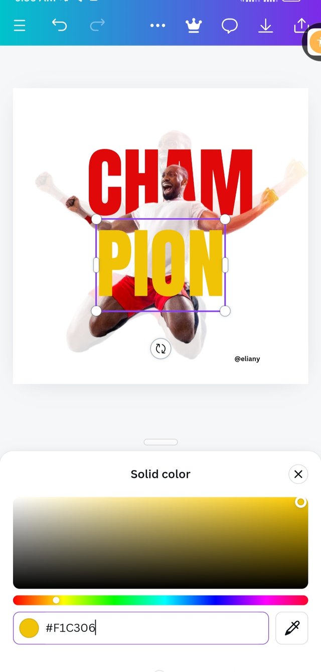 2 2 | 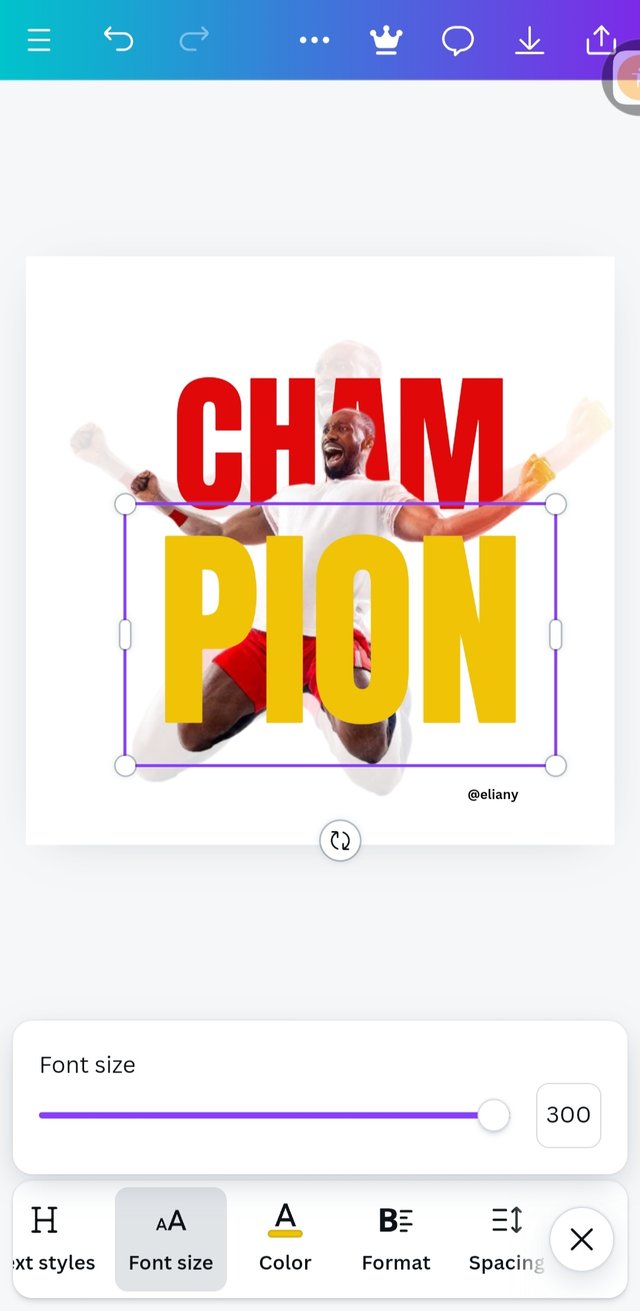 3 3 |
|---|
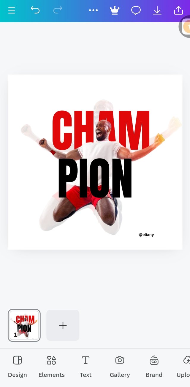
I typed the second text, PION then used the same font Anton
I added colour to the text by using the colour wheel, I chooses colour hex code #f1c306 which is a variant of yellow.
I used font size of 300 to enlarge the text and also applied alignment here.
Step 6; Finally, I added my champion quote
 1 1 | 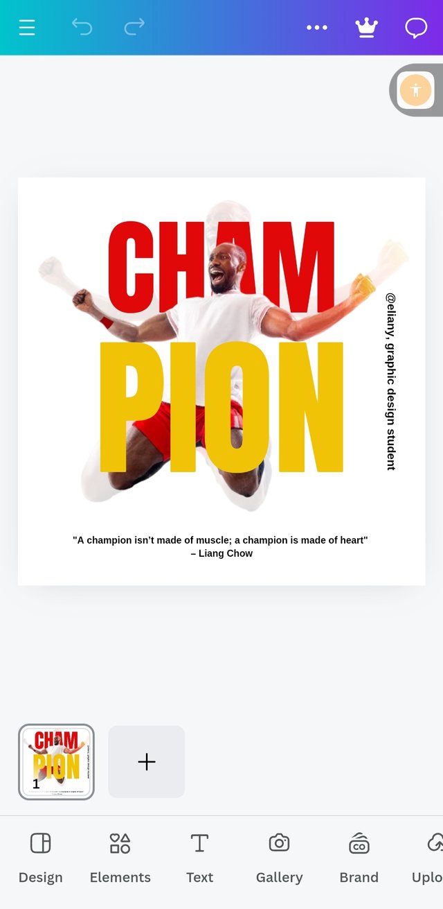 2 2 |
|---|
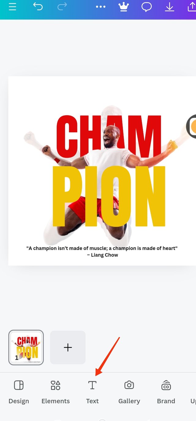
I added a quote by Liang Chow; "A champion isn't made of muscle, a champion is made of heart"
I added my user name
 |
|---|
 Original Original |  Replicate Replicate |
|---|
Let's talk about the principles used
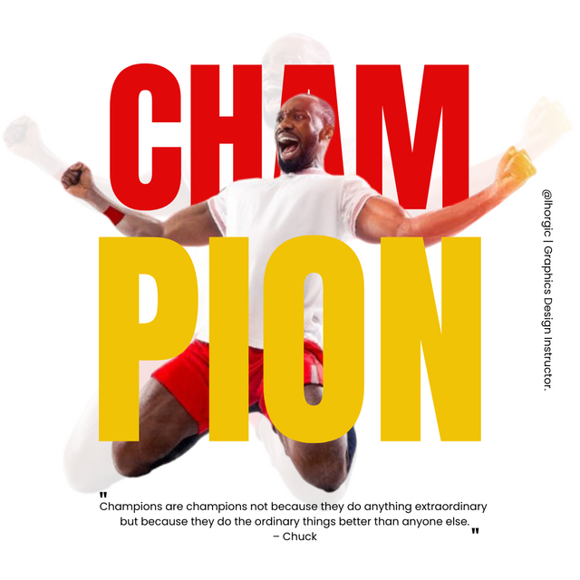
Colour Combination; The colour I use were nice combination red yellow and white. I used a white background, red on one text which contrast with the short worn by the man in the image and his bangle. The yellow colour also is a nice combination with red.
Therefore, the colours were okay
Element Spacing; My elements were not jam packed there were accurate spacing. Not too close and not too spacing in between, they were accurately arranged. I used line spacing of 0.8 in the 2 text, my font size was accurate as it helps to balance the spacing in each text.
Alignment; My element and text are aligned as you can see from the image.
Heirachy; I applied heirachy in this design as I positioned the background image making it really transparent so that my key image will stand out. I also applied this principle when I highlighted "cham" with red colour It really glitters and captures the interest of my viewer to look into the graphics.
Emphasis; The emphasis here is on champion so both the picture that is use in the design that depict "champion" and the colours used really emphasis "Champion"
Balancing; My work is really balance as all elements are balance and Equal.
Thanks to @lhorgic I appreciate your work and skills you use in impacting skills in others.
I will like to invite @mile16 @olesia and @wirngo to take part in this contest.

Oh, thanks for inviting me to the contest. But I don't understand anything about these editings). I can only make collages)
Oh so sorry, I'm only learning from this training.
If you can devote some hours of your day, download canva app then you can learn from this challenge contest.