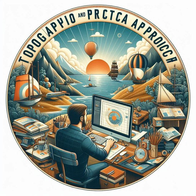
SEC20/WK3: Typography and Practical Application
Hello guys,
It's the third week of the Steemit engagement challenge for season 20 and I'm delighted to share my participation in this week's contest which is titled Typography and Practical Application. This is indeed a beautiful topic by @lhorgic as he has presented the lecture perfectly well.

| Discuss your understanding of Typography. |
|---|
Typography has to do with the arrangement of type (letters) in such a way that it is readable enough, appealing, and presentable. When you see a text that is well presented, your attention will be drawn to it and that is what typography is all about.
So in summary we can say that topography is the presentation or arrangement of our text or writing in such a way that the writing becomes readable, legible, and also visually appealing to those who are looking at it. If you have a text for instance and it is difficult for anyone to read through it because of the color or typefaces you applied then we can say that you have used a bad topography.
Every topography has to do with typefaces I.e., fonts, line space, size of the fonts used, colors, and many more to make it a good or a bad topography. From the lesson we have seen that making use of too many typefaces in a single design doesn't make it look professional so it is good to use just one or two typefaces that agree with one another.
Furthermore, for one to be able to understand topography better, he or she must also ensure that he or she understands the principles of hierarchy, alignment, whitespace, emphasis, and many others as they are part of the key features that the topography even appealing.
| Research 3 other typeface categories not captured in this lesson. Talk about them and also give a visual representation of the typefaces. |
|---|
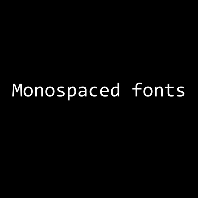
From my little research and studies, the 3 other typeface categories that are not captured in this lesson that I would like to discuss are Monospaced fonts, Display fonts, and Handwriting fonts. Below are their explanation and their examples.
.png)
Monospaced font: As the name implies, it is a font that has the same space between its characters. The space between letters A & B in any sentence in which this font is used is always the same. Often we see Monospaced font used in typewriter, coding, etc. Examples of Monospaced fonts are consoles, couriers, etc.
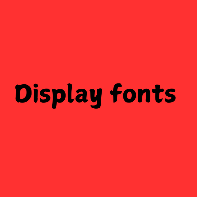
Display fonts: Display fonts as the name suggests, the display is a font that is characterized by drawing the attention of the audience due to the way it is been displayed. It is usually bold and anyone looking at it can easily read through it. It is a font that is used mostly for titles or headings. A good example of this type of font is the impact.
.png)
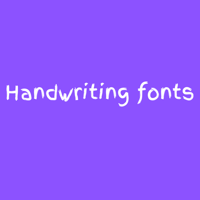
Handwriting fonts: In this type of font, we see exactly a handwriting i.e. a write-up that looks as though it was written by humans. So this type when seen you can easily match it to your handwriting or someone close to you who you have seen writing before. A good example of this type of font is finger paint.
| Demonstrate your understanding of Typography just like I have done with my four examples using the following guidelines below. |
|---|
a. Use "GRAPHIC DESIGN HOMEWORK" as your main caption
b. Use the color combination you picked in last week's color scheme task or any other different from mine to demonstrate
c. Ensure you create 4 different (typographic) designs and highlight the principles applied just like I did.
d. Fill in the details below after each of the four designs using this table
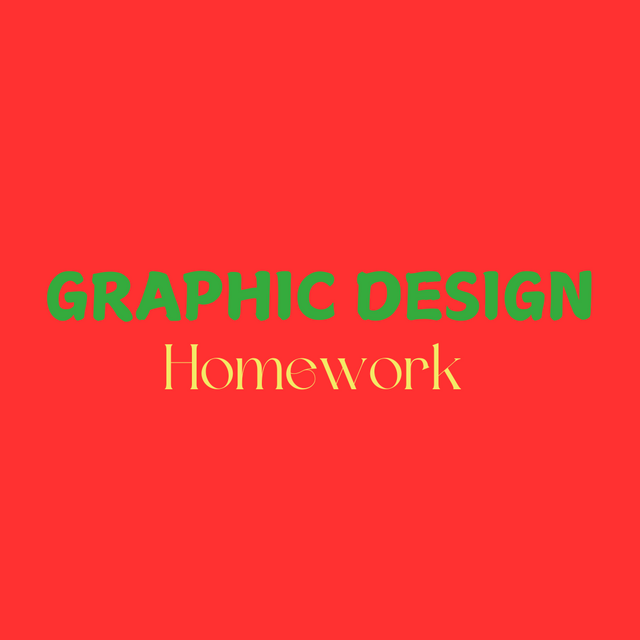.png) | First Topography Design |
|---|
| SN | Items | Answer |
|---|---|---|
| 1. | Typeface/font used | Upperbody: Display, Lowerbody: vintage font |
| 2. | Colour Hex used | Upperbody: #35AB3D, Lowerbody: #F4EA66, Background: #FF3131 |
| 3. | Alignment used | center |
| Second Topography Design | 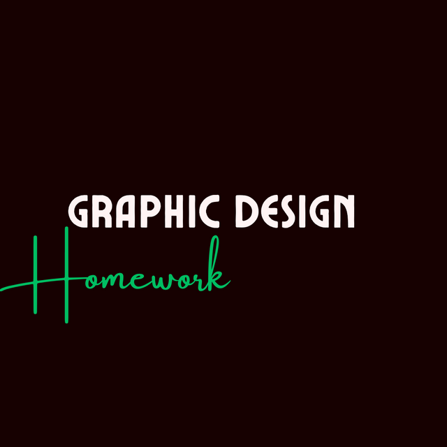.png) |
|---|
| SN | Items | Answer |
|---|---|---|
| 1. | Typeface/font used | Upperbody: Retro, Lowerbody: handwriting |
| 2. | Colour Hex used | Upperbody: #FFF4F4, Lowerbody: #00BF63, Background: #170101 |
| 3. | Alignment used | left |
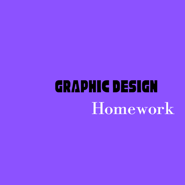.png) | Third Topography Design |
|---|
| SN | Items | Answer |
|---|---|---|
| 1. | Typeface/font used | Upperbody: Geometric, Lowerbody: Rounded |
| 2. | Colour Hex used | Upperbody: #000000, Lowerbody: #FFFFFF, Background: #8C52FF |
| 3. | Alignment used | right |
| Fourth Topography Design | 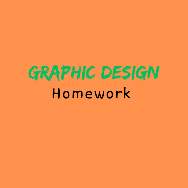.png) |
|---|
| SN | Items | Answer |
|---|---|---|
| 1. | Typeface/font used | Upperbody: Graffiti, Lowerbody: Hangul |
| 2. | Colour Hex used | Upperbody: #00BF63, Lowerbody: #000000, Background: #FF914D |
| 3. | Alignment used | center |
Based on the above task, I have been able to attempt the questions given by the professor in all aspects. I'm pleased with this task and I hope to learn even more as we progress. I want to thank the professor for the job Weldon because I have learned something new here today in the course of carrying out this task. I want to finally invite @suboohi, @solaymann, and @ripon0630 to also join the contest in this community today.
Upvoted. Thank You for sending some of your rewards to @null. It will make Steem stronger.
Great post! 😊 Your breakdown of typography is clear and insightful. It's awesome how you explained the importance of fonts, spacing, and alignment, while also highlighting the impact of readability and aesthetics. Your examples of monospaced, display, and handwriting fonts, paired with thoughtful color combinations, made the topic even more engaging. Keep up the great work, and good luck with the challenge! 💪🎨
¡Saludos amigo!🤗
Me encantó la idea de mezclar la fuente Retro con la Lowerbody: handwriting porque, visualmente le aportas una proyección visual al diseño súper llamativo ya que, lo vintage siempre nos asegura lo clásico.
Te deseo mucho éxito en la dinámica... Un fuerte abrazo💚