SEC20/WK3: Typography and Practical Application.
 Typography canvas edits
Hello everyone!.
Welcome to this week's engagement challenge. I'm grateful to be participating in week 3 of the season class of graphics design. A lot to discuss, let begin.
Discuss your understanding about Typography
Typography is the art and technique use in designing and arranging type. It encompasses the selection, arrangement, and spacing of typefaces to create visually appealing and readable text.
Key Elements of Typography:
Typefaces: This is the design of a particular set of characters which can be classified into various categories like serif for instance;Times New Roman, sans-serif ( Arial), script (Cursive), and monospace (Courier New).
Font: This is a specific instance of a typeface which is define by its size, weight ( bold, regular), style (italic), and other similar characteristics.
Kerning: involves the adjustment of space between individual characters to achieve optimal readability and aesthetics results.
Tracking: contains the adjustment of space between groups of characters.
Leading: stated as the vertical space between lines of text.
Alignment: involves the placement of text relative to the page or container it can be left, right, center, justified.
Importance of Typography:
Readability: welt applied typography enhances readability by making text easy to read and understandable.
Visual Appeal: Typography can contribute to the overall visual appeal of a design, creating a harmonious and aesthetically pleasing composition to the audience.
Brand Identity: Typography can greatly help establish and reinforce a brand's identity and personality.
Communication: Typography can convey emotions, messages, and tone through its choice of color and arrangement.
Typography is used in various contexts, including:
Print design: Example; Books, magazines, newspapers, posters, and packaging.
Digital design: Example ; Websites, mobile apps, presentations, and social media graphics.
Advertising: Example; Print ads, billboards, and digital campaigns.
Branding: Example; Logos, stationery, and other marketing materials.
Research 3 other typeface categories not captured in this lesson. Discuss about these and also give a visual representation of the typefaces.
1• Monospace:
Monospace typefaces have a fixed width for each character, regardless of their shape. This results in a uniform appearance, often used in programming, coding, and typewriter-style fonts. Monospace fonts can be either serif or sans-serif.
Example: Courier New
2• Blackletter:
Blackletter typefaces, also known as Gothic typefaces, are characterized by their intricate, angular shapes. They are often used for historical documents, medieval-themed designs, and decorative purposes. Blackletter fonts can be classified into various subcategories like Gothic Fraktur and Gothic Textura.
Example: Fraktur
3• Display.
Display typefaces are designed for impact and are often used for headlines, titles, and large-scale signage. They come in a wide variety of styles, from bold and geometric to ornate and decorative.
Example: Impact
Demonstrate your understanding of Typography just like I have done with my four example using the following guidelines below.
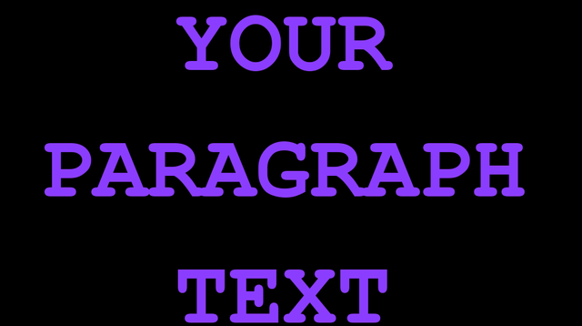
| Image 1 | 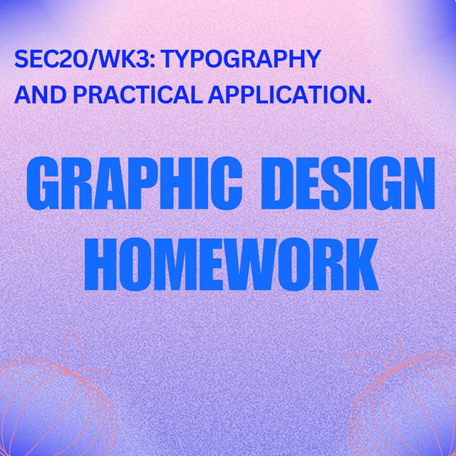 |
|---|
| SN | Items | Answer |
|---|---|---|
| 1. | Typeface/font used | Subheading: canvas sans, Main heading: impact. |
| 2. | Colour Hex used | Subheading: #0d2bfa, Main heading: #146bff, Background: gradient; #bbbbbb |
| 3. | Alignment used | Subheading: left align, Main heading: center align |
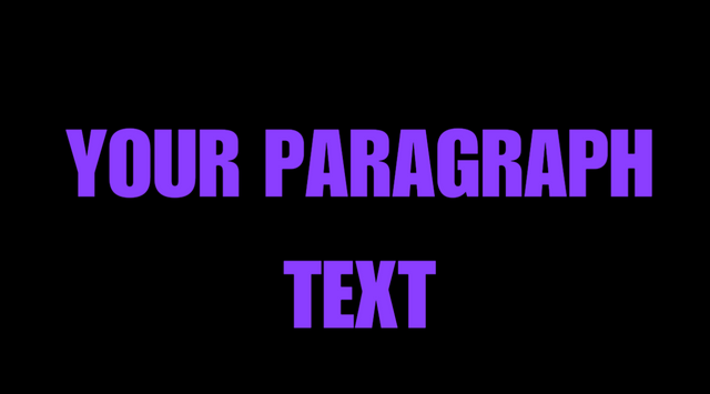
| Image 2 | 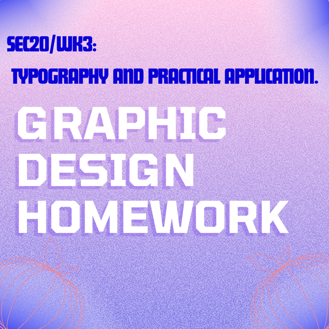 |
|---|
| SN | Items | Answer |
|---|---|---|
| 1. | Typeface/font used | Subheading: Futura impact, Main heading: Tomorrow |
| 2. | Colour Hex used | Subheading: #0900d6, Main heading: #ffffff |
| 3. | Alignment used | Subheading: left align, Main heading: left align |
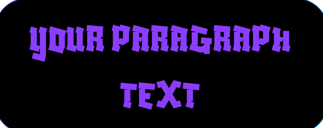
| Images3 | 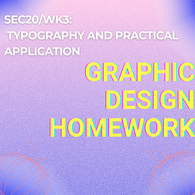 |
|---|
| SN | Items | Answer |
|---|---|---|
| 1. | Typeface/font used | Subheading: monsarret, Main heading: Roboto bold |
| 2. | Colour Hex used | Subheading: #ffffff, Main heading:#fef855 |
| 3. | Alignment used | Subheading: left align, Main heading: right align |
| Image 4 | 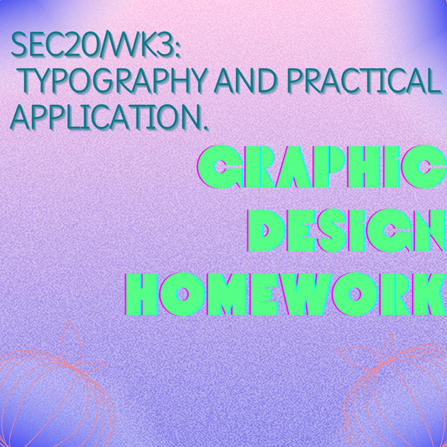 |
|---|
| SN | Items | Answer |
|---|---|---|
| 1. | Typeface/font used | Subheading: playwrite us modern, Main heading: Druzhba Retro |
| 2. | Colour Hex used | Subheading: #0f7988, Main heading:#55fe84 |
| 3. | Alignment used | Subheading: left align, Main heading: right align |
Quite a nice exercise and I was able to pull off the task with ease. I got coffee so I have to learn something new about the various fonts which could be used in graphics designing and also the positioning of letters Why using appropriate colors which match your design.
To Round up, I would like to invite the following persons to participate with me in this contest. @simonnwigwe, @chant and @wirngo
Credit to: @rafk.
¡Saludos amigo!🤗
Para la práctica, utilizaste unas tipografías muy interesantes que me gustaron mucho aunque, te confieso que solo he utilizado la Canvas Sans que por cierto, es maravillosa para los diseños donde queremos proyectar jovialidad.
Te deseo mucho éxito en la dinámica... Un fuerte abrazo💚
What a fantastic post! 🌟 Your breakdown of typography elements like typefaces, fonts, kerning, and tracking is clear and insightful. I love how you explored the Monospace, Blackletter, and Display typefaces with excellent visual examples. 🎨 Your practical demonstration of typography through images is well done, especially with the thoughtful use of colors and alignments. Keep up the awesome work! 💪✨ Looking forward to more of your creative designs! 😊