RE: SEC20/WK3: Tipografía y Aplicación Práctica
Hello @yolvijrm thank you for participating in this week's lesson. We have assessed your entry and we present the result of our assessment below.
Feedback:
• You have clearly defined Typography the way you best understand it and I appreciate the remarkable effort you put into your explanation.
• You have attempted the question two task which states that you discuss about 3 other font categories you personally researched.
• Finally, Your practical is nice, but I just want to give suggestions and recommendations to you on how to get better.
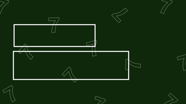
a. In image 1, you did your best but your text did not properly align the way they should, what we have there looks like an imbalanced center alignment. The image below will help you see how to use the right alignment properly.
 |  |
|---|
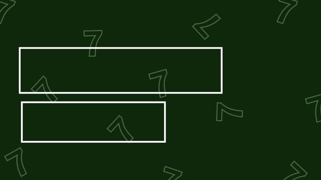
b. In image two, you used center alignment which is cool and your typeface combination is not bad either. I just hope it doesn't appear kiddish to your viewer, because fonts or typeface speaks volume and communicate our feeling and countenance.
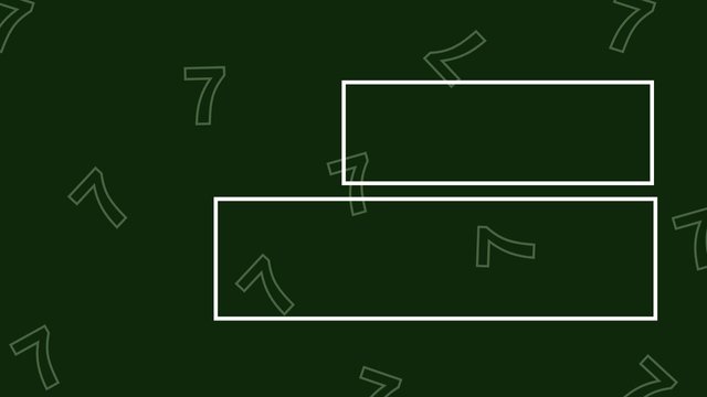
c. In Image 3, The same comment above made for image one is applicable here. You need to be able to align your text properly to reflect your chosen alignment. The image below will show you how the left alignment should be.
 |  |
|---|
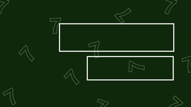
d. You did a perfect job with image 4 and I commend your effort.
Lastly, you would have earned yourself more points if you had talked about the graphic principles you engaged in making these designs as it would have further proven that you understand how these things work.
In all, you did beautifully well and I must commend your effort. I hope you keep up with the energy level.
| Criteria | Remark |
|---|---|
| Plagiarism Free | ✅ |
| AI Free | ✅ |
| Attention to details | 4.7/5 |
| Overall Outcome | 4.7/5 |
| Total score | 9.4/10 |
Regards
@lhorgic❤️
Greetings my friend. I appreciate very much your verification of my work and the recommendations which will help me to improve.
At the end of the 4th question, I gave a brief explanation of the principles used in the realization of the graphic pieces.
Best regards.