RE: SEC20/WK3: Typography and Practical Application.
Hello @alejos7ven thank you for participating in this week's lesson. We have assessed your entry and we present the result of our assessment below.
Feedback:
Let me start by commending your effort and resilience to learn, seeing your entry each week is enough proof that you really want to get this right. And I must say, you amazed me with this week's entry.
• You have clearly defined Typography the way you best understand it and I appreciate the remarkable effort you put into your explanation. However I saw the statement below and hope to correct it
The difference between typography and font is that typography is the name given to the style that we are going to use, which can be a totally unique lettering work, and the font corresponds to the different sizes and thicknesses that the same font has.
I think you meant the difference between Typeface and font just as I explained in my lecture.
• You have rightly attempted the question two task which states that you discuss about 3 other font categories you personally researched. You did a good job.
• Finally, Your practical is nice, however I have few observation and recommendation to make you become better at this...
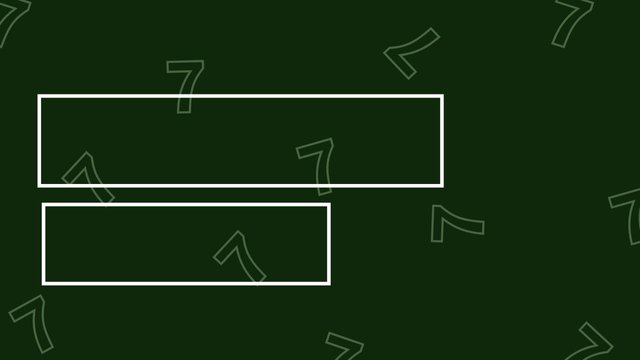
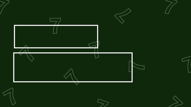
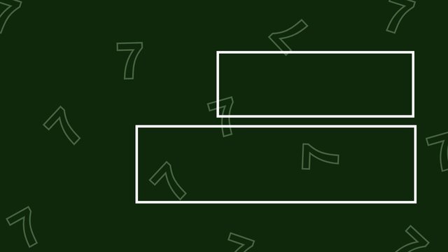
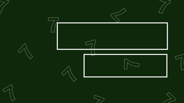
a. Image one looks cool, your colour, perfect, your background, beautiful, your typeface, top notch. However You used the left alignment but mentioned right in your description. In addition, you didn't used the right alignment you claimed to have used, appropriately. You just need to use hierarchy and emphasis to size up your text/elements. I have helped with a visual explanation to help you just as seen below.
 |  |
|---|
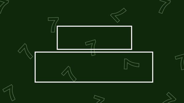
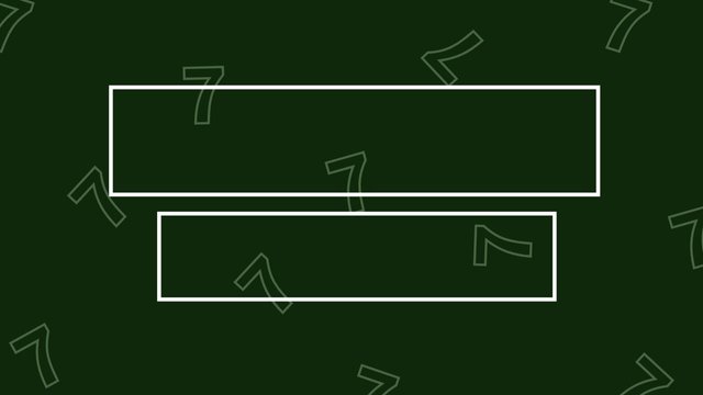
b. In design two, you used the center alignment which is just so perfect. I just hope your viewers do not find it a bit difficult to figure out your caption because of your typeface choice. So yes you did a good job with the center alignment as you can see that it matches with my example below.
 |  |
|---|
c. The same comment in design 1 is applicable to this as well. You used the right aligned but stated in your description that it's left, maybe a typo error. However you didn't also visualize it properly. I have also prepared another slide to help you do the right alignment pefectly well.
 |  |
|---|
d. Image 4 is cool but can be better if you take advantage of the things I have just shared with you.
Lastly, you would have earned yourself more points if you had taken your time to talk about the graphic principles you engaged in making these designs. This would further prove that you understand how these things work.
In all, you did beautifully well and I must commend your effort. I hope you keep up with the energy level.
| Criteria | Remark |
|---|---|
| Plagiarism Free | ✅ |
| AI Free | ✅ |
| Attention to details | 4.7/5 |
| Overall Outcome | 4.8/5 |
| Total score | 9.5/10 |
Regards
@lhorgic❤️
.jpg) Team True Colours - @aaliarubab
Team True Colours - @aaliarubab