SEC20/WK3: "Typography and Practical Application"
 |
|---|
Hello friends and welcome to my article in the SEC S20/W3 I would be duly participating in this dynamic. I duly hope we enjoy my article.
Typography is an artistic pattern which enhances text with the sole purpose of arranging a word, phrase or sentences. Typography is a digital art of arranging letters into readable texts, appealing to the sight and displayed in an artistic manner.
Typography goes beyond arrangement of letters to form a word, it stretches to letter format, adequate placing of these words, attractive colors and overall, it must be eligible and a readable text. The readers thought must be communicated in this technique to meet its demands. It's crucial to note that the background colors and fonts used in typography are crucial to beautifying a text making it wonderful for the eyes to behold.
Importantly, typography has been a criteria to give off a perfect graphic quality. There must be adequate choice in front size to make a great design. The background color must suit the colors in the text. Adequate arrangement is key to having good typographical design.
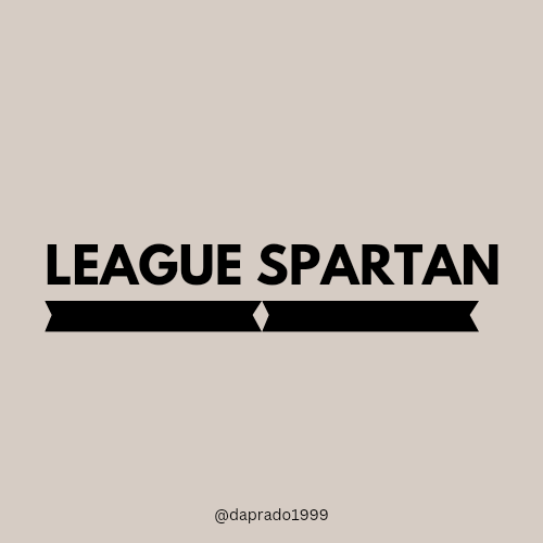
League Spartan: This has been termed one of the most modern fonts in the sub genre sans-serif it is beautifully spaced, graced with bold letters and is noticed to be rampant in our society. Here below is a visual representation of the typefaces.
 |
|---|
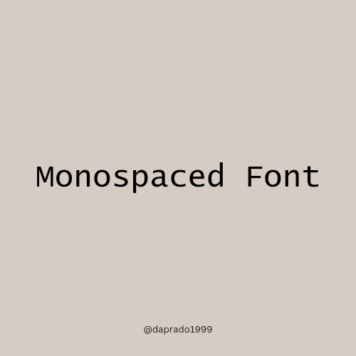
Monospaced Font: This is yet another beautiful typography category. It has an arranged format for these special characters. This usually gives off a smooth view it's usually used more often than not in programming. I would be showing visual representation in this special font. Example of this is courier
 |
|---|
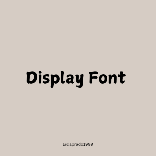
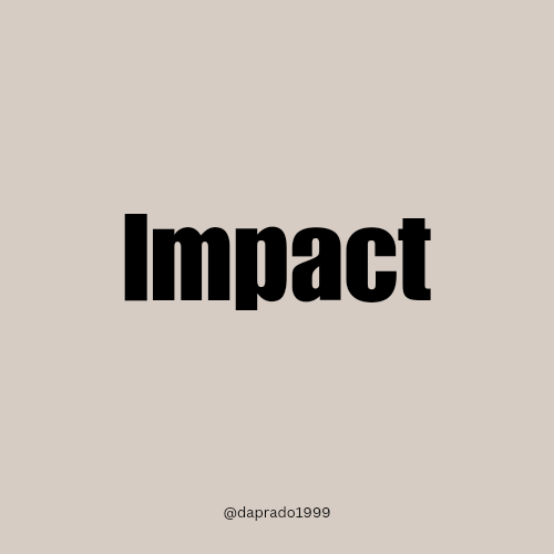
Display Fonts: This is a good font too, characterised by bold letters, it is being displayed in a very visible way to be seen to have good geometrical spacing of it's characters. An example below shows of its visual representation of the display font Impact
 |  |
|---|
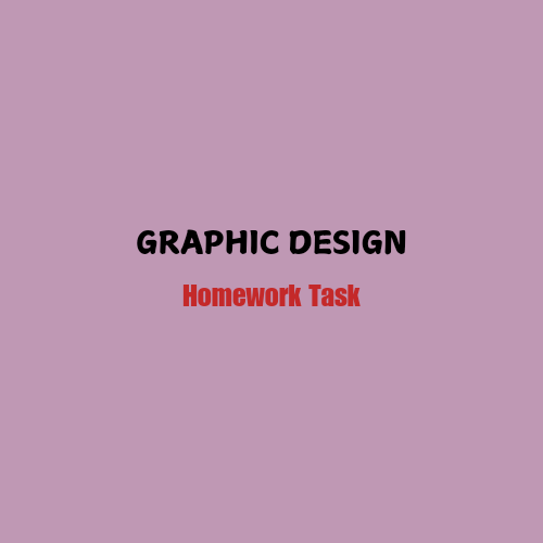
1st Typographic Design
| Item | Answer |
|---|---|
| Typeface/ font | Body Text: Ample & Impact Display respectively. |
| Color Hex used | Background Hue: #BF98B4 Text Hue: #000000 #004AAD |
| Alignment | center |
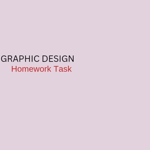
2nd Typographic Design
| Item | Answer |
|---|---|
| Typeface/ font | Body Text: Canva Sans, Arimo respectively |
| Color Hue | Background: #E2D2DD Body Text: #5A2C2C #C42929 |
| Alignment | left |
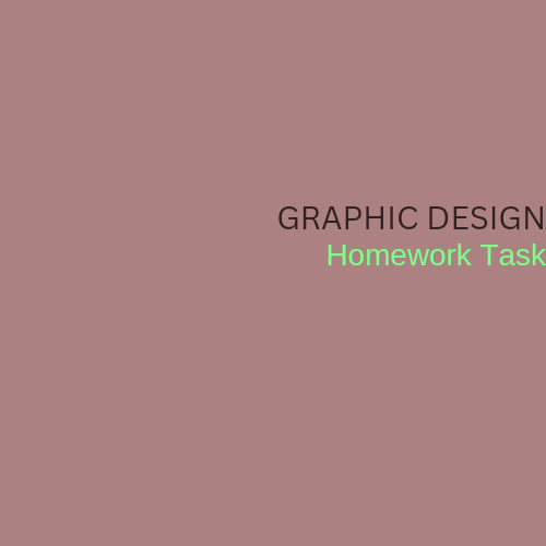
Third
Typographic Design
| Item | Answer |
|---|---|
| Typeface/face | Body Text: Canva Sans Arimo respectively |
| Color Hue | Background: #AC8181 Body Text: #3O2222 #7BFF88 |
| Alignment | right |
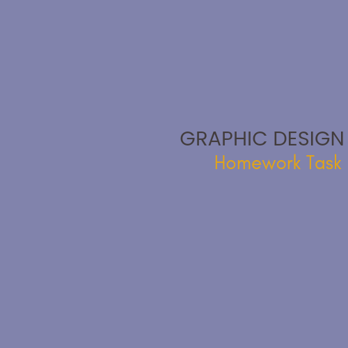
Fourth Typographic Design
| Item | Answer |
|---|---|
| Typeface/ font | Body Text: Popping & glacial indifference respectively |
| Color Hue used | Background: #8183AC Body Text: #423C3C #E4A516 |
| Alignment | right |
Cc:
@lhorgic
I have concluded my article and would love to invite @simonnwigwe @nsijoro @bossj23 @eliany to join challenge
Upvoted. Thank You for sending some of your rewards to @null. It will make Steem stronger.
Congratulations, your post has been upvoted by @scilwa, which is a curating account for @R2cornell's Discord Community. We can also be found on our hive community & peakd as well as on my Discord Server
Felicitaciones, su publication ha sido votado por @scilwa. También puedo ser encontrado en nuestra comunidad de colmena y Peakd así como en mi servidor de discordia
¡Saludos amigo!🤗
Seleccionar una tipografía no es tan sencillo como nos gustaría y si utilizamos más de una, se nos complica más la situación por ello, es importante aprender estos principios que nos han impartido porque, de esa manera vamos a poder realizar diseños idóneos.
Te deseo mucho éxito en la dinámica... Un fuerte abrazo💚