"SEC20/WK1: Introduction to Graphic Design and Principles."
I am no stranger to the term graphic design. In everyday life, I have found many examples of the application of graphic design. One of the most common ones I see is the design on product packaging. But, what about you guys. Do you know what graphic design is?
Previously I would like to thank @lhorgic who has held this lesson. Although I am not an expert in this field, I often create or edit images. So as far as I know, I learned while I was editing images.
What is Graphic Design?
Graphic design is a form of visual communication that utilizes graphic elements, such as images, text, color, and so on to convey information effectively. Examples of the application of graphic design other than on product packaging, include posters, billboards, brochures, and many more.
You need to know, in making a design, we can't just do it haphazardly. We need to think about the right combination of colors, image size, writing, proportions, and so on. Therefore, it is important for us to learn the basics of graphic design. There are two things that are the basis of graphic design, namely elements and principles.
Graphic Design Elements
There are many types of graphic design elements but I only explain 6 types of graphic design elements, namely points, lines, planes, typography, light, darkness, and space. In this article, we will only discuss these 5 elements.
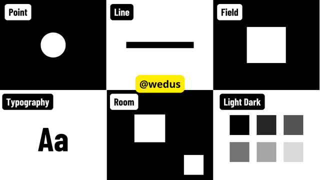
1. Point
A point is a small, dimensionless shape, usually round and without direction. Points are often grouped in varying numbers and densities. With movement, light, and color, points can form lines, produce the impression of radiance, or create new colors through close placement.
2. Line
A line is a series of parallel points that form a whole. Lines can be long, short, straight, curved, thick, thin, or broken, each creating a different impression. Lines are used in design to create order, highlight certain points, and in the creation of charts or graphs.
3. Field
A plane is an enclosed area formed by lines that meet, creating a two-dimensional space (length and width). In graphic design, planes are used to define objects, enhance layouts, and communicate the designer's ideas to the audience.
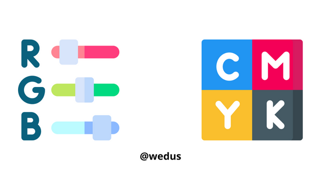
4. Color
Color is an important element in graphic design that gives meaning and theme. There are two categories of color: RGB (light) and CMYK (ink). Color selection must be careful by creating a color palette for an interesting combination, and must be in accordance with the measure. Excessive use of color can make the design look tacky.
5. Room
When designing, it is important to use space to avoid crowding that can be overwhelming to the eye. Space is the distance between design elements such as objects, backgrounds, and text, and helps make information easier to understand.
To create an attractive design, understand the principles of graphic design, namely balance, contrast, emphasis, harmony, rhythm, proportion, and unity. These principles help organize design elements so that the work looks harmonious and effective.
Principles of Graphic Design
Graphic design follows principles just like any other subject. These principles serve as patterns or rules to achieve a specific goal.
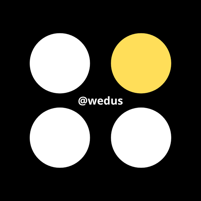
One of the main principles is contrast. This principle helps to highlight the differences between similar elements. For example, if you have two identical shapes, using different backgrounds can create contrast, making it easier for the audience to see the difference even though they are similar in shape or color.
Another important graphic design principle is emphasis. This principle focuses on making certain elements stand out in the middle of the design so that it attracts the audience's attention.
To apply emphasis, make sure that the element you want to highlight has a striking difference from the rest of the elements. For example, if you have several shapes on the same background, use a different color on one of the elements to make it stand out. This way, the audience will immediately focus on the emphasized element and understand the information you want to convey without confusion.
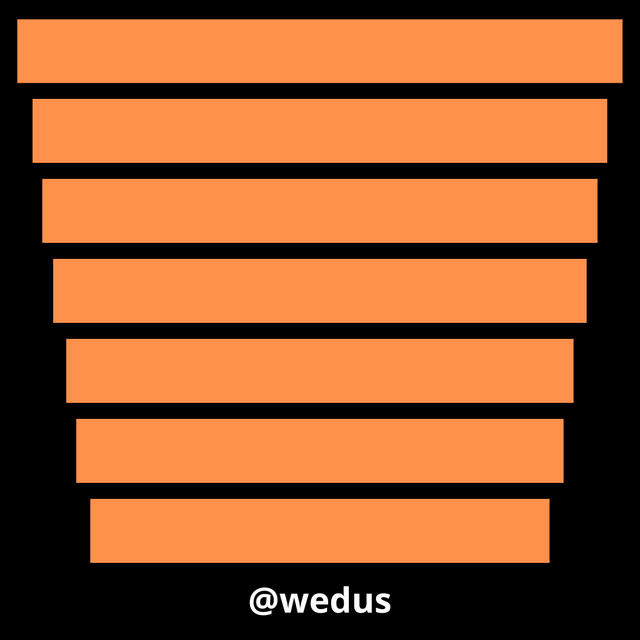
The next principle is hierarchy. In graphic design, hierarchy refers to the arrangement of elements to indicate importance or priority. Like in an organogram, where the highest position is placed on top or larger, in design, the most important elements are given greater visual weight to emphasize their position. This arrangement can be from largest to smallest or vice versa, depending on how you want to present the information.
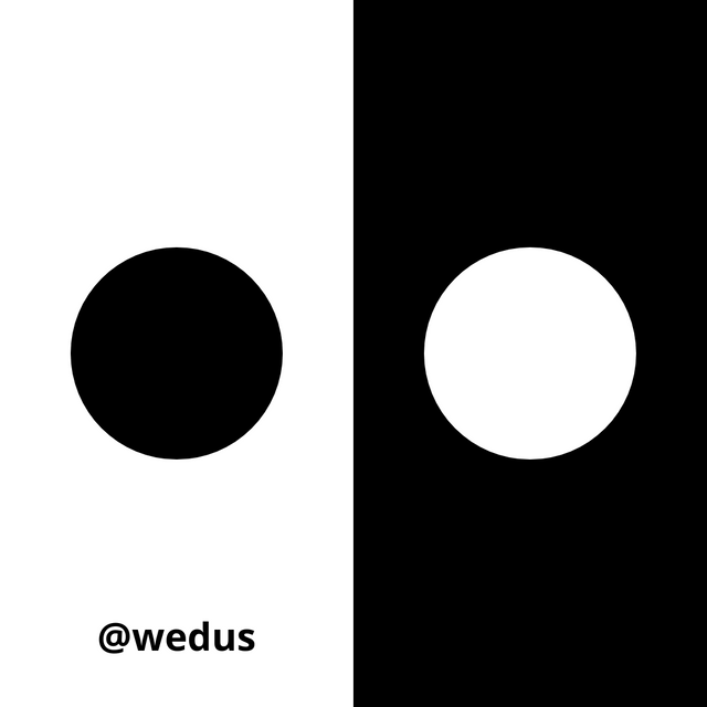
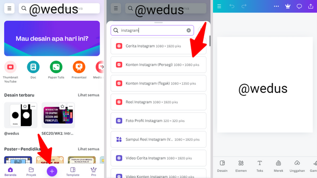
How to make a practical design below
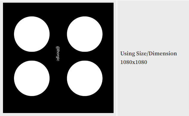
To create the design above, I usually use the canva website to edit. if you are using headphones you can visit the google playstore and download the canva application.
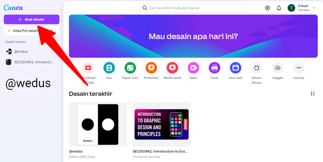
1. Open Canva Website, Or If You Are Using Headphone Launch your Canva app, look for the plus icon "+" to choose the size/dimension as seen. I am using Instagram 1080x1080
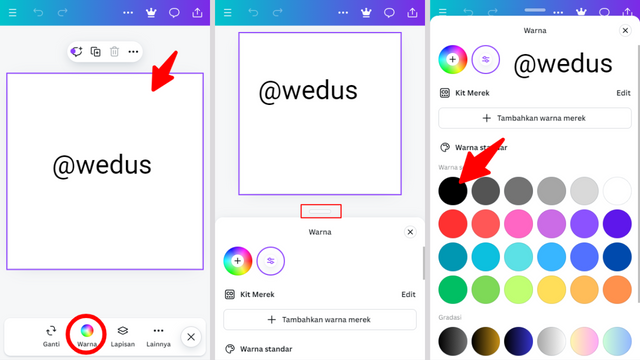
2. I changed the color by looking for the color icon in the toolbar. Then, I dragged the slider on the second slide to select the desired black color.
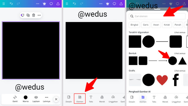
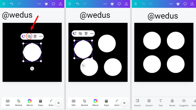
3. At this point, the background has turned black. Next, add a circle shape by clicking on the appropriate element. If this is your first time doing this, use the search bar to find circle, then select it.
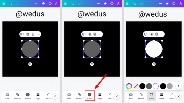
4. The circle in the background can be changed to white using the method explained earlier. Note: To enlarge the circle, drag the edges of the shape.
5. Now, we have a white circle ready. The next step is to click the "+" box icon four times to duplicate the circle into four parts. Then, adjust the position of each circle by dragging it to the desired location.
In this summary, I have dived into and discussed graphic design concepts from my own perspective. I have explained the 5 main graphic design principles that I have chosen and shown practical ways to design images the way I want them.
Learning is a wise move, and applying what you have learned is the best way to understand it deeply. Thanks to @lhorgic for this valuable tutorial. I also invite @temagpx @unfinamess @sposideat to join in this lesson. Hope you guys get the most out of this process!
Hello @wedus thank you for participating in this week's lesson. We have assessed your entry and we present the result of our assessment below.
Feedback:
• You have clearly defined Graphic design the way you best understand it and I appreciate the effort you put into it.
• Your selection on the principles of design is nice coupled with your comprehensive explanation. You did a good job delving deeper into the principles, It also cool to see that you used corresponding visual of these principle to explain your points which is quite commendable.
• Finally, Your practical looks really nice in it presentation, well detailed and comprehensive. I hope you keep up with the energy level. Weldone.
Regards
@lhorgic❤️
Professor @lhorgic. This is another unverified account. Please check: https://steemit.com/@wedus/posts.
Seems like account farming is undergo in season 20 SEC.
Sorry in advance because I didn't read everything that is prohibited in this contest. but I would like to thank you sir. for the support you give me, I am very happy because my hard work is appreciated by you even though I am wrong @lhorgic❤️