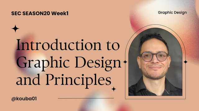
SEC20/WK1: Introduction to Graphic Design and Principles.
Hello steemians,
I am excited to be participating in the first week of SEC20 on the theme of Introduction to Graphic Design and its Principles. As a visual creative enthusiast, I am always looking for new ways to improve my skills and explore tools like Canva to bring my ideas to life. Through this participation, I will share my thoughts and personal experiences on applying some key graphic design principles.
What is Graphic Design? Briefly Share with me your understanding about graphic design |
|---|
As I have experienced and taught, graphic design is much more than just creating attractive visuals. It is a discipline that combines aesthetics with communication to convey ideas and emotions clearly and effectively. Having taught this subject at the Institut Supérieur des Arts et Métiers de Siliana, I have often explained to students that graphic design is based on several essential elements: typography, color, layout and images, all used harmoniously to capture attention and communicate a message.
Using tools such as Adobe Photoshop, Illustrator, and interactive content design software, I have guided my students in creating real-world projects, such as posters, brochures, logos, and websites. The functional aspect of graphic design is just as important as the visual aspect, as it involves solving communication problems for different media: print, digital, or interactive. In my classes, I also emphasize the importance of understanding the target audience and adapting the message according to their expectations.
Personally, I consider graphic design to be a combination of art, technology and strategy, where a clear objective must justify each visual decision, whether it is to promote a brand, inform or interact with an audience.
Pick any three of the principles of Graphic design and talk about them based on your level of understanding . |
|---|
Here are three fundamental principles of graphic design, based on my own understanding and experience teaching design and multimedia:
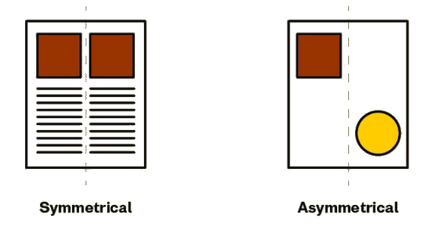
- Balance: Balance is the distribution of visual elements in a harmonious manner throughout a composition to create a sense of stability. It can be symmetrical, where elements are evenly distributed, or asymmetrical, where visually heavy elements are counterbalanced by lighter but strategically placed elements. In my experience, balance is essential to making a composition visually pleasing. I have often explained to my students that using good balance draws the eye and naturally guides the viewer’s gaze through the content.
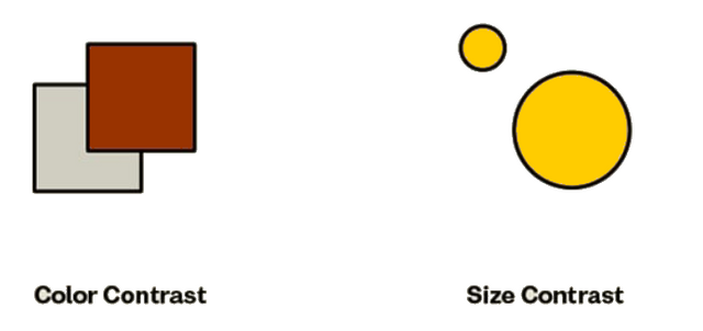
- Contrast: Contrast creates a visual hierarchy by playing on the differences between elements, whether through color, size, shape, or typography. This principle is crucial to drawing attention to specific parts of the composition and making it easier to understand the message. For example, I teach my students to use contrasting colors or different font sizes to emphasize key elements, such as headlines or call-to-action buttons on a website.
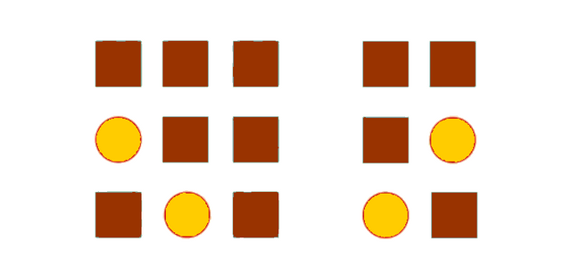
- Proximity: This principle concerns how elements are grouped to show their relationship. Elements that are close together are perceived as related, while those that are far apart appear unrelated. When teaching graphic design, I emphasize the importance of proximity in organizing information clearly and coherently. For example, in a magazine layout, elements of the same article (such as the headline, text, and images) should be grouped so that the reader can intuitively associate them.
These three principles—balance, contrast, and proximity—are pillars in creating effective designs. They help structure visual compositions and ensure that the message is not only aesthetically pleasing, but also clearly understood by the audience.
Practically show us how to make the graphical image below. |
|---|
I am convinced that creating a beautiful image requires not only good graphic planning, but also the right tools, such as the Canva app. This is my first attempt with this tool, and I am eager to see what I can accomplish.
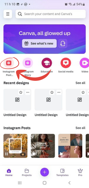
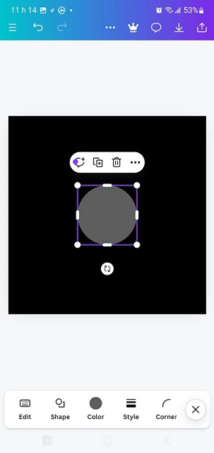
To start, I open Canva on my phone. The interface is simple and attractive. My attention is immediately drawn to the red icon with a pointing arrow that allows me to create a new project. Several design formats are offered, and I choose a square Instagram post (1080×1080 pixels). A blank page appears, ready to be customized.
| Picture1 | Picture2 | Picture3 |
|---|---|---|
 |  | 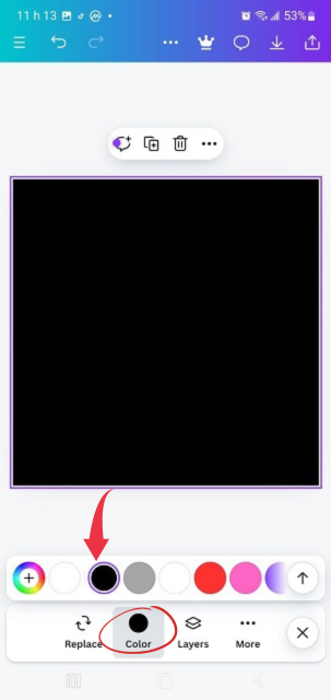 |
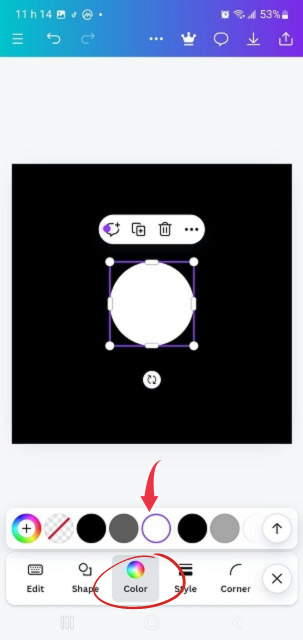
I see a "Color" button at the bottom of the screen. By clicking on it, I can choose from different color options. I opt for blue, my favorite color, and it transforms the background of my composition into a beautiful blue. From there, things get serious.
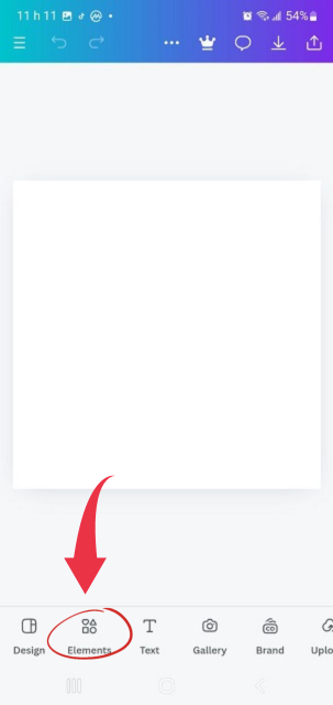
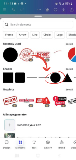
Carefully, I decide to add elements to enrich the design. I click on the “Elements” button, which opens a page filled with shapes, icons, and other visuals. I select an element that appears on my workboard. But since I don’t like the initial color, I change the element to white, which gives it a more modern and clean look.
| Picture4 | Picture5 | Picture6 |
|---|---|---|
 |  |  |
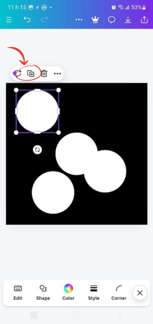
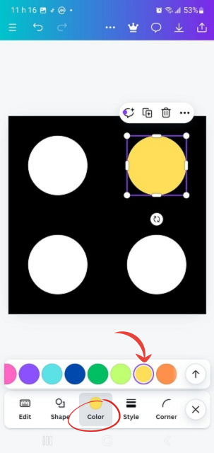
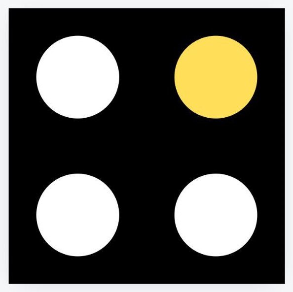
To get four identical elements, I click on the “+” button and duplicate them. The elements are now visible, but they are scattered. I carefully rearrange them so that they are aligned in a coherent way. Then, I repeat the process to change their color to yellow, giving more dynamism to my design.
| Picture7 | Picture8 | Picture9 |
|---|---|---|
 | 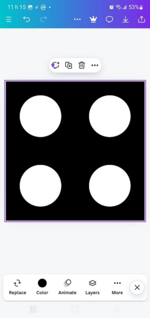 |  |
Finally, once everything is in place and I have made the final touches, I download the design to see the final result. My work is complete, and I am proud of the design I created with Canva.
Thank you very much for reading, it's time to invite my friends @cruzamilcar63, @mvchacin, @adeljose to participate in this contest.
Best Regards,
@kouba01

Hello @kouba01 thank you for participating in this week's lesson. We have assessed your entry and we present the result of our assessment below.
Feedback:
• You have clearly defined Graphic design the way you best understand it and I appreciate the effort you put into it.
• Your selection on the principles of design is nice coupled with your comprehensive explanation. You did a good job delving deeper into the principles, It also cool to see that you used corresponding visual of these principle to explain your points which is quite commendable.
• Finally, Your practical looks really nice in it presentation, well detailed and comprehensive. I hope you keep up with the energy level. Weldone.
Regards
@lhorgic❤️
Greetings friend @kouba01
Without a doubt, Canva has become one of the most used applications by steemites. Personally, I have not had the opportunity to use it, but I know the good variety and quality it offers to generate graphic designs.
Good job.
Indeed, Canva is a fantastic tool, and it's great to see how popular it has become. If you ever get the chance to try it, I’m sure you’ll enjoy its ease of use and versatility for design projects! Thanks