SEC20/WK1: Introduction to Graphic Design and Principles.
Hi friends,
I am Jyoti from India. Hope you are all enjoying life with family and friends, here I am going to participate in the SEC S20 W1 contest: https://steemit.com/hive-147599/@lhorgic/sec20-wk1-introduction-to-graphic-design-and-principles organised by @lhorgic.
Introduction to Graphic Design and Principles |
|---|
Question 1: What is Graphic Design?
Briefly Share with me your understanding about graphic design
Using typography, graphics, and visual elements to convey ideas or messages is the creative discipline of graphic design. Or you can call it a Visual Communication. It is the art and practice of planning, organizing, and organizing visual content to promote, evoke emotions, or promote a particular concept or product.
Attractive designs and logos grab everyone's attention. It helps in quick merchandising of products that leave an image memory to the audience.
If you are a brand startup or planning to launch a website, it's high time you understand what graphic designing is all about. Because it makes it easier for you to spread your idea to people.

Question 2: Pick any three of the principles of Graphic design and talk about them based on your level of understanding .
Contrast:
In graphic design, contrast refers to the difference between elements in a composition. It aids in highlighting the differences between related elements. This difference can be achieved through various attributes such as color, size, shape, texture, and typography. The goal of using contrast is to create visual hierarchy and draw attention to specific areas or elements within a design.
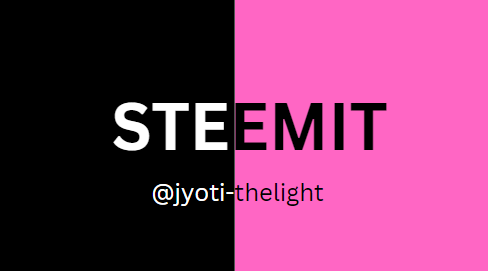
Emphasis
Emphasis is a principle of design that highlights certain elements to make them stand out from the rest. It can be achieved through various methods such as size, color, contrast, placement, and typography. By strategically emphasizing specific components, designers can direct the viewer's focus and create a hierarchy of information.

Alignment
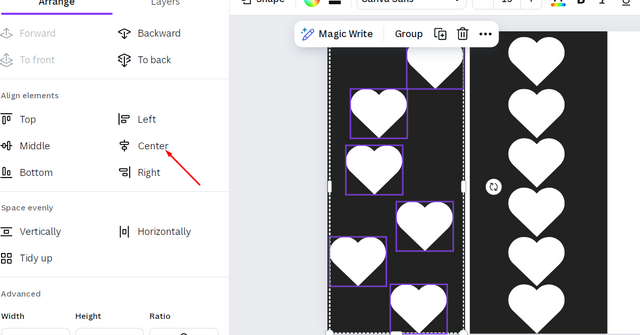
In graphic design, Alignment refers to the arrangement of elements in relation to each other and the overall composition. It's a fundamental principle that influences how information is perceived, guiding the viewer's eye through a layout and creating a sense of order and cohesion.

Question 3: Practically show us how to make the graphical image below.
I am a professional traffic designer so I don't use mobile application but I am designing using laptop or computer for this contest task, I am going to show how to make a design through Canva website.
Step1 :
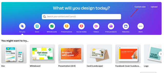
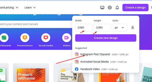
At first go to website open create design in right corner below which button "Custom Size", Click on it.
Step 2 :
After clicking on it, click on the ready template Instagram 1080 Square in the drop down menu below.
Step 3 :
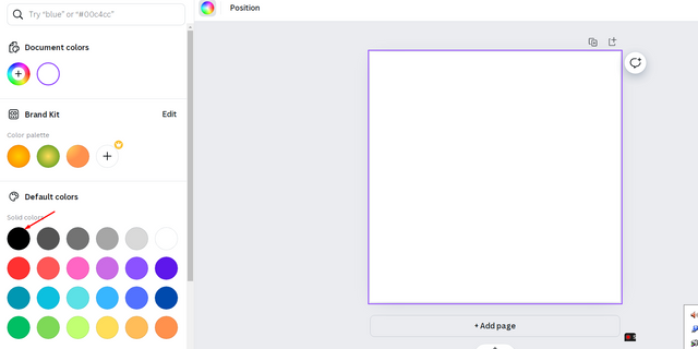
After clicking on it there will be a white square "DRAWING AREA" as shown below

Step 4 :
Above it there is a color palette tool with the help of which we can choose the color we need, I v'e chosen black.
Step 5 :
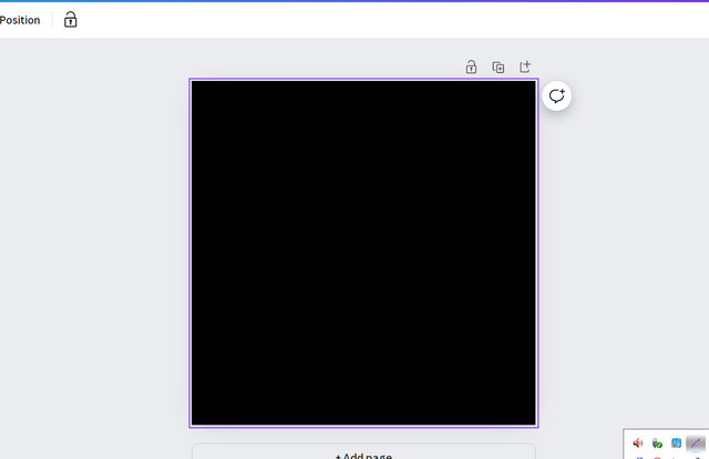
When you clik on the black color of the color palat the drawing area will change to black color as shown in the picture.
Step 6 :
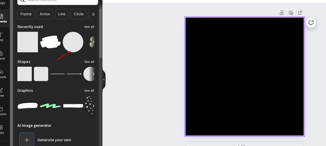
Now go to tools at the left side and click on elements tool. It will show you many elements cush as shapes, photos, graphics etc.
Step 7 :
Choose shapes and choose circle element to insert a circle .
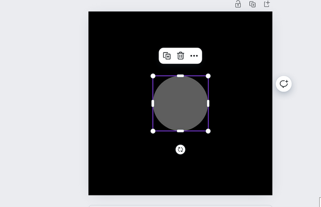
Step 8 :
Use the color palette tool located above to change its color to white.
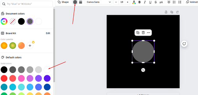
Step 9 :
Copy the cirle and paste 3 times or press 'Alt' key and drag the circle shape to create more 3 circle shapes.
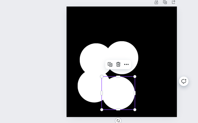
Step 10 :
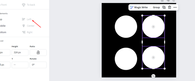
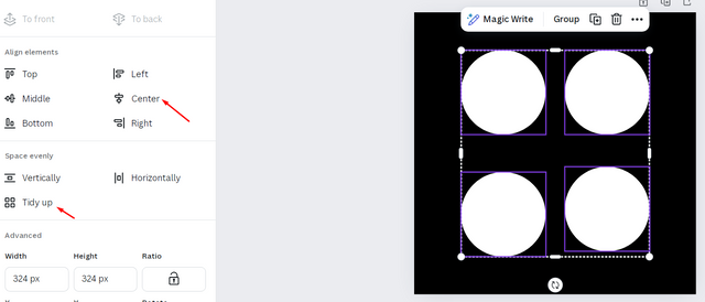
Now seperate and slign them using position option located above to allign the circle.
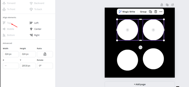
Step 11 :
Use left allignment, top allignment or tidy up tools to align like in the picture
Step 12 :
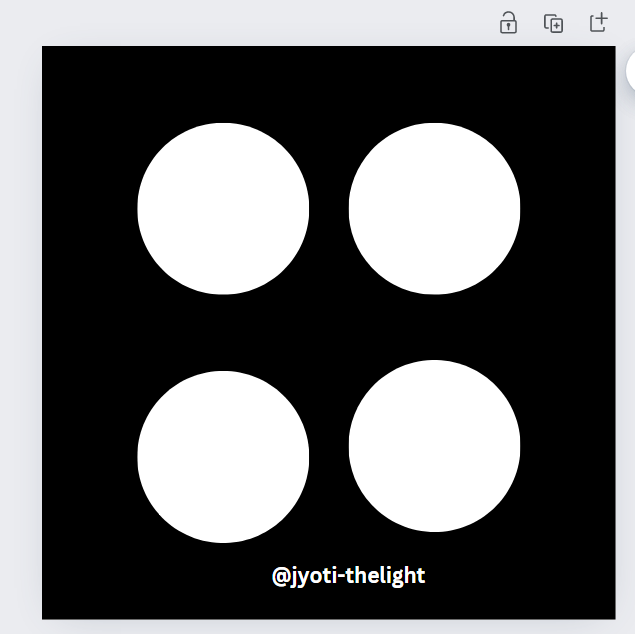
Now the design is ready save it and download it as jpg or png file.

I like to invite
@riya01,
@suborna03 ,
@dave-hanny, to take part in this contest.
Note : Some of above images taken from my computer as screenshots while using those applications
Discord : @jyoti-thelight#6650 Telegram :- https://telegram.org/dl

Hello @jyoti-thelight thank you for participating in this week's lesson. We have assessed your entry and we present the result of our assessment below.
Feedback:
• You have clearly defined Graphic design the way you best understand it and I appreciate the remarkable effort you put into it.
• Your selection on the principles of design is nice coupled with your comprehensive explanation and visual representation of those principle. It's quite commendable.
• Finally, your practical is quite detailed and comprehensive.Although your final result does not mirror the very image given to you in the homework task where one of the colour of the four white circle was changed. All the same,I commend you for a job welldon. I hope you keep up with the energy level.
Regards
@lhorgic❤️
Upvoted. Thank You for sending some of your rewards to @null. It will make Steem stronger.