"SEC20/WK1: Introduction to Graphic Design and Principles."
Canvas
Everyone wants to present something nice and more appealing to an audience that would capture attention by doing so graphic design is very important. Graphic design goes a long way to pass information across to the audience in this post I have talked about graphic design as given by @lhorgic
• Question 1: What is Graphic Design?
Briefly Share with me your understanding of graphic design
Graphic design is all about the art of composing visual elements like images, typography, colors, and shapes to convey a message or information effectively for audiences (viewers) to understand. Designing the layout of our posts, and magazine, creating a poster for advertisement, and designing packaging for products are part of graphic design.
When it comes to graphic design, there are many tools such as Sketch Illustrator, canvas, InDesign, and several other tools that are used for graphic design. As a Steemian I use Canvas for designing my thumbnail image. In summary, graphic design is the art of bringing images, text, and colors together to convey a message.
• Question 2: Pick any three of the principles of Graphic design and talk about them based on your level of understanding.
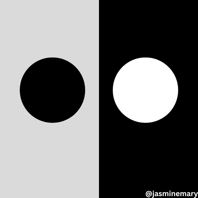
Contrast: This is the principle that helps graphic designers to know the distinction between elements that are similar in a design. In achieving this principle, it is done by placing elements opposite to each other.
Doing so makes the elements separate from each other despite their common features. Contrast can be expressed in the form of Large vs small, Dark vs light, Thick vs Thin, Long vs short, and so on, just as it is shown below.
Alignment: This is the principle of graphic design that is based on the visual arrangement and order in a design layout. This principle states that elements should be arranged orderly fashion.
For example, elements that are moving to the center, right, or left should be in the same line, and the goal is to ensure that there Is no distortion in the movement of elements. For example, whatever element or text that I want to center should probably be centered well just as it is shown below.

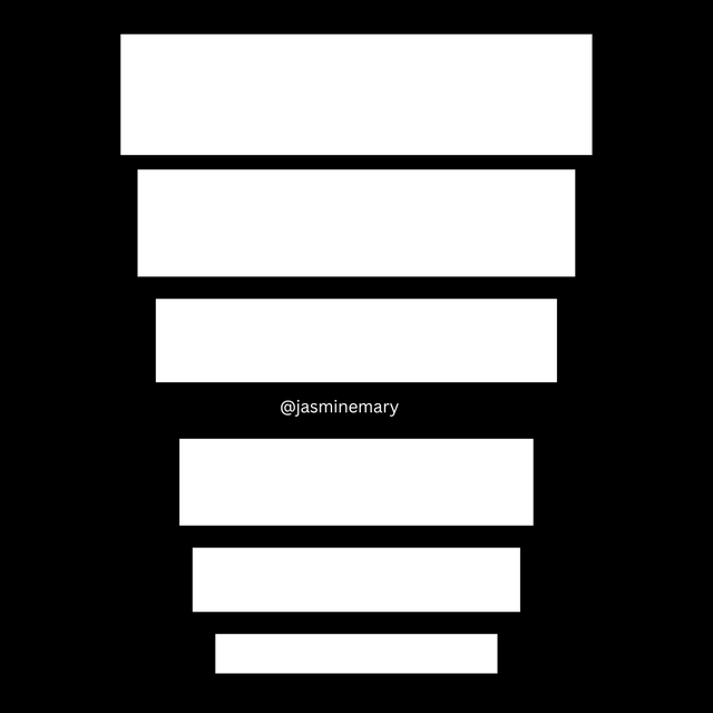
Hierarchy: This is the principles that let us know the importance of elements according to their height, weight, or size. In this principle, le an element with the highest weight, size, or height should come first followed by the elements that are next to it. This principle made use of dominance and priority through giving extra weight to certain elements just as it is shown below.
• Question 3: Practically show us how to make the graphical image below.
Here, I will be taking you through how to make the graphical image of the tutor using his steps practically.
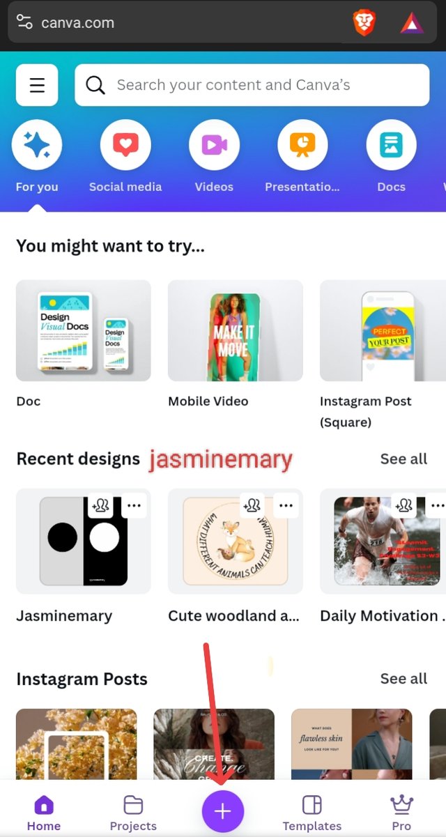
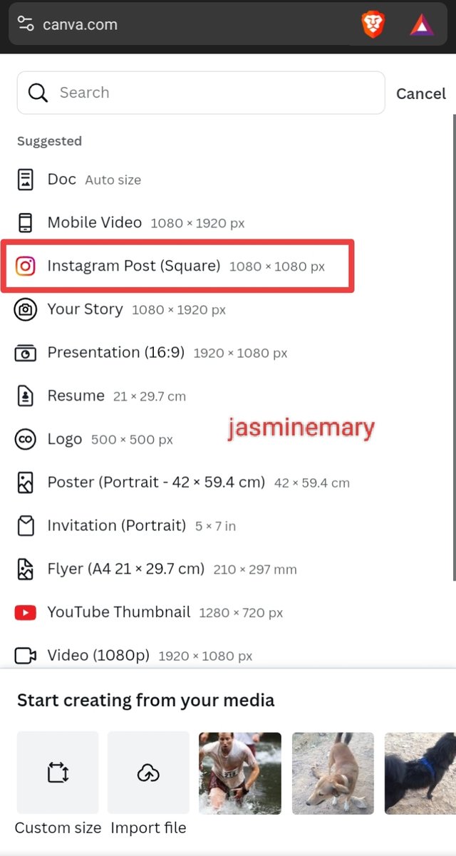
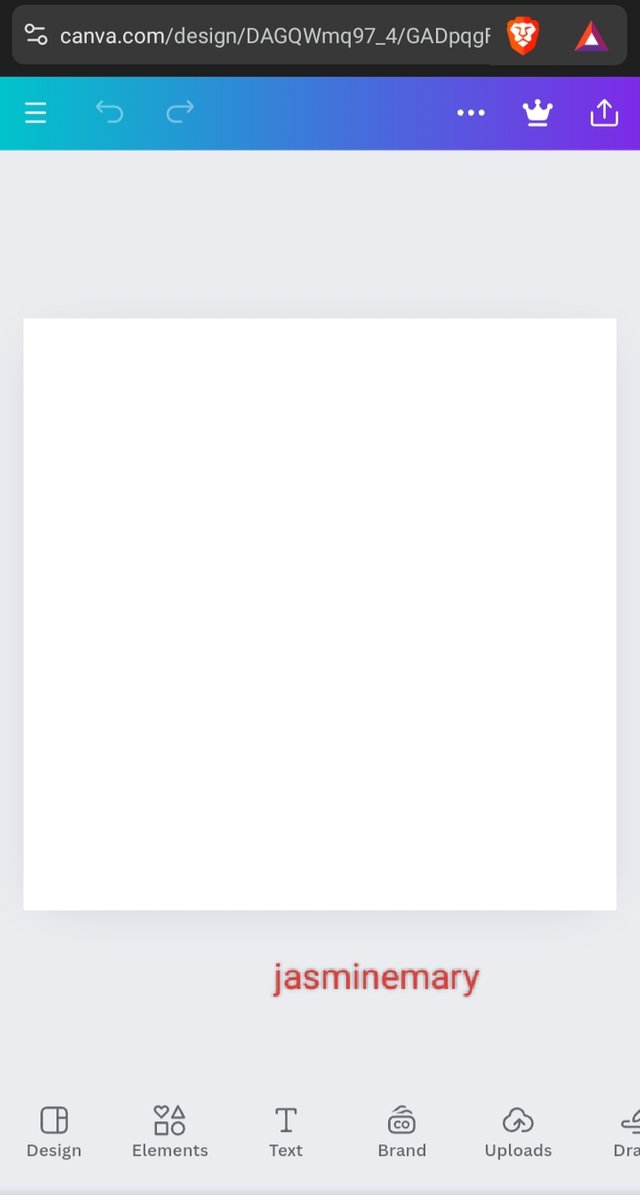
- The first thing I did was open the canvas app and click on the plus "+" icon which I then select Instagram 1080x1080 as the size/dimensions.
 |  |  |
|---|
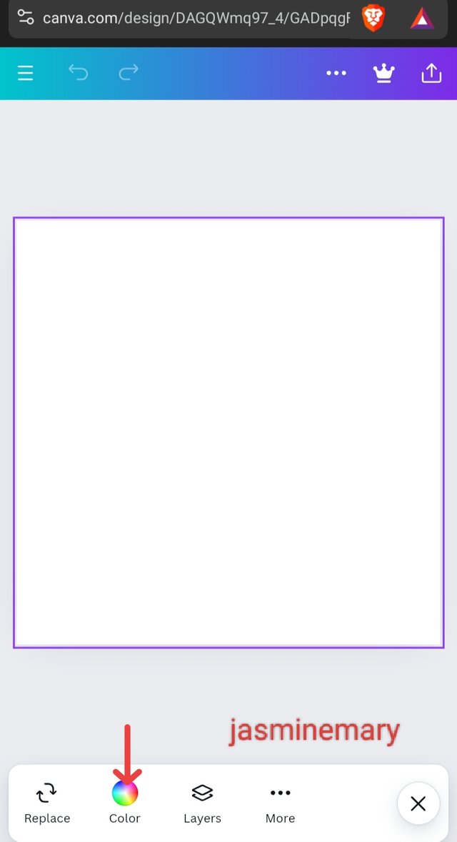
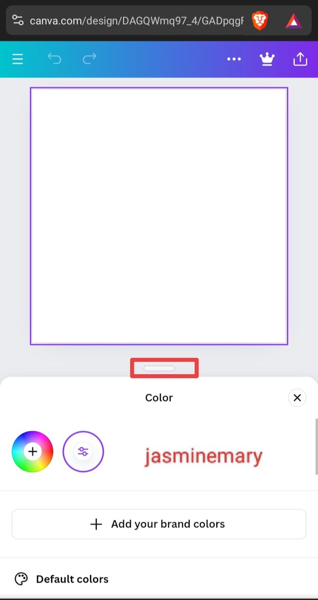
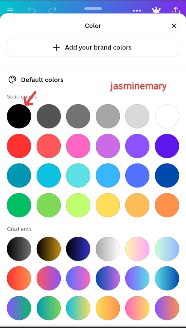
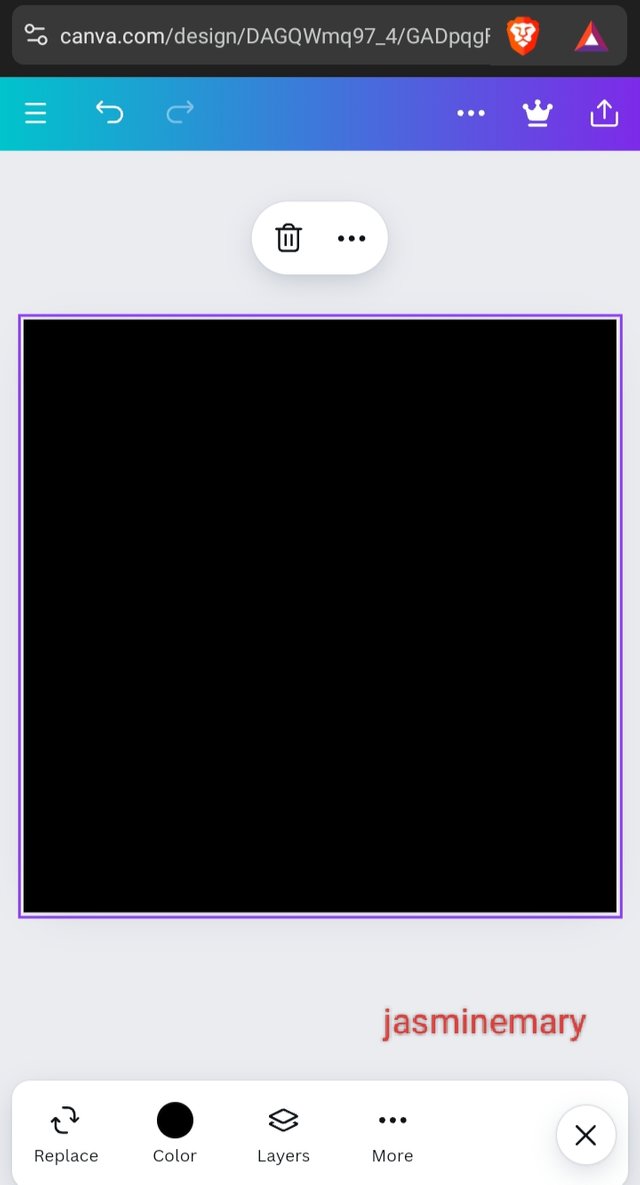
- For me to change the color, I located the color icon on the too bar, where I dragged it up to the highlighted part on the second slide to get the black color.
 |  |  |
|---|
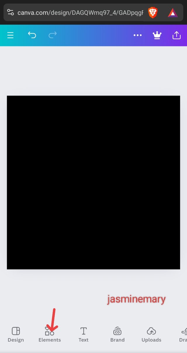
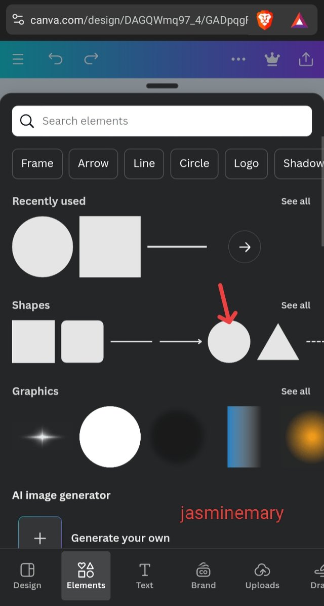
- I click on an element to bring in the circle shape. As I just clicked on the elements, I saw the circle shape which I didn't bother searching for it.
 |  |  |
|---|
- For me to change the color of the circle shape, I tap on the circle and select the color white color preferred color.
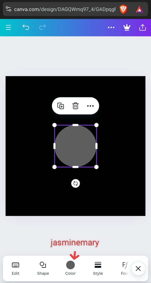 | 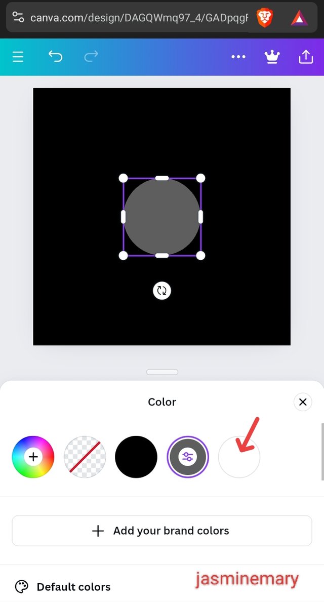 | 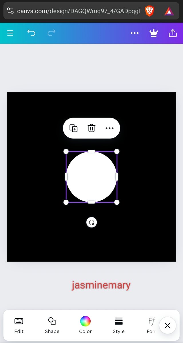 |
|---|
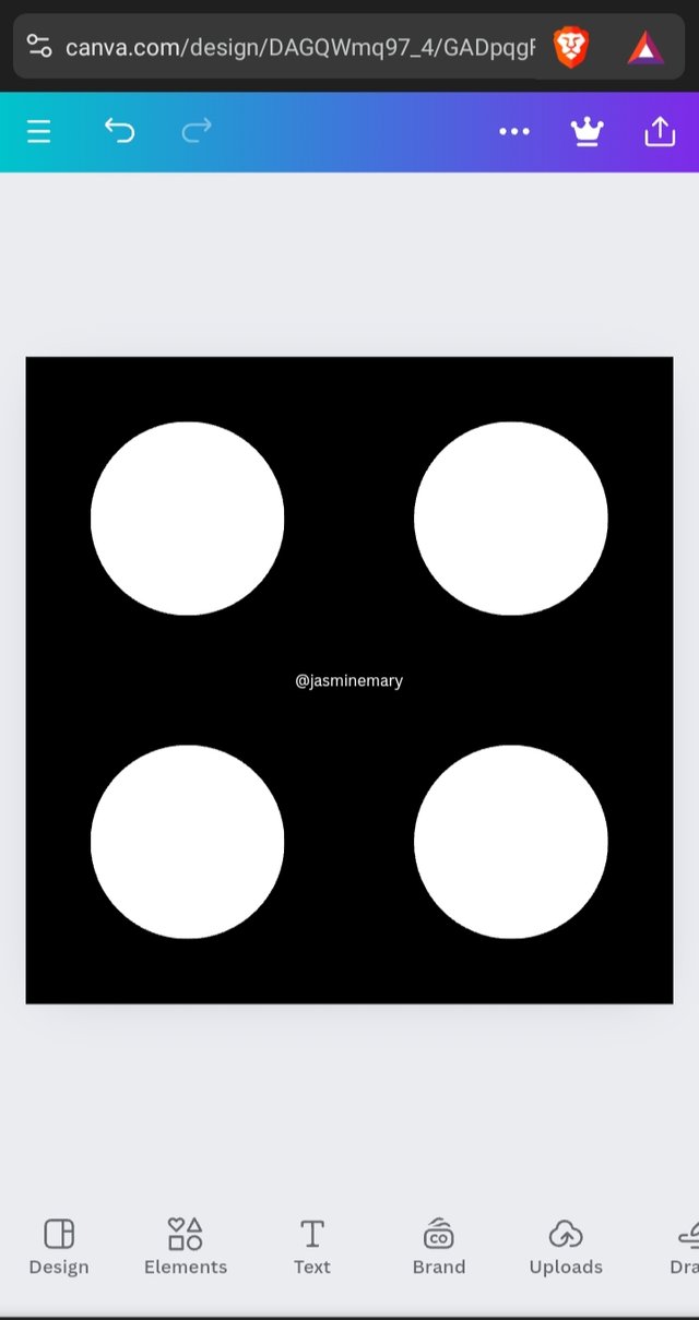
- For me to be able to duplicate the circle, I click on the boxed + icon 4 times. After duplicating the circles into 4, I then arrange them by dragging each one after another to my desired position as shown below.
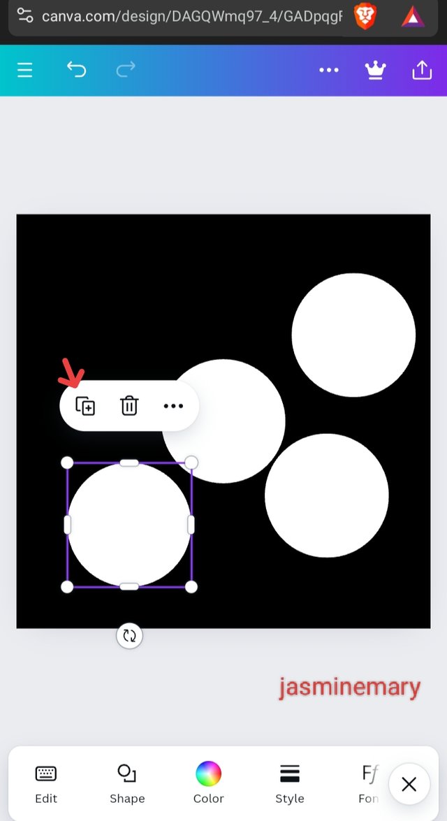 |  |
|---|
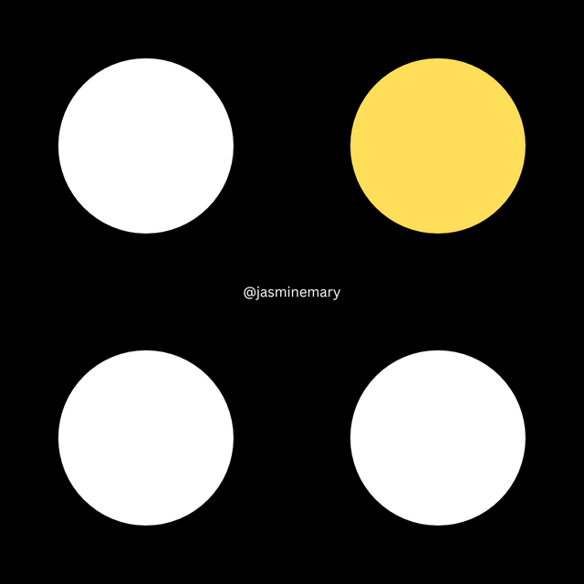
Finally, you can see that I have created an exact graphical image that I am been asked to create.
I am inviting my friends; @dave-hanny, @ruthjoe, and @vickyson to also join me.
Hello @jasminemary thank you for participating in this week's lesson. We have assessed your entry and we present the result of our assessment below.
Feedback:
• You have clearly defined Graphic design the way you best understand it, and I appreciate the effort out into it.
• Your selection on the principles of design is apt, you also presented a illustration of those principles which is quite commendable.
• Finally, your practical is quite detailed and comprehensive, you must have taken your time to work on this diligently...to get this result. I hope you do not relent. Weldone!
Regards
@lhorgic❤️
Thank you sir.
Thank you, friend!


I'm @steem.history, who is steem witness.
Thank you for witnessvoting for me.
please click it!
(Go to https://steemit.com/~witnesses and type fbslo at the bottom of the page)
The weight is reduced because of the lack of Voting Power. If you vote for me as a witness, you can get my little vote.
Congratulations! Your post has been upvoted through steemcurator06.

Good post here should be . . .
Curated by : @𝗁𝖾𝗋𝗂𝖺𝖽𝗂
Hola mi querida amiga @jasminemary, un placer saludarte
Excelente trabajo nos has compartido amiga, que bueno que utilizaste ejemplos en los principios del diseño que nos permite entender un poco mejor su utilización y objetivos dentro del diseño.
Has seguido paso a paso cada uno de las indicaciones del profesor lo que te ha permitido llegar exitosamente al resultado final que se pide en este primer curso.
Te deseo mucho éxito. Un abrazo 🤗
I have been using canvas since I started writing on steemit. Thanks for your support.