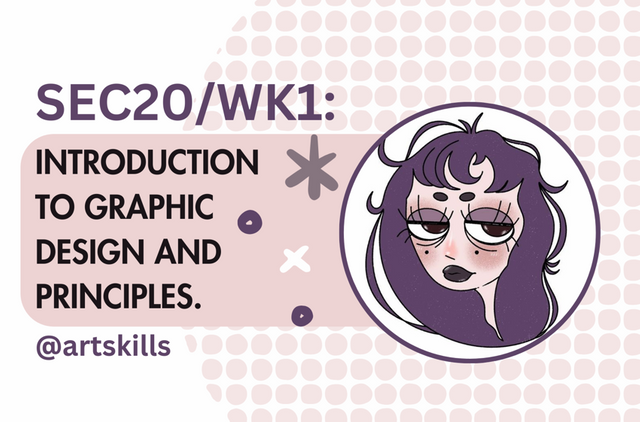
SEC20/WK1: Introduction to Graphic Design and Principles.
Hello.
I invite @jen0revision @esthersanchez and @xpilar to try this lesson :D
- Question 1: What is graphic design?
Graphic design is creating images that can communicate a message to others, it is often used in advertising like product labels. The main elements of graphic design are the colours, shapes, images used, and the style. Ideally, the design looks appealing and is clear so people understand what the purpose of whatever it is (like a poster or thumbnail).
There are many forms of graphic design, like in illustration, advertising products on posters or billboards.
The field of graphic design that interests me the most is illustration, which could be for book covers, poster designs and social media posts.
- Question 2: Any 3 principles of graphic design I want to talk about:
Contrast
Contrast is used to differentiate between two objects that are similar but opposites in design, so it's easy for you to notice the differences between them.
| Description | Image |
|---|---|
| Example with contrast |  |
| Example of no contrast |  |
Balance
To balance in graphics design is to help make it organised and harmonise the design's layout, while eliminating disproportions. So this can be ensuring elements like shapes, images or text are symmetrical in an organised layout, but at times if done correctly, asymmetrical designs can be aesthetically pleasing.
| Description | Image |
|---|---|
| Example with balance |  |
| Example of no balance |  |
Emphasis
To emphasise an element in a design would be to ensure that it stands out by using a different eye-catching colour. Doing this will help navigate viewer's attention to a singular part of the design. This creates a focal point.
| Description | Image |
|---|---|
| Example with emphasis |  |
| Example of no emphasis | 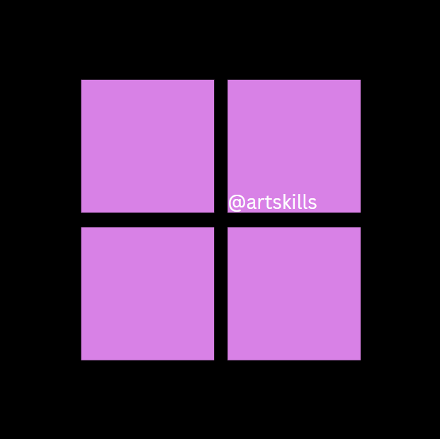 |
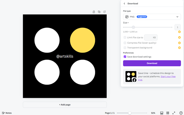
- Question 3: Practically show how to create image in the post.
I don't use Canva on my phone so I always use it on my laptop, so this is what I used for this lesson.
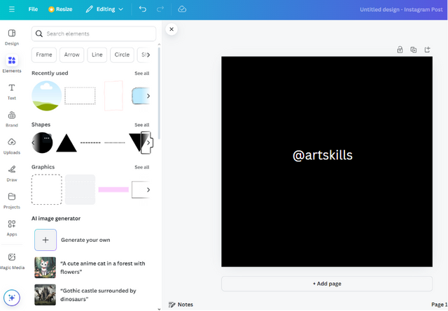
Step 1:
I first opened canva and clicked 'create a design'.
Then, I used the 'Instagram Post (Square)' as it was the 1080 x 1080 dimension specified for the task.
Step 2:
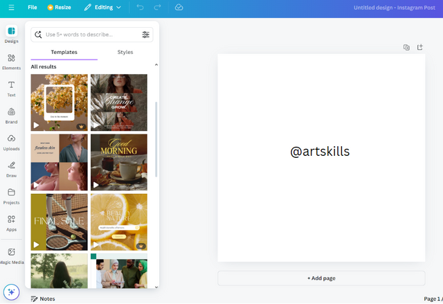
From step 1, this is my plain white square. In it, I put my name as suggested by the teacher.
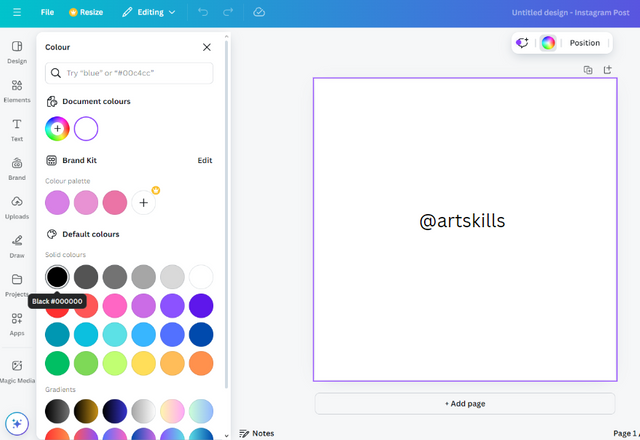
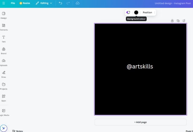
Step 3:
Next, I went to the left hand side, and selected the colour Black for my background.
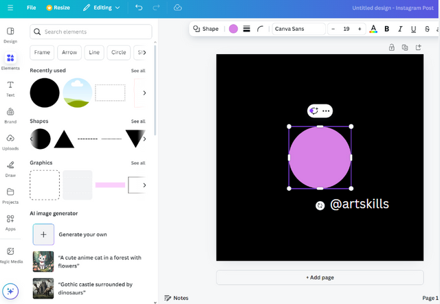
Step 4:
I selected the 'elements' section, and I looked for the circle on the shape section, if the circle does not show up, there was a search bar to search for the shape at the top.
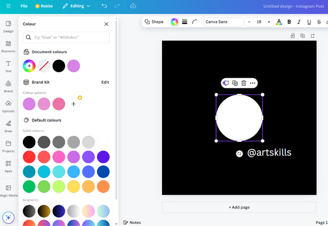
Step 5:
I changed the colour of the circle to white, and then I clicked the duplicate button 3 times, to create 3 other circles of the same size for the next step.
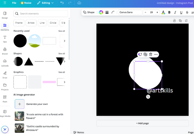
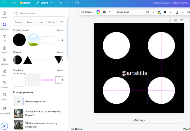
Step 6:
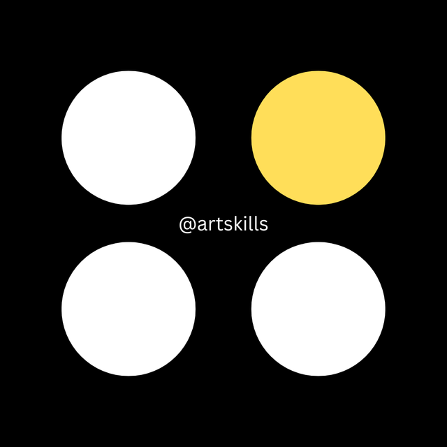
With the 3 other circles from the duplicate button, I tried to arrange them in a balanced manner using the guide lines Canva provides (the faint purple lines in the image). As you can see, I created a balanced layout I was happy with.
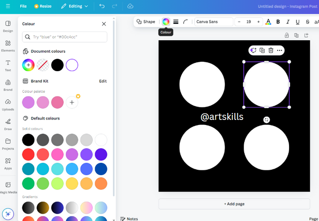
Step 7:
To emphasise one of the circles, I selected the top left circle, and changed its colour to yellow. In order for it to be like the teacher's.

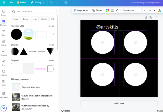
Step 8:
This is the result of step 7. Here, I centered my username.
Step 9:
This wasn't necessary, but I wanted to show how I saved and downloaded my finished piece.
Finished:
I found this lesson interesting! I hadn't learnt about the principles of graphics design before. Looking forward to more lessons!
Disclaimer: ALL of the pictures used in this post were created by me, @artskills.
Hello @artskills thank you for participating in this week's lesson. We have assessed your entry and we present the result of our assessment below.
Feedback:
• You have clearly defined Graphic design the way you best understand it and I appreciate the effort you put into it.
• Your selection on the principles of design is nice coupled with your comprehensive explanation. Although a part of your explanation here wasn't clear i.e the visual illustration for emphasis and contrast. Nevertheless your work is quite commendable.
• Finally, Your practical looks really nice in it presentation, well detailed and comprehensive. I noticed you didn't use your mark up tool to highlight key areas in your practical steps, do well to use in subsequent homework entries. I hope you keep up with the energy level. Weldone.
Regards
@lhorgic❤️
Thank you for your feedback! I enjoyed doing this homework, I learnt a lot.
Looking forward to the next one! :)
I really like the thumbnail you made @artskills !
I think you've worked really hard completing all the tasks which are way beyond me.
I will be following the tasks from afar as I really need to improve my graphic skills but this time I'm concentrating on only one course - the SEC-20 Wk1: Introduction to Pattern Making.
Good luck with the Graphics Course !
Thank you very much! It was fun to make.
It was nice to learn more about graphic design, I recommend it!
Oh wow! Good luck with your pattern making course!
Describiste muy bien los principios del diseño. Además creaste el ejercicio sugerido logrando la imagen con éxito y pasos explicativos muy claros desde tu PC.
Éxitos en el curso.
Muchas gracias!
Thank you for the invite! Really love the thumbnail you did for this post with your avatar ❤️ I'll try give this lesson a go, but I'm not sure I'll finish before the deadline haha
Ofcourse! Thank you very much :) if you do take part- Goodluck!
This post has been upvoted/supported by Team 7 via @httr4life. Our team supports content that adds to the community.