Let's Make a Level for Duke Nukem 3D, Part 11
Last time, we detailed the jumping puzzle area somewhat. Here's what it looked like when we left off:
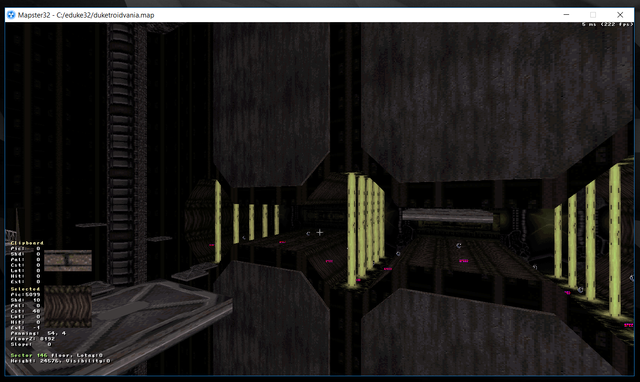
Spiffy. Only problem is, there's no detail on the floor or ceiling. There's an easy solution to that however, which will look nice in this setting.
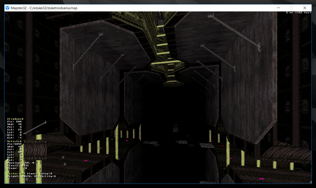
There, that looks suitable for this room. I've had to move around loads of platforms to build that ceiling stuff (remember what I said about not neglecting ceiling details?) so I have to move them back to fix the jumping puzzle. But then after that, I need to make the entry room to the underwater maze.
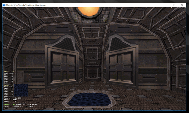
That looks...adequate. Really just the room's basic structure and texturing is done, I don't know what the lighting situation is going to look like yet. It's a complex room so lighting will, once again, be a bitch. I could have kept it simple to make my life easier when it came time to add shadows, but I don't want to let down the design in any area.
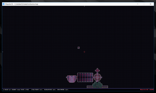
See that itty bitty room way out there? That's the underwater sector. Now I gotta explain how water works in this game. It's a ruse. A heckin' bamboozle, friends! It's just a type of teleporter.
When you duck while standing waist deep in an above water sector (lotag 1) you are silently, instantly teleported to just below the ceiling of the corresponding underwater sector (lotag 2) linked to it by a pair of sector effector sprites with identical hitags, and a lotag of 7.
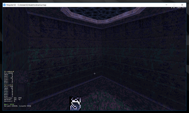
Here it is. Where you submerge to when you dive into that pool in the floor. This will be the beginning of our underwater maze. That's why it's so far from the rest of the map, so there's room to branch out.
Distance doesn't matter much since you teleport there instantly, although if the distance is very large, on bigger complex maps that tax the processor, there will be a small delay when submerging.
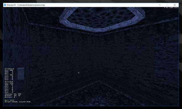
Here I've given all surfaces a palette of 1 (blue) to further reinforce the feeling that the player is underwater. The typical slight blue tint doesn't cut it in my book. If you disagree and prefer it the other way, let me know. I'm gonna end it here and start expanding the underwater base in earnest next time.
Until then, feast your eyes on some screenshots of this map using the High Resolution Pack enabled:
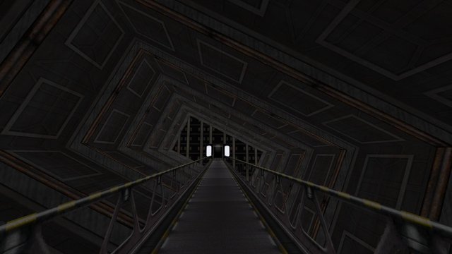
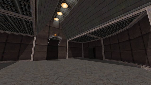
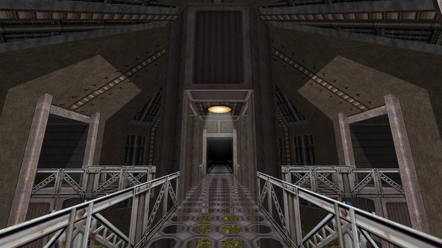
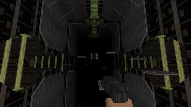
WOOOAAHHH SUPER 1998 LEVEL GRAPHICS!!! CAN YOU HANDLE IT???
Stay Cozy!

Woah, 1998 era graphics?! THAT'S TOTALLY, LIKE, TUBULAR, MANNN.
The hi-res pack does make the textures look pretty damn good though, in all honesty.
How is it already eleventh part, times flies too fast (I thought it was only fourth).
Woaaah, my eyes are melting! Graphics are just too legit :d
The Water level will be super cool. I love water in any game.
Is it Minecraft or Zelda I'd love this shit!
@alexbeyman its really cool man..Sounds cool when You get teleported to underwater maze
I like the entry room to the underwater maze. And with that High Resolution Pack everything looks very clean and a bit more spacious - nice to look at. :)
OH man sooooo many hours playing this game. My brain thought it looked so real in 1998. Such graphics. Wow pixels.
Maybe a dark room plus a flashing lamp on the wall will look more challenging, extrem and horror as the real story.
thanks @alexbeyman
It looks really awesome. Sounds cool when You get teleported to underwater maze. I definitely like the blue palette to reinforce the feeling of being under water.
Wow this is looking nice. So how many hours in total do you think you have put into this masterpiece?
4 or 5 so far
Wow that is crazy. If I was trying to build it I would probably take way longer for sure. Probably 10 hours or more if I did it.
I disagreed with the dark tinted blue, nevertheless, it's doesn't make for a really suitable colour for sea, maybe something lighter would do