Getting the style right
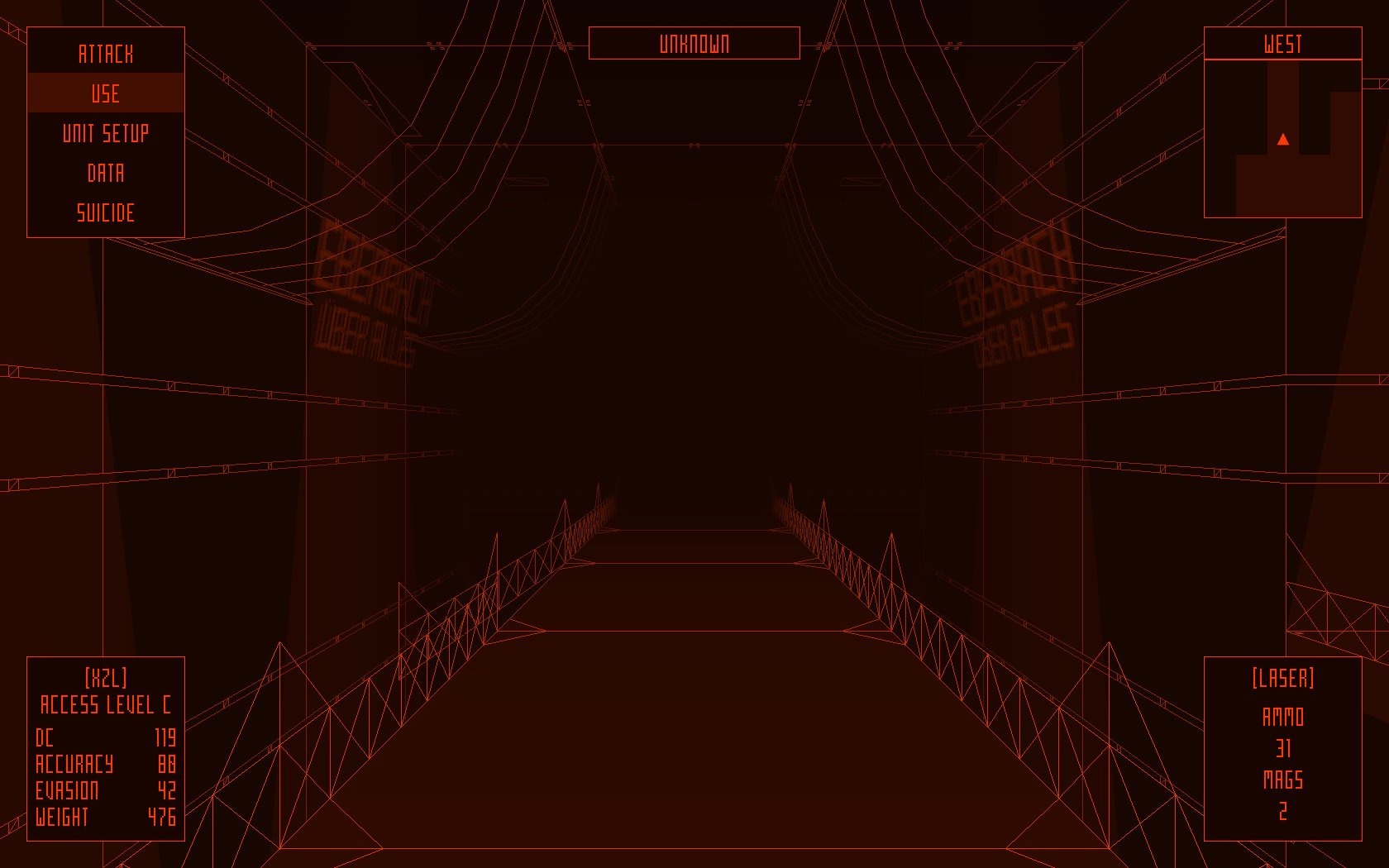
Hi, guys. To ship the project, developers always have to overcome many challenges. To get it to the point where they’re proud of it, they have to deal with even more of them on top with existing ones.
Today I want to talk about it.
So, let me introduce you R. Surt, the main developer and driving force behind the game, who is responsible for code, sound, graphics and story of Das Geisterschiff. That’s quite a lot, huh, but we 2 are the only developers of this game.
Surt R: One of the biggest challenges for Das Geisterschiff was getting the right graphics style for the game, which had to imitate a scanner attached to the mechanical combat suit.
At the same time it had to:
— stand out from the crowd
— be easy to work with for a non-artist (i.e. myself)
— be suitable for low-end rigs
Meeting each of these goals was important and mandatory.
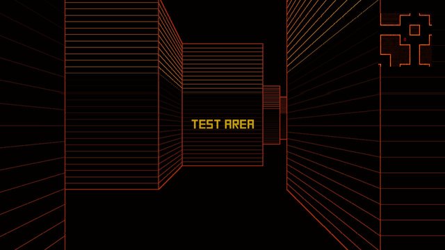
This style was dropped in mid-2017 for several reasons. Edge detection and isoline effects were too expensive, which conflicted with the third goal of the project. The control over the final appearance was limited too, so at times it took hours of balancing to get the mesh edges just right. Not to mention that dancing around the issues that edge detection brought to the table got tiring pretty fast.
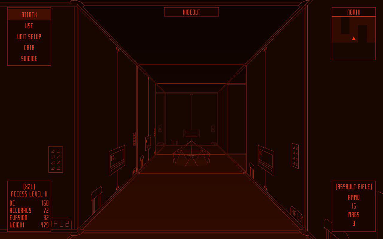
Pixel art was never considered — it's very common, it's taking a lot of time and frankly, my attempts looked like shit. Investing a year+ of free time into this was impractical since it would distract me from programming, a more important skill for game development (and my weak spot at that time). Textured 3D wasn't even considered for the same reasons.
Untextured low poly with modern bells & whistles style was considered, but dismissed pretty quickly — it felt kinda off. Lights and shadows would conflict with the ideas behind the style and slow things down — either it would make low-end rigs struggle with the game, either it would take a lot of time to bake the lighting and make it look right.
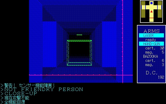
One of the main references for the gfx style was Carmine, the main source of inspiration for my project. So in 2017, I decided to postpone the release and take time to find and implement a new style that would work better both from the artistic and technical side. Besides, I have to admit: the codebase was a big and buggy mess and something had to be done about it. If it was released in 2017, it would be a disaster.
So I started playing around with low-level GL library in Unity while rewriting and refactoring the game code, and this eventually led to the current style. While it's not perfect on the technical side (apparently GL stuff is a CPU hog in Unity, which I don't remember from my early tests), it works well. While I've only recently got comfortable with this style, I can block out and finish a small segment of the game in a matter of days. Right now the game runs at 50-100 fps on a cheap laptop from 2010 and I have full control over the appearance.
Optimization was fun too — there were more pitfalls than I imagined. Writing custom editors was another challenge, but it was necessary — even simple textures have roughly 100+ vertexes. Now imagine assigning 200 vertexes by inputting the values by hand and then trying to tweak this mess. Unfortunately, I had to break the levels into smaller parts to make them manageable with my current hardware, but since the loading times are very short that's not much of a problem.
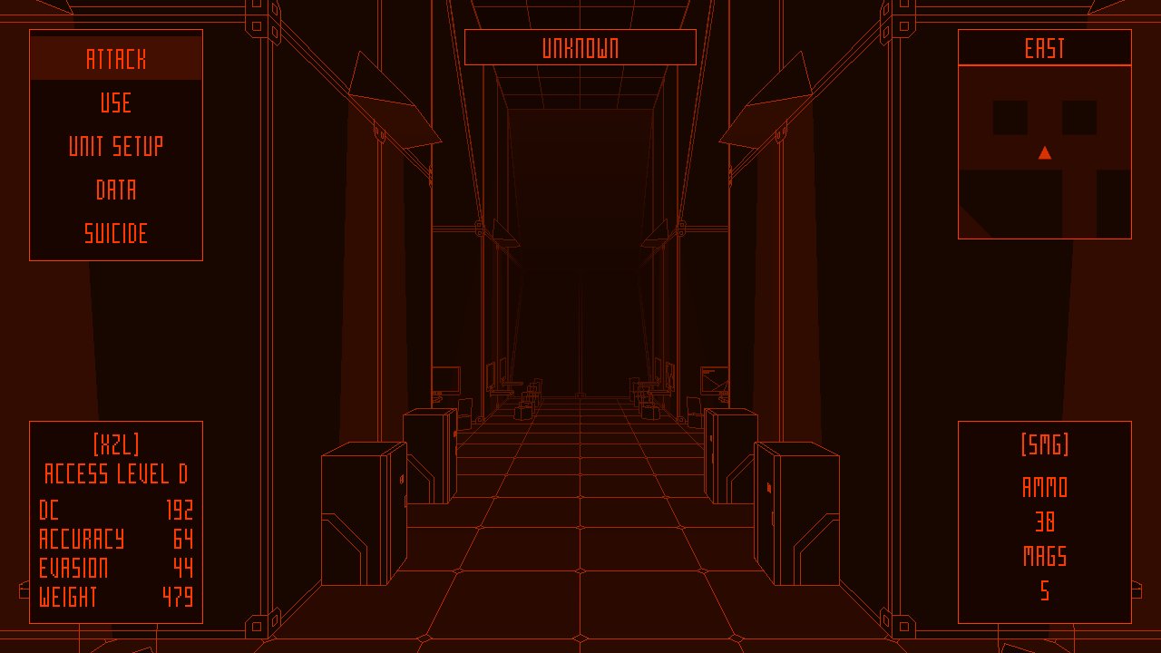
The bottom line — it was worth it, the race towards the release is almost finished, and I hope more game developers will get happy endings like this. While one could just make a mess and dump it on Steam, I'd like to treat this project as a packaged product that (hopefully) won't have to be updated after the release.
P.S.
Was this article good or not, what do you think?
Also, ask your questions, I'd like to answer them. Or maybe suggest some ideas on what to write in the next article.
FYI our twitter is here: https://twitter.com/surt_r
i love the art style. it's very technical. it's fascinating how you're experimenting with the gl library. for me i get attached to games that disclose more info. i enjoy learning about how they're built and who the developers are. the more personal it gets the better. that's just me. so i enjoyed this article. one thing i wouldn't agree is that most games end up going through many updates even after release and continue to evolve. anyways, with some more polishing i think this can really be a legit game. not like the garbage that gets dumped on steam.
Thank you for your opinion!
About the updates for the game — we believe that we need to get the quality of the base game right and deliver the best possible game that only needs bugfixes if there are any bugs left. This is not a roguelike or a simulation game with many complex mechanics, so it's not too hard to pull this off.
We've received a lot of feedback and got a lot of new ideas during the development, but some of them are already too late to implement without reworking an important part of the codebase — for example, the green color scheme. But we can take this feedback into account if we make another game with this graphics style.