SEC S20W2 - Mastering Flutter's Widget Tree, State Management, and Essential Widgets
Hi everyone!
You are warmly welcome to the 2nd week of Steemit Engagement Challenge Season 20. Here you will learn the widget tree of flutter, state management(stateless and stateful widgets), commonly used widgets, and much more . So let's start.
.png)
Understanding Flutter's widget tree
In the previous lecture we have discussed that everything in flutter is a widget. The arrangement of the widgets used in the application is like a tree. The widgets form a pyramid form like a tree.
Widget tree is a basic concept. It tells us how the UI of the applications has been built and how the used widgets are aligned with each other.
It is a hierarchical structure. Each element in this structure is represented a s a widget. Every element in the UI from the buttons to text and labels to layout is a widget. They can be the visible, invisible and state widgets. All the widgets are arranged in a tree like structure. In this tree like structure the parent widget can have more than one widgets.
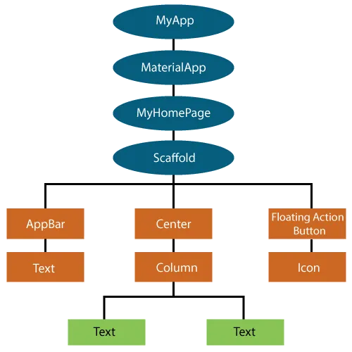
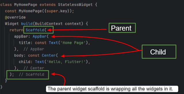
In the above picture there are a total of 12 widgets. The top most widget in the application is known as the root widget. So in the above picture the top widget within the app is Material App.
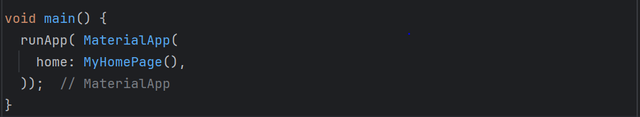
Here the MaterialApp is the root widget from which the application starts executing. It is wrapped by the runApp which is the entry point of Dart.
In the widget tree there is parent child relationship. Some widgets act as a parent and some behaves as child widgets. In the above picture we can see that the MaterialApp is the parent widget and all other widgets are its child widgets. There can also be a nested parent child relationship.
In this example you can see:
Scaffoldis the parent widget. Scaffold covers the whole screen. And it holds all the widgets used on the screen.- Similarly
AppBar, TextandCenterwidgets are the children of the Scaffold Widget. - If we see further at lower level
Centerwidget is again wrapping theTextwidget. Here the center widget is parent and the text widget is its child. It is the nested parent child relationship.
So it is how a widget tree in the flutter works. A widget tree plays an important role in the layout. And it helps us to understand the widgets used in the application with their proper structure and order. We can spot the required widget easily.

State Management - Stateless and Stateful Widgets
State management is very important in flutter. It tells us how the widgets interact with each other and changes their state and ultimately how it affects the user interface of the application.
Stateless Widget
This is an immutable widget. It means that its state cannot be changed in the real time once it is created in the application. It does not has any internal state. It is only called when the widget is added into the widget tree or when its parent widget is called and throughout its life cycle it remains unchanged if the whole app is not rebuilt. These widgets are useful when there is no need to track the state over time in the application. They are useful to represent the static data.
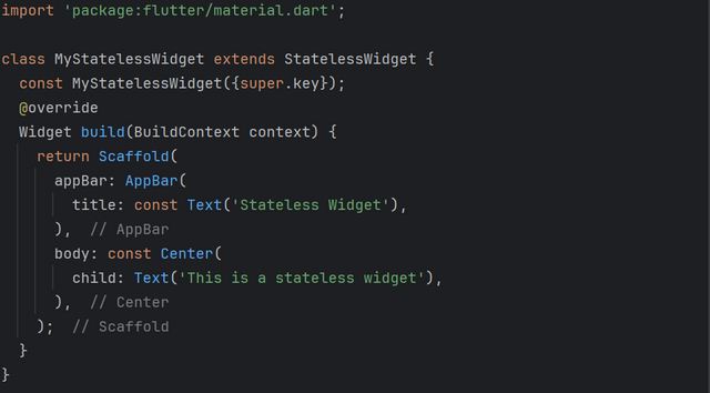
This is a simple stateless widget in which static data has been presented. I have used the title and a text widget. Thee widgets cannot change their state.
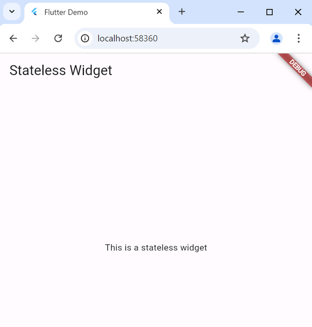
Here in the output if we refresh the screen the title will remain unchanged. The text This is a stateless widget will also not change dynamically. Because they are used in the stateless widget.
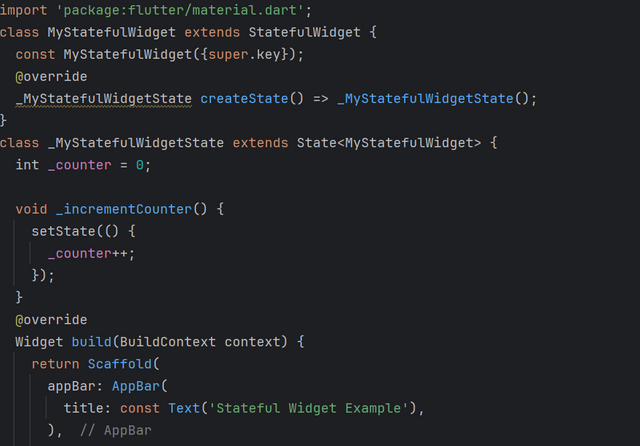
Stateful Widget
This is a mutable widget. It has its own internal state. It can change its state during its lifetime. Stateful widgets have createState() method which allows for the change of the state. Flutter allows rebuild of widget to reflect the new state in the UI.
Stateful widgets have two classes:
- The stateful widget class which is immutable and defines the widget.
- The state class which holds the mutable state and can change over time.
Moreover there is an important element of stateful widget which changes the state of the screen. That is setState(). It rebuilds the widget and update the screen user interface.
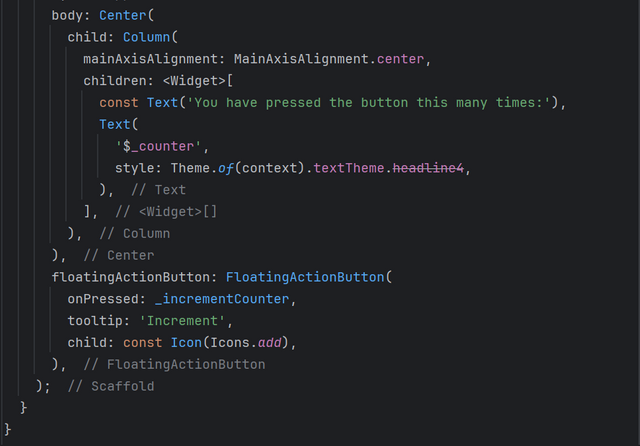
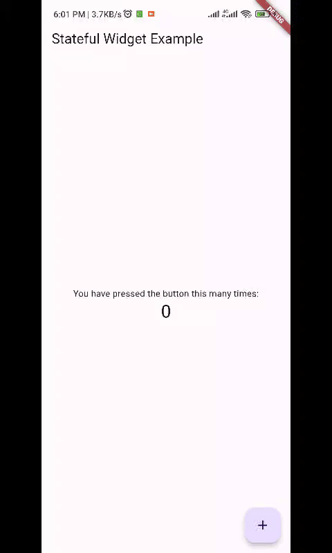
Here you can see that in the stateful widget the state of the screen is changing and we can see the updated user interface. But if we use stateless widget we cannot update the user interface.
Commonly used widgets: Column, Container, Row, ListView, Icons(PrefixIcon and SuffixIcon), Buttons, Image, CircleAvatar etc.
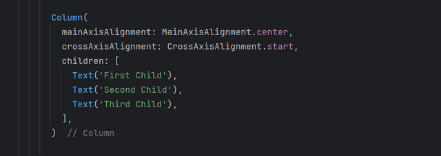
Column
This is very useful widget which is used to align the layout of the application. Multiple children can be used in a column . Moreover it is used to align the widgets vertically. It's syntax is very simple.
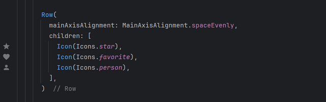
Row
Row is also a commonly used widget. It is used to align the widgets horizontally. It's syntax is similar to the column. It can also have multiple children.
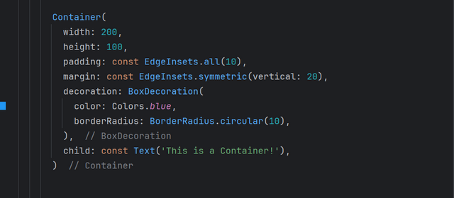
Container
As from the name we can guess it is a container which can hold something. So in flutter a container holds other widgets. We can apply decoration by using the container. We can use it for the multiple purposes. We can also convert into a button using the advance concepts.
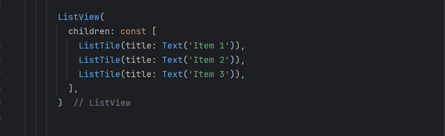
ListView
It is a scrollable list of widgets. It is used to display the large number of data in the list form. This list can be scrolled vertically and horizontally. We can also use dynamic lists while using ListView.builder
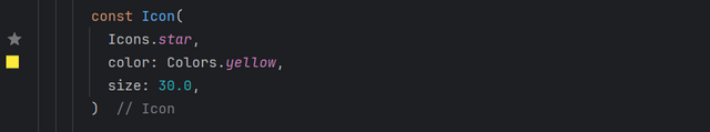
Icons (PrefixIcon and SuffixIcon)
Icon widget in flutter is used to display the icons in the application. We can use built-in widgets as well as export custom widgets. Prefix and Suffix Icons are used in the textfields to display the icons in the start as well as at the last of textfields respectively. We can customize the size and the color of the Icon widget.
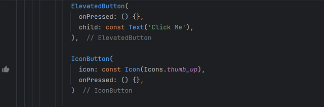
Buttons
This widget is used to display the buttons. There are different types of buttons in flutter:
- ElevatedButton: A raised button with elevation.
- TextButton: A flat button without elevation.
- OutlinedButton: A button with an outlined border.
- IconButton: A button that displays an icon.
Image
This is also an important and commonly used widget. It is used to display the images. There are different ways to add image using the Image widget.
- AssetImage: In order to use an asset image we have to add the image in the
pubspec.yamlfile. - Netwrok Image: We can directly use the images using the URL.
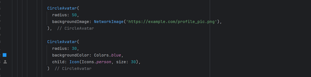
CircleAvatar
It is used to display the circular images and icons. It is typically useful for the profile pictures. We can add background image as well as the plain background can also be used with an icon.
Introduction to Expanded, Flex, and SizedBox
Expanded and Flex
Flex widget is a lower level widget. It is used to create flexible layouts vertically and horizontally. It is a base widget for the Row and Column widget. It divides the screen for each widget and the widgets automatically manipulate the widgets on the screen.
Expanded widget is used to control that how much space each child will take as compared to others using the flex property.
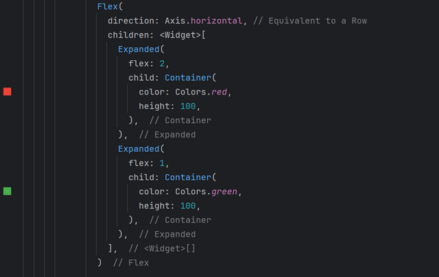
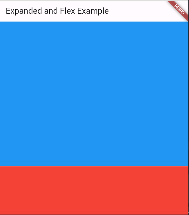
In the above example of flex I have used horizontal direction. And the flex property of the first container which is of red colour is used as 2 under the expanded widget. It will occupy the 2/3 parts of the screen as the complete screen is divided into 3 parts.
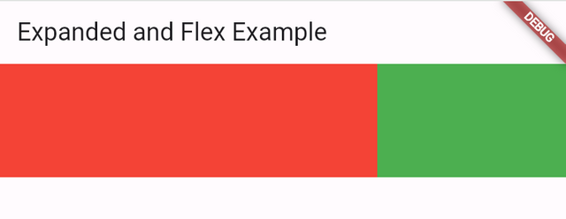
And similarly the second container of green colour will occupy the 1/3 part of the screen horizontally. So it is how the flex property is used under the expanded widget. We can use flex property in the parent widgets to align the child widgets.
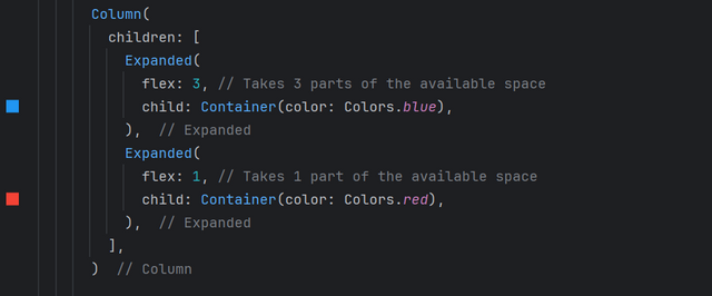
In the above example we have used flex and expanded widget in a column to divide the screen vertically. In this the red container is occupying the 3/4 part of the screen and the second container is occupying the 1/4 part of the screen vertically.
SizedBox
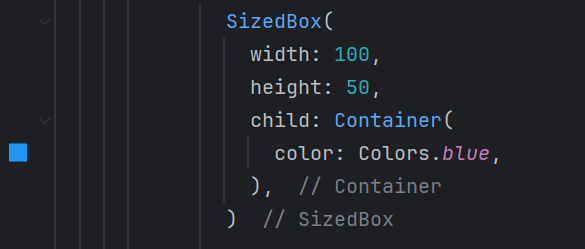
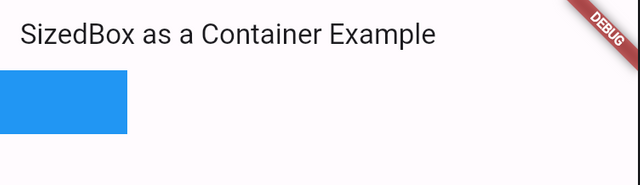
SizedBox is commonly used to give horizontal and vertical space between the widgets. But it can also be used as a container as it supports container properties as well.
 |  |
|---|
It also adds visual space between the widgets to balance the user interface. I also use SizedBox to give space vertically as well as horizontally between the widgets.
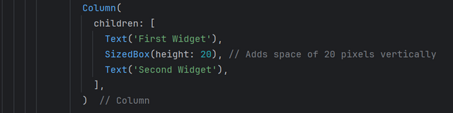
Here you can see that I have used 2 text widgets in a column. And in order to give vertical space between these two widgets I have used SizedBox.
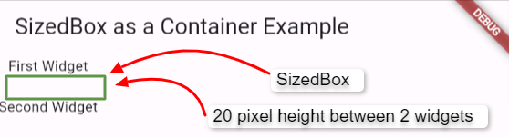
It is the output of the above code. Where i have highlight the space with the help of a box which is representing the sizedbox of 20 pixels between the two widgets. It is how the sizedbox is used to give space between the widgets.
Padding and Margin
Padding and margin is used to give space inside and outside the widgets respectively.
Padding is a space which is given inside the widgets. It is the space between the widgets boundary and content of the widget. So it is basically used to add space around the content of the widget.
Margin is the space outside the widget. It is the space between the widget boundary and its parent widget or other child widgets. It separates the widget from the surrounding widgets.
There are built-in classes for the padding and margin which can be used for their proper use. We can use the defined classes according to our needs. We can use custom padding and margin on all sides of the widget.
Homework Assignments
Create a Simple Layout with Column and Row Widgets. Create a simple UI that displays three text widgets vertically using a Column. Inside one of the Column children, add a Row that contains three icons aligned horizontally. Add some space between the text widgets using SizedBox.
Build a Stateful Counter App. Create a StatefulWidget that displays a number in the center of the screen. Add two buttons, one to increase the number and one to decrease it. Update the state of the app when the buttons are pressed.
Create a List of Items using ListView. Create a list of strings (e.g., a list of fruits). Display this list in a scrollable ListView. Each item in the list should be displayed as a Text widget inside a Container with padding and margin.
Explore Flex and Alignment with a Responsive UI. Create a layout where three Container widgets are displayed in a row. Use Expanded to make one Container take up twice the space of the others. Use alignment properties to center the content within each Container.
Project:
Profile UI: Build a simple profile screen layout using various Flutter widgets. The screen should include a round profile image, social icons in the horizontal alignment, text as name, and buttons representing his different skills and attributes. These all should be aligned using the layout widgets discussed. Use SizedBox where needed.
Contest Guidelines
Post can be written in any community or in your own blog.
Post must be #steemexclusive.
Use the following title: SEC S20W2 - Mastering Flutter's Widget Tree, State Management, and Essential Widgets
Participants must be verified and active users on the platform.
Post must be more than 350 words.
The images used must be the author's own or free of copyright. (Don't forget to include the source.)
The participation schedule is between Monday, September 16 , 2024 at 00:00 UTC to Sunday, - September 22, 2024 at 23:59 UTC.
The publication can be in any language.
Plagiarism and use of AI is strictly prohibited.
Participants must appropriately follow club status such as #club5050 or #club75 or #club100.
Use the tags #flutterdev-s20w2 , #country (example - #Pakistan, #Nigeria), #steemexclusive in your first 4 tags.
Use the #burnsteem25 tag only if you have set the 25% payee to @null.
Post the link to your entry in the comments section of this contest post. (Must)
Try to leave valuable feedback on other people's entries.
Share your post on Twitter and drop the link as a comment on your post.
Rewards
SC01 would be checking on the entire 16 participating teaching teams and challengers and upvoting outstanding content. Upvote is not guaranteed for all articles. Kindly take note.
At the end of the week, I would nominate the top 5 users who had performed well in the contest and would be eligible for votes from SC01/SC02.
Important Notice: The nomination of the top 5 users is solely based on the quality of the post. So focus on the quality and creativity of the post. Also ensure your quality engagement.
Flutter Mobile Application Dev Team (mohammadfaisal)

X Promotion: https://x.com/stylishtiger3/status/1835156045599068483
Upvoted! Thank you for supporting witness @jswit.
My Entry: https://steemit.com/flutterdev-s20w2/@akmalshakir/sec-s20w2-mastering-flutter-s-widget-tree-state-management-and-essential-widgets
"I made it just in time, like a cat running from a dog!"
https://steemit.com/hive-145157/@sergeyk/sec-s20w2-mastering-flutter-s-widget-tree-state-management-and-essential-widgets
My entry: https://steemit.com/hive-120823/@mrsokal/sec-s20w2-mastering-flutter-s-widget-tree-state-management-and-essential-widgets