SEC S20W2 - Mastering Flutter's Widget Tree, State Management, and Essential Widgets
Assalamualaikum my fellows I hope you will be fine by the grace of Allah. Today I am going to participate in the steemit engagement challenge season 20 week 2 by @mohammadfaisal under the umbrella of steemit team. It is about flutter mobile application development. Let us start exploring this week's teaching course.
Create a Simple Layout with Column and Row Widgets. Create a simple UI that displays three text widgets vertically using a Column. Inside one of the Column children, add a Row that contains three icons aligned horizontally. Add some space between the text widgets using SizedBox.
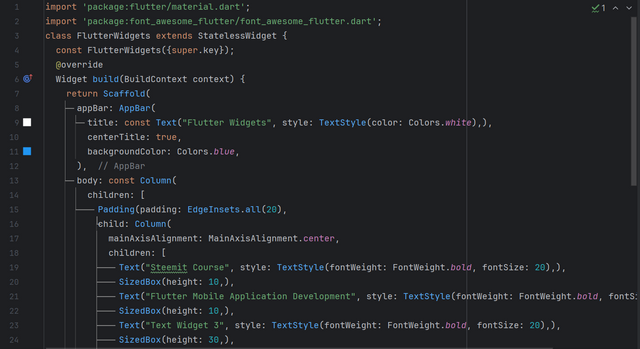
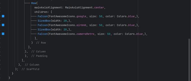
I have studied the whole lecture with great attention and care and I have practice different widgets. Here I have created a simple user interface as required by teacher. All the code to create a screen which displays the 3 text widgets vertically and then it displays icons in the row widget horizontally.
This all the code is to create the screen of simple user interface. I have used following widgets.
- First of all I used
Scaffoldwidget. - I used
appBar - I used
Columnwidget to display the text widgets horizontally. - Then I have used 3 texts widgets and after each text widget I have used sizedbox.
- After that I have used
Rowwidget inside theColumnwidget.
to display the items horizontally. - I have used 3
Iconson the screen. For the Icons I have usedFontAwesomeIconsflutter package. - I have given size of
50 pxand similarly blue colour to all the icons.

The first three lines are the 3 text widgets. And after those text widgets there are 3 icons in the row widget for the horizontal alignment.
Build a Stateful Counter App. Create a StatefulWidget that displays a number in the center of the screen. Add two buttons, one to increase the number and one to decrease it. Update the state of the app when the buttons are pressed.
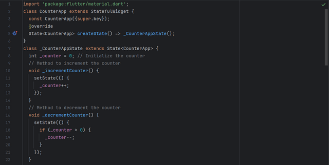
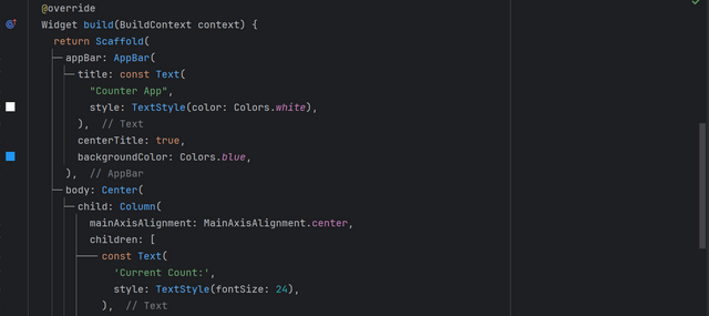
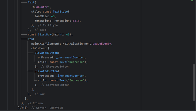
In the counter app logic is used such as to count the numbers and to display them on the screen. And in the task there is need to count the increment as well as adjust the count in decrement. Here is the code to make an app which counts the numbers when we press the button increase and similarly it decrease the count when we press decrease button.
Indeed all the code is visible in the above pictures but I want to add some description like explanation about this code.
- First of to create a
Statefulapplication I have usedStatefulWidgetas the parent widget. Because of this widget the screen of the application will be updated. - I have created a private variable
_counterand I initialized it with 0. It will be used to store the value of the increment and decrement. - Then I have defined increment and decrement methods.
- I have used
SetState()method to update the state of the screen. - Then as usual I have added
appBar. - I used
Columnwidget as a main widget in the body. - I used
Textwidget to display a simple message. - Then I again used Text widget and passed
_countervariable to the text widget to display the value store in it. - I have used 2
ElevatedButtonwidgets. In the increment button I have called increment method and in the decrement button I have called decrement method.
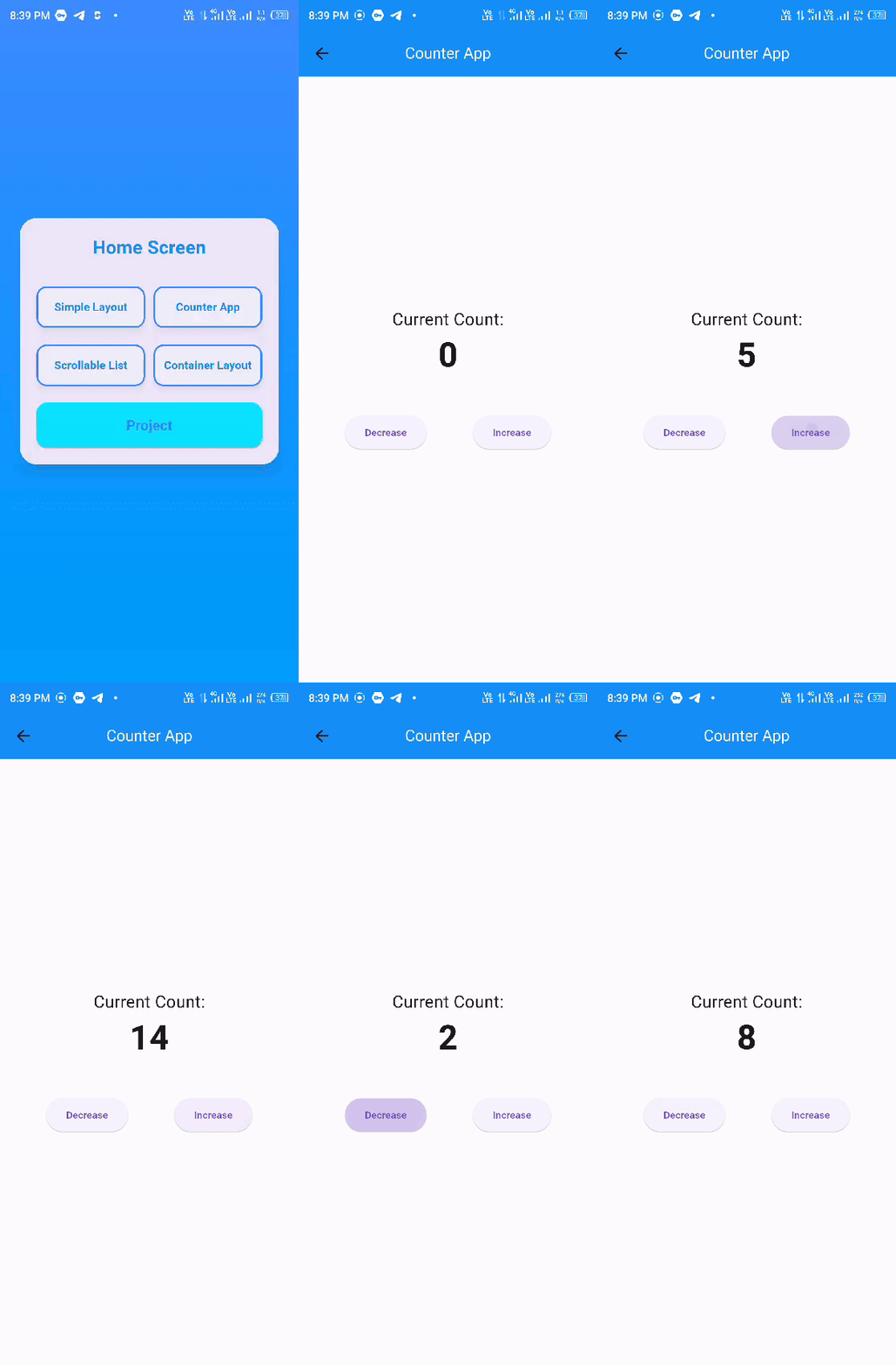
THe counter application is successfully working. It is increasing the calue of count when I am pressing Increase button and similarly it is decreasing the value of count when I am pressing the decrease button.
Create a List of Items using ListView. Create a list of strings (e.g., a list of fruits). Display this list in a scrollable ListView. Each item in the list should be displayed as a Text widget inside a Container with padding and margin.
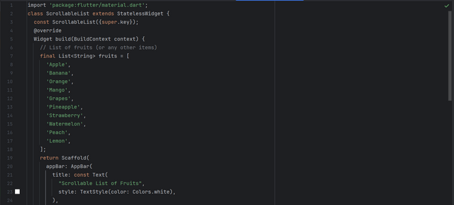
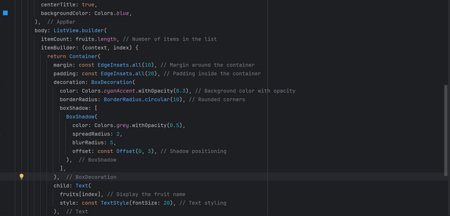
In order to create the list in flutter we can use ListView widget. Then we can place desired data in the listview. Here is the code to create a list of the fruits and we can display it on the screen.
Here is the explanation of the above code:
- I have used a
StatelessWidget - Then I have created a list of the fruits. The list contains 10 fruits startig from Apple and ending with Lemon.
- In order to display the list on the screen I have used
ListView.builder. - I have given the length of the list as
fruits.lengthbecause the name of my list is fruits. - Then I have used a
Containerto put the list of the fruits in it. - I have added decoration to the container using
BoxDecoration. - In order to call the list of the fruits I have used
Textwidget in the container as a child.
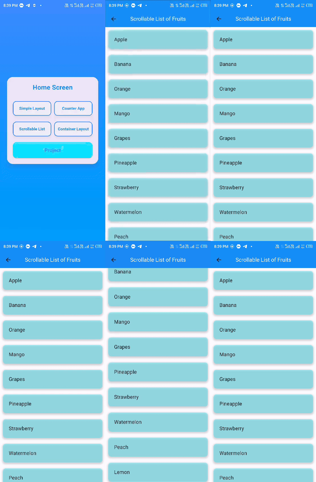
The list of the fruits is now visible in the application. This is a scrollable list of fruits.
Explore Flex and Alignment with a Responsive UI. Create a layout where three Container widgets are displayed in a row. Use Expanded to make one Container take up twice the space of the others. Use alignment properties to center the content within each Container.
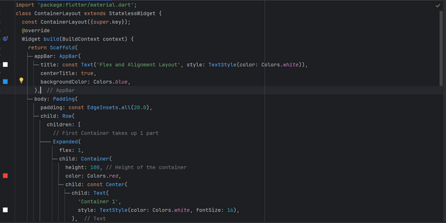
Flex is another important feature to align the widgets on the screen properly. It helps to create a responsive user interface. And we can divide the screen into different parts as per our requirements. And we can use it to align the containers on the screen.
Here is the explanation of the above code:
- I have used
StatelessWidgetbecause I have to display static data on the screen. - I have used
Paddingwidget to give padding on all the sides of the child widget. - I have used
Rowwidget as a child of the Padding. - The I have added 3 containers in the row to display them in horizontal alignment.
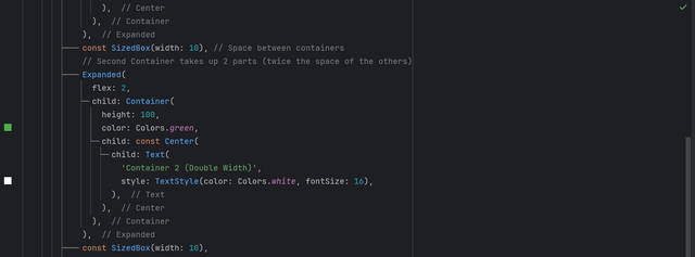
- I have used flex property of
Expandedwidget to divide the screen.
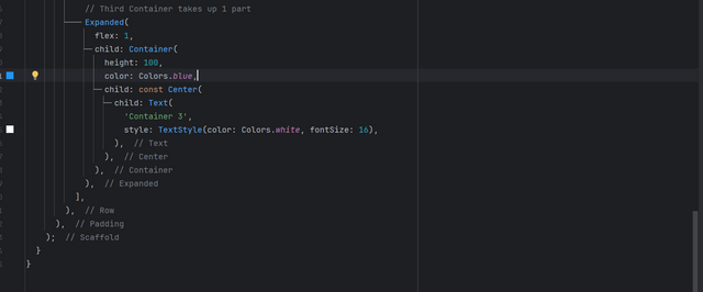
Actually I have divided the screen in total of 4 parts . The first container is occupying 1 part of the screen horizontally. And the 2nd container is occupying 2 part of the screen horizontally. And similarly 3rd container is occupying same as of 1st container. I have given red, green and blue colour to the containers consecutively. And I have added some space horizontally between the containers.
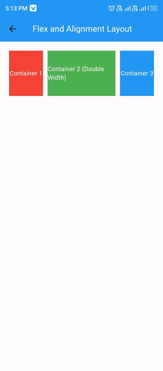
The screen has been divided into 4 parts horizontally. And the first container of red colour and the last container of blue colour is is occupying one part of screen each and the second container of green colour is occupying 2 parts pf the screen.
Profile UI: Build a simple profile screen layout using various Flutter widgets. The screen should include a round profile image, social icons in the horizontal alignment, text as name, and buttons representing his different skills and attributes. These should all be aligned using the layout widgets discussed. Use SizedBox where needed.
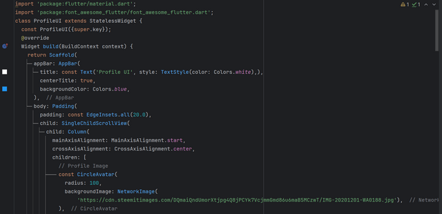
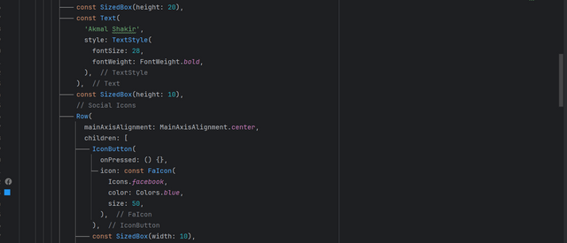
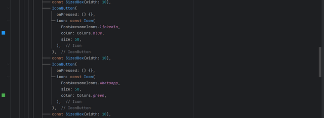
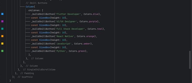
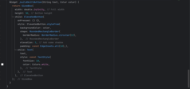
It is an interesting project to create the user profile. We always interact with a user profile on each application whether it is a mobile or web based application. Usually I profile of the user has a picture, some social links and the attributes of the user or the skills of the user. Here is all the code to create the required profile user interface.
Explanation of this code is given given:
- As it is a static user interface so I have used
StatelessWidgetwidget. - Then I have used
Scaffoldwidget. - In the scaffold widget there is
appBarwidget. And I have give some styling to the title of the app with blue background. - Then I have used
Paddingin the body. It will be applied to all the user interface. - Then I have used
SingleChildScrollViewto make the screen scrollable. It will protect the bottom of the screen from being overflowed. - As I need to add more than one widgets vertically so I have used
Columnwidget. - Then in order to achieve the first goal of a profile there is the need of a profile picture. As the profile pictures are circular in shape. For the circular profile image I have used `CircleAvatar. It is just a circle and I have used background image to fill it.
- Then there is always a name of the user in the profile. So to add username I have used
Textwidget. - Social links are also the part of the profile. So I have used a
Rowwidget and thenIconButtonwidgets to add social links to the profile. I have used Facebook, Linkedin, Instagram and Whatsapp icons. - After that I have added buttons to show the expertise and skills of the user. For this purpose I have created a Custom and Reusable
ElevatedButton. I have given some style to the ElevatedButton to look beautiful. - I have used text and colour as a parameter to this widget so that it can be changed dynamically. Because each button requires different text and colour.
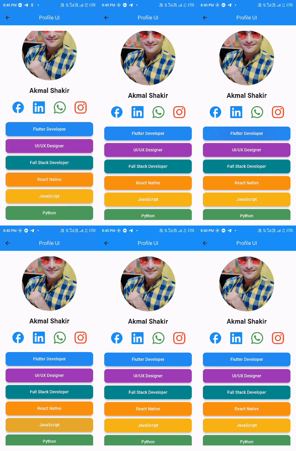
Finally the profile UI has been created. It has a profile picture, name of the user, some social links of the user as well as the skills of the user. And one more thing that I have used a NetworkImage to display the image. I have used the link of my steemit profile picture.
I have utilized all the concepts learnt in the lecture. First of all I used the concepts in the different separate tasks and then I have combined all the concepts to form a complete profile user interface.
It is the video of all the of the tasks and their outputs. I have merged everything in a single application. The first page is the HomeScreen which has all the necessary data and options to navigate from this screen to other screens. HomeScreen has 5 custom ElevatedButtons such as Simple Layout, Counter App, Scrollable List, Container Layout and Project.
The navigation used to access all the screens is working fine. And the application is running smoothly. I have added a background music to the application from youtube library and it is making the video more enjoyable.

This post has been upvoted/supported by Team 7 via @httr4life. Our team supports content that adds to the community.
Thank you @httr4life