AE Projection Map just Makes Sense
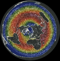
They removed this projection from nullschool, you can look at all the others, however. Here are similiar settings.
They removed this projection from nullschool, you can look at all the others, however. Here are similiar settings.
No, they don't make sense. They distort more and more as you travel out from the center point. So, the farther out from the center point you go, the less sense they make, and the less they represent reality.
Otherwise, they are nice.
haha
but yet, just like the rotating ball, does not actually match observed reality.
why is it so hard for people to dismiss both and keep looking with an open mind?
give me a better working model, I would check it out. but no, i'm not just blindly looking for something new, it is what is, not what could be that I'm looking for.
Congratulations @klevn! You have received a personal award!
Click on the badge to view your Board of Honor.