IAMED: The process behind the identity
The process of designing an identity for a personal brand can be quite challenging... especially when you're your own client, which happened to be my case. Join me as I briefly share the journey from concept to finish of how I got through that process.
Phase 1: Choosing the name.
I think I have a weird ear for names... for example names like, "Mad mango" for a fruit brand, "The Color Red" for a luxury fashion brand, get me really excited, like super excited :). So, oddly enough "iamed" sounded right. I had heard a (grossly sarcastic) close friend of mine use it and it sounded weird enough, though generic, I thought to hold on to it. So here I was with a pretty much meaningless name that just sounded nice (to me), but the events that would unfold in the coming months reinforced my choice, hence my decision to adapt it in building my personal brand. 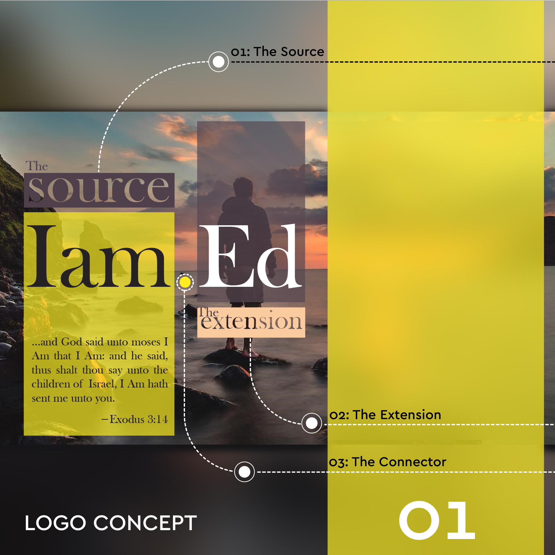
At the time, I knew very little about "type" but in my mind I could picture the wordmark "Iam.Ed" written in a classic serif typeface, and so, while exploring the possible fonts to express what I had in mind, "Baskerville Oldface" seemed a perfect fit. At this point, I'd like to emphasize that I'd decided on a design direction long before I jumped into Adobe Illustrator to digitize my ideas. So even when writing the name by hand, It had to be a certain way to express what each character represented (the capitalized "I", in "Iam" the "Dot" separating "Iam" from "Ed" and then the capitalized "E" in "Ed).
Phase 2: The Construction
The next thing I had to consider was how best to incorporate my personality into the wordmark. The Attributes I focused on were ;
1: Simple
2: Precise
3: Bold
4: Balance
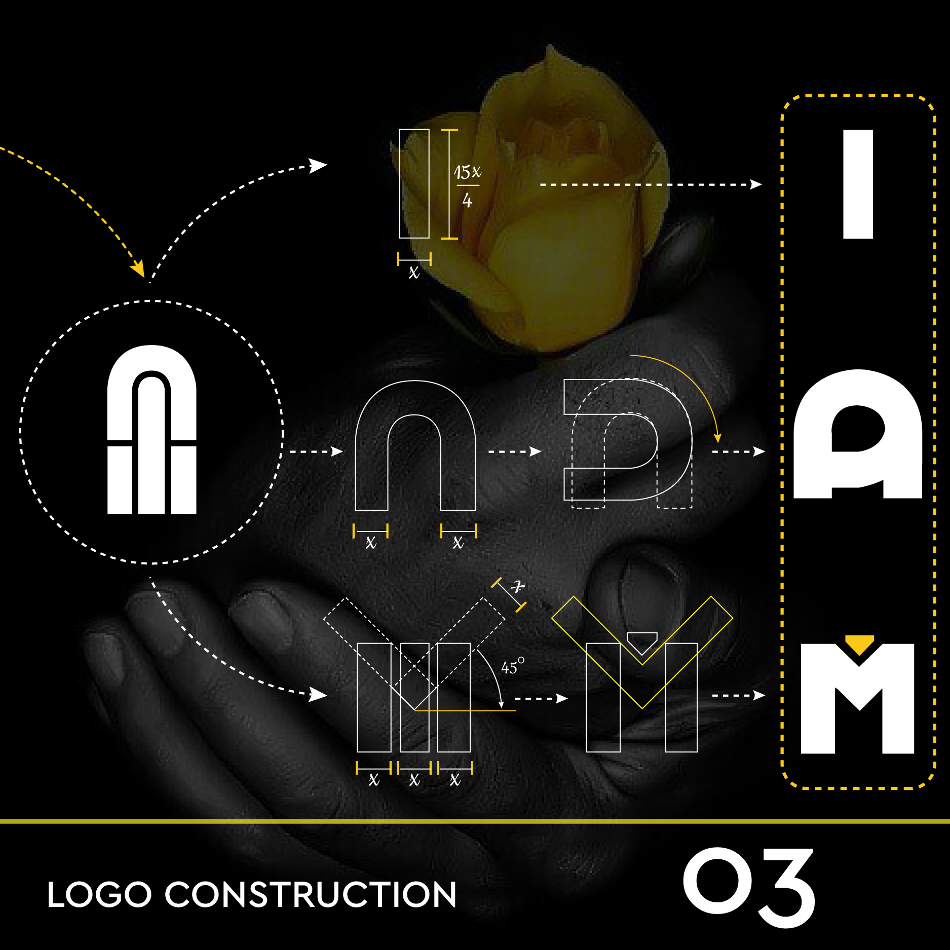
Starting out with three rectangles of equal width (an unfinished concept from a personal project I'd been working on at the time), I manipulated them to form the word "ED"... (and the rest is history :D) 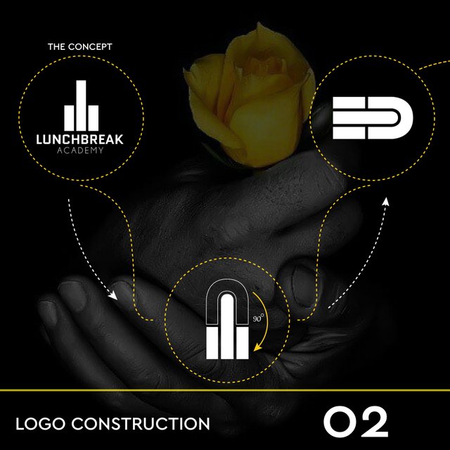
Phase 3: Assembling the elements/ the reveal
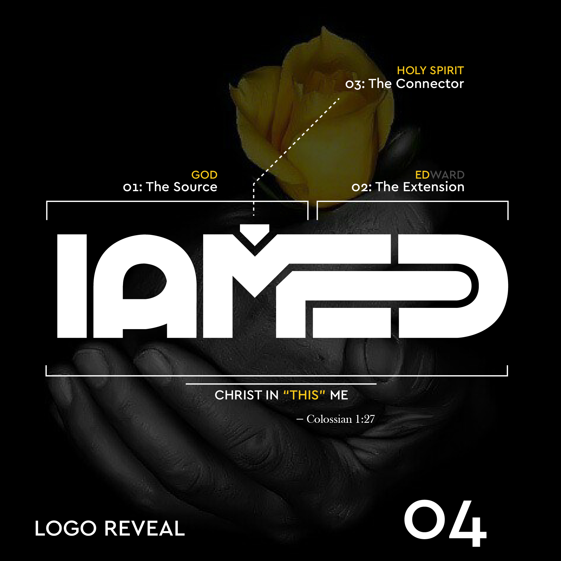
Finally, all the individual elements forming the wordmark were complete, but something was missing, (at least to me) so I thought to ad a spin to the wordmark by messing around a little with the letters "M" and "E". Actually, the ideas was for "IAM" to point to "Ed" as an independent yet inseparably connected entity. Hence the reason "M" extends into "E", besides I thought it added an extra point to the overall aesthetics of design.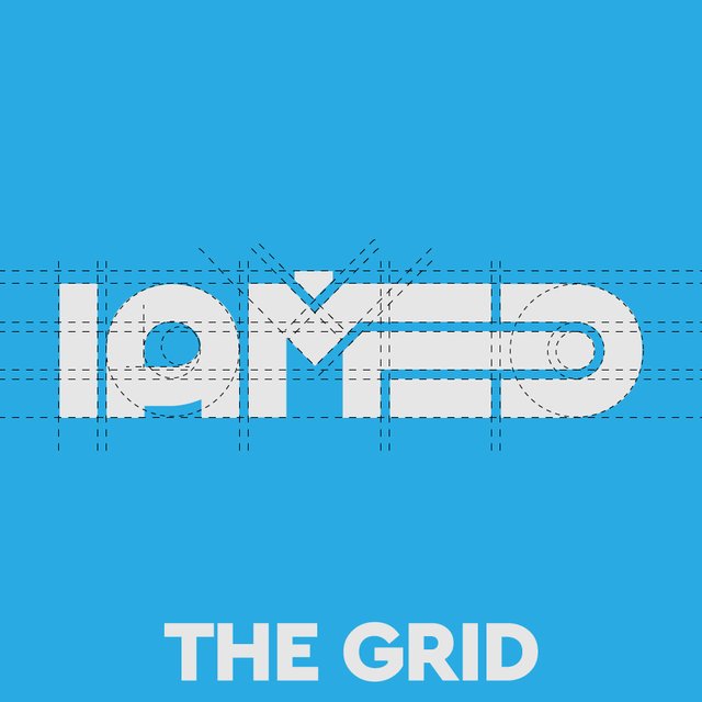
Ok guys, so that's my story. The mark is definitely subject to change with time, knowledge and experience. I would really love to know what you think. Oh! and by the way, this is my first Steemit post. Cheers!
Awwwwwwwwwwww.... You're finally here....
:) glad to be here
Wowwwwwwwwwww
Wowwwwwwwwwww
EDWARD YOU'RE JUST BLESSED
I don't know what goes on in your head sometimes.... But I hope you know that you're my brand consultant...
Okayyyy.... Iamed
Creativity mixed with divinity.....devil wud just have to scream.."what a calamity!"
:D
Sir.............dopeness
Congratulations @iamed! You received a personal award!
Click here to view your Board of Honor
Congratulations @iamed! You received a personal award!
You can view your badges on your Steem Board and compare to others on the Steem Ranking
Vote for @Steemitboard as a witness to get one more award and increased upvotes!