Cinematography: Why It Matters So Much
Being a huge film buff (read: FUCKING NERD) like myself, there tends to be certain little things you notice after binging and rewatching so many movies. A particular genre of film I've always admired greatly is of the "thriller" variety. Films that combine action with mystery in such a way that makes you simultaneously attached to the characters well-being, but also wanting you to see them go through wild situations where their survivability is pushed to their limits. Movies like "Zodiac" and "Nightcrawler" are prime examples of what I'm referring to. Something that really stands out in particular about these movies that sets them apart from regular "action" movies is how much more intimate they tend to be with the way they are filmed. The camera lingers more on the faces of the characters, shots tend to be drawn out more and almost have a eerie horror-like aspect to them as the people on screen are seen doing seemingly basic non-eventful things like walking down the sidewalk at night or looking into a mirror for an extended period of time.
These short shots and long takes and zoom ins and outs are all part of cinematography. It's what makes a motion picture, well, a motion picture. Whenever it comes to the latest action movies or summer blockbusters that fill up theater seats each year, one of the biggest things to come up is the evolution of "special effects" and "visuals" of movies. A (somewhat) recent example of big action movie franchise that undoubtedly made Hollywood loads of money was Taken, a (until the inevitable sequel or "reboot") trilogy about a retired CIA agent who gets thrust back into his old lifestyle when his daughter gets kidnapped and so on and so forth. Part of what made the original movie so popular was how tense and upfront the action was. Everything was always turned to 11 and the sweeping shots and short takes made everything that much more edgy because it disoriented the crowd in such a way that made them feel the intensity of how quickly everything was happening.
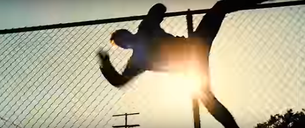
By the third movie however, it seemed as if what made the original refreshing and exciting was repetitive and draining. A "classic" scene to get mocked is one of the middle-aged hero jumping over a fence. However, in this scene that spans a grand total of six seconds, there is FIFTEEN different shots, all from various angles. Of such a simple action too. It's disorienting and dizzying in the worst way possible and a borderline self-parody of what once was such a well-received filming technique.

"ENTICING"
What happened exactly? Why what was once considered a dumb, albeit entertaining as hell, popcorn movie series all the sudden openly made fun of by the general audience? Besides arguably just being over-saturated and outstaying it's welcome, the largest culprit wasn't just the fact that it wasn't fresh or fun anymore. No matter how much the budget increased with each sequel, they failed to capture what made the original exciting. It was an example of a series losing it's "soul", the essence of what made it appealing in the first place and what is unfortunately the downfall of so many blockbuster series. But when it comes down to what made it so mundane and predictable was the cinematography.
On the other end of the spectrum, a movie that was considered an instant cult hit shortly after it's release is the 2011 "Drive". Drive on paper seems no deeper than your average run of the mill action/thriller. You have a no-named protagonist who gets mixed in with his neighbor and love interest's ex-convict husband who just done serving a prison stint and is left in debt to some local crime lords.
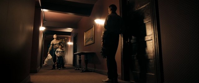
At one point in the movie, near the beginning, there is a scene in a hallway of an apartment complex where the main character and his soon to be love interest are seen walking through to their respective homes after getting off the same elevator together. No dialogue, no real overly tense music, just a soft-toned drawn out shot of two people going about their lives before anything extraordinary even occurs. Yet it says so much, it's dripping with raw emotion you don't often seen in your average thriller or action movie.

This hallway to be exact.
That is just one example of how downplayed and tonally different the scenes in Drive are from most movies of it's genre. It's filled to the brim with aesthetically pleasing scenes and takes that seem to go on JUST long enough before they get drab or dull. You could pause the movie on just about any shot and have a solid desktop or Facebook cover photo.
The budget for Drive was $15 million, measly for a modern, A-celebrity starred action movie. Compare this to the bloated budget of the $48 million Taken 3 and you start to see how much money is thrown into these movies isn't really a fair estimate of the quality of how the final product looks. A good eye and the ability to know exactly when to say "action" and "cut" can make all the difference in the outcome of a movie as much as the editing and special effects.
Excellent introduction to cinematography and its importance to quality filmmaking! I look forward to reading more of your thoughts on this subject in the future.
Nicely put. I found the scene in Drive in the elevator to be masterful. Gosling's kicking the guys head in only to look up and to realize he has crossed the line revealing his true self to his love interest. The look on his face is spellbinding. Terrific camera work! Al;so I invite you to watch Alfred Hitchcock's Psycho! The bath tub scene cinematography and the direction changed thriller films forever and still does... and in black and white! Whoa!