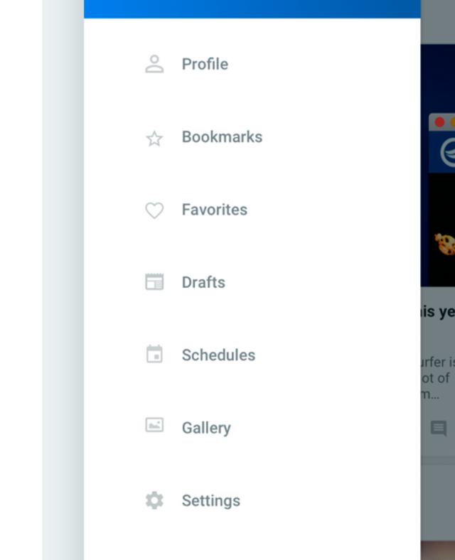
Text is still too small, you can see it just looking at the pictures...
This is whitespace everywhere...

And here you need a magnifying glass... Why are the photos massive and the text minimal? This should be first thing to fix

Text is still too small, you can see it just looking at the pictures...
This is whitespace everywhere...

And here you need a magnifying glass... Why are the photos massive and the text minimal? This should be first thing to fix

Thank you for your suggestion! These prototypes have not been tested on real devices yet. Once we will start testing we will adjust font sizes and other values for sure!
Can't you provide text font size controls to user ...just like Discord does?
Good idea for themes settings!
Thanks
personally I think the text is just fine
I couldn’t work out how this is different from the web page on an iPhone. That said, I tried to leave this comment using the app and the comment wouldn’t load.
If there is no difference for you then probably it means you can keep using web page and that's it. Or if you want some difference or special features you could ask for them or suggest any improvements. We would be glad to hear for that.