A Fresh New Look for EOSPark Account Page

The importance of the Account in the EOS world is self-evident, and lots of data and information are associated with Account. For a better user experience, EOSPark reorganised the detailed Account Page, allowing users to explore all important informations on EOS much easier.
So compared with the old version, what are the highlights and noticeable changes asides from a more simple and beautiful design for the new version of EOSPark‘s Account Page?
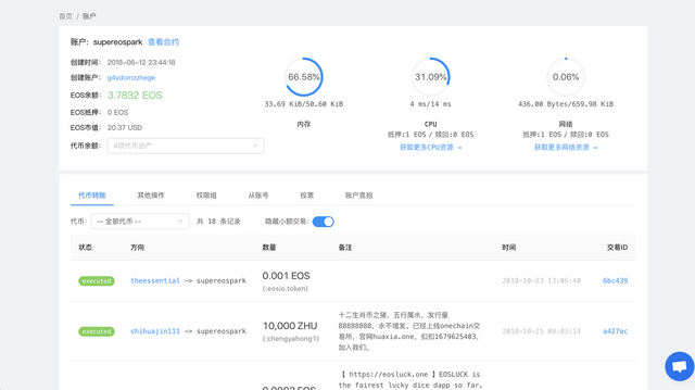
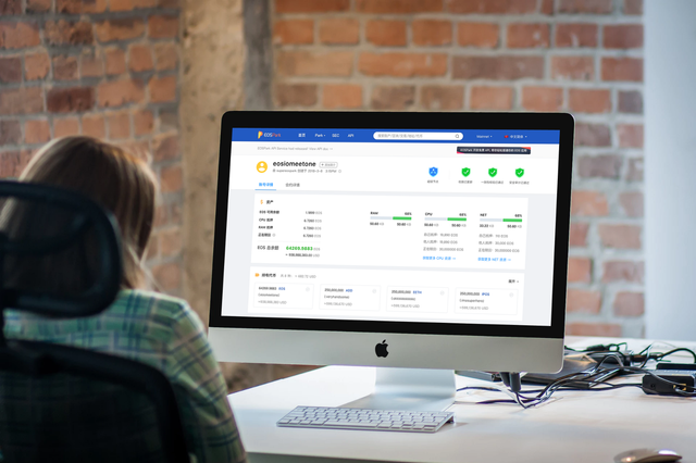
1 . EOSPark Exclusive Features:Editable account profile (Coming soon) and indicative tags
We added indicative account tags for users to understand which properties does the account possess straightforwardly. For example, through the medals in the upper right corner, you can find out the identity of this account:is it a block producer? And also the security indicators: Had the account passed the consistency check and contract audit or not?
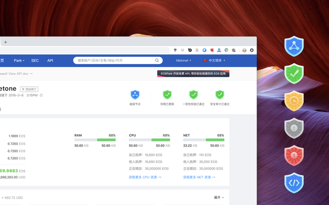
And account’s profile is editable which means we allow account owners edit their account profile or upload their brand logo on their account page. (PS: The account owner need to log in to Scatter first to submit an application for editing account profile.)
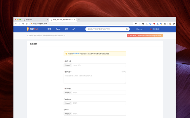
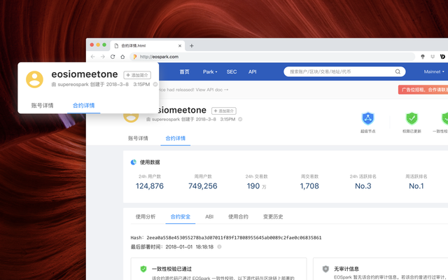
Specer said: In addition to the info of account creator and creation time, we also attached a transaction id link toward the transaction creation details. And you can possibly find out who is the real behind-the-scenes creator from the raw data, it may help you to know more about the account and could be your evidence for some disputes as well.
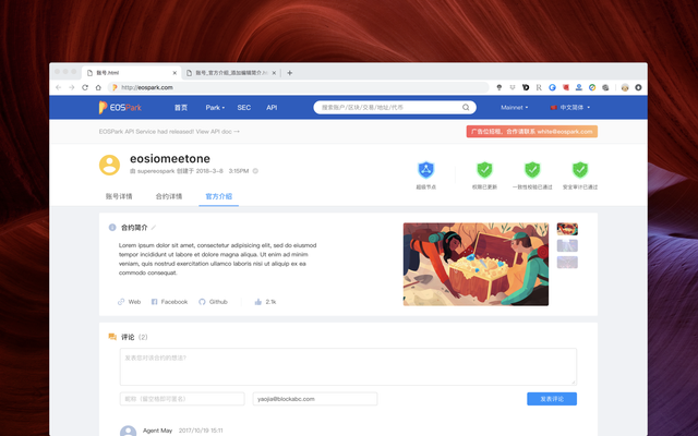
2. We composited account/contract/token/BP pages into tabs and put them under one account
Sometimes one account may be both a normal account and a contract. Users need to go to different pages to query the corresponding information. This is a normal experience when using most of EOS block explorers.
Based on this situation, EOSPark puts the account page/contract/token/BP and other details pages under one account name to make the account information more intuitive. Selecting a specific tab, user are able to know the related detailed information of this account rather than switching onto different pages. That is: For a contract account, the status of consistency check and contract audit will be composited in a single tab named Contract. And the contract owner can submit the source code for consistency check or proceed audit by one time searching the account name; For a BP account, the user can read the detailed introduction of the BP by switching the Tab (clicking on the BP name from th BP list on homepage will also locate to the account page with certain tab selected). So EOSPark will automatically identify the account and display the corresponding information on one page. (ps:The contract and BP details page is being developed and coming soon)
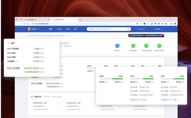
3. EOSPark account asset breakdown giving you the most unambiguous informations.
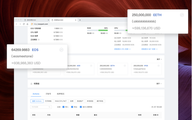
We redesigned the account assets section and the information was organized more clearly. The biggest change from the previous version is that you can see the total EOS balance. In addition, the stake of the CPU and NET had a breakdown of “self staked” or “staked by others” and “Refunding”. (ps: Put the mouse on the small question mark that is refunding, you can see the time when the last refund took effect.)
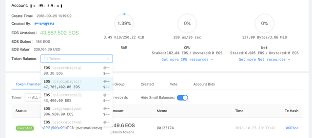
4. Changed layout for better presenting airdrops
In the old version of EOSPark account page, airdrops are sorted in the drop-down box, and many users liked this feature. In order to intuitively get the information of the tokens and airdrops, we put airdrops center and displayed below the account assets. It is more convenient for users to watch the airdrops on EOSPark.com.(🚁🎁🍬)
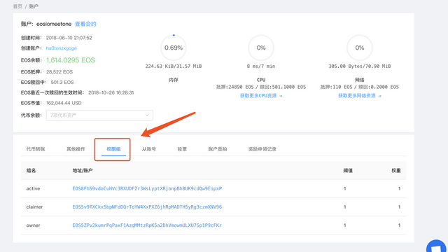
5. Separately listed permission groups
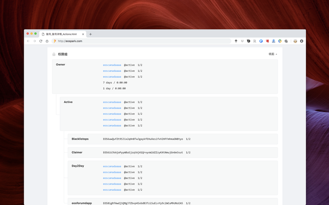
What’s more, the new account page also lists the permission group information separately (originally in the third tab below the account), so that you can understand the permission group information more quickly.
6. A better presentation for transaction records
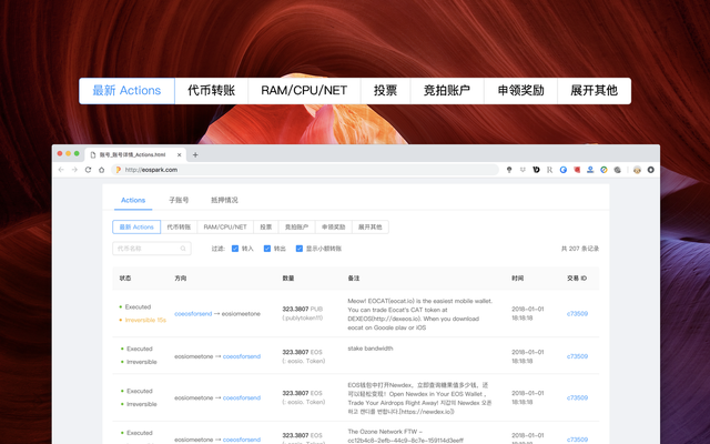
The next section is actions, sub-accounts, and delegation records. In fact, the original EOSPark also has actions sorted by categories, but this function is a bit unnoticed, and many users didn’t know how to filtrate the overwhelming records. So this time, we have strengthened restructured this section, not only can users check all actions but also check transaction records by filtered , and we added a action status for abnormal transactions such as transfer delayed and etc.

The above are highlights of this version of EOSPark. We will continue completing other updates to release the EOSPark 2.0 In coming few weeks. Thanks for your always supporting.
👫👭👬Contact Us:
WeChat:Asst_BlockAbC
telegram:https://t.me/eospark
twitter:https://twitter.com/eospark_com
Medium:https://medium.com/@white_59505
Business development:[email protected]
Technical suopport:[email protected]