MINIMALIST ECOMMERCE DESIGN: WHEN LESS IS MORE.
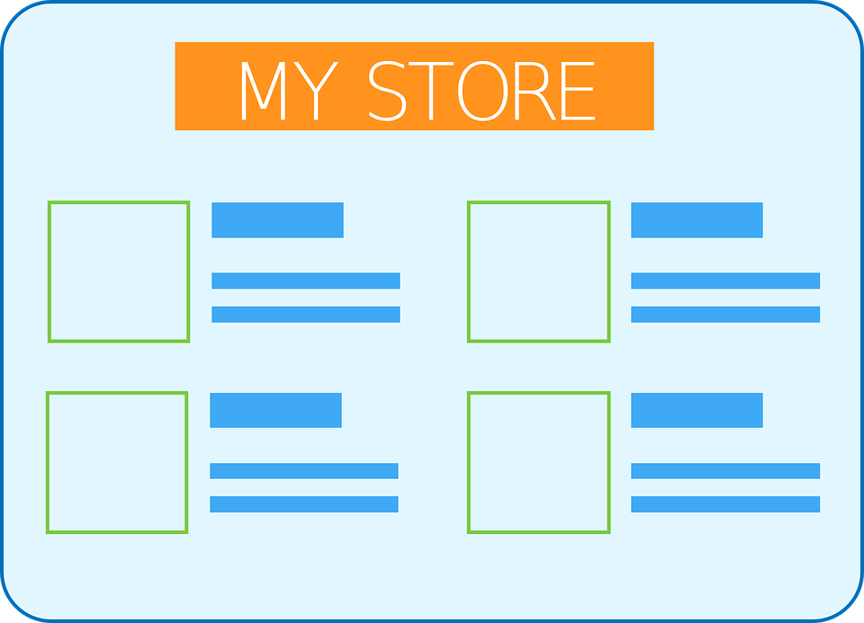
We usually see ECOMMERCE WEBSITE DEVELOPERS trying to woo online customers by placing their featured products, specials, sales items, online support, toll free no.s, hard hitting sales copy etc., – all being distinctly highlighted to stand out by using different color banners, flashy graphics etc. This desperate attempt makes the web pages look bloated and too crowded with an overload of information, colors and options. Many often this backfires as web users get overwhelmed by excess options and turned off by the tacky look, leading them to leave the website. To counter this the concept of minimalist design has evolved where there is a direct approach for presenting information with ‘less is more’ or an attempt is made to ‘say more with less words’. This design focused on using more of blank spaces around to give breathing space to the page elements. The sections and call to actions are reduced considerably and the colors of graphics, banners etc., are non conflicting and more soothing. With less options to look at, the users stay more on the website and explores. Of course the graphics and whatever call to actions used have to clearly indicate to the user where they will lead to when clicked on. Clear navigation and brief but well written content with good typography engage the users at a different level.
Minimalist design’s aim is to create a positive emotional experience for the web users by giving them less to deal with. Pleasing interfaces creates better responses and higher conversion rates for ecommerce websites.
When getting a ecommerce design done, ask your ECOMMERCE WEBSITE DEVELOPMENT COMPANY to give you a minimalist design option as well and use that for A/B split testing to see the difference in the bounce rate and conversions.
