DTube gets new colors!
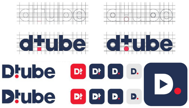
Time has come to unveil DTube’s new logo that foreshadows the launch of an exciting new version of DTube.
We would like to dedicate very warm congratulations to @albanlaurent, who brought this new design to life with a very professional and artistic approach.
We wanted to take the time to elaborate a deeper reflexion on brand values, positioning and colors, so as to create a strong and unique brand identity.
New logo in the making
We have been working on a new logo for the past month. Just a quick history:

v1: August 2017

v2: January 2018
Artistic process
First @albanlaurent tried many different approaches and unleashed the creative beast. It ended up with 3 graphics tracks
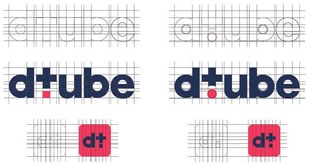
Route #1: Add, record, like, share, focus
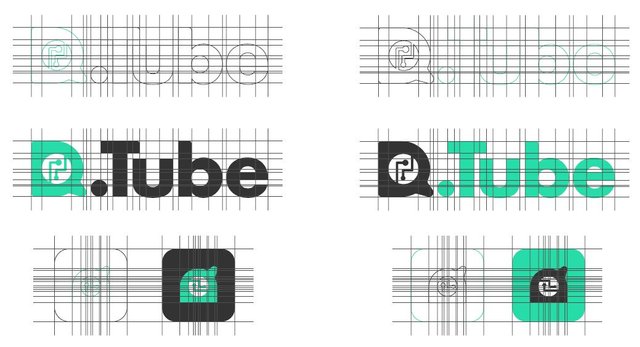
*Route #2: Cryptocurrency & community *
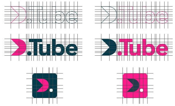
Route #3: Evolution & Player
Navy blue and soft red
After many debates, we decides to choose route #1 with 2 colors to determine new DTube’s identity: “Navy Blue” soothes and reassures new users and “Uni Red” dot represents the famous camera”s “rec” signal, right in line with the platform’s video focus.

Fine-tuning
From this route, many different versions were drafted, with a lot of debates around the upper or lower case “D”
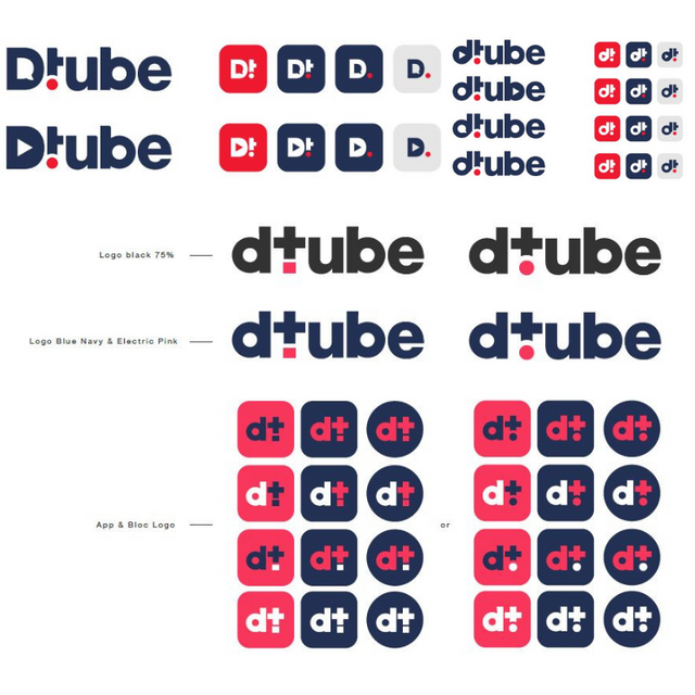
And finally ...
Discover the new logo that made a full unanimity from the team:

The new DTube logo

Mobile Apps and Favicon
We know a lot of you would have loved to participate in the design process through a community event but we felt we needed to keep it simple as design appreciation is very highly subjective. However, feel free to give your opinion on other variants as a comment below!
We really hope you will enjoy this new identity, if you like to use the new design, feel free to download the media kit in the About page: https://d.tube/about
Stay tuned, a new crazy update is coming!
The DTube team
Discord
GitHub
Twitter
Telegram (new)
Yeah I can predict that latest update, Well my most of the prediction proves to be 100% right by the way, hehe.
Loving this new logo man💪💪,
Just bring that update, Asap🔥
Posted using Partiko Android
Thank you so much brother
Wow....truly attractive and a good one...love the way it was unanimity chosen by the team...👍
Posted using Partiko Android
What Do I See here?! Logo for APPs? ! Cant wait for mobile dtube!
Posted using Partiko Android
I really like the new logo.
Can't wait to hear of crazy updates :D
Thanks darling
At first I hope you are so much good.I wish to you are happiness forever.
Thank you to @albanlaurent you have given new version logo of @dtube that I have like so much.Really It is be so wonderful logo.I am so excited to use it.Tomorrow I will use it.Thank you thank you so much dtube community members
Thanks brother
Good
Thanks 🙏
The design looks nice.
Looking forward to seeing more updates from @dtube
Thanks bro
Ooooh I love this!! Not just the different color variations - but the branding is also much more modern. Switching from harsh blacks and reds to slightly softer tones does wonders for the positive vibe and approachability.
Well done!!
Thank you dear
I like the rebranding!!!!
Thank you
Great!
Hopefully getting uploads to actually work reliably is next on the list along with better error reporting when they fail ("unknown error" is NOT helpful).
Please contact my fellow Dtubers on Discord and they’ll be happy to help you
Yeah, no.
My point is, along with the marketing (colors for logo's and what not, that this post is about) is also very important that the site actually works. Upload problems have existed since I joined over a year ago! And when it doesn't work (3 times out of 4 about for me) there at least should be some help and suggestions right there on the page. Not a message "Unknown Error".
I already joined the discord, but It should work without having to join yet another (centralized even!) service. After the length of time DTube has been up, this should no longer be the solution.