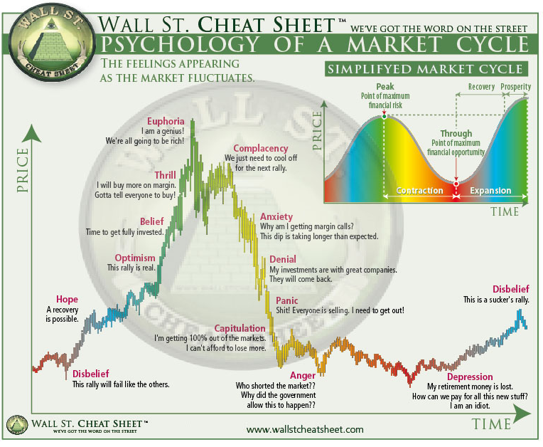
Indicies analysis. - Could we expect a market crash like 2008? - In depth analysis
I want to show all of you some information about the greatest indicies and their behavior. We should all prepare for some big moves in the market.
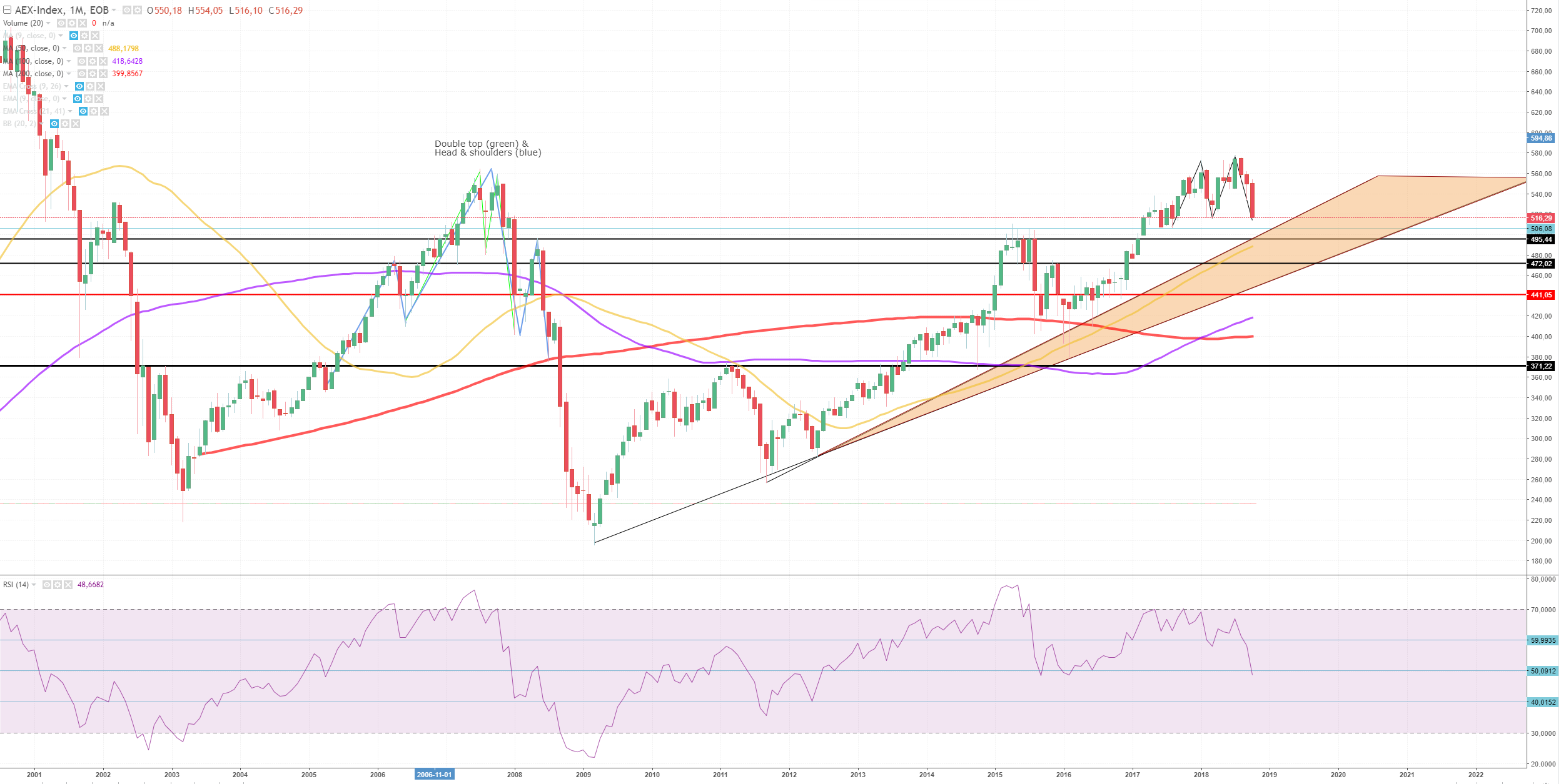
AEX
](https://steemitimages.com/640x0/https://cdn.steemitimages.com/DQmaTb7udLHxWpjknES7sBfDkMafvqmNj7TdA3o65bXoHju/AEX_1M.PNG)
The AEX is in a bull trend for a while, the triangle is overlapping a long range support level.
As we can see a double top pattern is formed on the AEX's month chart, which is a reversal sign. It's breaching his necklevel (support). Next we have a small resistance at 506. Followed by 495, these are re ranges of the previous top levels in 2015. It's likely that we'll break through these support levels to at least 472 level which will be in the triangle.
The worst things is when we breach 441 which is a crucial support level. If something like that happens the market could easily switch to a bear market. From A bull market since 2009.
We can see something similar to 2008's crash. Also forming a head & shoulders pattern. That means we could recover to 495 which will be switched to a resistance.
The RSI is showing more bearish behavior over time. Which also show hints of a bull market turning into a bear market. RSI tops are getting lower and we broke through RSI@60 and even through RSI@50.
When bull markets ends RSI usually drops <40 and we'll have to wait for the RSI to recover >40 again.
Additional Information
If the market crash inside the triangle we're probably not going into a bear market, but combining the information of other indices will give us some general information. All markets tied together, if one index crashes the others will be pulled with them, sometimes resulting in a breach of a crucial support level. Like a snowball effect.
Dow Jones
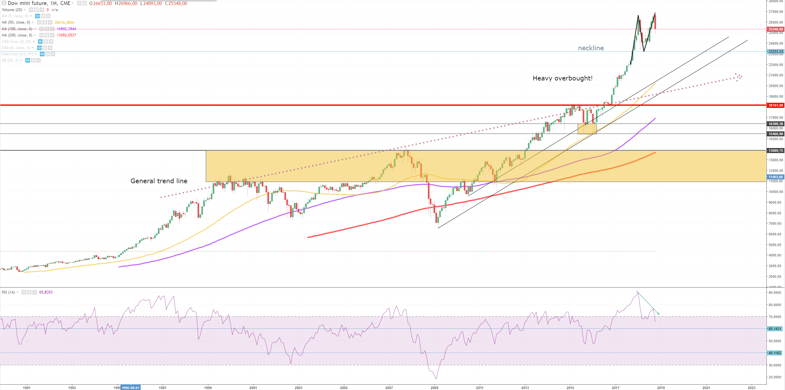
Dow Jones is heavily overbought from 2016. RSI reached levels around 90. That's a sign that you'll need to step out.
RSI spiked again but lower, resulting in a downward RSI trend, which means people are selling.
There is no serious support level, first seen is the neckline @ 23233. If that's breached we'll have a double top pattern. The support below is at 18161, which is almost 30% down from the current price level of 25348.
At 15460-16399 is alsa an area with a lot of buying pressure. So these could be the first support levels when experiencing a market crash.
Maybe the market can even go < 13889 but that's hard to predict because of the inflation over the years.
DAX
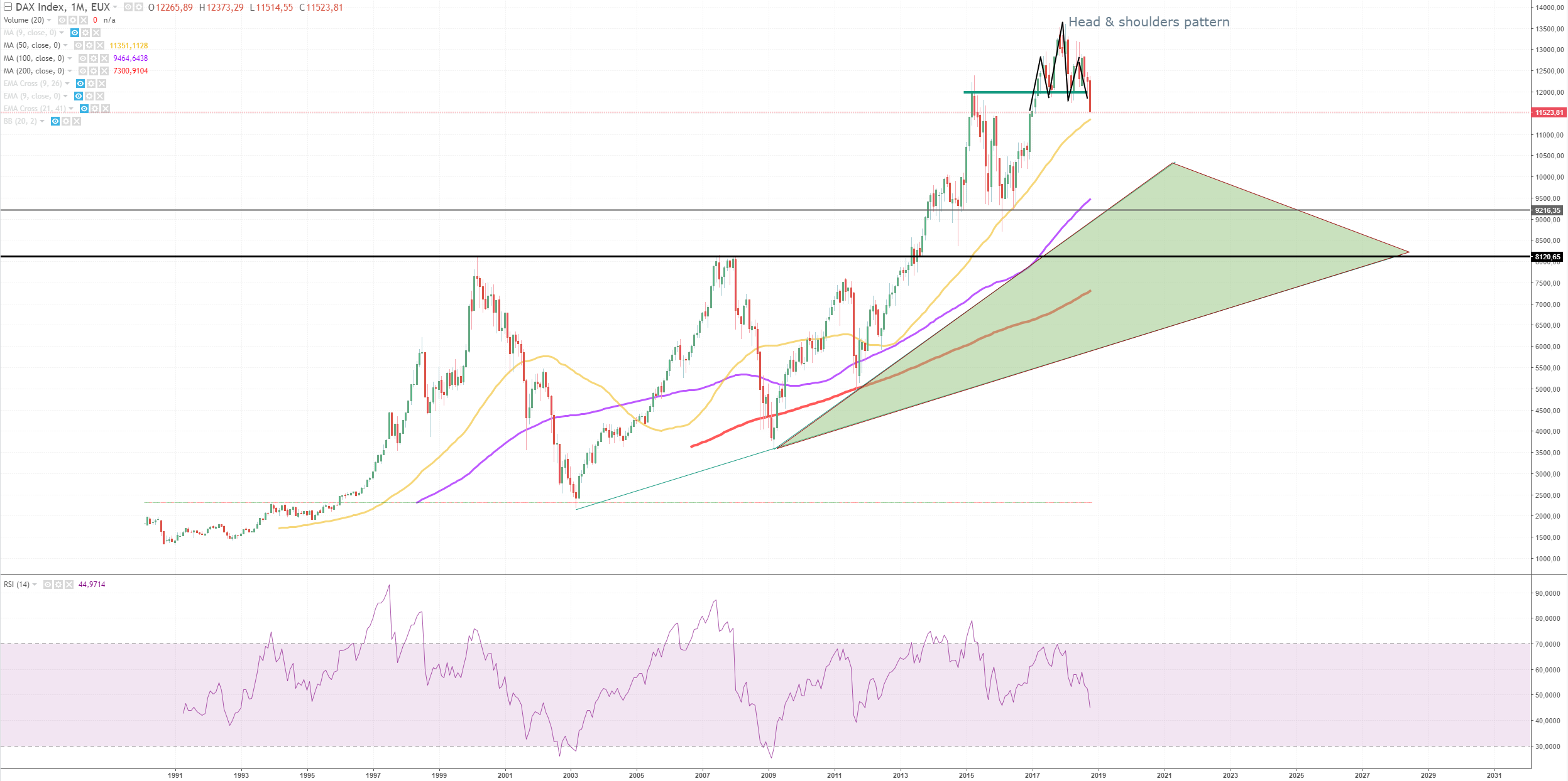
The DAX is showing some serious reversal patterns, a head & shoulders at the moment. Are ready broke through it's neckline and previous support from a top in 2015.
We could possibly see a downtred to 9216. From there on a lot of thing could happen. A head & shoulders could be formed again, resulting in a slight uptrend. But this depends on the behavior of other markets. 8120 is a difficult level to breach, this were the previous top levels.
The MA50 (yellow line) was showing some support. But this time the MA50 probably won't hold because multiple indicies are going down.
The green triangle is the expected down trend. Tops are getting higher, so new bottoms will likely be in the green area.
I also wanted to check some fibonachi levels, to check some unseen levels in the green triangle. Fibonachi isn't that accurate to we have to find some old resistance/support around these levels.
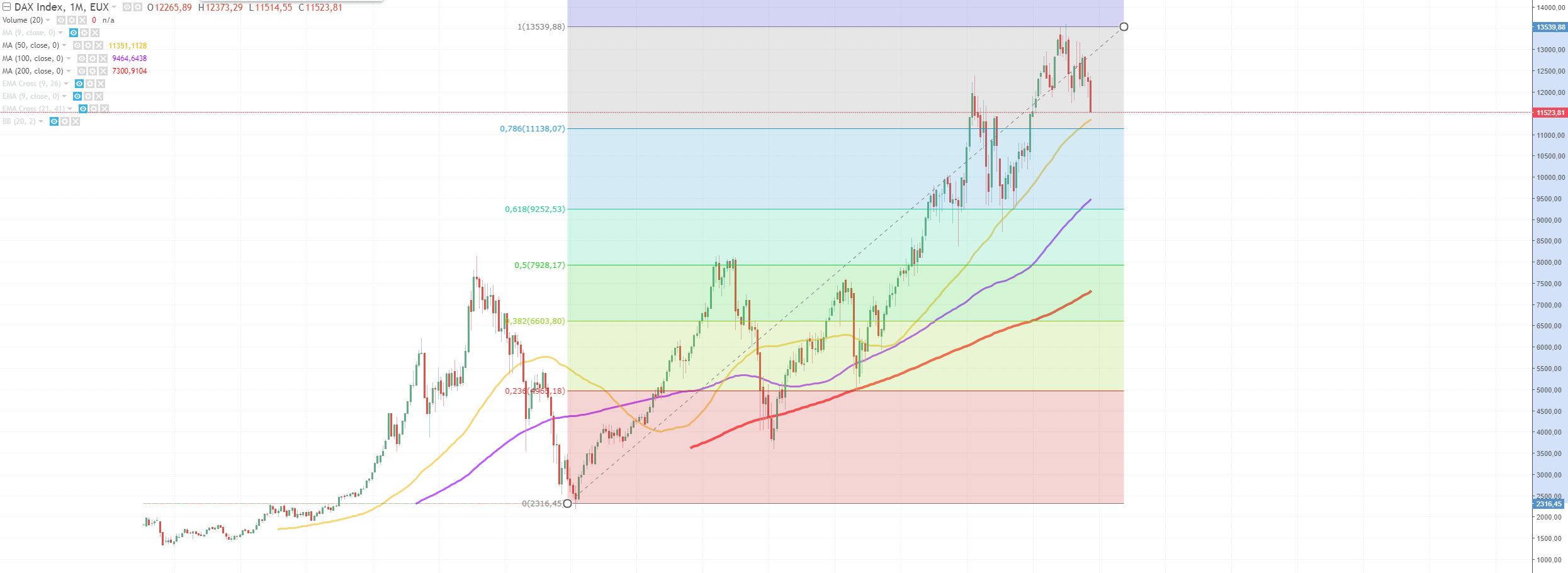
Fibonachi levels @ 0,236 shows us previous bottom in 2013.
Fibonachi @ 0,5 shows us the top level in 2007.
In between is 0,832 which shows us some corrections after two market crashes. This is around 7100 level. That will probably be our utmost bottom value.
NASDAQ
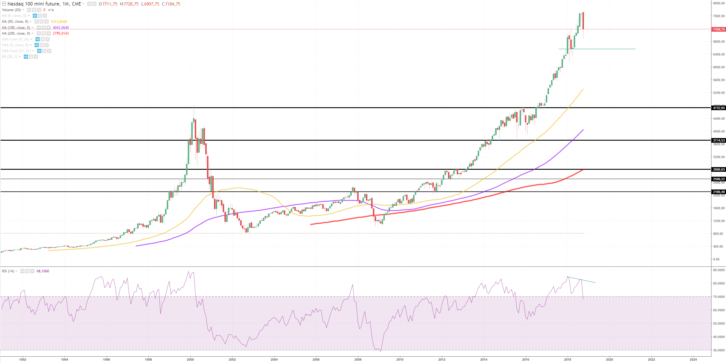
Well this doesn't look good. It really looks like a bubble. Check the same bubble pattern from 2000 and predict what could happen. Also America might have some issue's in the future with the trading wars which will have a negative impact on the market.
This is some general behavior for bubbles, could be seen in previous bubble in the year of 2000. And could quickly be happening again...
It's very likely to fall below 3714 if we enter a bear market. And even some levels beneath that are not unlikely to be seen. So be carefull with this market.
GOLD
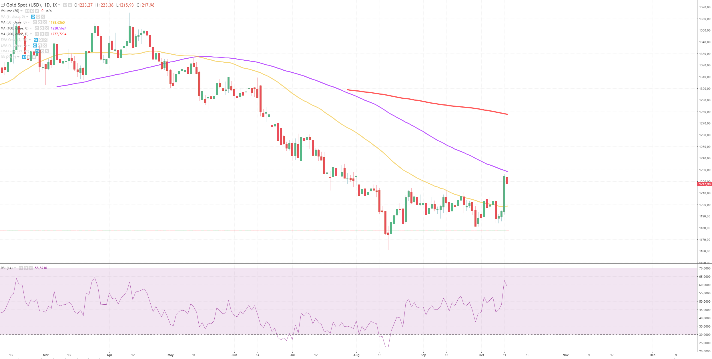
This is the day chart of gold. When we see the indicies going down. Gold is going against the market, the way up.
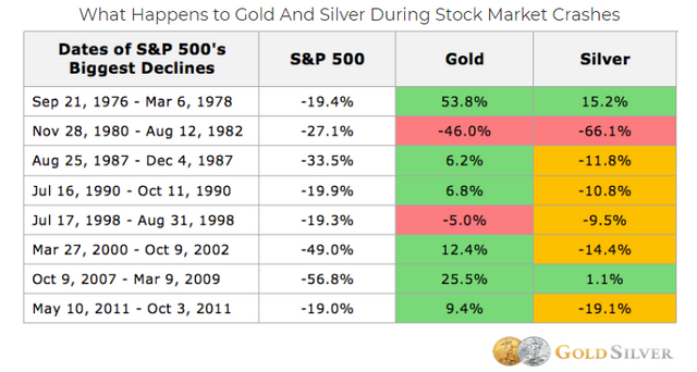
We can see, in history gold always perfomed well in times when markets were bearish.
To be honest I had some intersting price levels for gold and were below this price level, around 975. But we suddenly see some patterns in gold which are contradict to the index market.
If this continue's I'll make some new TA of gold, if I see some signals, turning in a bull market I'll let you know.
TA is no guarantee
Nice! I had a look at China and Korea also this week, take a look here, doesn’t look great. The gold/spx ratio concerns me as well.
I’m bullish gold personally after last weeks breakout move on Thursday. Have a look at this and this if you’re interested.
Gold/spx looks very interesting,
But I can't find spx with my broker, it's the S&P500?
You make a lot of TA, keep up the good work!