You are viewing a single comment's thread from:
RE: My latest contributions to Steemit Condenser app
Ahhh lol. Yea. I did suggest to place it between the header and the top of an article. But I guess we need to place it on a spot that triggers the most ad impression. I will ask them again.
Posted using Partiko iOS
Yeah it's just not appealing. Especially to potential new users. I understand needing to make money. But I have never seen another website throw an ad banner above everything else lol. Between the header and article would be 10000x better. I'll even shut the ad blocker off and come back to Steemit as my interface if they do it.
There are actually quite a few that do that.

CNN is one of them:
Weird. None for me. I turned my blocker off and still none.
Nevermind. Took about 15-20 seconds for it to pop up. But, that's hideous and mainstream news corporations should not be an example for us. Look at other social media sites. The ads are integrated into the content. These are two completely different kinds of things. If we're going to compare we should be doing so with our competition. They have ads hidden and catered to you based on everything you post.
You can afford "secondary" ads placements if you have enough traffic. But as traffic goes down, you will probably wants to improve ads revenue by better placement. But often, best ad placement does not rhyme with good looking website...
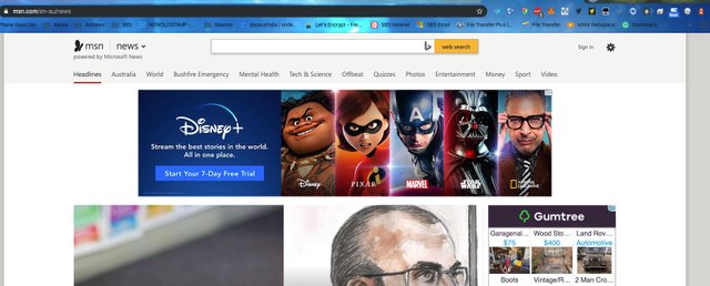
But also don't like a banner at the topmost. I rather have one right after the website's header like here:

Yeah below the header is a huge improvement. It's still ugly. But, nowhere near as bad and at least tolerable. The ads are just going to keep pushing people away from Steemit to other front-ends at the end of the day though. Unless they do a better job at integrating them into the design.
💣
Posted using Partiko Android