Creating a new art style

A new look
It’s been a while since my last post. I was busy, and that happens from time to time. Fortunately, I had some time making new things. First, I want to show you all a new series of illustrations I’ve been working on. This series of illustrations are developed by me for my new website. They are used to get a new a s c e t i c of the ground. I would like to share some insight of this new look and feel.

Color


Formation & placement
Every image consists of a white top and a dark blue bottom. This will create a cool looking transition between text elements. It also keeps the image 'responsive'. For the people that are not familiar with this term. It means that your website is 'mobile friendly' and scalable.
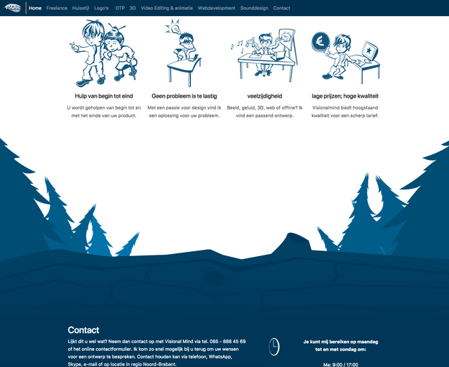
Here you can see a screenshot I’ve made. Rather then using boring flat colored panels. I used an image as transition instead. The top has a white background while the bottom has a dark blue background. The image is used as a transition between the two panels.
Warped perspectives
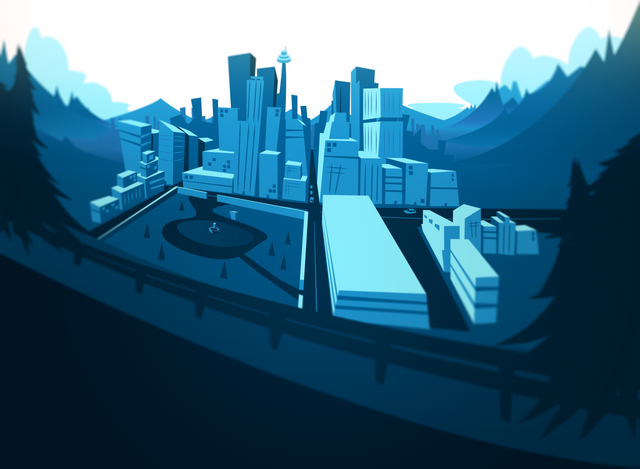
I also love to play with depth and perspectives in my illustrations. When you warp perspective lines the image will look more cartoony and memorable. This style gives your images more character.
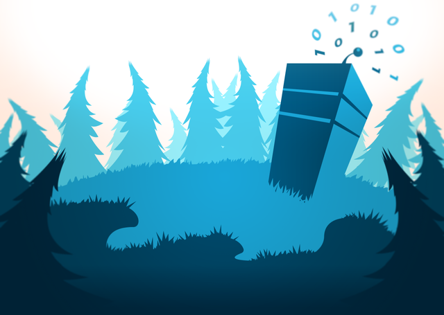

Inspiration
These illustrations where inspired by the look and feel you see in Zelda the Wind Waker and some wallpapers I saw online. In this one I tried to tell a story. Will this captain ever find his treasure? And what does it mean!?!
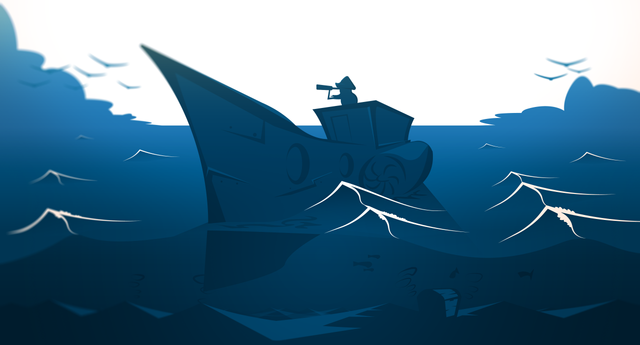

Mixing 2D with 3D
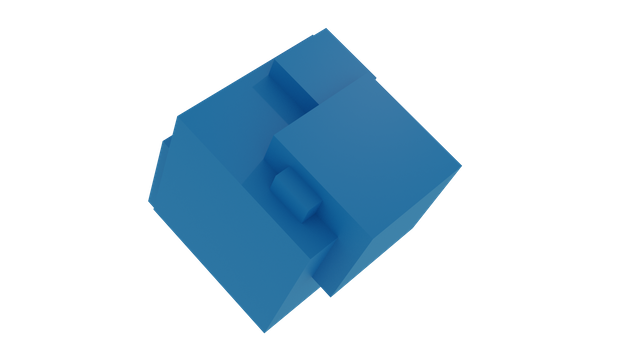
I’m really happy how this image turned out. In this experiment I tried to blend a 3D rendered cube I’ve made in Blender with an Illustrator image.
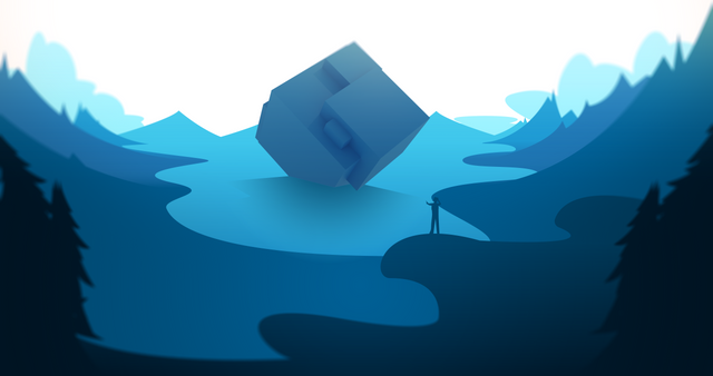

Creating depth
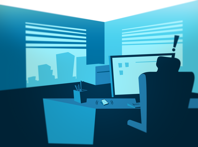
There are 11 illustrations in total. But only 7 where selected for this article. Every image shows a special element that separates them from each other. The lighter colors are always set in the background. While the darker once are more in the foreground. This will create atmospheric depth. Every image has vignette, iris blur and a sun colored overlay as an effect. These effects where added with Photoshop.

Peace | Gavin van Hoeijen
You can contact me in English with this contact form: www.visionalmind.com/contact
Congratulations @visionalmind! You received a personal award!
You can view your badges on your Steem Board and compare to others on the Steem Ranking
Vote for @Steemitboard as a witness to get one more award and increased upvotes!