Design Basics #04 - Using Canva
In the last episodes we talked about choosing photos, matching colors and combining fonts. This time, we will have fun and create an actual design. Don't worry, you don't need any costly software. In fact, you don't need any software at all!
We are going to use Canva.com - a free, easy and professional online tool. I'm not affiliated with them, but i like their site a lot. That is why i want to show you how to use it for your designs.
The Interface
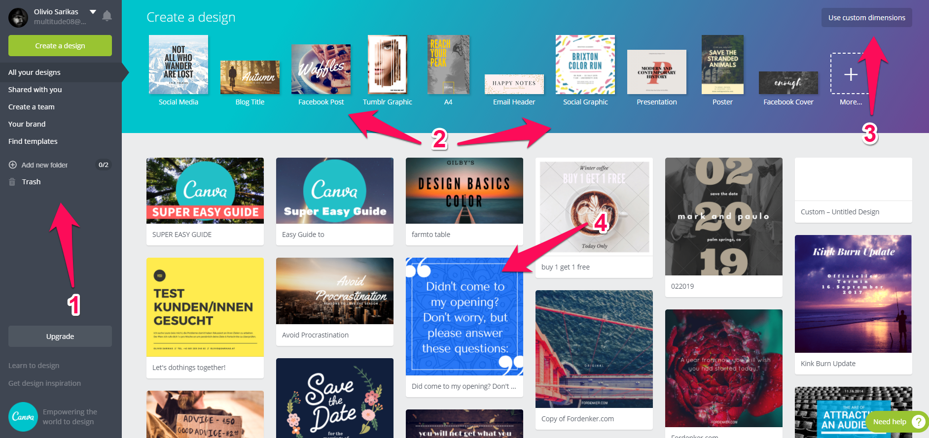
After you created your free account, you will see this screen.
- In the left bar you will find all the most important options. It's a bit like a Menu bar you know from software.
- Here you can select from a range for popular Social Media Formats that are designed to fit the dimensions of that platform. For writers there is even a KINDLE COVER size too. :)
2.1.) Click on "more" and you will see more size choices. From "SoundCloud Banner" to A4 Poster.
2.2.) Be SURE to choose the CORRECT SIZE, as free users can NOT resize their designs later on. If unsure, go rather bigger, export and resize in another tool later. - This is very important, as it allows you to set your own dimensions (even print resolutions).
- Shows you everything you have created so far. Yes, every design you make will be saved for later and you can edit it or make duplicates.
First Design
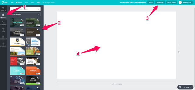
I went ahead and selected "Presentation (16:9)" - a good format for Steemit. A new browser tab opened and now we are in the work area of Canva.
- The left bar changed into an editing menu, giving us many great choices to create our design.
- Our first choice will be one of the pre-made design. Though you can also start from scratch.
- Gives us a range of options to share, download and even order prints.
- Is our work area, where we will create our design.
Choosing a Design
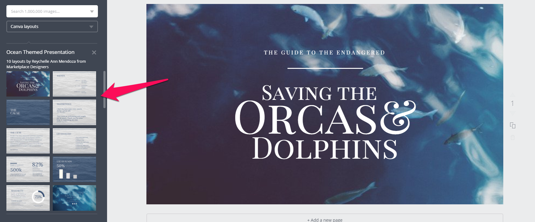
Because i choose "Presentation (16:9)" some of the pre-made designs give us 10 or more pre-designed slides. That is really handy if you want to talk about a topic in detail and preset some stats or facts. Your post will look super professional.
However, we are just going for a single cover picture this time. Any pre-made design comes with a full combination of background image, effect filters and font selection. We are free to change any of them, of course. I selected this one for us and we will edit it now.
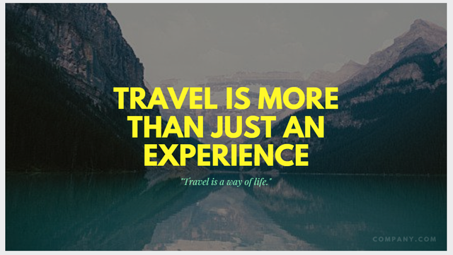
Editing the Design
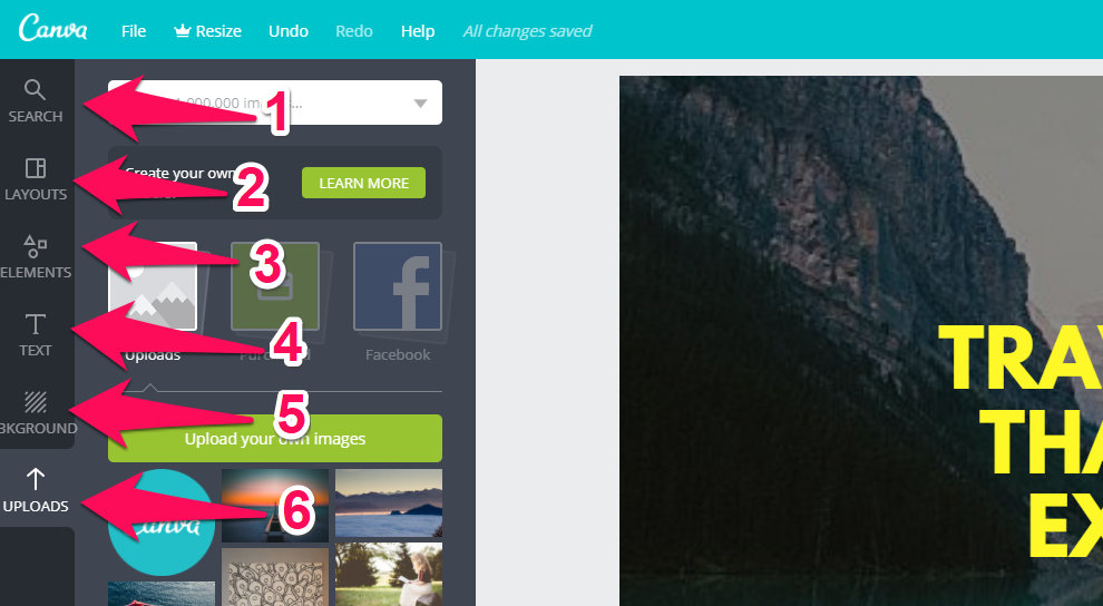
Time to get to know the edit menu on the left
- Search - here we can search for many shaped and photos. They are FREE it indicated - otherwise you need to buy them
- Layouts brings us back to the layout choice. We are free to choose another layout at any given time.
- Elements is our toolbox for photos, shapes, frames, forms, lines, illustrations, ect. There is a ton to choose from and create your very own design and look.
- Text gives us a ton of pre-made font combinations. This is a great way of making your font combination easy as pie. Keep in mind that not all fonts are free.
- A large selection of background colors and patters of abstract designs
- Upload is our magic area of uploading any photo or illustration we want to use. These are saved here for later use too.
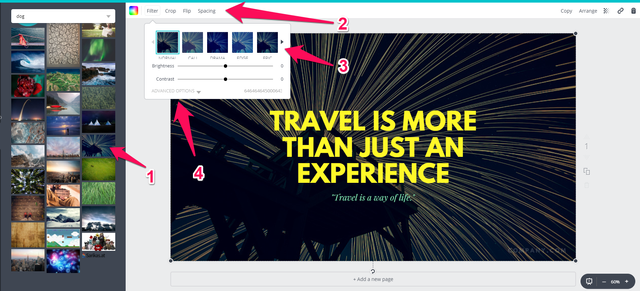
I selected one of my own images and dragged it onto the work area to replace the image that came with the design. After clicking on the picture in the canvas, notice how the menu above the design area changes.
- On the left we see the "Upload" area, with all the images i uploaded so far
- Is the smart-menu, that now holds all the image editing options like "crop" and "flip"
- After clicking of "Filter" a pop-down menu is shown, that gives us instagram-like filters as well as several image adjustment options
- "Advanced Options" gives us even more ways to tweak our image.
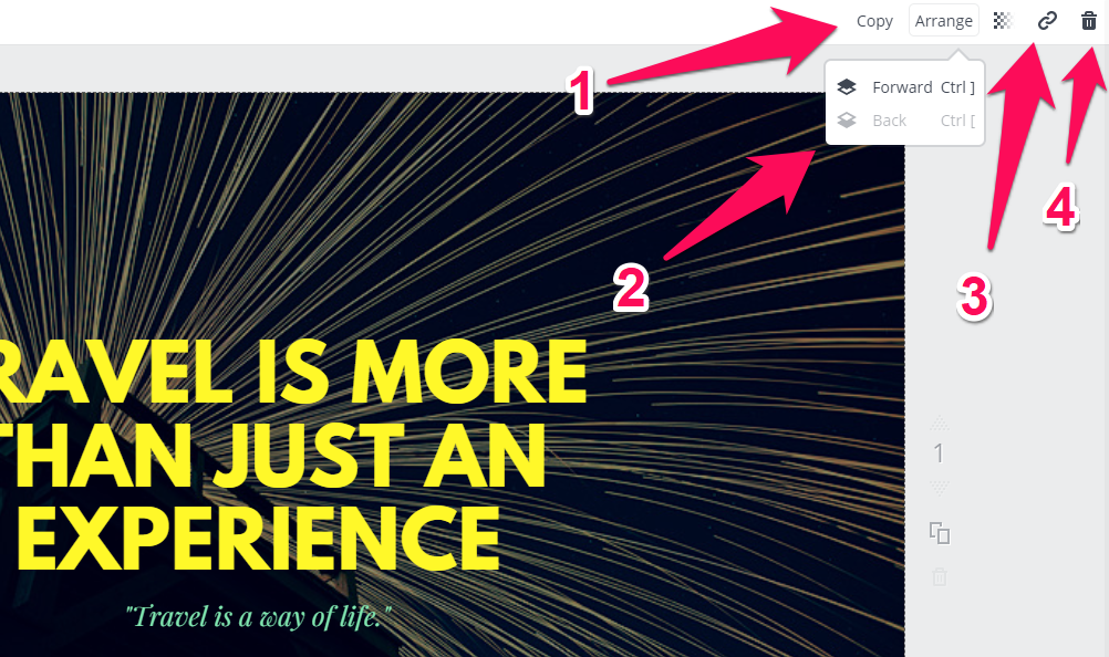
On the right side, we fine more options that are important for us.
- Copy allows us to make a duplicate of the selected object
- Arrange is very important, as this gives us a way to move an object one layer up or down. Everything in canva is placed in single layers, like pieces of paper on top of each other.
- Is a way to connect a web-link to a object. This obviously does not work for jpg or png exports.
- The trash bin allows us to delete the selected object.
Extra: In the turquoise bar on the top we also find a "undo" option, in case we make a mistake.
Changing the Text
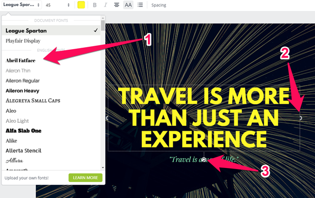
If we click on a text in canva, we can not just change what is says, we get a lot of options, that most will know from text editing software like Word. From left to right: Font, text size, font color, bold or italics, text align, upper case, bullet points and spacing
- In the font selection we find a large amount of font choices. They are all ready to use.
- This handle allows us to resize the text box.
- This handle gives us a way to rotate the text box.
Extra: If you move the mouse cursor to the side of a selected object, the mouse cursor turns into a cross with pointy ends. This can be used to drag the object across the work area.
Ready to go
I entered new text, change the font size and color and rearranged the texts a bit. Now we are ready to go.
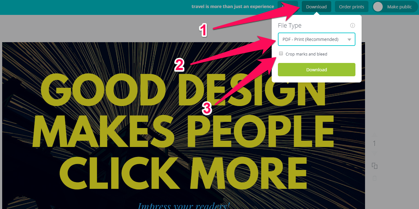
- The "download" button shows us a list of formats to choose from.
- Here you can select your desired export format. You can export as often as you like. Usually you would choose either JPG or PNG. I only selected PDF to show you the print option (Do NOT select PDF for online use - it is not a image format).
- "Crop marks and bleed" are markers that your print shop will need in case your print needs to be cut (If in doubt, call them call and ask). This option is only shown when choosing PDF. If you send your PDF to a print shop, leave the box unchecked. Otherwise check the box to hide these marks if you create a brochure for online use for example.
Extra: Unlike JPG, with the PNG format you can create transparent backgrounds. This is useful when you use a web image that is on top of other elements and is not intended to look rectangle in shape.
Finish
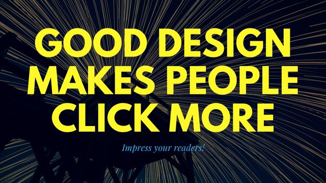
I finished our cool and fresh design and exported it as a JPG, for use on Steemit. You can see it below. Keep in mind that your design will be saved in your account for later use. If you create a Series of posts or videos, you can always create a duplicate of your design and adapt it for your next post or episode. Try to build a BRAND design that is easy to recognize and gives your readers an additional visual hint that this is a post by you.
Thank you for reading. Use the comments to ask and share your thoughts :)
Next post in this Series:
Design Basics #0 5 - 10 ways to max Canva
Other posts by me:
Design Basics #01 - How to select a picture
Design Basics #02 - The Power of Color.
Design Basics #03 - Learn how to use Fonts


This is really interesting. I had the privilege of going to design school that paid for our expensive software. This looks like a great alternative for people who don't have access to software. Is it possible to use custom fonts as well? The spreads you showed in this post are incredible however. I haven't updated my font book in years and might just visit canva for my next post's graphics. Thanks for sharing!
Thank you for reading. Yes Canva is really nice for people with no access to software. And the pre-made designs take away a lot of pressure on creating something that looks professional.
That is definitely more than just interesting. I wish I had enough time to go look at Canva right now and put your tips to practise, but have made a folder to bookmark this particular episode of your course on design - because let's be honest, that's what this is. I've been using a very old version of photoshop and managing okay with that, but I never use it for quick and easy things I'd like to make visually, as it's too much hassle. This seems exactly the right tool for me, so thank you for introducing it to me! Hope many people will find it helpful!
Thanks a lot. Hope you get a chance to read it soon :) I will create a second part that goes into more detail of the more advanced tools of canva :)
OK, I did it. You're right, an excellent tool. I wonder when the free options will run out of giving me enough to be useful. But so far, very good! Thanks!
As informative as always
thank you and happy to see you again in my comments :)
Add dsound.audio and soundcloud to embed in posts ;)
thank you for the suggestion. i will have a look at that :)
Hi there @multi4g, I found this post via Pimp Your Post Thursday!
Thanks for pointing out this fantastic service, I know this is going to help out many people!
You asked for suggestions about groups you could join that would appreciate posts like this. I'm one of the leaders of a group called The STEEM Engine, and we would love to have you as a member in order to share posts like this with our community.
We have a variety of users across Steemit who blog in various topics, but we're always looking for fantastic content creators to join us. I encourage you to check out our group account, @thesteemengine for more info on the group and a link to the Discord server.
With that in mind, we have a member, @perennial, who has started a community for comic artists, so that's a group that might benefit from this.
In addition, check out @stellabelle's @slothicorn account. She's established a group for creatives. They might also benefit from future blogs like this.
Let me know if you have any questions, and it's a pleasure to make your acquaintance!
awesome, thank you so much. i will check it out asap :)
thanks for the tutorial bro
thank you for reading it :)