Villeneuve Residence in Montreal
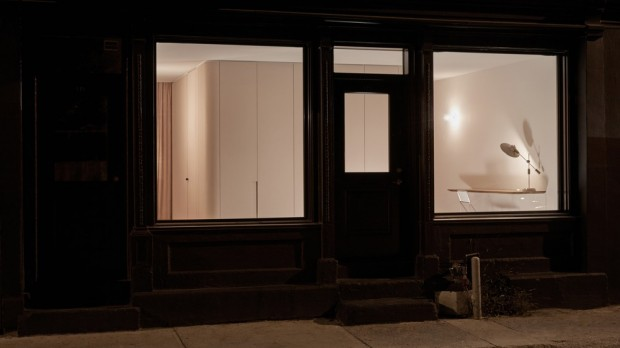
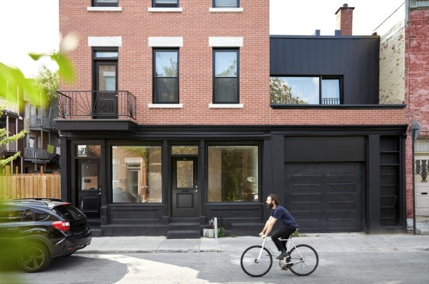
Located in a building that once housed two units above a grocery store, the Villeneuve Residence designed by Atelier Barda has a facade consisting of two old wooden shop windows framing a central door.
The parcel of the building is located between a south-west side yard on one side, originally used as storage and loading area, and on the other side a deep garage topped with old shed. storage. The initial program defined by the clients suggested a complete redefinition of the side yard in the green courtyard - a rare and popular feature in the heart of the borough. It also included the complete conversion of the commercial ground floor and the first residential floor into a single two-storey unit, topped with existing rental housing. A partial floor above the existing garage was then proposed to generate an additional living room and a small private terrace overlooking the street.
Thanks to the orientation of the main façades, it was clear that the proposed transformation would offer a great potential for openings and luminosity which, in return, would inevitably be accompanied by a loss of privacy due to the proximity of the neighbors and the street. Based on this observation, the development proposal sought to answer the following constraint: how to conceive the relationship between the private and the public within the new housing? The main idea was to introduce the clients as protagonists of the project, to reveal fragments of their history to the passers-by of the street while ensuring their intimacy at the chosen moments. This direct frontality that customers and passers-by would face had to be staged rather than ignored.
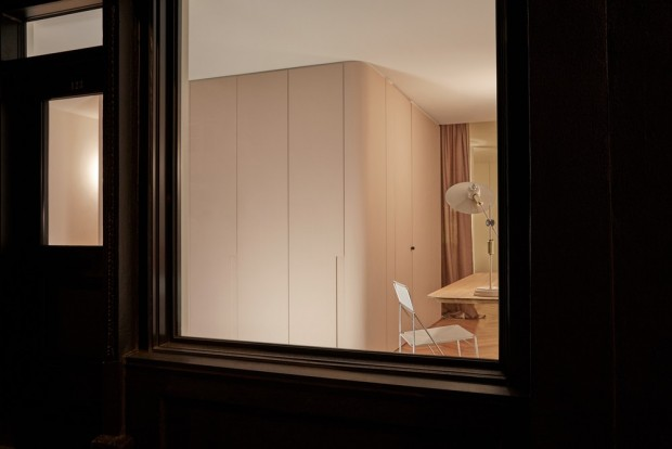
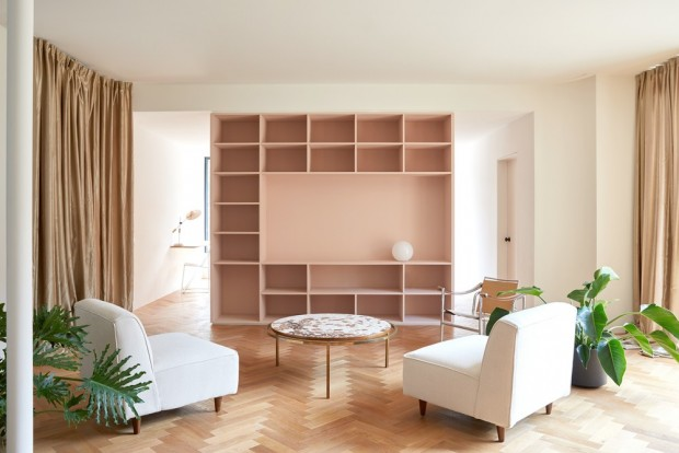
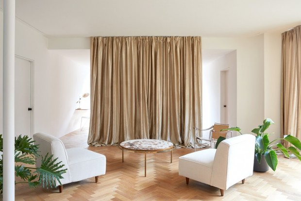
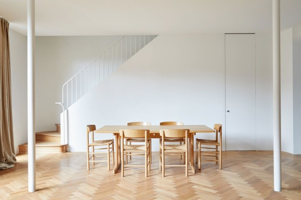
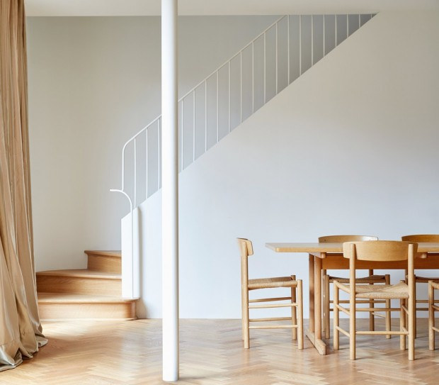
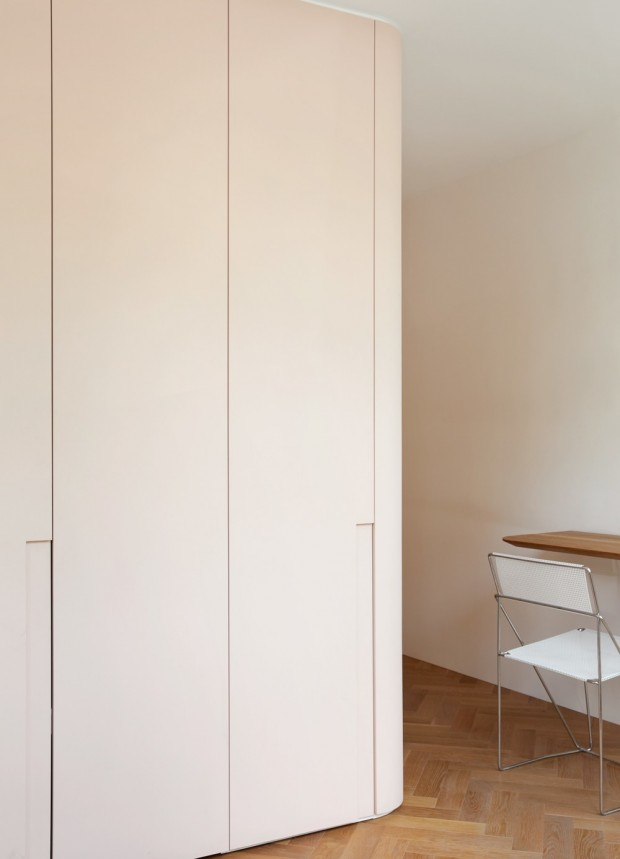
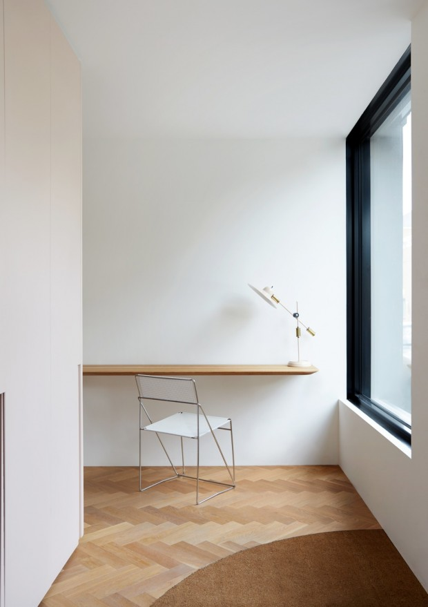
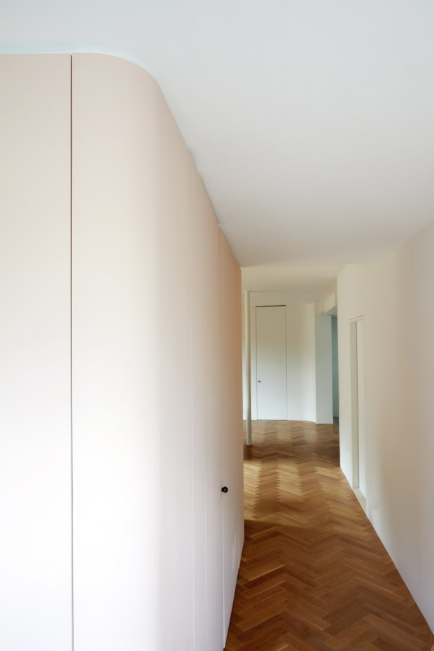
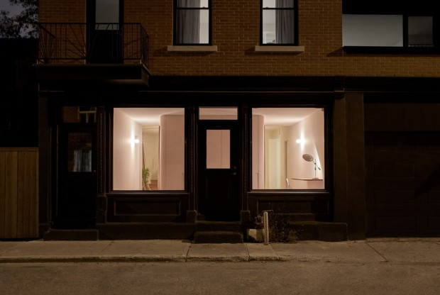
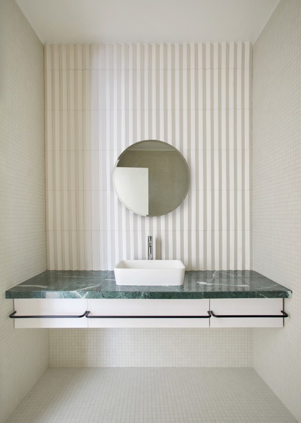
Thus, the whole of the design was guided through two complementary themes: the game between seen and not seen and the cinematographic framing. In this respect, the former large commercial windows have been preserved, on the one hand for their luminous contribution, but also essentially on the ambivalence between showing and hiding it. Therefore, a central technical block was arranged frontally to the window. Including a cloakroom, a bathroom and a library, it serves as a transition to the intimate space of the ground floor (living room, dining room, kitchen). His role is to create a visual screen from the street without obscuring the window. Thus, the moments of intimacy perceived by passers-by are restricted to the moments of passage between one space and another. Indeed, although the facade is highly permeable, all living space and activity of the ground floor remain invisible from the street, except corridors and interstitial spaces. Curtains give the living room its theatrical side. An office space has also been created at the entrance, which, when occupied in the evening, accentuates the cinematographic framework of the large bay window.
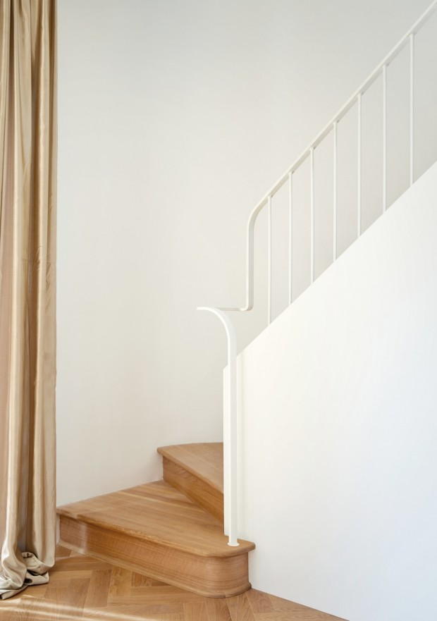
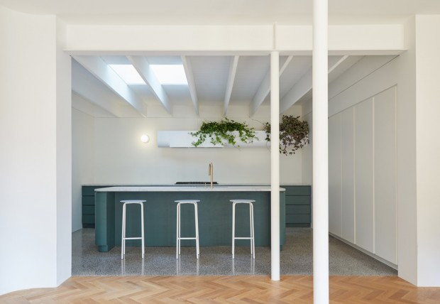
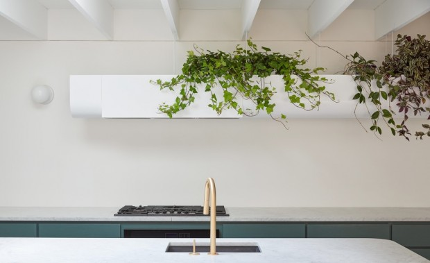
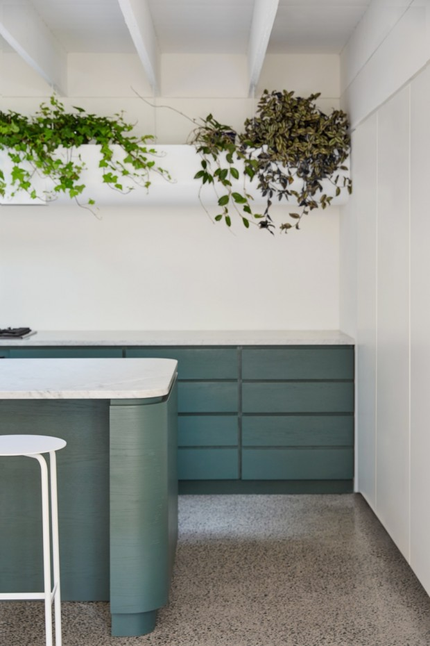
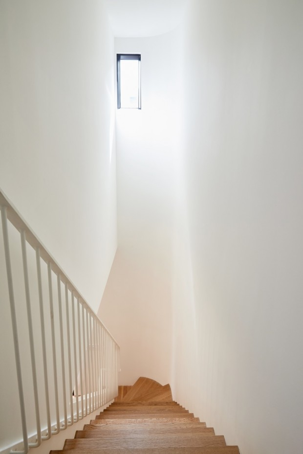
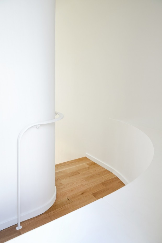
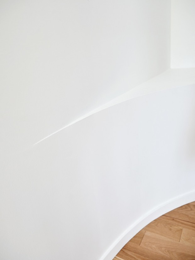
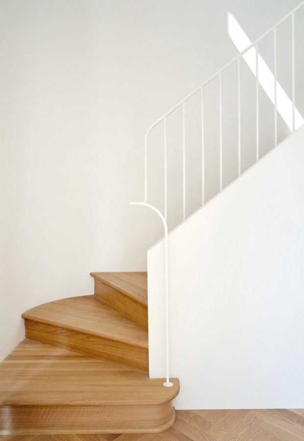
The use of color also contributes to the staging of the space, sometimes subtle from the street thanks to variations of pink of the central block, sometimes more contrasted in the living space where the green tones of the kitchen s are arranged in terrazzo type concrete. Numerous architectural details punctuate the interior path, from the choice of materials to the curves games, through the care taken to the elements created to measure, for example the hood of the kitchen or even the handrail of the staircase. The project was able to overcome the constraints of the existing to better reveal the soul of places.
You got a 0.60% upvote from @upme thanks to @lili123!
You got a 16.67% upvote from @kalinka courtesy of @suggeelson!
You got a 20.00% upvote from @postpromoter courtesy of @lili123!
@originalworks
The @OriginalWorks bot has determined this post by @lili123 to be original material and upvoted(1.5%) it!
To call @OriginalWorks, simply reply to any post with @originalworks or !originalworks in your message!
This post has received a 0.51 % upvote from @sneaky-ninja thanks to: @lili123.