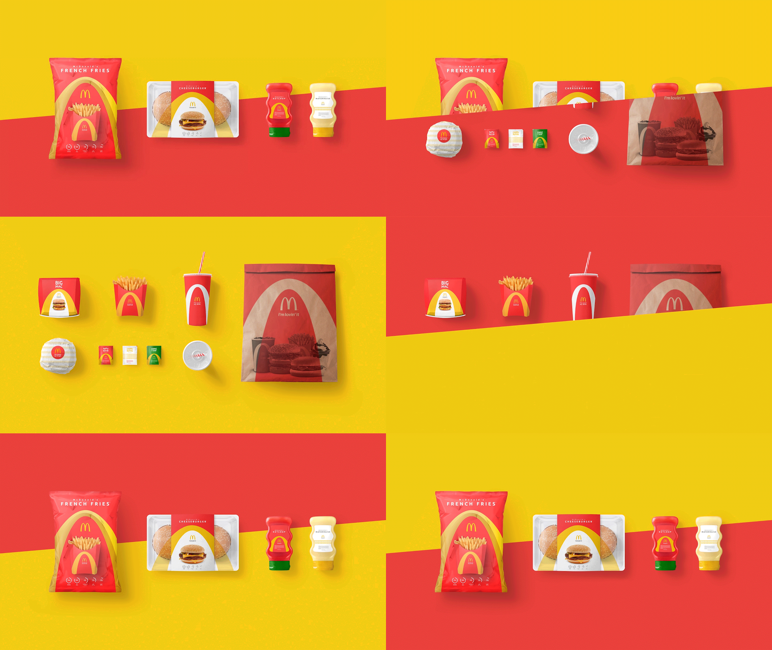
McDonald's Packaging Redesgin
I created a clever redesign of the famous McDonalds packaging!
It follows the brands origin story and symbolically depicts it.
Give me your thoughts about it.

https://www.behance.net/gallery/54174487/McDonalds-Packaging-Desgin
I like it a lot. Looks professional and I especially dig the french fries chips bag.
Thanks a lot for your detailed opinion, much appreciated :)
I like it! I think it looks very clean and it communicates well. Great job! :) Helen