[Design Process] Pillar Wallet - Home / Dashboard Screen - Where it all begins

I'm sure you've been wondering how the Dashboard (Home Screen) would look like for the Wallet. So this is the time when I finally show and tell you.
As always, we were coming out from User Stories so we want to keep in mind what we want to show them.
In our case we want to
- Tell them the current exchange rate
- Tell them how much specific crypto currency they haveand how much it's worth
- Tell them what crypto currency they have (The idea is to be a multi-currency wallet down the road)
- Show them the latest transactions, at least the last one that they performed and to see if it's still pending, etc.
Then the transactions.
One Transaction in (Most Recent) History should contain
- How much Ether you sent/got
- If you sent the money or receive it
- From whom/To whom it was
- If it’s received or not.
Transaction Details should contain
- Transaction Id
- Looking Up Transaction on Blockchain using third party service
- Time, Date
- Note
- To, From
- Name, how much was sent
- Status and how many blocks/approvals it has
Important thing to point out is that time is not important to (our) Users therefore it's not included in the quick view.
Quick sketches
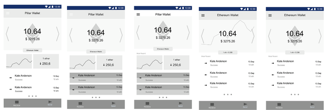
First I used a paper to get many ideas out. Then I picked one or two and played with them to get some vectorized sketches. I had 5 at the end.

I also created different versions of transactions on a separate Artboard.
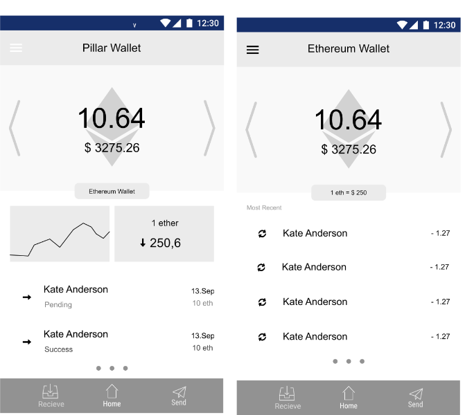
Based on the problem we had (simple, intuitive, shows you what you want to know quickly, and has potential to become a multi-currency wallet) I narrowed it down to these two. Basically the first design can be stripped down of certain elements to become even simpler as shown in the second design.

Though at the end I went with the first design.
Reasons
- The graph can be expanded into separate view to show you the price action
- The exchange rate to me looks great and by clicking on it you can get to a conversion tool to exchange between different currencies.
- Clicking on the name of the wallet will let you change to different wallet (also as indicated, you can switch to another wallet ).
Though I was not doing research for a multi-currency wallet so my assumptions might be wrong. So these multi-currency features were more just an ideas.
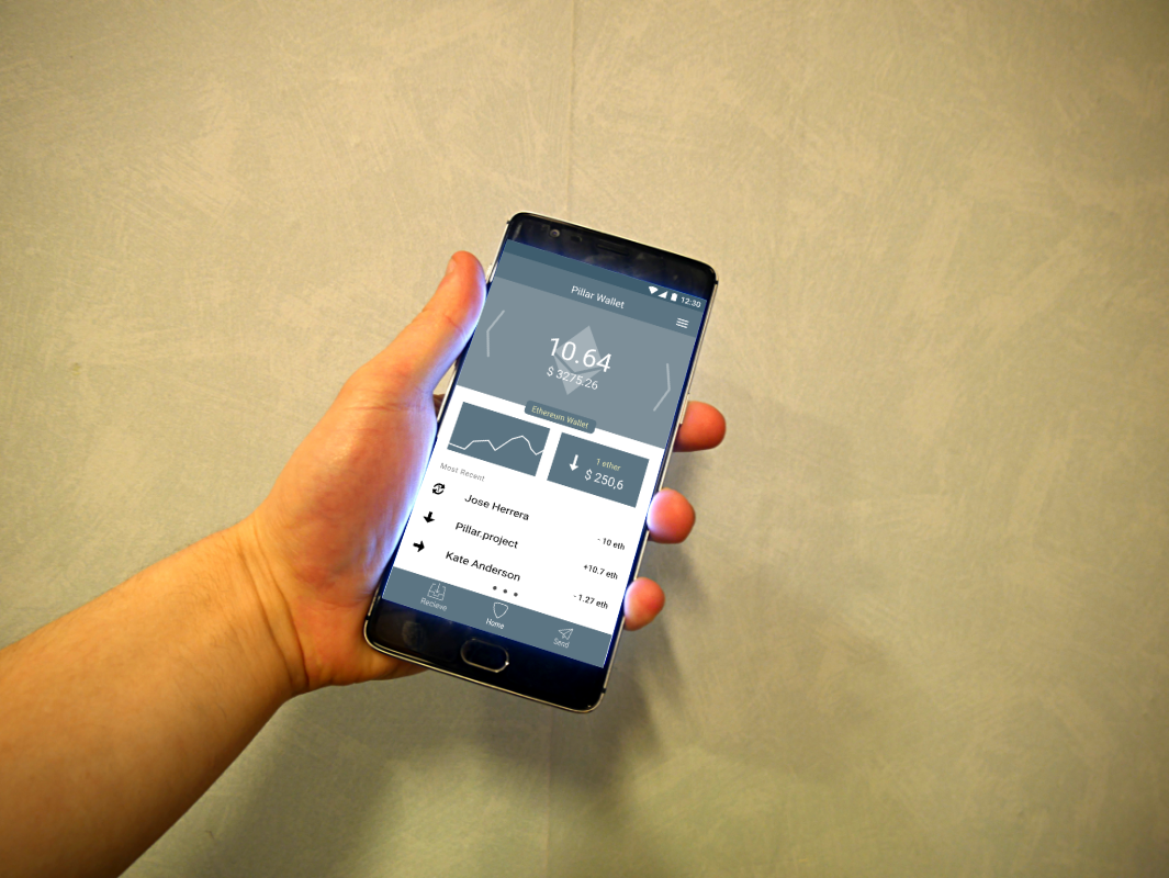
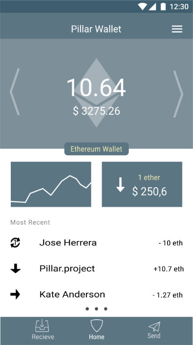
Though here's the final version.

Problem
I do have a bit of a problem with the graph as well as showing whether the price went up or down.
At least one User persona would have problems with that and I understand. It can be painful to look at your savings go down in value or to see a huge fall in the graph. As a new user this might make you think crypto currencies are a scam, or that it's going to crash. Basically similar problems people have with stocks and other assets like those.
After all, we're emotional creatures and we're easily Fooled by Randomness (check out the book).
That made me think of different solutions to problems like "reacting to a price drop", etc. which made me think of some interesting solutions to that so a newcomer won't freak out, sell his assets and lose some money, which, in turn, would make him have a bad experience with crypto currencies and he might not come back for a long time.
And this is not what I want. I feel like my mission is to make this crypto world a more usable place so an average Joe can use it which would help with mass adoption.
When your grandma is using Bitcoin then my mission is successful.
What do you think? What could be improved?
Also, see :
Join me on the journey of learning and improving in Design. Together we can learn faster.
Design Thinking
An account dedicated to human-centered design with a dream of making crypto and block chain usable for an average Joe with a dream of working on crypto-related projects full-time.
You can look forward to
- Learning Resources and Material
- Design Breakdown and Critique
- Inspiration
- My Learning Journey
- My Work
- Other people's great work (resteemed)
and some surprises plus any suggestions from the audience.
Sneaky Ninja Attack!!
You have been defended with a 18.75 % upvote!
To help keep my Jōki (蒸気) power strong I rely on the townspeople of Sōsharumedia (ソーシャルメディア).
I was summoned by: @designthinking.
I have done their bidding and now I will vanish...
woosh