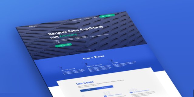
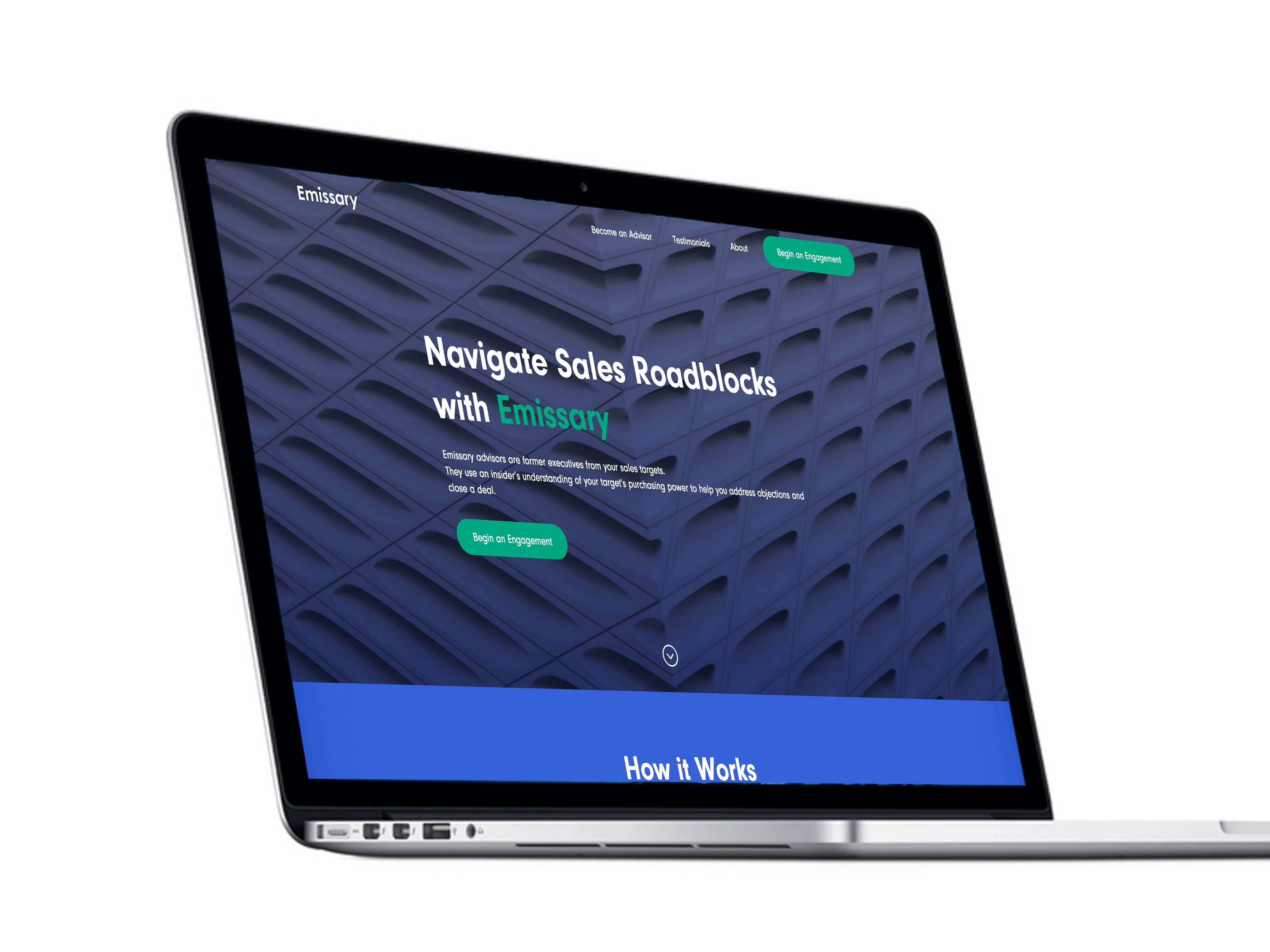
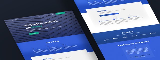
Our website design for Google Ventures-backed startup, Emissary
We designed and built this website for Emissary. The design is minimal, bold, graphically pleasing and geared towards driving visitors to sign up. Emissary uses executives who no longer work at top companies who can be great assets and network openers for people who want to connect with the companies these people used to work for. If you want to get Nike as a client, Emissary will connect you with someone who was a VP or higher at NIke within the past couple years who has the network to introduce you. This is the power of Emissary.
The company is sales-based and has a very interesting and valuable business model.


Here is their current website: http://emissary.io/
Please let me know what you think of the website design! Thanks!
Ciao for now, Steemians.
- Weston (aka @design-guy)

That is a great design you made there good work!
This layout design is sooo better than the current one.
Good work!