DATAPLATE #1: VISUALIZING GLOBAL AQUACULTURAL PRODUCTION
------------
aq·ua·cul·ture…the breeding, rearing, and harvesting of plants and animals in all types of water environments including ponds, rivers, lakes, and the ocean. (NOAA, 2017)
------------
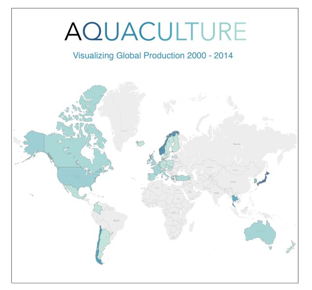
Indicators of aquacultural production for OECD member countries are visualized below (source: OECD.stat.org; years: 2000 - 2014).
------------
Leading aquacultural producers
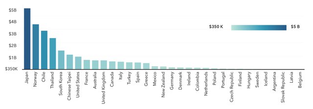
Darker-shaded countries on the map above show higher yearly-averages in aquacultural production (USD) than lighter-shaded countries. No data available for grey countries. Dollar amounts per country can be determined using the legend in the bar chart below. There, each bar stands for a country and is shaded identically to the map, i.e. according to aquacultural production in average yearly USD.
Average yearly production in metric tons
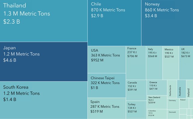
Cube sizes in the tree chart below represent yearly aquacultural production averages by country in metric tons. Cubes are colored-coded for average USD production in aquaculture during the same time period, using the same color gradient as the map and bar chart above.
Yearly aquacultural production in metric tons and USD
Average aquacultural production in USD is plotted against average production in metric tons (t) in the scatterplot below. Each dot represents these values for one year in one country.
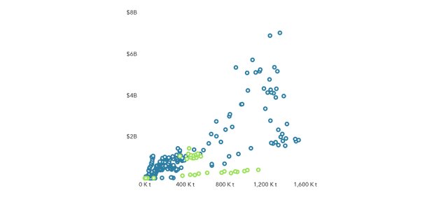
The relationship between these two variables is visually linear. Greater variance in the predictor variable (USD) at higher values of dependent variable (metric tons) reflects complexities in the market which should be explored in more detail at a later date.
Blue dots represent total aquacultural production for the country that year. Green dots represent plant aquaculture only. Plant, or floral aquaculture is done by a minority of countries and is discussed in more detail momentarily.
Production of faunal (animal) aquaculture
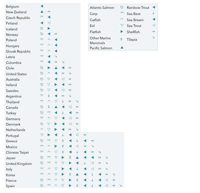
SYMBOL CHART: Marine animal species produced by each country are identified in the symbol chart below.
**Please note charts above analyze grand totals for production by country, which is not a summation of the species counts given below. Totals for data below vary from data above as they were collected independently.**
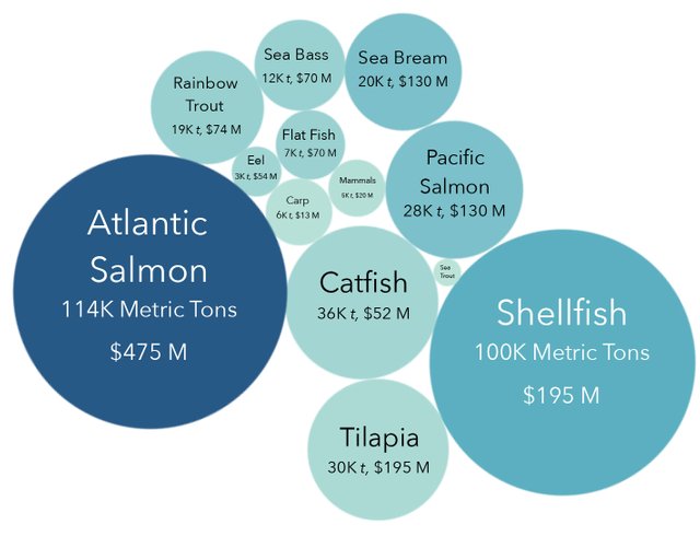
BUBBLE CHART: Yearly averages by species. Size of circles in the bubble chart below represent yearly production averages (in metric tons) for faunal aquaculture by species. Darker shaded circles indicate higher average USD per year, per species across countries.
Production of floral (plant) aquaculture by country
Shaded countries in the map below are producers of aquacultural plants, such as seaweed. Countries shaded darker have higher yearly averages in aquaculture production than those shaded lighter (USD, use color gradient legend on map).
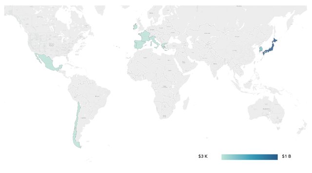
Both the map above and the tree charts below show production dominance by Japan and Korea in plant aquaculture: note that size of squares in the left tree graph represent production in USD by country, with colors shading toward higher production in metric tons. In the chart right this is reversed, with size of squares representing metric tonnage, and colors shading toward higher production USD. In both charts countries other than Japan and Korea do not meaningfully register due to comparatively low production volume. Further analysis is needed once more robust data become available.

Data source and notes
All data retrieved from OECD.stat.org, a robust source for global economic statistics maintained by the Organization for Economic CO-Operation and Development.
Data availability by country is constrained to member OECD countries. This limits generalizations made here: China for example is not an OECD member countries and information on its aquacultural practices is barely present in the data, thus excluded from analyses.
Other resources
National Oceanic and Atmospheric Association. “What is Aquaculture?” (2017)
http://www.nmfs.noaa.gov/aquaculture/what_is_aquaculture.html
