Color in our life
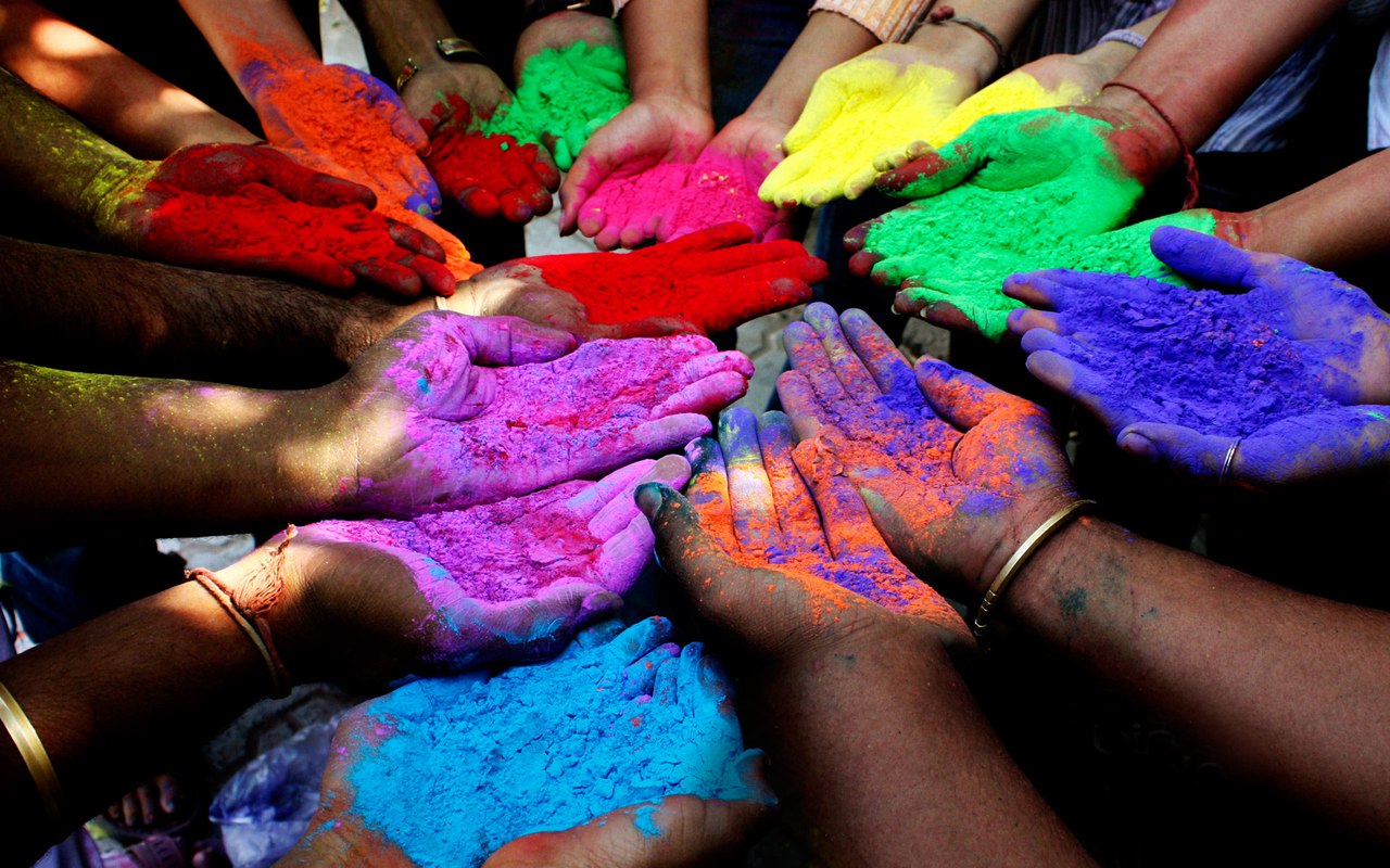
The color is closely related with psychology; it’s been proved that colors surrounding us influence our psyche. This influence goes subconsciously. The proper use of the color range helps to control mood and desires, arousing specific psychological mechanisms. Let’s take a closer look at them:
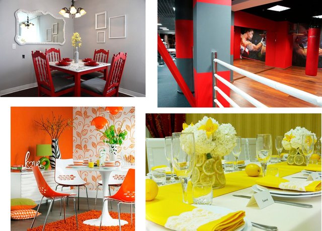
Red, orange and yellow. These colors are considered to be exhilarating; they activate specific processes of our organism. For example: they increase appetite, improve mood or even eliminate sluggishness and apathy. In terms of it we can see in which rooms we can use these colors, for instance in the dining room, you can eat with yellow or orange ware, use red napkins, but don’t go too far not to gain weight because of constant desire to eat. It’s good to use these colors for children’s playgrounds; also I’ve noticed that they are used in gyms, it makes the nervous system and muscles more active. And probably athletes always want to eat :) Among these, red causes the strongest reaction, increases the rate of respiration and heart rate, and raises blood pressure. The red color aloes increases different senses. For example it makes the sense of increased sound volume. This feature can be perfectly used in the room with a home theater or at a party.
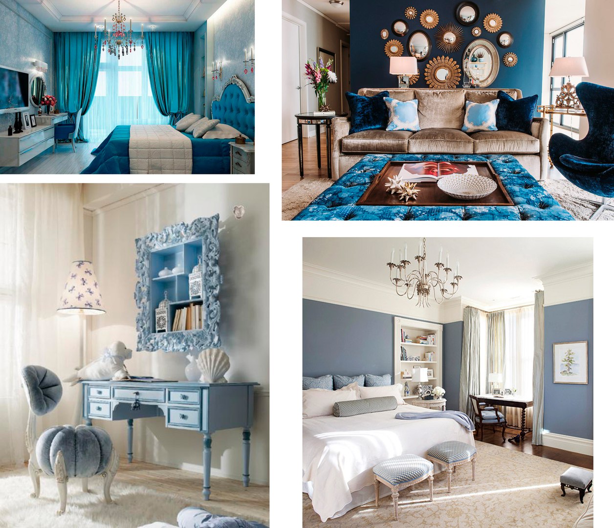
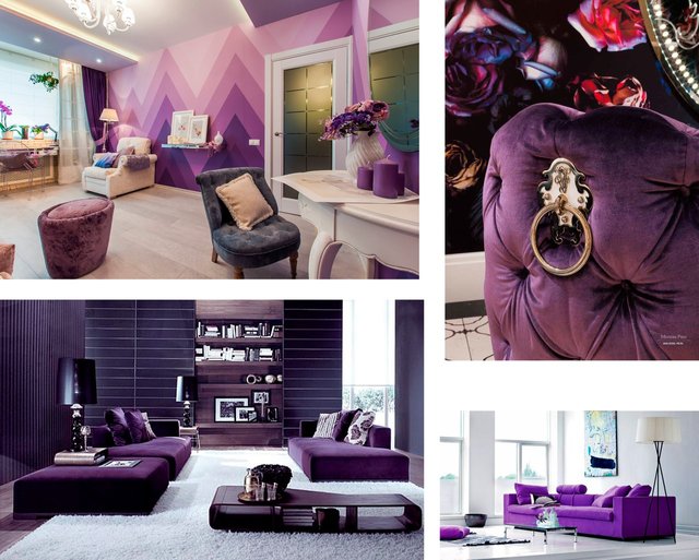
Blue and purple. These colors can calm and sometimes even depress, the decrease heart rate and emotions. It’s better use them in such rooms as: a bedroom, a living room, a library room or in nursery if your child is hyperactive. These colors help to create a special interior where nothing bothers or irritates. Blue is able to sooth and distress. If you want to lose weight – paint the kitchen with blue, and your appetite will decrease. People say that purple induces sadness and deprives of bright emotions. Though I like this color very much, I get only positive emotions looking at my purple wall in the living room. But still the purple color is considered to be a “hard” one, that’s why it’s not recommended to use in the rooms where children live. According to scientists, prolonged exposure to these colors leads to depression, causes sadness and boredom. Therefore it is better not to abuse these colors; you can find it good to use them in the form of accessories for the interior or one wall.
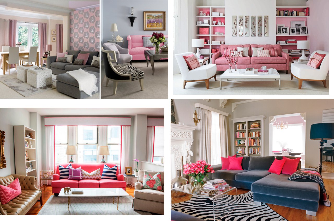
Pink There are lots of shades of pink. If it’s bright and saturated then it works as the red color. If it’s soft and cold then it works as the blue one, it will calm you as well. No wonder it is suitable for girls' rooms (where it is most often used), because it creates the impression of tenderness and purity. Bright color accents - pillows, mats, napkins - can enliven any interior, bring you light and pleasant emotions.
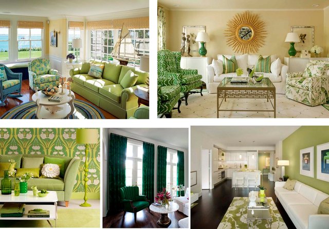
Green. Different shades of green relax and relieve fatigue. Green neutralizes the influence of other colors, helps to get rid of negative emotions, that’s why it’s often used in bedroom, it helps relax and have a rest. Children’s rooms and gyms should be painted with it, because it can bring boredom and deprives of bright impressions. But a green colored recreation room is a good idea!
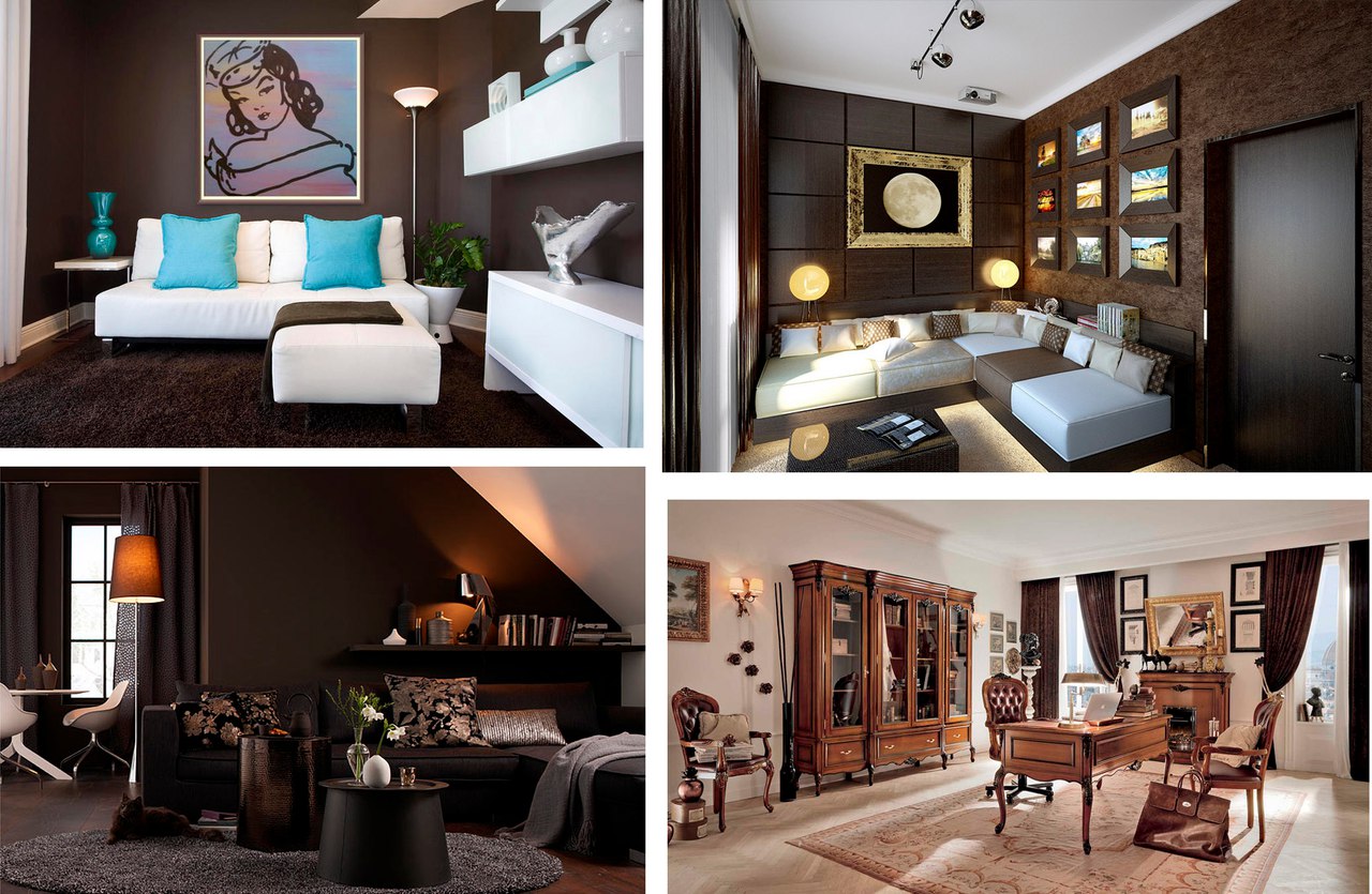
Brown. This color gives the sense of tenderness and closeness to the nature (soil, trees). Brown has a good effect in case of nervous exhaustion - it gives a feeling of smooth silence. It’s not able to give bright emotions; it’s good for a home office where you can do scientific work, write, do the calculations, be fully focused with no worries. But remember, it’s not suitable for children’s rooms, you should avoid brown floor and furniture, and it’s also not good for bedrooms. This color can suppress in tiny rooms without giving lightness and light-heartedness.
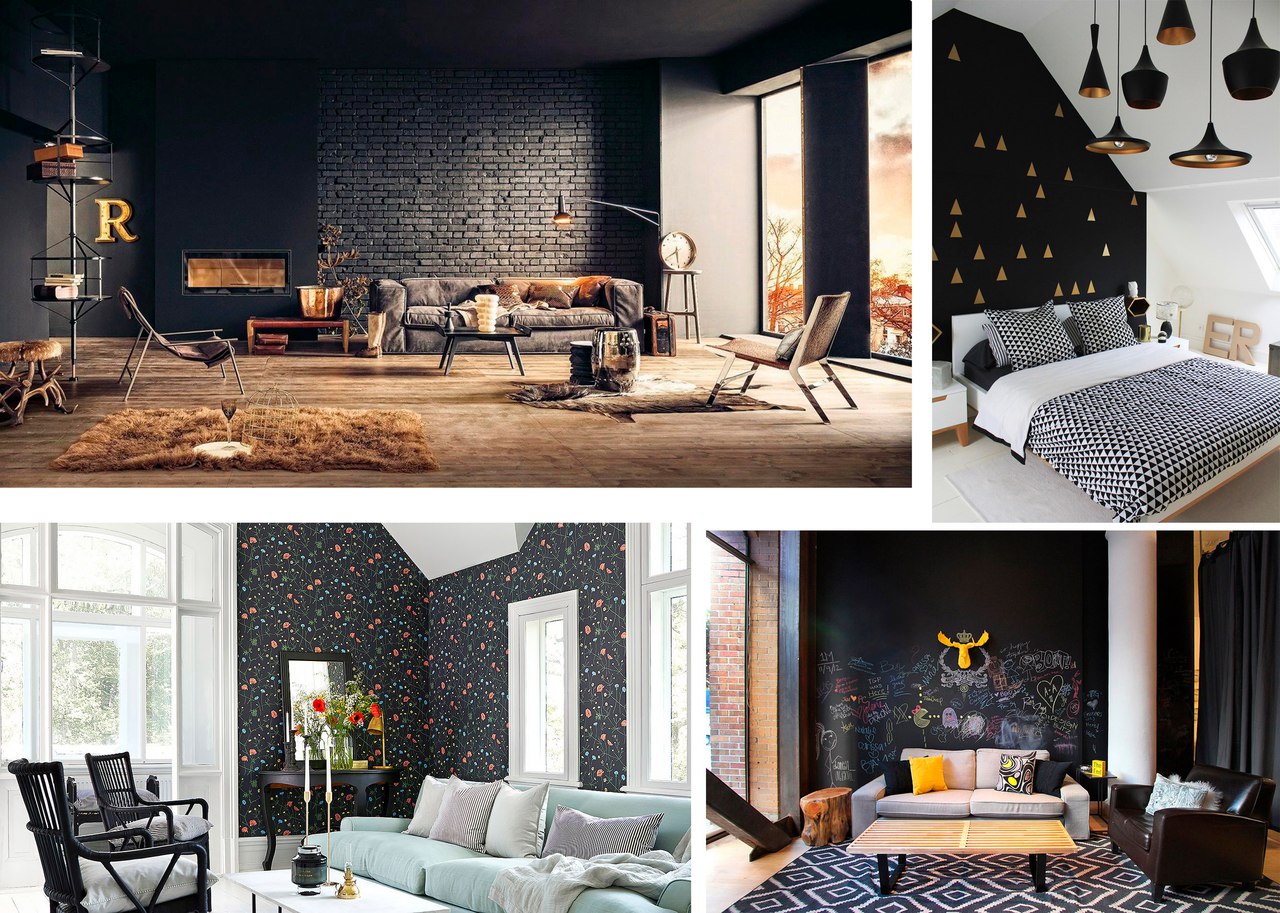
Black, White, Gray. These colors rarely provoke any emotions, therefore they are neutral, and sometimes they are interpreted as a lack of color. If you abuse them: lots of black will depress and aggrieve or it will cause fear; abundance of white can cause the feeling of hollowness and loneliness. Abusing neutral colors can cause melancholy and apathy or even lead to depression. That’s why it’s good to combine neutral colors with bright and warm ones in houses. But many statements are debatable! After all, a color can affect people differently. And fashion doesn’t stand still; it also dictates the rules from year to year. I love being in white interiors, I feel the “air” and space there. You can change “the room’s mood” with the help of bright accessories (curtains, pillows, vases, books, well anything). Somebody feels good in a room with black or dark graphite walls, it looks stylish enough, besides, it can be combined with accessories or white inscriptions.
Just turn on your imagination and find your attitude to a particular color. In spite of advices, it’s an individual work; you should listen to your feelings and find your own “harmony”, Thank you for attention! :) P.S. photos are taken from the Internet, the collage is made by me :)