A great example of dashboard visualization.
There are different ways to visualize data.
One of those is certainly the dashboard of the Fitbit application. Here is the online version showing different types of data visualization.
There are different types of graphics such as bar chart, line graphics etc..
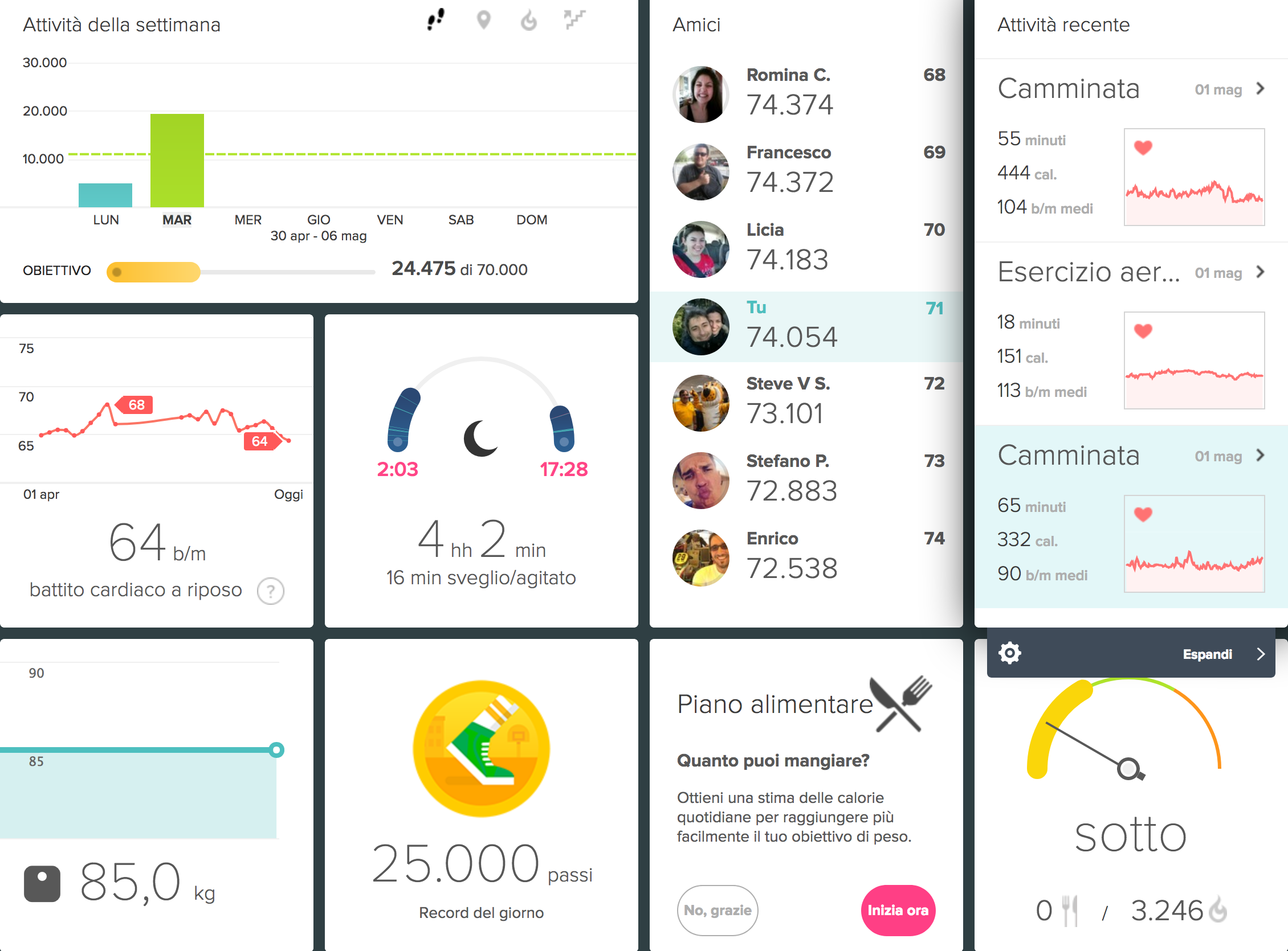
The design is really great and usability is also very good as you can add as many widgets as you want.
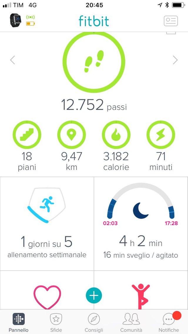
In the same way, the Fitbit mobile app shows also all the info the user needs and the iOS version of the application has even better usability with respect to the Android one I had previously.
nice, upvoted
super interesting! data visualization is critical. Being able to show the raw data in a way the becomes insightful is what makes pure data into a valuable service!
This is a first test for our experiment ;-) showing the change in 24h for the data of yesterday from coinmarketcap. The problem is finding a way to visualize the data in an original way and/or combine it with other data.
very cool! I have in mind a few ratios that are interesting to monitor on a daily basis. The dashboard you shared in the post is great. However, not sure how complex to pull that kind of dashboard might be :)
Collecting the data is not hard.Don't know about the dashboard but for now I can create a report with all the different graphics in .pdf or .html with a reporting tool called R. Just sent you a demo on Skype.