Headmade: Curie logo design contest entry
Hello everyone,
Last week we finally decided to make our agency profile on Steemit, and today we made our first introduction post.
When you are working in the creative industry the act of picking a work that you will show to someone is never an easy choice. So while we had a debate about what should or shouldn't be put on our blog, our colleague who was already on Steemit told us about Curie logo contest.
Now we are new here, but we are very familiar with the Steemit and Curie guild philosophy (our agency will speak about this on a regional communications event this march) so we gladly voted for this as our first task.
On the very beginning, we have to say that this was not an easy one. When we are doing logo proposals we always try to synthesize and reflect the core of the client's identity and Curie really speaks a lot about itself. Whitepaper and other materials were of great help, but there was also important to create the concept that would be applicable in various formats while maintaining core functions:
• Represent the brand identity of Curie guild
• Be easy to recognize
• Be applicable to all present and future materials
We don’t need to say that everything was even harder, because we have to propose alternative to current logo which is (by our humble opinion) excellent!
THE PROCESS
After intensive discussion about the way we should go, we put this questions on our table:
• What should we do with verbal identity and following associations (Maria and Piere Curie, curation process, power of vote, etc.)?
• How should we develop a Curie sign, so it can be applicable o various formats where full logo will not be available (avatar photo for example)?
• What will be the adequate typography?
Soon it was clear that we will have to pick some of them and try to develop the logo that will point out the most important act of Guild – upvoting that can be a key moment of luck that will lead to the success of new Steemians. So we decide to stick to that association and see what will be the final result. We also decide to use heavily modified modern typeface.
It is very important to say that we try to keep our process as a natural extension that reflects the development of Guild itself, so we will try to illustrate this in the following steps:
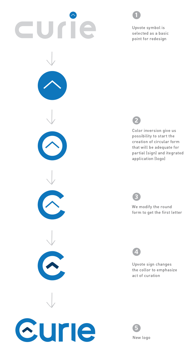
This will help to make different variations in possible applications – without changing the circular round form of sign. We made an simple animated gif to ilustrate you how sign keeps its form in different situations.
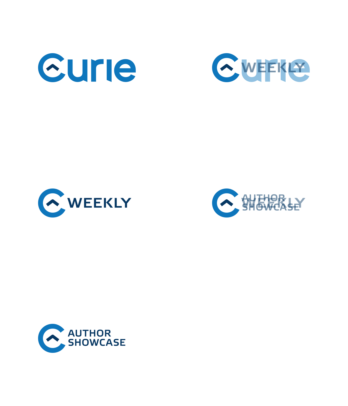
In practice, it can look like this:
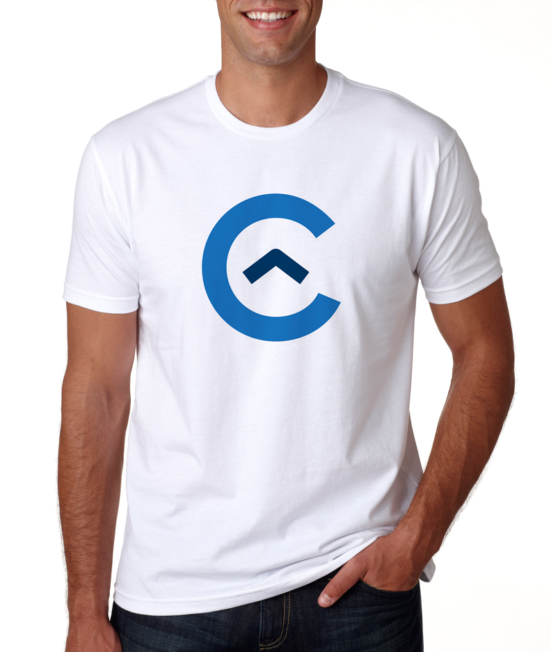
And here is a little mockup because everyone loves T-Shirts :-)
We hope you will like it, and we will be very happy for every comment from the community. Of course – thank you for this opportunity. We have so much fun and we hope this would be a nice beginning of our Steemit experience. If you think that this logo has a potential, we will be happy to develop full application standard guidelines for you.
We wish you all the best in your future work!
