Curie - Logo submission
Hello everyone, this is my submission for the Curie Logo Design Contest.
The following design is the main idea for the logo, after learning about Curie.

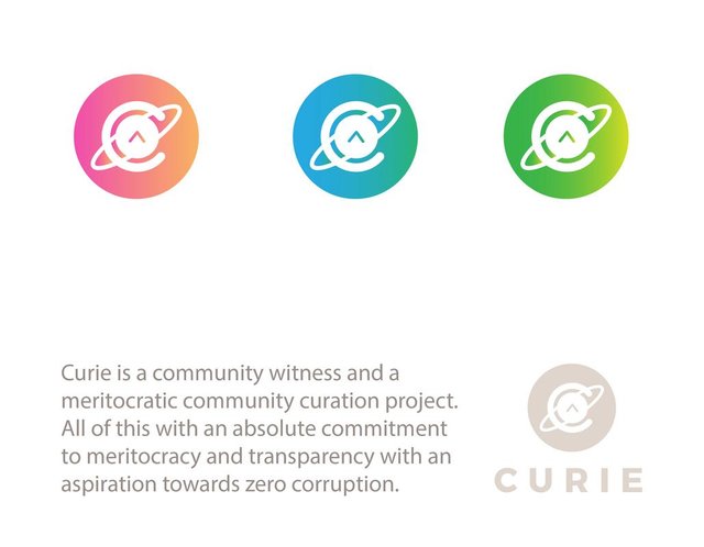
I think the design concept represents Curie's main activity, while every single element is there to achieve that. I think you're wondering what do I mean by that. Well, as you can notice there's a big "C" standing for Curie around the well known upvote symbol which also stands for the Steemit community. While the ring around them, represents the movement and what keeps everything together , it could also represent the curation trail. It also makes you think of chemistry which is directly related to where the community's name comes from, Marie Curie and Pierre Curie.
However, considering the fact that a more compact and circular form is required, the next design where the negative space is being used, could be the final version, though both versions could suit different situations and environments.
I've made three more color variations, so you can see what it would look like, and added a short description of what Curie is, if you want to learn more about the Curie Community here you can find it's whitepaper.
Also let's take a look at how the logo would look on Curie's profile (I'm using busy here):

If you liked my submission you can support me by voting my comment in the Curie Logo Design Contest or you could support another design.
I found out about Curie when I received an upvote from it and it's curation trail on one of my posts, so I want to thank the whole community this way.

Much love,
AlenThin.

Creative logo, it looks commercial and well designed...
I like it ! You have my upvote !
Nice work, have my upvote. I did some designs too, see my blog or contest.
Good luck Alen!!!! I hope you will win!
This is near perfect! Great job!