Adding Grid to your CSS arsenal
Grid Layout is a CSS layout method that is wildly overlooked compared to Flexbox. Both tools aim at providing first-class support for vertical and horizontal alignment. The difference though is that while Flexbox is a unidirectional layout concept, Grid is a multi-directional one.
Come again?
In Flex you will most likely setup a container like so:
.container {
    display: flex;
}
You will then either add
flex-direction: column;
if you want the items aligned in a column, or leave the stylesheet as is to align the items in a row (the default).
As you can see, a flexbox container will organize its items either vertically or horizontally. I imagine this simple unidirectional workflow is a big part of why Flex is so much more popular than Grid. It’s easy to remember the basic rules and, in many circumstances, one direction is all you need.
Enter Grid
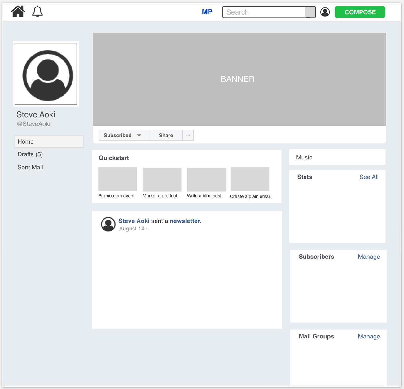
Take a look at the following UI design sketch (figure 1):

If you had to implement this UI, what would be your first step?
...
...
...
If it’s to setup the general layout, that’s what I would do, too. The next question comes to mind.
How would you group the content?
...
...
...
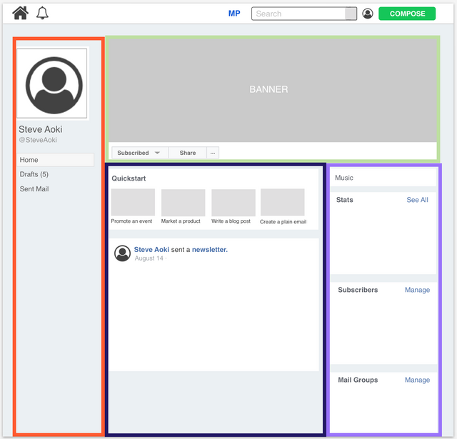
Alright, time is up. This is what I’m thinking (figure 2). I imagine it is the most flexible considering the content on the left, right, and center could potentially extend far down.

Let’s see how Grid comes into play. I went ahead and wrote a codepen for the bare-bones layout: https://codepen.io/alien35/pen/oozgrW
As you can see, Grid can be simpler than Flexbox for situations like these. This is all the HTML youneeded:
<div class="wrapper">
  <div class="left-content"></div>
  <div class="header"></div>
  <div class="center-content"></div>
  <div class="right-content"></div>
</div>
With one single Grid container you can manage the vertical and horizontal placement of the content. With Flexbox you would need a couple more Flexbox containers.
As for CSS (SCSS), it’s fairly succinct as well:
.wrapper {
  display: grid;
  grid-template-columns: 250px 450px 200px;
  grid-gap: 10px;
  grid-template-rows: 300px 200px 200px;
  .left-content {
    grid-column: 1 / 2;
    grid-row: 1 / 4;
  }
  .header {
    grid-column: 2 / 5;
    grid-row: 1 / 2;
  }
  .center-content {
    grid-column: 2 / 4;
    grid-row: 2 / 4;
  }
  .right-content {
    grid-column: 4 / 5;
    grid-row: 2 / 4;
  }
}
Alright, there are a few new CSS tools you’ll need to remember, but there’s plenty of documentation and, best of all, it was logically conceived.
Take those slashes for instance. The slashes separate the ‘start’ values from the ‘end’ values. To understand what is happening, my approach is the following: I look at all the grid-column ‘end’ values. Whichever is highest denotes how many columns my grid has. In this case there are five. With the same logic, it becomes clear that there are four rows. With that understanding in mind, changing a Grid child’s placement becomes a fairly trivial task. Just change its ‘start’ and ‘end’ values relative to the 4 x 5 Grid.
The elephant in the room
But what about cross-browser compatibility?
I imagine this document regarding browser compatibility will update with time: https://developer.mozilla.org/en-US/docs/Web/CSS/CSS_Grid_Layout/CSS_Grid_and_Progressive_Enhancement. As of right now, however, all browsers are supported and most don’t need prefixes. IE and Edge will need the ‘-ms-’ prefix. The other major browsers should work out of the box.
Congratulations @alien35! You received a personal award!
You can view your badges on your Steem Board and compare to others on the Steem Ranking
Do not miss the last post from @steemitboard:
Vote for @Steemitboard as a witness to get one more award and increased upvotes!