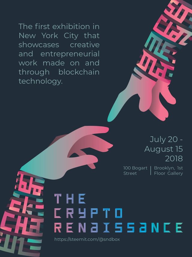
My entry poster for The Crypto Renaissance Design Competition
Hello steemians, this week I wanted to participate in The Crypto Renaissance Design Competition by @sndbox, for which I had to leave a bit my comfort zone and do something I had not done before, a poster!, although I usually do illustration I don't have experience in graphic design, so I opted as much as possible to stay true to my field and gave my best to do something I could be proud of, and I am happy to share with you the result, I hope you like it.

You will notice that I opted for a design comprised mainly of an illustration, I admit that it was very difficult to think of a way to graphically represent something as abstract as blockchain technology and I ended up choosing a simple illustration inspired by the word "renaissance" (part of the exhibition name), that is why I chose to use a fragment of the painting of the creation of Adam by Michelangelo, with the idea of representing the union of blockchain technology and social media because this is the first steem-powered exhibition in New York.
You can Know more about this awesome exhibition in their announcement post.
Let's talk a bit about the process
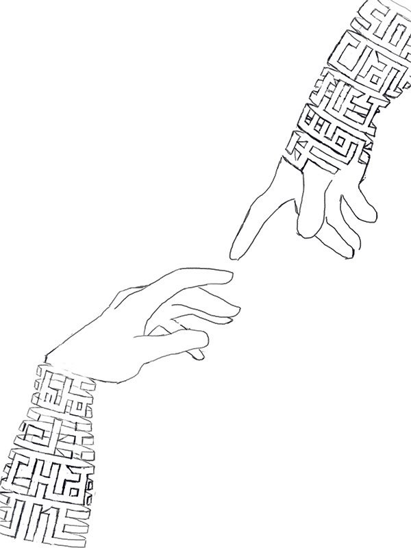
The first thing I did was a sketch in photoshop to check if the idea worked, in doing so I tried to be as detailed as possible to facilitate the task of vectoring it, and once happy with the sketch I imported it into Adobe Illustrator.

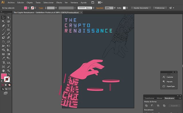
Already in Illustrator I made a model thong using two ovals and a rectangle, which I copied and modified to make each one of the thongs of both arms always coupling to the sketch and once I had all the basic shapes, I started to cut and draw the necessary sections to form the letters.

When I finished vectoring, I started coloring with gradients, I tell you that it was the first time I did it, so I had to watch several tutorials, until i made it work.
When incorporating the texts I had many doubts about how to distribute them in the negative space, what kind of font use and what color, I still do not have much knowledge of graphic design and composition, but I did what I could, the layout of the texts can be subject to changes.
Congratulations! I like your idea very much!
Thank you so much! I like your work too :)