Cryptocurrency Data Analysis Part I: Obtaining and Playing with Data of Digital Assets
The word “cryptocurrency” has taken the financial world by storm, and yet there is a lack of formal and open research being conducted on the data of the digital assets. Personally, being a cryptocurrency investor and a data scientist, I am fascinated by studying this nascent asset class under the microscope of data analysis and machine learning tools in order to guide my investment decisions.
These series of tutorials will hopefully bridge the gap between data scientists and realm of cryptocurrency; vice versa, non technical crypto traders will be able to use this as an opportunity to acquire some directly applicable coding skills. Our data will come from Poloniex.
Setting up the research environment
We will be using Python 3 and Anaconda Environment throughout the series. Before we embark on scraping crypto data, follow instructions to install Anaconda, the package management tool. The link will take you to Continuum Analytics website that will install both: the Python interpreter and the packages that we will require. Particularly, we will be taking advantage of Pandas library and Jupyter Notebooks, two of the most awesome tools for hacking around with data.
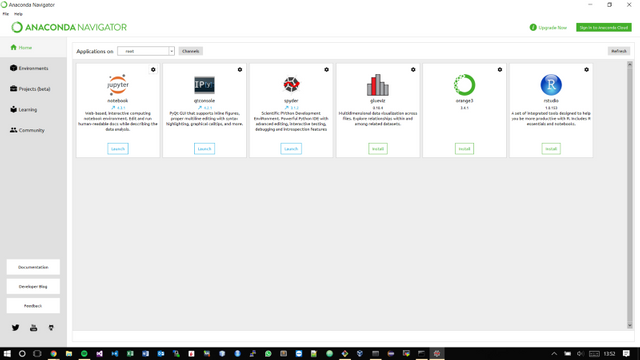
When you are done installing the environment, search your system for Anaconda Navigator, open it.

When inside the navigator, click the launch button beneath Jupyter Notebook icon.
This will open root window of Jupyter in your default browser. Create new Python 3 Notebook by clicking on the respective option in the New drop down menu.
This will take you to the notebook. This completes the setup of our research environment.
Scraping the Data
Import pandas library, type and run:
import pandas as pd
To run a code cell, either press Play button located at the top panel or press Shift+Enter.
Also run:
%matplotlib inline
This will make visual plots appear inline without further calls to show the plot.
Poloniex uses JSON or JavaScript Object Notation to communicate its Open, High, Low, Close, Volume (OHLCV) historical data with outside world, which is pretty much the standard of data transfer for the majority of crypto exchanges:
{"date":1483920000,"high":916.41833046,"low":880,"open":916.41832969,"close":902,"volume":1561326.5181909,"quoteVolume":1743.42476903,"weightedAverage":895.55141462}
The problem with JSON is that it is quite tedious to unpack and sort it into arrays manually. If you were to do it manually, you’d have to query each object like a Python dictionary and sort the values into arrays. Thankfully, pandas library has pd.read_json() function that will do all the sorting and datetime conversions. We are ready to write our data fetching function, which will take in a symbol and bar frequency and return pandas dataframe containing the time-series of a given cryptocurrency from the first available date:
import pandas as pd
def CryptoData(symbol, frequency):
#Params: String symbol, int frequency = 300,900,1800,7200,14400,86400
#Returns: df from first available date
url ='https://poloniex.com/public?command=returnChartData¤cyPair='+symbol+'&end=9999999999&period='+str(frequency)+'&start=0'
df = pd.read_json(url)
df.set_index('date',inplace=True)
return df
Now, lets see it in action! Let’s fetch daily bitcoin - USD close data. In the next cell, type:
df = CryptoData('USDT_BTC', 86400)['close']
Now run it. Note that if you remove ['close'] from the end of the call, you will get the full OHLCV bar data.
Getting the First Look
You can inspect the head of the dataframe by typing and running df.head() :
date
2015-02-19    244.00
2015-02-20    240.25
2015-02-21    245.00
2015-02-22    235.00
2015-02-23    235.00
Name: close, dtype: float64
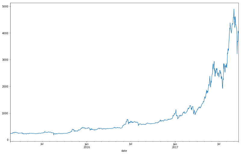
To visually inspect the historical time-series, type df.plot() . You will get a plot of price history as an output:

That’s good and pretty, but we do not get much information from that plot. Pandas lets you do a lot of quick and dirty analysis by chaining method calls on a dataframe. For example, you can get descriptive stats of the series’ percentage returns by typing df.pct_change().describe():
count    943.000000
mean       0.003689
std        0.038105
min       -0.318834
25%       -0.009105
50%        0.003074
75%        0.018144
max        0.270148
Name: close, dtype: float64
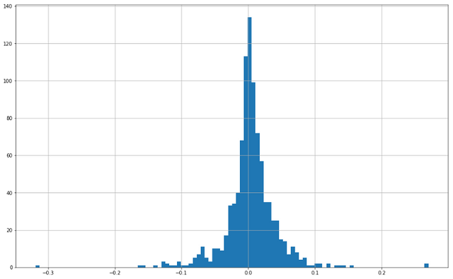
As expected, bitcoin is very volatile, but can we visualise it? We can plot histogram of percentage returns in one line: df.pct_change().hist(bins=100) Which yields the following graph:

Now we can visualise bitcoin’s fat tails.
Hopefully, this has given you a taste of things to come in the series. Feel free to experiment with the data fetching function and pandas library. Try and fetch data for other digital assets by changing the symbol string in the function call or try plotting different historical time-series, by simply calling .plot() on the dataframe.
Please leave your comments and feedback below.
Happy coding!