Cryptofolio experiment with 2 new chart lines!!! Update 22/01/2018
After a month of data crunching and interesting results, I felt like something was missing.
I've noticed that the top 100 and top 50 are producing the most profitable results. And I decided the expand the experiment in more detail. I've created 2 more chart lines. One follows the movement between top 50 up to top 100 (50 coins) and the other one from top 25 to top 50 (25 coins)
I've created a small formula in excel instead of adding a new portfolio(this would be ridiculous complex because the price is based on a starting date en marketcap order). Another advantage of the formula is that I can calculate each previous entry point of the graph.
After completion you can see the immediate result: HANDSDOWN the top 50 up to top 100 generates the most revenue!!!
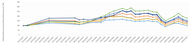
Cryptofolio experiment 22/01/2018
Other posts:
-Introduction: What happens if I Invest in each top 100 coin?
Follow me on TWITTER!