Crypto Guide For Non-Technical People: Looks
After a week of vacation, let's get back on crypto with a less serious undertone. It was a rough week, which I luckily could sit out from the sidelines, so today I will only look at something that almost has nothing to do with the tech. This is my take on the best looking icons/logos in crypto.
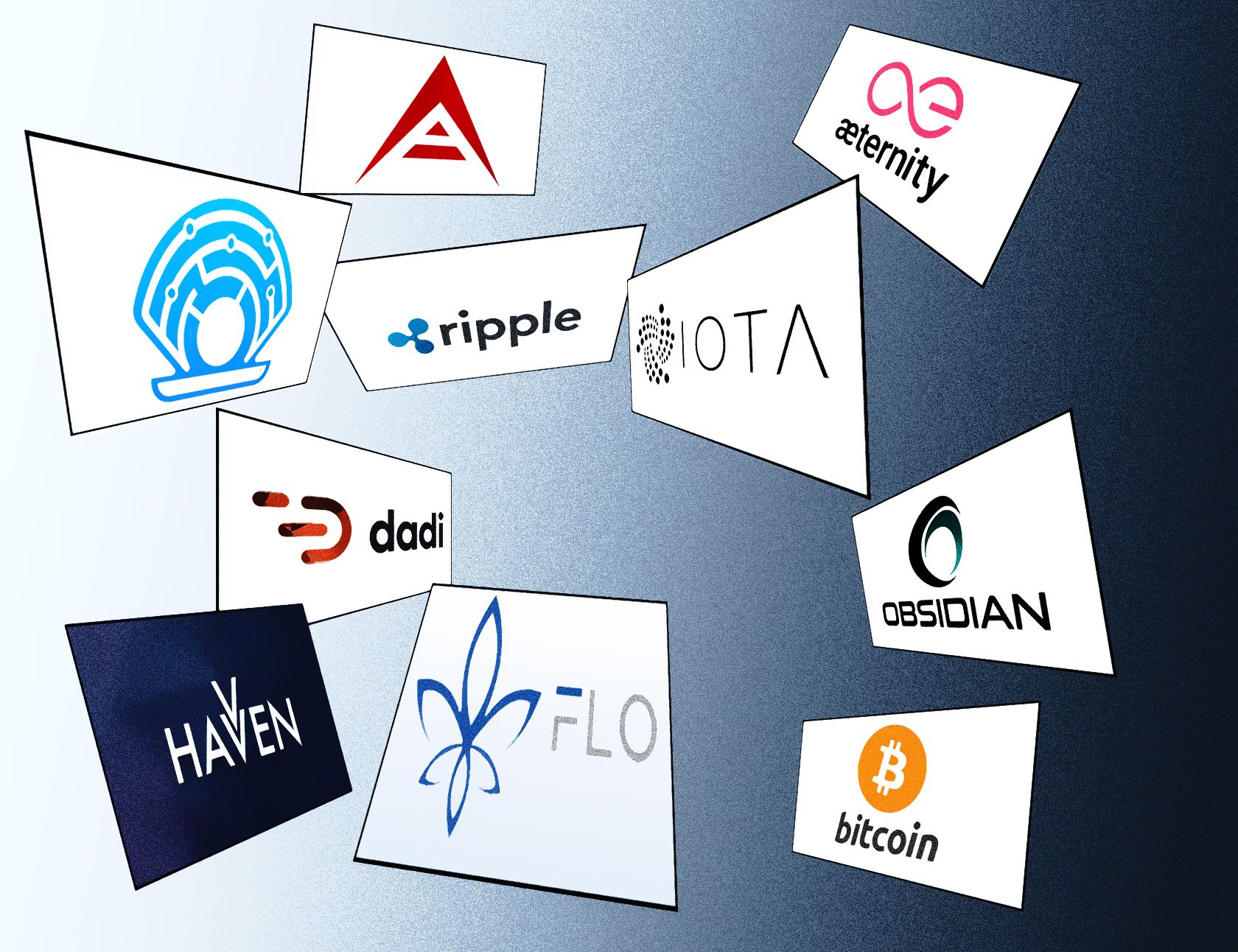
While I know this is something of personal taste, if you ever should invest in a coin judging by the looks, this would be my recommended Top 10:

10. Havven (HAV)
Simple yet effective. Havven, written with two V's, uses this odd grammar in their logo and icon as well. The stacked V's are instantly recognizable. The navy color used in most of their communication compliments the look.
9. Bitcoin (BTC)
Everyone looking at the Bitcoin-logo knows instantly that this is a payment method, a coin. The use of the two bars on the B are a referral to other coin symbols (like U.S. Dollar). Also the use of the light orange is something very recognisable.
8. Ripple (XRP)
Three interconnected dots, representing ripples in the water. Simple, but easy to remember. The rounded font chosen by Ripple adds to the image.
7. Dadi (DADI)
A stylized D, almost as if it is in motion. Very recognisable logo, and an interesting choice of color, with the brownish orange. The font DADI uses looks very similar to the one of Ripple. Guess I like fonts with a belly.
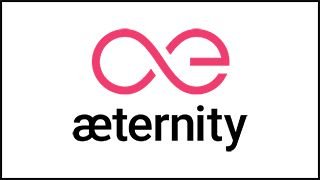
6. Aeternity (AE)
It's almost too easy to think of. You name your coin Aeternity, take the symbol for eternity and change it somewhat. Than you end up with this. But the simplicity makes it genius. The way 'AE' is integrated in the eternity symbol is very stylish. The choice of color for pink is brave, and distinguished.
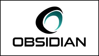
5. Obsidian (ODN)
The font and logo look robust, like the source it's referring to. Obsidian is volcanic glass, originating from the lava of a volcano. The glass in real life has a greenish black look, which also is featured in the logo. The circles represent a simplified form of the Obsidian. Besides the name, this logo just looks bad ass.

4. Oyster (PRL)
Naming your currency Pearl, deriving from a protocol named Oyster, and the logo has drawn itself. What I like about the restyled Oyster logo is the simplified form of an oyster containing a pearl, but also has a techy feel with the connected dots.
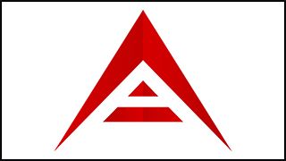
3. Ark (ARK)
Fierce, spikey, almost looking like a spacecraft, or the helmet of Darth Vader. The stylized A of Ark is an eyecatcher. The red color always gives contrast, on both dark and light backgrounds, and with some imatination you could also see the logo as a sign of things to come. The only way is up.
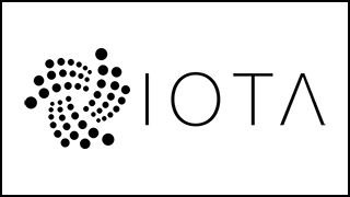
2. IOTA (MIOTA)
There's movement in the logo of IOTA, just like they have in mind with their own alternative for blockchain, the Tangle. The thin font chosen to write the name IOTA looks great besides the dotted icon as well. IOTA in Greek means: an extremely small amount, which can be linked to the scalability of the currency.

1. FLO Cash (former Florincoin) (FLO)
When it comes to design and look, I would've put all my money in Florincoin, now rebranded to FLO Cash or FLO coin. The logo is a stylized version of a lily, which appears in many coats of arms, especially in that of the city Firenze (Florence) in Italy. The whole thing just looks awesome. If their currency can take the top spot in value as well remains to be seen...
The Ugly Ducklings
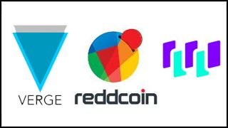
In contrast to the double V used right bij Havven, Verge (XVG) did it the wrong way. The logo looks just to simple, despite that it stands for a public blockchain, with an overlying private one. Besides that, if you see it next to your coins in an app, it may scare the sh## out of you, because it looks like an arrow pointing down, which never is a good sign when money is involved.
Reddcoin (RDD) just looks, ehm, awful. It literally is a red coin, put in some colorful piggy bank. It doesn't make much sense and looks like a color blur when scaled down. Maybe this one could've been thought out a bit more. At least the Verge one still has a meaning.
Waltonchain (WTC) restyled their logo, and I really wonder way. It's gone from okay to pretty damn ugly. The choice of colors is odd, which is done delibirately by the designers, but it just doesn't work. Also, the odd-colored blocks look very simple, and the image gets worse when scaled down. In case of looks, I would recommend staying away from this one.
Do you agree or disagree? Do you have suggestions of other good or bad looking logos in crypto? Please share your view in the reply.
For future viewers: price of bitcoin at the moment of posting is 8517.00USD