Cryptocurrency day trading: How to get started & how to win
Cryptocurrency day trading: How to get started & how to win
At some point or another most of us have probably thought about cryptocurrency day trading. The idea of actively making a profit every day certainly sounds appealing, but many people often jump in without doing enough research and end up getting burned. Luckily, if you want to day trade Bitcoin or other digital assets you can benefit from decades of people trading stocks and all of the experience and tools that have developed alongside them. Most of the concepts of trading stocks, and especially the FOREX market, can easily be applied to trading crypto and Bitcoin as well. Let’s take a look at what crypto day trading is, how to get started, and what tools we can use to gain an edge.
In this article we’ll be discussing the following topics:
What is day trading?
Is crypto day trading for me?
What are some day trading strategies?
Basic tools for day trading crypto
Advanced tools for mastering crypto day trading
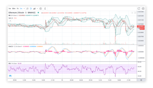 Chart of the Binance ETH-BTC market
What is day trading?
Day trading is simply the buying and selling of assets within the same day. There are many different strategies and approaches that can be considered crypto day trading, but they all have a goal of holding short-term positions and making small but consistent profits.
Is crypto day trading for me?
There’s no such thing as easy money, if you’re looking for a fast and easy way to make money cryptocurrency day trading is not for you. Successful trading requires hard work and a lot of learning and the majority of traders aren’t successful, that’s just a fact. Most traders also aren’t putting in the time to learn to trade properly. Experienced, career traders can consistently make more profits than losses and use it as a sustainable source of income. If you’re willing to learn a new skill and you’re ready to dedicate time each day towards trading or learning, crypto day trading might be just the thing for you.
What are some day trading strategies?
Every person has their own strategy that develops in accordance with their accepted level of risk, how much time they can dedicate towards trading each day, and a number of other preferences. Each person is unique and it’s up to you to experiment until you develop a system that works for you. That said, there are some popular strategies that are widely established and have plenty of learning resources available online:
Swing trading crypto involves using technical analysis and charts to identify trends and profit off of them. Traders might be holding an asset for a couple hours to a couple weeks. Crypto markets have historically gone through periods of high volatility so if you want to swing trade Bitcoin there are plenty of opportunities to do so.
Scalping crypto involves making a large number of trades a day and often holding assets for only a few seconds or minutes. The goal is to buy and sell on very short price fluctuations and make a lot of small profits.
Crypto arbitrage involves exploiting price differences between assets or exchanges. One popular approach is spatial arbitrage, in which you buy an asset on one exchange and sell it for a higher price on another exchange. Another approach called triangular arbitrage involves exploiting price differences across multiple trade pairs on a single exchange, such as trading BTC for ETH, then ETH for LTC, then LTC back to BTC. You can read more about how cryptocurrency arbitrage works in our blog post: How to Profit From Crypto Arbitrage Trading.
Basic tools for day trading crypto
The world of trading securities has developed tons of tools that we can use to analyze the markets and help find trends. Day trading Bitcoin and cryptocurrencies is all about being able to identify important information quickly by assessing order books, candlesticks and other market data. If you don’t have a full understanding of how order books work yet you should stop right now and read this great article: Breaking Down How Crypto Exchanges and Order Books Work.
Candlesticks & volume
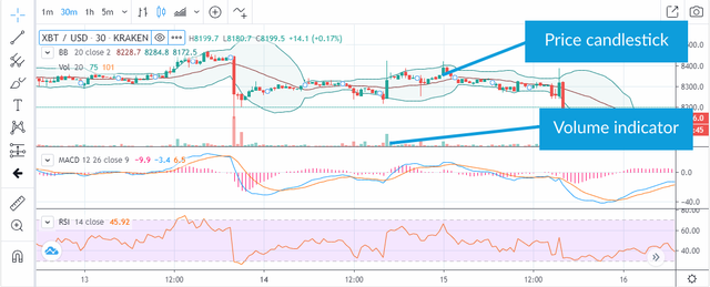 Example of a candlestick chart
Each candlestick has two pieces, a vertical line and a vertical bar called a body. The top of the vertical line is the highest price during that interval (5 minutes in the example below), and the bottom of the vertical line is the lowest price during that interval. When you view a chart you can typically choose intervals ranging from as small as 1 minute to as large as 1 month or more.
The ends of the vertical bar represent the open and close prices, meaning the price at the beginning and end of the interval respectively. The body is red in color if the close was below the open, meaning the price went down during that interval. The body is green in color if the close is above the open, meaning the price went up during that interval.
Volume is visualized with vertical bars, each representing the total amount of assets/coins traded on that market during the specified interval. The color of the bar is simply the same as the color of the price candlestick: green if the close was higher than the open (the price went up), and red if the close is lower than the open (the price went down). An increase in volume can mean that there is more interest in an asset as more people are trading it, and can help identify when price movements are beginning to happen.
A large increase in volume after a price has been moving in a downwards trend can mean that many people think it’s hit a low and are now buying. This buy pressure has the possibility to cause a reversal and send the price trend upwards.
Inversely, alarge increase in volume after a price has been moving in an upwards trend can mean that many people think it’s hit a high and are now selling to take their profits. This sell pressure has the possibility to cause a reversal and send the price trend downwards.
Chart indicators: RSI (Relative Strength Index)
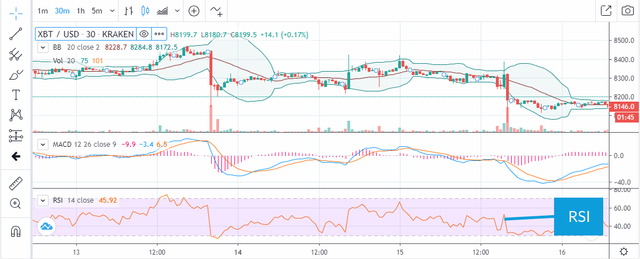 Example of an RSI indicator
RSI is a momentum indicator that looks at recent price movements to help determine if an asset is overbought or oversold. If an asset is overbought, a reversal downwards is possible (but not guaranteed). If an asset is oversold, a reversal upwards is possible. It’s displayed as a single line with values between 0 and 100, and the range between 30 and 70 is highlighted a different color with a dashed line at both 30 and 70. This is because an RSI ≥ 70 is considered overbought (the price can be expected to go down shortly), and an RSI ≤ 30 is considered oversold (the price can be expected to go up shortly), so this highlighted region makes it easy to quickly see if either is true.
Chart indicators: MACD (Moving Average Convergence Divergence)
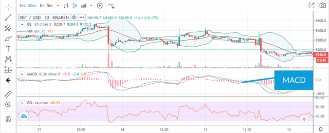 Example of a MACD indicator
MACD is a trend-following momentum indicator that can help identify and predict upwards or downwards trends in price. It compares the 26-period EMA (Exponential Moving Average) to a 12-period EMA. EMA is a moving average of the price that places a higher significance on more recent price changes than older price changes, helping to determine recent trends.
The MACD is visualized in three parts:
MACD Line — typically blue in color, this is a subtraction of the 26-period EMA and the 12-period EMA.
Signal Line — typically orange in color, this is a 9-period EMA of the MAD line’s values. This acts as a trigger for buy and sell signals.
MACD Histogram — The MACD histogram is the pink bars along the 0 line. This represents the difference between the MACD Line and the Signal Line.
You’ll want to see how the MACD line (blue) and Signal Line (orange) move with respect to each other. When the MACD line (blue) crosses over to above the Signal Line (orange) and the histogram value is increasing, many traders consider this a signal to buy as a reversal in momentum has started to happen.
Similarly, when the MACD line (blue) crosses over to below the Signal Line (orange) and the histogram value is decreasing, many traders consider this a signal to sell.
Chart indicators: Bollinger Bands
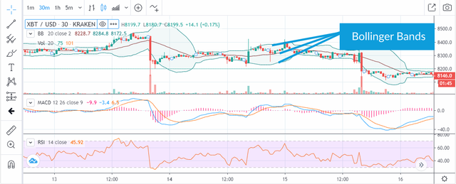 Example of Bollinger Bands
Bollinger Bands are an indicator that use a set of lines plotted two standard deviations (positively and negatively) away from a simple moving average (SMA) of the asset’s price. There are three lines: a basic moving average (the middle dark red line), and an upper and lower band (the green lines above and below). The are between the upper and lower band is highlighted with a light green background, creating the “band”.
Many traders believe that the price will tend to try and stay within the band. So if you see the price nearing the top of the band, some believe that it’s probable the price will start moving back down to stay within the band.
When the upper and lower bounds get closer together, making the band become more narrow, this is called a “squeeze”. This marks a time period of low volatility, and many traders believe this can be a signal that an increase in volatility may be coming soon. The opposite is true as well, if the band becomes very wide this signals a time period of high volatility, and many believe this can be followed by a decrease in volatility.
Most trading activity occurs with the price between the upper and lower bound, within the band. When the price breaks outside the band this is called a “breakout”. This is a significant thing to occur, but it doesn’t signal whether the price will move up or down.
Depth charts
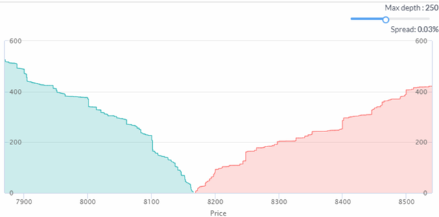 A depth chart
Depth charts are a very common tool for visualizing open bids and asks in an order book. On the left we see a green area chart representing all open bids(buy) orders. On the right we see a red area chart representing all open ask (sell) orders. On the bottom Y axis we can see the price, and where the two charts converge is the last traded price. So looking at the depth chart above, we see the last traded price (the current price) is around $8,165. Each area chart increases its height according to the overall sum of open orders up to that price. So if you see a large vertical increase in either chart, that means one or a few large orders are set at that price. Depth charts allow us to easily visualize where other traders are opening buy and sell orders, which may indicate where other people think the price may move, or where areas of resistance may be.
A large vertical increase on either side is sometimes referred to as a “buy wall” or “sell wall”, because it looks visually like a wall. If you see a large vertical increase on the buy side, such as at around $8,100 on the chart above, that means that if the price moves down and eventually reaches $8,100 a lot of BTC will have to be sold at that price before the price keeps moving downwards. In this way, a trader or group of traders with a lot of money available can create large orders that make it difficult for the price to move beyond a certain point.
Advanced tools for mastering crypto day trading
Now that we’ve covered the basics, let’s take a look at some more advanced tools that we can use to gain an edge while day trading. Coygo Terminal is a secure advanced crypto and bitcoin trading platform that provides all of the above charts and indicators as well as a number of other tools, so let’s dive in.
Order Book Superiority
Order Book Superiority is something that isn’t common in the world of crypto, but it can be a powerful tool to quickly assess which direction other traders and trading bots think the market may be moving by analyzing the current state of the order book. Coygo Terminal, a multi-exchange crypto trading app, provides a great view of Order Book Superiority so I will be using that in the examples below.
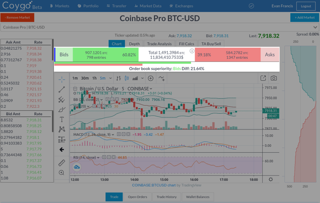 Order Book Superiority in Coygo
Order Book Superiority in Coygo Terminal takes all open bids (buy orders) and asks (sell orders) within 5% of the last traded price, and calculates both the sum of orders as well as the total number of orders. Sum gives us how much overall value is waiting to be bought or sold in open orders, and count lets us know how many buy and sell orders there are. Green is used for all bid (buy) numbers, and red is used for all ask (sell) numbers. The bar graph below let’s us quickly visualize the difference between total sum of bids vs asks, with the percentage difference below it. In the screenshot above, we see “Order book superiority: Bids Diff: 21.64%”. This tells us that there is more money in open buy orders than open sell orders within 5% of the last price.
When there is a big difference between bid vs ask sum, this can mean that there is more interest by other traders in either buying or selling. If significantly more money is tied up in sell orders than buy orders, that may show that people are predicting the price is moving downwards .
When there is a big difference between bid vs ask count, this means that more individual traders are trying to buy or sell. If there is a higher bid sum, but a much higher count of ask orders, that may mean that there is only one or two large bid orders that are skewing the superiority, which can easily be cancelled to change the superiority. This is one way that other traders or bots can manipulate order books to make it appear like there is more interest in buying or selling than there actually is.
Trade Analysis
Now let’s look at another tool provided by Coygo Terminal: Trade Analysis. If order book superiority is looking at the future with open orders, Trade Analysis looks at the past with recent public trade activity. View trades as they occur in real-time and analyze recent trade activity on any exchange or market that Coygo supports. Compare recent buy vs. sell order count, and buy vs. sell cumulative sums on any market.
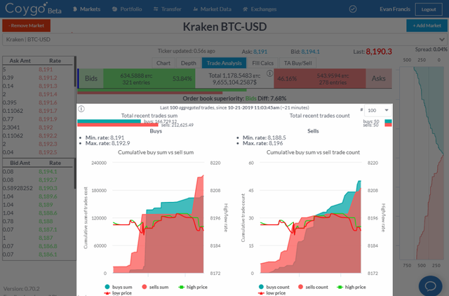 Trade Analysis in Coygo Terminal
On the left we see an area chart of the cumulative buy vs sell sum over time, with the high and low price for each interval overlaid with green and red lines. Above we see a bar chart comparing the total buy and sell sum. On the right we have a similar display, but this is for the cumulative buy vs sell count.
One great use of this is to spot if a large increase or buy or sell volume is organic from a number of traders, or from a large order by a whale. If the cumulative sum of buys drastically increases over a short period of time, and the count of buy orders during that time period stays relatively the same, that tells us that one or a few large buy orders were made
If there is a higher cumulative buy sum than cumulative sell sum (on the left chart) and they begin to converge, this can mean that sentiment is changing as more value was previously being bought but now more value is being sold. Combined with other indicators, this can be a powerful tool to quickly assess where the momentum is moving.
Crypto arbitrage scanner
Arbitrage trading is a common strategy for day traders, regardless of which asset class they’re trading. If done right it can guarantee a quick profit, but tracking down the profitable spreads and acting on them quickly is key to success.
Finding spreads (differences in prices) across exchanges requires monitoring a number of exchanges simultaneously and doing the math to determine which is the biggest spread. Doing this manually can be a tedious and slow task, in reality this isn’t feasible. For that reason it’s always best to use a tool that can help quickly find and assess arbitrage spreads as they can change very quickly. Again Coygo Terminal provides a great solution for quick arbitrage scanning, so I will use that for my example.
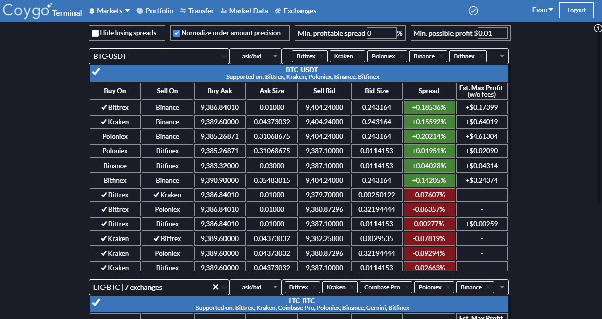 Coygo Terminal’s Arbitrage 2.0 scanner
As seen above, with Coygo Terminal’s real-time arbitrage scanner you can monitor prices and spreads in real-time across multiple trade pairs an exchanges. The largest spreads are highlighted with darker colors. Profiting from arbitrage requires quick thinking and action, with Coygo Terminal you can find arbitrage spreads, submit trades to multiple exchanges in parallel, and transfer between exchanges all from the same interface.
Worried about slippage or speed of submitting arbitrage orders? Capitalizing on arbitrage spreads is all about speed, as they may only exist for less than a couple of seconds. Coygo Terminal has three options to help maximize profit without incurring slippage and submit orders as quickly as possible. These can be seen in the GIF above:
Largest w/o slippage — Automatically sets both accompanying buy and sell orders to the largest order amount possible without incurring slippage.
Limit to max available — Limits order sizes to what’s available in your wallets on either exchange.
Set max amount — Allows you to set a maximum order size amount.
For example, you can set your order configurations to enable Largest w/o slippage and Set max amount with a max of $200 worth. Your order amounts will be updated in real-time whenever the order books update, so when you a profitable spread appears you can simply click “Submit buy & sell orders” and submit them as quickly as possible without ever having to waste time manually configure the orders yourself.
Best of luck!
Whether you’re day trading Bitcoin, swing trading crypto, attempting crypto scalping, arbitrage, or any other short-term trading strategy, there are plenty of tools at your disposal if you’re willing to spend the time to learn them. If you’re committed and ready to work hard, day trading cryptocurrencies can be an exciting and lucrative endeavor. Best of luck!
original source https://www.coygo.app/blog/posts/cryptocurrency-day-trading-how-to-get-started-how-to-win/