Calling For Graphic Designers On Steemit: Who Wants To Create A Logo For @surfermarly's Blog? [Design Contest Rewarded With 250 SBD 🤑🤑🤑]
Creativity is the process of having original ideas which have value. - Ken Robinson
Let's prove that, Ken.
I need some creative help!
It's been 15 years now that I studied Computer Science in Media. At that time I was even able to design 3D animations.
But I got out of practice 😏
I want a nice logo for my blog, so I thought the best way to get one might be to advertise a design competition on steemit.
Graphic Designers on steemit, where are you?

The Design Competition
As we learned in the very beginning of this article, creativity is valuable.
That's why I'd like to organize this pitch as a design competition.
The winning logo will be rewarded with 200 SBD and the most popular with 50 SBD 💰💰💰
These are a lot of doughnuts, so a real sacrifice for me!
If one of your blog posts generated a payout of $200 it would currently bring you on steemit's trending page. So I thought rewarding a creative performance like that would be pretty fair.
Are you motivated?
The rules of the game
- The creation needs to include the word surfermarly.
- There are no specific rules regarding coloring, font style or design in general. However, the whole 'world of surfing' should be somehow reflected in the logo. Think about the ocean, the beach, sun, surfboards, etc.
- Bear in mind that the logo will be the basis for a further logo animation I need for my videos. So think about having a version with a transparent background that might be used in my vlogs.
- The format needs to be suitable for the usage in any digital medium. If you could provide even a vector graphic, this might be contributive during the selection process. So: mention it! The logo needs to be scalable (300dpi resulution) in any case.
- The logo needs to be a 100% original creation, NOT including any third party elements (and related copyrights).
- All proposals need to be submitted by publishing them in the comment section of THIS article. If you want to do a separated blog post to promote your entry, do it! But don't forget to drop the logo here anyways. We need them all present on one page!
- Of course, other users can upvote the submissions then. However the logo that receives the most upvotes doesn't need to be necessarily chosen as winning creation.
- If the most popular logo (most upvotes from other users) wasn't the winning logo, I would reward it with 50 SBD. Then the winning logo would receive 200 SBD and the most popular logo 50 SBD. If the winning logo was the most popular, too, the creator would receive the full reward of 250 SBD. So go get your friends voting for you! 😉
- All proposals have to be submitted until next Thursday 17th of August 2017.
- The winner will be announced on Monday 21st of August 2017.
- Once elected the winner, the creator assigns and transfers the full right of use to @surfermarly.
EDIT (10th of August, 9:30 pm UTC): Since I've been asked several times in the comment section: the style needs to be 100% surfermarly. What does that mean? @rubenalexander designed a card for me yesterday that perfectly fits in. So this might be a nice orientation (not a must) for you regarding style/coloring:
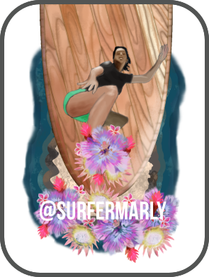
EDIT (10th of August, 9pm UTC): In the unexpected event of not receiving any valuable proposal, I reserve my right to not reward any of the participants. Submissions need to meet a professional standard as well as ALL of the above mentioned general rules.
Did I miss something? Do you have any questions? Are you ready?
Well then let's have some fun though!
I'm excitedly looking forward to the results!
Please let me know if you have ANY questions on the contest.
Best of luck to all the participants!
Marly -
Usually I don't ask for resteems, but in this case I'd really appreciate if you shared the article with your friends. The more creatives, the merrier! THANK YOU!!! 😍

This banner was designed by the talented @rvanstel. Contact him for more info.
Original content. Quote found on gambarkatakata.xyz.
OOo I'll have to see if I can come up with something fun for you! Maybe I'll hand draw it :)
Hehe, sure! But for the competition it needs to be a scalable digital format, preferred a vector graphic.
Per your request, the image is a vector file. I hand drew this wave, so it is one of a kind! I thought I would go with a more subtle look and have your name surfing the wave. :) Hope you enjoy my work! Thanks for holding this competition, it has been a lot of fun.
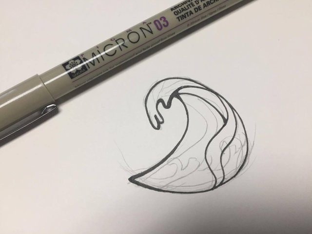


I love the simplicity and power of this design
Wohoooo! So you hand drew this??? Insane!
Every day I get more and more surprised about how many talented, creative and inspiring people we've got on this platform. Amazing!
Thanks for the entry, it's realy beautiful! So how did you know that turquoise is my favorite color? :-))
awww heheh That's my favorite color as well :) Glad you liked my work. I put a lot of thought into it! :) Thanks again for the awesome challenge. :)
Simple, sweet and wavy. ;)
That's the beauty. Unveiling the true wealth and depth of the steemit community is ......
hehe just made a blog post about your logo competition :) Hope you enjoy the read.
Thank you alot. Would love to see you join the steemgigs community as well on discord: https://discord.gg/CGuPyyT
Oh... Do you mind explaining to me more on that? I'm not familiar.
hehe for sure! :)
Thank you very much for your participation, @karensuestudios!!!
Here's the winners announcement if you are interested in having a look at it:
https://steemit.com/creativity/@surfermarly/proudly-presenting-my-new-surf-brand-announcing-steemit-s-design-contest-winners
Yes! Finally ended up with something I am satisfied with.
It is going to be a tough competition, I have seen some amazing entries here in the comment section.
Here's mine!
After a fight, I turned the Steemit logo into a fancy circular wave (but subtle so this logo can also be used on platform other than Steemit) and managed to place @surfermarly right in it! That's right - she's surfing on Steemit and on waves.
Hope you like it!
The best one by far!
Good luck @sjennon!
agree!
Wow thank you so much guys <3
Hehe, you just did something really amazing :-)
<3 yay!
Best detail in your own post:
Haha, yeah! :-D
HAHA, yes!
Thank you knircky for supporting #steemgigs. Tips make the whole #steemgigs experience top-notch
You are right. But you just killed it :-)
Can't make any decisions so far since the competition will run a few more days. However, I can tell that this one will be at least close to no. 1.
Love it!!!
Thank you so much.
Have a great start into the weekend @sjennon! :)
Ah thank you! I am really glad you like it :D
I would like to thank @firepower for his luv which inspired me :') I was stuck with it for awhile but then I ended up with this!
Well it seems that he did a really good job :-))
Yes apparently xd
I really like this one. Great job.
Looking at the letters of the font, almost every letter leans forward like a wave just about to break.
Thanks for noticing! I actually tried out a couple of fonts. Some more square than the others, but I found this playful one the most fitting with both the logo and the ambience of the surfing scene :)
I said I will participate, but I only participate if Im able to win and this @sjennon girt just hit it out of the park. Cant compete, sorry.
I would only love to see how it works in one color (darker blue perhaps).
Gosh please join the steemgigs community. Thank you for this. We on discord: https://discord.gg/CGuPyyT
I joined! Thanks :D
I really like this one! Love the steemit waves :)
Hey @surfermarly, here is my entry, both are png but I can provide them with a background if needed :)
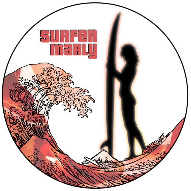
And a black and white version!

Post: https://steemit.com/art/@juliakponsford/logo-design-for-surfermarly-contest-entry
Oh wow! That's impressive!!!
How did you do the wave? It reminds me of henna paintings.
I will jump over to your post right now and upvote it :-)
THANKS for being part of it!!!
It's a Japanese style wave, it does look like henna!
I realized that I didn't answer your question, for the waves I traced over bits of a creative commons wave I found (and modified and duplicated bits) that is in the Japanese style then I painted all the colors in. I use an app called infinite painter for most of my art!
Awesome!!! It's amazing to see people creative in that way.
Thanks for the insight! It's much appreciated 😉
Have a great day!
I think the crests look like animals... I think I see birds and deer and horses within their depths!
I like the imagery in the logo. A nice way to capture the global nature along with the surfing motif. I think this would make a pretty nice logo attached to her blog.
Thanks dbz! I appreciate the comments!
Congratulations on receiving such a great feedback! It was a hard decision for me. In the end your logo didn't win, but I hope you appreciated the challenge anyways 😊
https://steemit.com/creativity/@surfermarly/proudly-presenting-my-new-surf-brand-announcing-steemit-s-design-contest-winners
I did thank you very much, the one you chose is great!
This is awesome! Love these kind of things.
I don't like putting any labels on things.. So I'm not going to call myself a 'designer' haha but I do sometimes make some things in PowerPoint lol.
Let's do this. Wishing everyone a fun time! By the way, what's your favorite color?
And honestly.. I think 200 SBD is so much for a logo.. I would be stoked with 20 SBD as first prize!
Shout out to this one I am voting for
Hehe, good to have you on board!
Try to use a graphic program instead of Power Point, since the logo would have to be scalable.
I LOVE turquoise! Good question :-)
That's full PNG so completely transparent on the edges :) Click on the image to see a slightly bigger version uploaded to the site :)
OMG I LOVE THIS ONE! it is so gorgeous!
Thanks!
Agreed :)
Woa,this is fabulous,distinct,a lovely design to beat @enazwahsdarb, I give you a 5 star rating..all the best bro
I like your logo @enazwahsdarb! Achieving a well designed logo requires really hard work. Surfermarly should definitely be happy with entries like this! Goodluck! ;)
don't feel this fits here very well. I mean the server is a dude that barely moves. Needs to be more energetic.
I fixed it :) put ladies hair on. Check a little further down in my comment thread :) let me know what you think now
The stereo type behind surfers are to be laid back and relaxed people. Not normally the energetic kind. Also the steemit logos are a nice touch you only see at a second glance.
Yeah, the relaxed move is OK; but it needs to be a girl :-)
Awesome!!! I love how you incorporated the SteemIt logo. Very cool
I agree with @longfield98, this is the winning logo. I like your idea, too, @surfermarly :)
Cool! same as Sticky bumps!, did you do the girl vector too?
Yeah sticky bumps, right!
Vector would be important...
This one for sure. But a woman silhouette of course.
This is fabulous,fantastic design to beat,a superflous standard set,would be hard to topple, @enaswahsdarb
Competition closed! This has got to be the winner!!! No doubt! Amazing work.
Hehe, it's a really good one - I agree! Benchmark's set high though :-)
However, the person on the top should be a girl (to be me), hehe
Very true! Kind of a obvious overlook! Hopefully he can fix this :D
Wohooo! Nice one!!! 👌
Would be even cooler if the person was a girl... can't you add some long hair and shorter pants? 😃
Also, I thought I would add this colorful girly-flower for some spice :P What you think? All PNG. So you will be able to use with any background :) Even your vlogs.
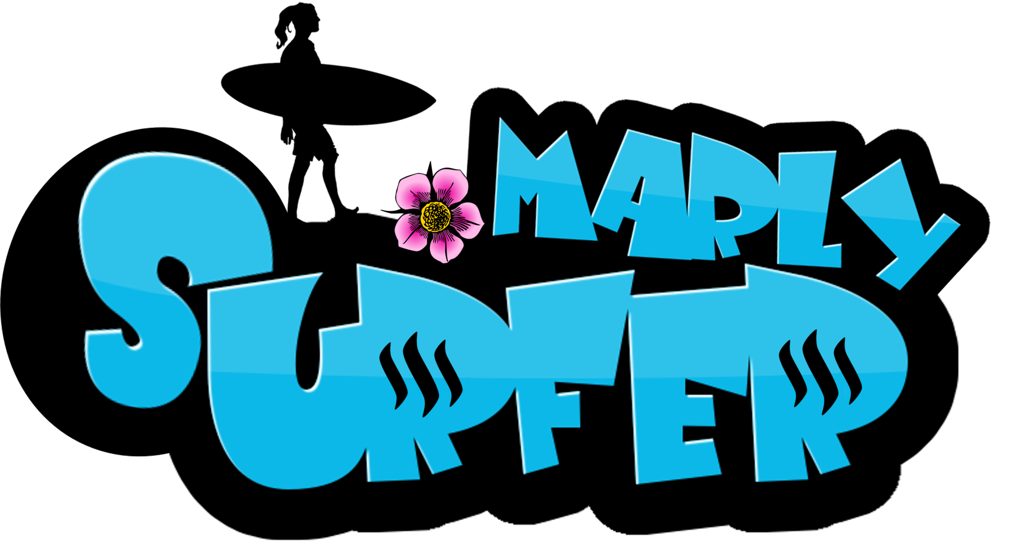
Now? :P
Haha thanks :D Let me see!
Yeeeeah! That's MUCH better!!! Now only the pants need to be shorter, because girls don't wear these long pants in the water, hehe. I wouldn't even need the flower 😉 Good that you did one with it. I won't upvote the article to give everybody the same chances here, but I really like it 😊
Do you have a vector graphic of it?
Legs changed :) Let me know your thoughts :) I took out the flower too.
I thought I would add a shorter hair styled one, since your hair is shorter :)

Love it as the Steem sign looks like shark gills:)
Yeah, you did well! That definitely fits much better with me :-)) Great, thank you for the love to detail!
Glad you guys like it :)
I have seen all the logos submitted for the contest!
Putting contest aside, the first thing a logo must have is the Class, definitely logo must speak up about the thing it is created for. I found all these fine qualities in this logo! It is charming, classy and eye catcher. I don't know about the final result but if I have been appointed as a judge, I would choose this one!
Great efforts and good art! Loved it. I Rest My Case @surfermarly :)
Wow such kind words! Thank you my man :)
You are Welcome but it was not to flatter you but my true suggestion.
wow so good!
I love this logo 😊 love the way they stand on the letters ready to go surfing on the ocean 💕

My favorite. Great job.
Didn't know you were so great at this.. Lol
A man of many talents 😉
Haha, nice animation 😆 And yes, it's a very good entry!
Thank you 😊 Im a Jim Carrey fan😄lol
Wow!!! You have some serious talent!! I'm voting for you @enazwahsdarb !! Good luck!
NYCE! love the different surfer versions, incorporating @surfermarly's suggestions! Excellent job, @enazwahsdarb. I hope you win. Even to be in the top 3 is great. Most of all, I like that you are participating in this and sharing with the SteemIt community.
Thanks my friend :) I am not a designer, I just enjoy being creative sometimes haha.
Yeah it had the perfect combination.. Some constructive criticism, mixed with a challenge. My favorite :D
Thanks for that! Talk soon my friend.
My vote is definitely for @enazwahsdarb. His design is my favorite for your theme @surfermarly! Love the turquoise color too. He's also an awesome guy :)
This one is really great. Simple but conveying the spirit of surfer Marly and incorporating Steemit in a cool way! Well done
Wow thanks guys! Love it :)
This comment has received a 13.76 % upvote from @bellyrub thanks to: @photobomb.
Thank you so much for supporting Marly and #steemgigs in the process. We have steemgigs community on discord. Please join us!
Please dear @enazwahsdarb can you tell me how can i upload pictures on my comment
Hey man, sure. All you do is drag the image into the text box. It will automatically upload.
Thanks a lot for your help
No problem :) Did you come right?
yup
Hi Again, here introducing a new entry to the Logo contest for @SurferMarly
When She said that is will be for an Apparel brands use maybe the twist came because is a real different thing to start thinking the logo according to the final public,
By the way, just wanted to do something very femenine again but not too much. Strong, and Chill
Here are some applications of the logo independently from colors, 'cause was made to be used in any color over any bakcground without loosing force or concept.
Please consider this Post itself
Buenas Olas para todos!
OH WOOOW! This one is amazing!!! I love the black and white version.
Actually I didn't imagine that a b&w entry would fit here (surfing is very colorful), but this one totally killed it.
I like the surfboard as underline, that's so sophisticated. "Life is a wave" oh yessss! Haha!
Amazing job, Leo! Muuuuuuuuuuuuy bien!
Una pena que no voto las entradas, jaja
This one will be definitely among my favourites! Oh dear, who's going to decide here?!?! Haha, this will be a hard choice.
Thanks for your efforts, time and dedication!!!
Love you are in liove with them. This one is my favourite. And yes the Black should Suit. In the moment you talked about a Brand for Apparel or you mentioned it was clear for me because I work for apparel hahaha. And the logo SHOULD firt everything! and more if you think in it a s a part of the apparel itself. That what a logo should do,,, get inside the soul of the Brand, and that[s the important. Colors are just a complement. Que tengas un excelente dia y si vas a surfar tira una foto y dedicala por acá que con eso basta! jaja... Gran abrazo para vos.
Absolutely. Color is just an add-on.
I was actually just preparing my next post about yesterday´s surf session. But I won't publish it before Monday, because on the weekends people vote less on steemit :-)
Un abrazo y disfruta del finde!
Oh I see... !
Enhorabuena por haber recibido unos votos bastante grandes!
Al final no me he decidido por tu logo, pero te digo que ha sido una decisión bastante difícil... El tuyo era mi número 2 porque es perfecto para ropa... Igual eso te alegrará un poco el día...😊
Aquí está el post donde anuncio la ganadora por si le quieres echar un vistazo:
https://steemit.com/creativity/@surfermarly/proudly-presenting-my-new-surf-brand-announcing-steemit-s-design-contest-winners
Que suerteee!
nice one @leotrap, easily my favourite here so far
Glad you like it! Yes... it's my favourite by far. Hope can have chances to win. :) Steemfest you know! hahaha
Hi!! @SurferMarly ^ ^
Wohooooo!!! Niiiiceee one!
Can't believe we have so many amazing entries only after 12 hours, that's impressive!
I like it - and I like the fact that it's me included in the design 😉
Muy bien hecho! Ahora ya sé quien eres aquí en steemit! Te sigo.
La verdad que por mí de momento no hace falta modificar nada. Primero estaba dudando de los colores, pero cada vez que lo miro me gusta más, jeje. Lo que buscaba es un logotipo que podría hasta servir de "surf brand" - o sea imaginándose que en un futuro lejano fuese una marca conocida, dejándola competir con marcas establecidas. Entonces necesitarías un logo que pudiese permitirte eso... El tuyo seguro que podría. El vector es importantísimo, porque ya tengo a alguien que me va a hacer un intro animado para mis videos. Ahí necesitaremos el logo vectorizado.
Jeje, a mi el surfing me trasmite paz cuando haya salido del agua - dentro es más bien un gran flash de adrenalina 😄
Buen día, we keep in touch!
Absolutamente! Pero surf para mi sobre todo es adrenalina :-)
Cuando bajo a la playa ya mi corazón empieza a latir como loco, jaja
I love the green-yellow version! Would you mind doing one with these colors, too? Perhaps that would fit even better with my style then? Because these green pants have become like my best friends during the past weeks, haha
This is so much fun! When I launched the challenge I had no idea how entertaining this would become. Love it!
:D Okey tonight I will modify the colors <3 <3
No rush, you've got one week :-)) Take your time and enjoy the weekend!
Uuuu @yusaymon que lindo trabajo! coincido con @surfermarly en las acotaciones las cuales son vitales, pero debo felicitarte porque se nota le pusiste empeño. Bravooo!
Gracias @leotrap me gusta bastante tu propuesta aprecio bastante tu opinión !! ^ ^
i like it. I would have chosen a pic where she is actually riding the surfboard
:)
Gosh please join the steemgigs community: https://discord.gg/CGuPyyT
Your effort in supporting Marly is special!
Okey I will do it :)
Are you threatening me!?
Awesome contest @surfermarly. And so many MANY great entries already. WOW, I almost passed on this because of them. BUT I decided I still wanted to give my vision on a logo for you that can be used as branding as well.
The main idea is you standing in front of your surfboard (notice the single line down the center) The negative space is made up by you and the color reflects your favorite color (or so I read) and with that also the color of your surfshorts.
More (intial paper sketch concept and progress) in my post HERE
And the logo in use on imagery
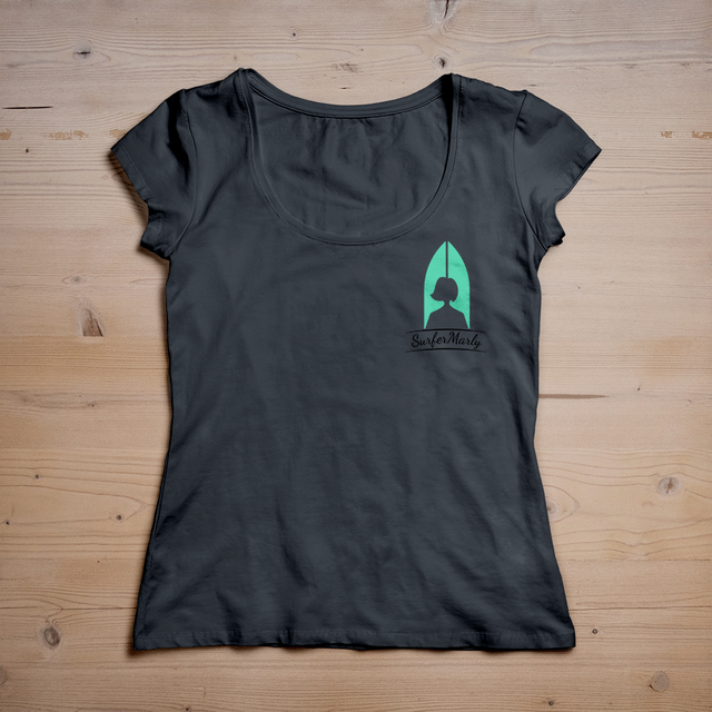
and apparel (branding)
Clicking the images will open a larger version.
I hope you like it.
NICE one!!! I like it very much! The white version on the image looks absolutely amazing!!!
I really appreciate your efforts and time. Thank you!!!
Now inform your friends that they need to upvote your entry to get at least 50 SBD for the community winner :-)
You guys are making my decision really hard!!!
Have good day :-)
I hope you don't mind I used photo from your website for it. But I agree, the solid white one has this certain je ne sais quoi
It wouldn't be much fun (or useful) if we didn't make it hard for you. That would mean there were only bad entries. Luckily though there are SO MANY good ones.
Thank you very much for your efforts!
Your logo was a really nice entry, and I was happy having you among the participants.
If you wanna have a look at the winners announcement, here we go:
https://steemit.com/creativity/@surfermarly/proudly-presenting-my-new-surf-brand-announcing-steemit-s-design-contest-winners
Again, thanks for your dedication!
Absolutely stunning, creativity 100% but maybe you should consider the font.
Overall i think this is the best entry for me. Good luck mate!
Thanks man. Appreciated. What do you think is off about the font ?
I like this one a lot too, simple but effective
Thank you. That was the main idea ... keeping it simple.
From a marketing perspective, this is the best option.
This is how logos are meant to be designed!
Nice adding, fully agreed :)
Hello, I present you my design for your logo! And here is the post about it :)
NICE coloring! And the pose on the board is brilliant. Looks almost like me, hehe. Surfing towards the sun, hoping that this big wave won't break right over my head... and life is good! Yeah!
Cool entry, and thanks for doing a post about it. I already upvoted it :-)
BEST OF LUCK for the competition!
Thanks! The pose was the hardest part hehe and I'm glad you like it :)
Yeah, that's obvious :-) Well done!!
Thanks for your participation, @oceansoul13.
Your logo was a really good one and I'm happy you received a bunch of powerful upvotes here.
In the end the winning logo is from somebody else, but I hope you've enjoyed your time during the challenge anyways. There will be more to come for sure!
https://steemit.com/creativity/@surfermarly/proudly-presenting-my-new-surf-brand-announcing-steemit-s-design-contest-winners
Yes, the winning logo is really cool! Still following you, I like what you do :)
WOW!!! That reminds me of these stickers people put on their cars. Very cool!!!
Her pose is really nice, I wish I'd stand on the board like her all the time, but I usually do some strange things with my arms, haha
THANKS for taking the time and participating!!!
Only one day has passed and there are already soooo many nice entries, exciting!!!
Have a great weekend :-)
glad you like it... it is actually you, I used one from your website and drawed it to be like this kind of art style, was pretty in a creative mood so I was happy to release it on this. finished it now. Would be cool if you really made stickers from these :P also good contest, worth it !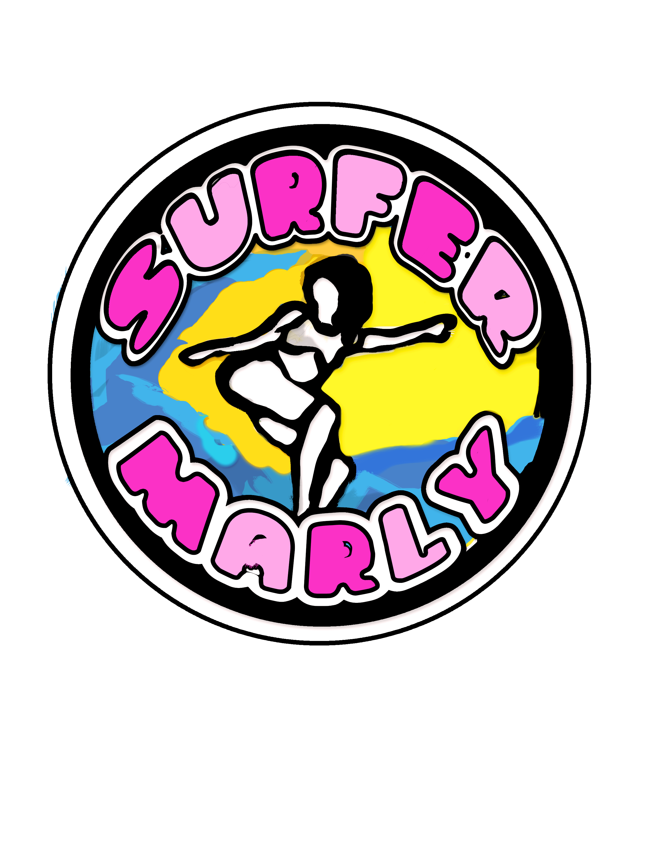 how can I get it bigger btw ?
You mean you picked it from surfermarly.com? I didn't know I was able to do such cool moves in the water, hahaha! Awesome :-)
Yeah right, stickers would be awesome. Then I could hand them out at the beach and do some promo :-)
Getting it bigger? You mean here in the comments? Or in general?
Did you use a vector graphic program like Illustrator by the way?
Yeah I have it bigger on my screen! It's definetly your stance I used the photo from that site yes ;) when I googled you to get a picture. shall I add the url of your site or steemit also into it ? May be a bit messy bit if it fits you have excellent promo stickers indeed
It's not necessary to add an URL at the moment, since I'd like to use the logo on different sites.
But thanks for asking and thinking about it! Great point.
used photoshop on this ;)
Thanks for your great efforts @seveaux!
In the end your logo didn't win, but I really enjoyed having you among the entries. Great job and you can be proud anyways :-)
https://steemit.com/creativity/@surfermarly/proudly-presenting-my-new-surf-brand-announcing-steemit-s-design-contest-winners