Crypto Art Challenge - Litecoin
Ciao!
Another challenge is being held by @sndbox and @creativecrypto this week - and it's all about Litecoin! Read more about the competition here. Last week, I won the challenge with my suprematist version of Ripple's logo. Yay!The Challenge
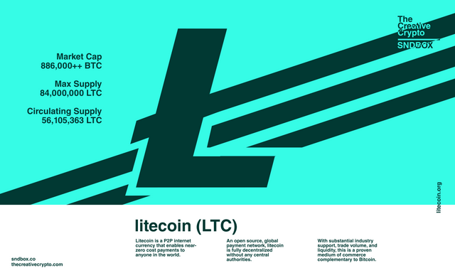
This week, we are tasked to interpret the Litecoin logo into a style or art movement of our choice. I'm quite indecisive about joining the challenge for the third time, but still, I'll give it a try. Just a few hours after @sndbox has posted the challenge, I have been already seeing really good entries! We've got some really good artists here.I'll be doing something different this round. I don't even know if this is qualified for the challenge but, typography is still art, right? I decided to choose Swiss Design, also known as International Typographic Style this time.
My Entry
What I loved about this style is it's so modern, that it is unbelievable if I'll tell you this design style was developed in the 1940s. It uses very minimal sans serif fonts which defines the whole design. Here is my entry: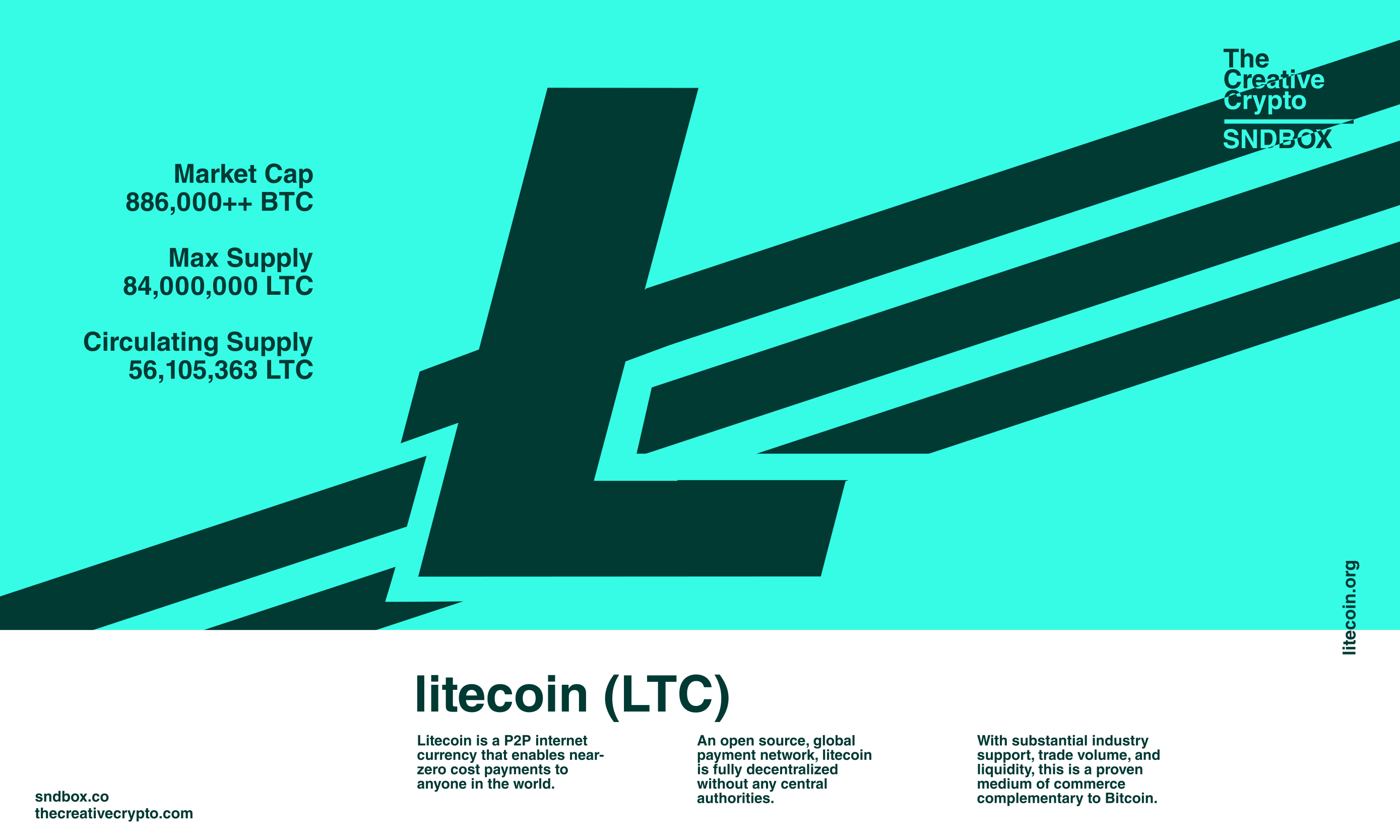
The Process
Everything was created using Inkscape. I decided to use the font Helvetica LT Std Bold for this one. Because why not? You can never go wrong with Helvetica. Hehe. Here's how I did it: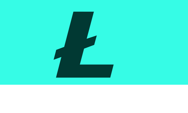
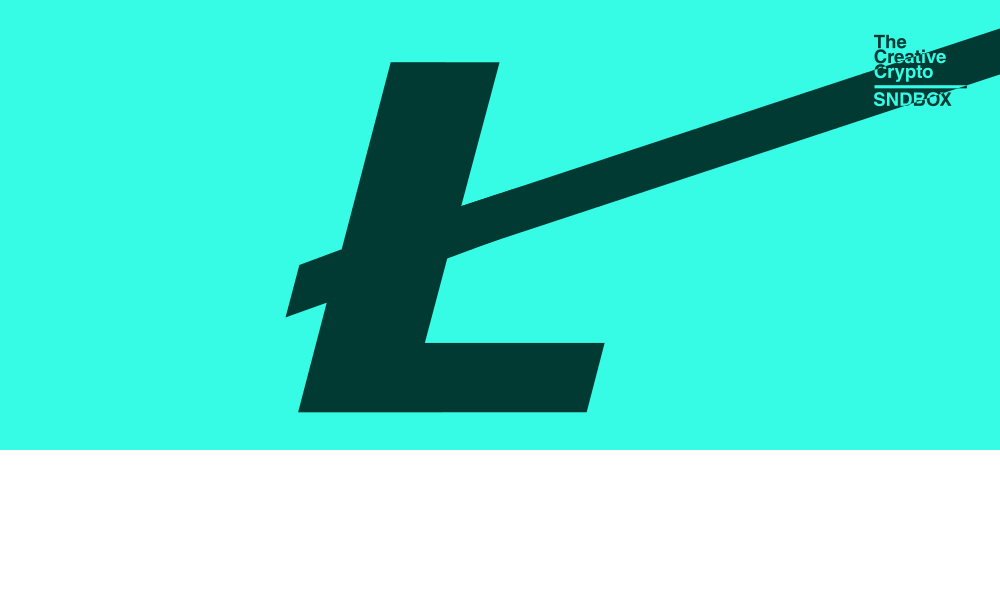

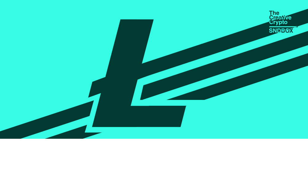
I hope you like it!
The texts are from Litecoin's official website, while those figures are grabbed from CoinMarketCap.com.
Sidenote: I think it is best viewed in night mode, as it emphasizes the whites in my design. So, go toggle that night mode on! Bye bye!