Logoless
I have always hated making logos.
I like the idea of making a logo, mainly the part where you think: "I must make a logo for..." That part. In that part, it is all very perfect, you are in awe of the potential.
You think broadly about clean, simple and impactful things. I personally still want to make a proper negative space logo. Then...
I get obsessed with a specific element. In this case I wanted my own logo to have a stiched smile and still be business.
Then they give me the company name, then they tell me what the company does and then I google it and then...
It all just seems a bit shitty. Anything I make then is either too cliché, too trendy or just plain shit. Isolating and just settling on something that works is a fucking minefield.
A lot comes from wanting to have it be 100% unique, something new.
Words
If there is one thing I do not like and yet I know it works and looks good it is a wordmark logo. Just text. I just won't, you don't need someone to make you anything then. You just need to spend time going through DaFont.com and find shit you like.
I like an emblem and wordmark combo, and also avoid abstraction since I feel like that is too akin to word templates. Copy-paste crap. Let's have some transparent blocks over each other, or a fucking swirl.
That is probably why I suck at logos in general. I do tend to have a nice simple idea in mind but then go ahead and Ruben it once I get to actually doing something.
Probably why I also don't try to draw. What I think and what I make are not even close to resembling each other.
Not all bad
That depends whether you are talking to me or someone else but yes it is not all bad. You eventually settle on something you might like, maybe you have a customer that shares your taste or even better if they are very adamant on what they want then it is not your fault for designing something that looks like a million others.
I did not make this one but remember my boss showing me the emblem font and the broken circle with a lot of satisfaction. Worse than that was the fact that the Develop Digital text is corporate so could not be changed but they merely needed a new emblem for the local company.
It was accepted but I still cringe and think it is a great example of falling for a fonts fancy curves and having something lazy, cliché and abstract which is 100% what I try to avoid.
You can't avoid it completely though. Many times these things are exactly what they want. Whatever gets them out of my face is always a good thing.
The base 65 shape was given as is and had to only get minimal change to make it their logo. Now they did say it is an original but now needs to be changed a little bit for the furniture part but I am not sure I believe that bullshit. The 65 shape is the kind of clean-cut design you get on all those inspiration sites.
Regardless. Slap some red bars on add the stupid words and call it a day. Not something you include in a portfolio though. These kinds of things are not things you ever show to anyone.
So sure logos can go one of two ways, unique and inspired or everything else.
Those damn inspiration sites cheat though because I think they had the design before the name giving you just these perfect matching name and concept designs which would have been a damn great idea.
Alas I did not think of it myself so FML. Sure it is design and you should steal what you like and improve or adapt it into something new but still wouldn't it be nice to just make something at least 80% awesome and different for a change.
Boring business
There are a lot of constraints though. With a logo the most difficult part for me is the simplicity. The second part is styling, and the rest is business and taste.
Once I have a concept and given up all hope on a myriad of other either eliminated by complexity or plain rigidness of the business type then you have the business of personal taste.
There is no accounting for taste.
I use to fall in the trap of offering 3 or 4 options which is a waste of fucking time. Now I give one option, it will be my preferred option and I take it from there. If the person has any goddamn brains they are able to say what they like and what they do not like.
You can always settle on something like this:

As a logo for a site or something it would need some simplification but given that it was more for cover page usage and print with a bit of insistence from the client-side it works well enough.
That is the other part I hate.
Usage
Logos are not always for companies or things. Many times they are just disposable. So you have to balance how much "concept" you do. I tend to waste too much time trying to do something new or just not repeat myself which really is more for me than for the people I do things for.
I don't really give a fuck about the logo or end usage. I care about whether I have done it before, do I think I did it as good as I could and how much of it is just a ripoff.
Silly selfish things but so be it.
After that phase I then settle for the just get it done and who cares if it is similar to other shit it is what they want. There is always the let's try this first phase which takes up a whole lot of time. Procrastination.
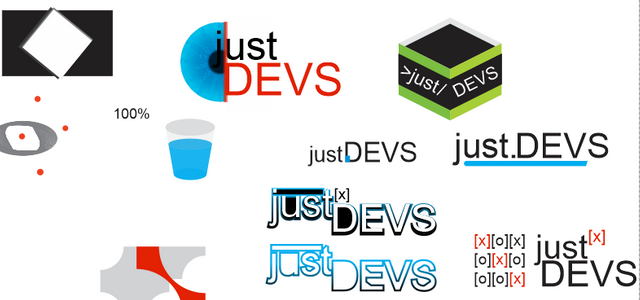 The let's just make shit phase maybe something hits home.
Once done
When you get the go-ahead for a logo it really is a good feeling. Not because I am proud of my work. I can probably point out many things that make it utter shit and will already have decided that I can not admit to making it. That is 90% of the work I do.
Once it is done then it is done. It seems very unimportant after the fact, it gets slapped on things and is no better than just typing a name out. So I hate making logos because they are just shiny things but I like the experience gained when planning and just trying stuff out.
I do it for myself... and the money. The thing you are making the logo for really does not give a shit other than it looks good-ish. Sometimes I even end up with something pretty good and I don't mind seeing it around again the rest of the time it does not matter to me either.
It looks to me that you do pretty nice work, but I find your descriptions of your processes and your work ethics pretty funny. :)
Always entertaining to read your posts!
Haha thanx... mmm I think I do have a bit different way of going about stuff but I have worked with some the customer is always right people and I can't stand that.
I'm kind of drunk and bored and you're right about most of this. Just reminded me that life's kind of stupid when you grow up. But I also wish i had your job even though I wouldn't be good at it
Posted using Partiko Android
Until you get to deal with the customers :) I will swop you for alienating coworkers. Kind of drunk and bored, that is the Xmas spirit isn't it? Have fun man
I have always loved making logos.
:)
Kill you darlings! It's all about that.
I do though love your own logo and the stiched smile raggedy doll. It's a good thing you didn't kill that darling.
!DERANGED
That is a great saying :) Kill your darlings.
Yes I do like the raggedy doll maybe more just as an emblem, the text is rather shitty. Yeah I will still make logos and probably always have the same issues as always but oddly they will always be accepted and I will get paid so I guess it is a win.
For me designing graphics is one of the most basic branch of art.(Also you can count it as a somekind of optic science) But art is in the last step of the hierarchy of needs. Maybe you are not satisfied with one of the previous steps. :)
Maybe, but I do like the structure in graphics, like print design etc. I think the closest I get to creating art might be photomanipulation but have never really wanted to do any traditional art. Fortunately, logos are just one part of design.
In my opinion photomanipulation is not a graphic design. (But All visuals can be manipulated by their shapes and their relations). It is more case of illustrators (Painters) and photograhpers case. I think 90% graphic designers or graphicers use photo editting tools like photoshop this is why photomanipulation is part of job of graphic designers.
I feel your pain. But with taglines.
I can imagine, it has all the same hallmarks as making a logo. But when it works it just works and brings it all together, more so a tagline as I see it as having a lot more utility in marketing.
This post was shared in the Curation Collective Discord community for curators, and upvoted and resteemed by the @c-squared community account after manual review.
@c-squared runs a community witness. Please consider using one of your witness votes on us here
Hi, @penderis!
You just got a 0.16% upvote from SteemPlus!
To get higher upvotes, earn more SteemPlus Points (SPP). On your Steemit wallet, check your SPP balance and click on "How to earn SPP?" to find out all the ways to earn.
If you're not using SteemPlus yet, please check our last posts in here to see the many ways in which SteemPlus can improve your Steem experience on Steemit and Busy.