You are viewing a single comment's thread from:
RE: Task Request | A logo for coogger-python
Hi @hacancelik. This is my logo proposal for Cooger Python.
Design #1
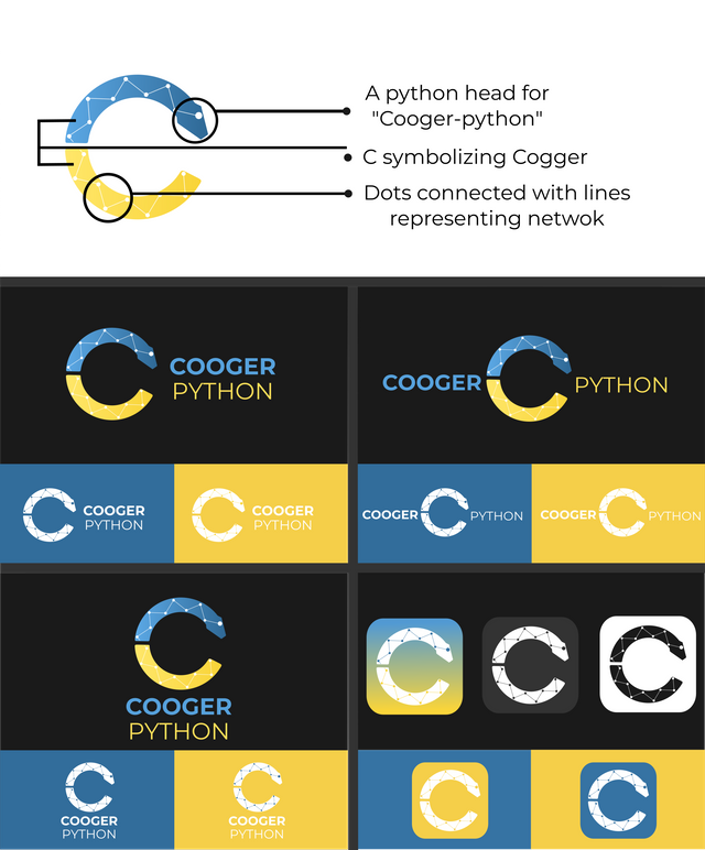
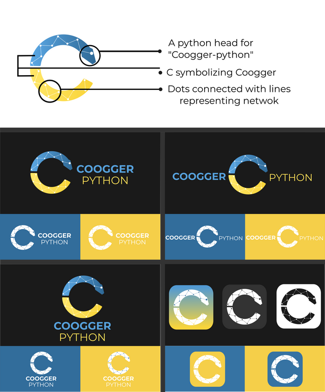
This logo design has a letter C which represents Cooger. The letter C is cut in half horizontally and the upper half has a python head on its end to best represent "Cooger python". There are dots connected by lines which represents network because Cooger is a knowledge sharing network with existing languages as stated above.

Design #2
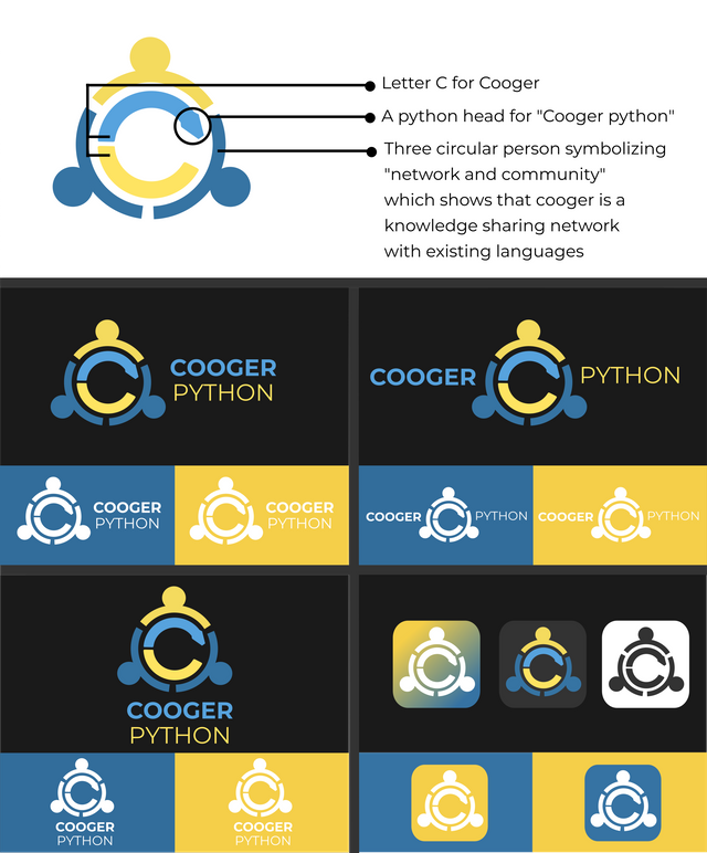
This logo design has just the same concept with design #1. The only difference of the two is their symbol of "network. In design #1, network was shown through dots and line but in this design, three circular people was used to show network and communities because Coogger is a knowledge sharing network with existing languages and categories that works with communities.

Any suggestions and feedbacks are highly appreciated. Thank you !
Cool but you write wrong name, two G not one it is coogger.
Both designs are beautiful, I really like them, but I liked more the first design, good job 🤘 your first design is simple thus, that is better than another.
Thank you man @hakancelik:) By the way, I have already changed the "cooger" to "coogger".

That is great work and design thank you.
You're very welcome man :)