You are viewing a single comment's thread from:
RE: [CONTEST] Looking for new profile cover images
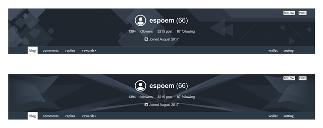
hi aspoem, this is my entry
what do you think??? I will wait for your advice, thanks
hi aspoem, this is my entry
what do you think??? I will wait for your advice, thanks
Hi, I like the first one more even though the symmetry of the second one is quite interesting. However, I could still find a few aspects that I believe could be improved.
Positives:
Negatives:
thank you for the advice, I will fix it as soon as possible ;)
hi sir, this is the result, i will also make the bright version for you ;)
what do you think, is this correct, thanks
Hi, can we talk on Discord about these images?