Character Design - Mag (The Pilot) for Tugboat Comic
Hey everyone - time for another character design post for Tugboat.
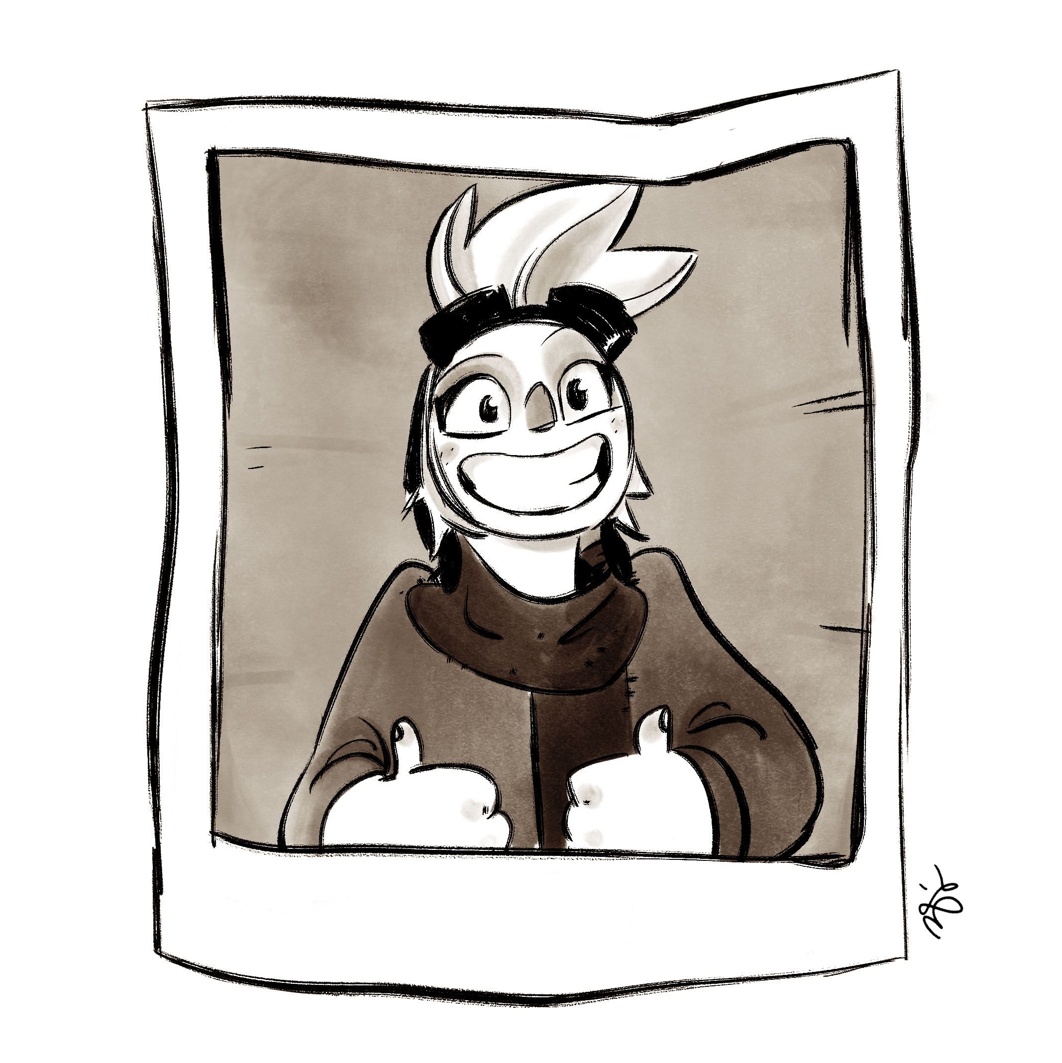
This one is Mag, pictured below in her pilot's licence photo! What a cutie.
Her design is much more refined from the initial concept, pictured below. As with Adeline, the main adjustment is that she got much rounder. She also doesn't wear her glasses over her eyes anymore.
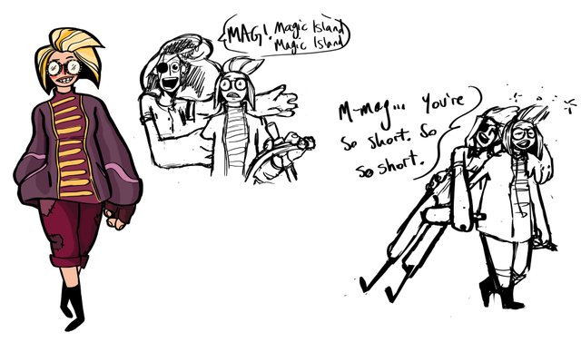
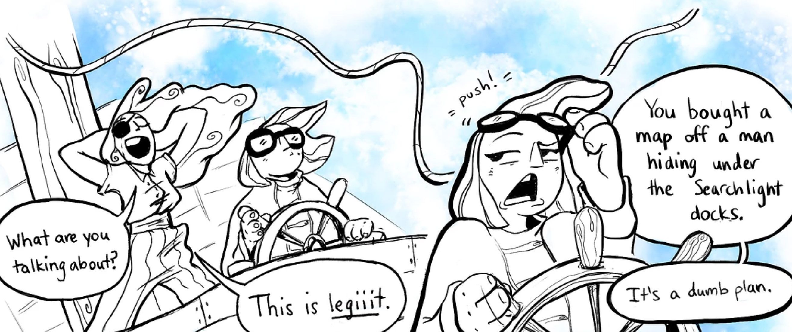
At the beginning of the first issue, which Hailey and I created for a comics class that I was taking at the University of Southern California, I realized that her face wasn't expressive enough. The goggles were cool, but didn't allow for the full range of emotions that I wanted her character to be able to convey. While she isn't as wild as Adeline, the two characters play off of each other in almost every scene. Mag is almost always the straight man for Adeline's antics - it needed to be clear what Mag was thinking at all times, so the goggles went up onto the forehead.
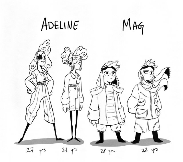
Next I did some different age tests - both for Mag and Adeline. Since part of the first issue included a flashback to several years previous, I had to figure out a consistent look that fit their characters appropriately.
And then I did a few combat sketches to see how they would move in a fight scene.
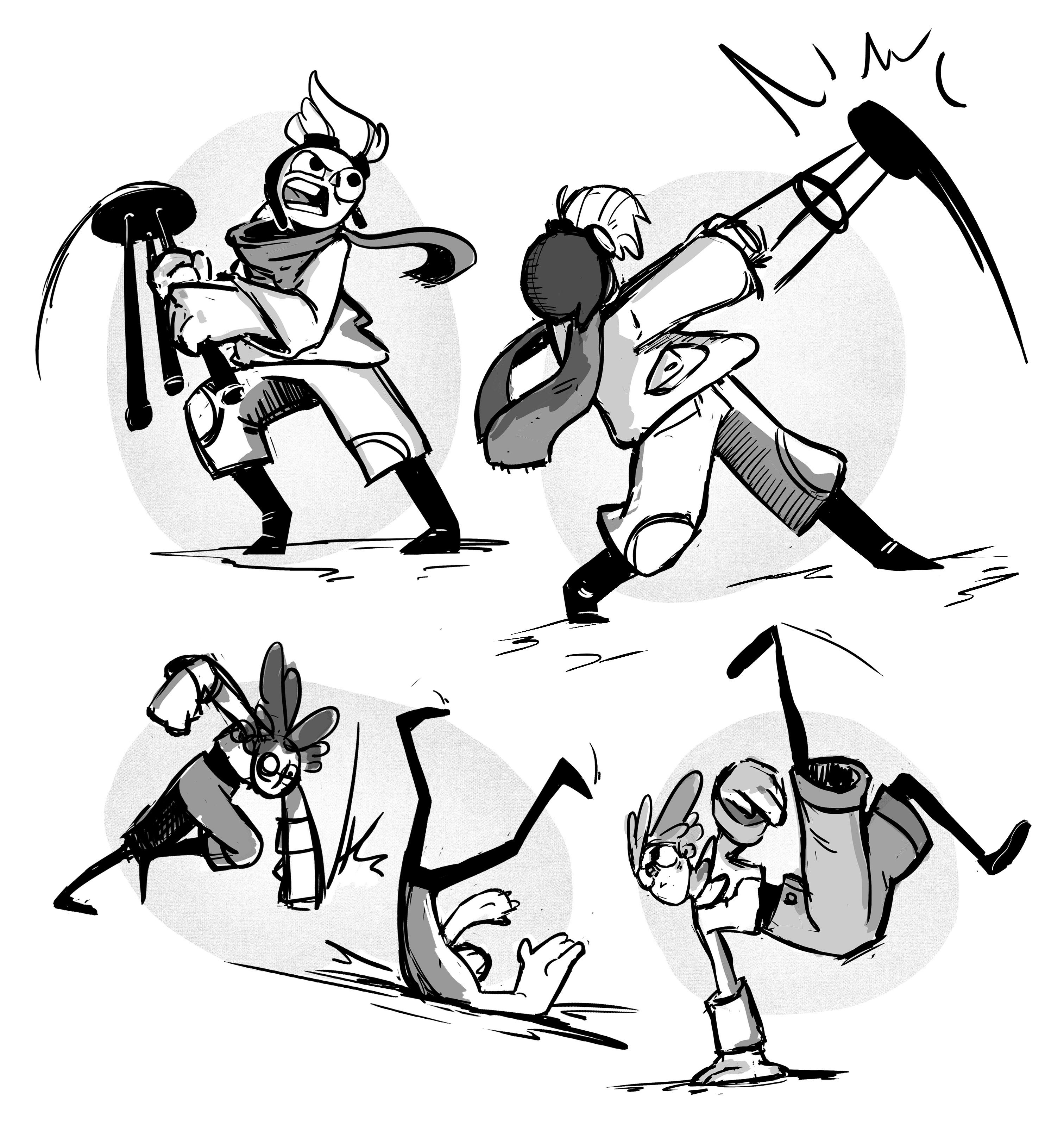
Then I practiced to make sure I was comfortable drawing her over and over again.
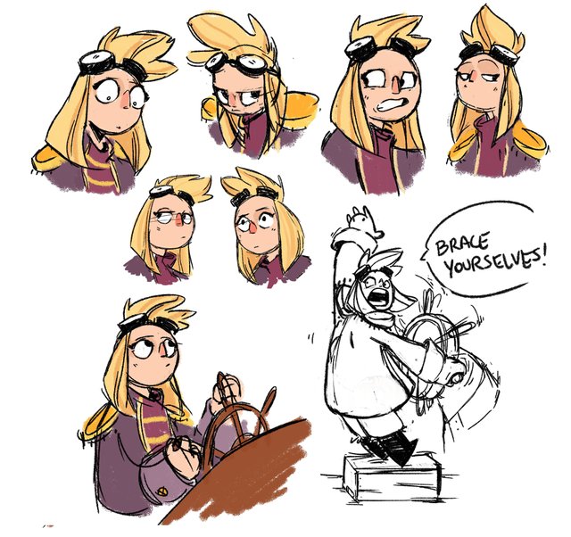
And then I made a turnaround for her!
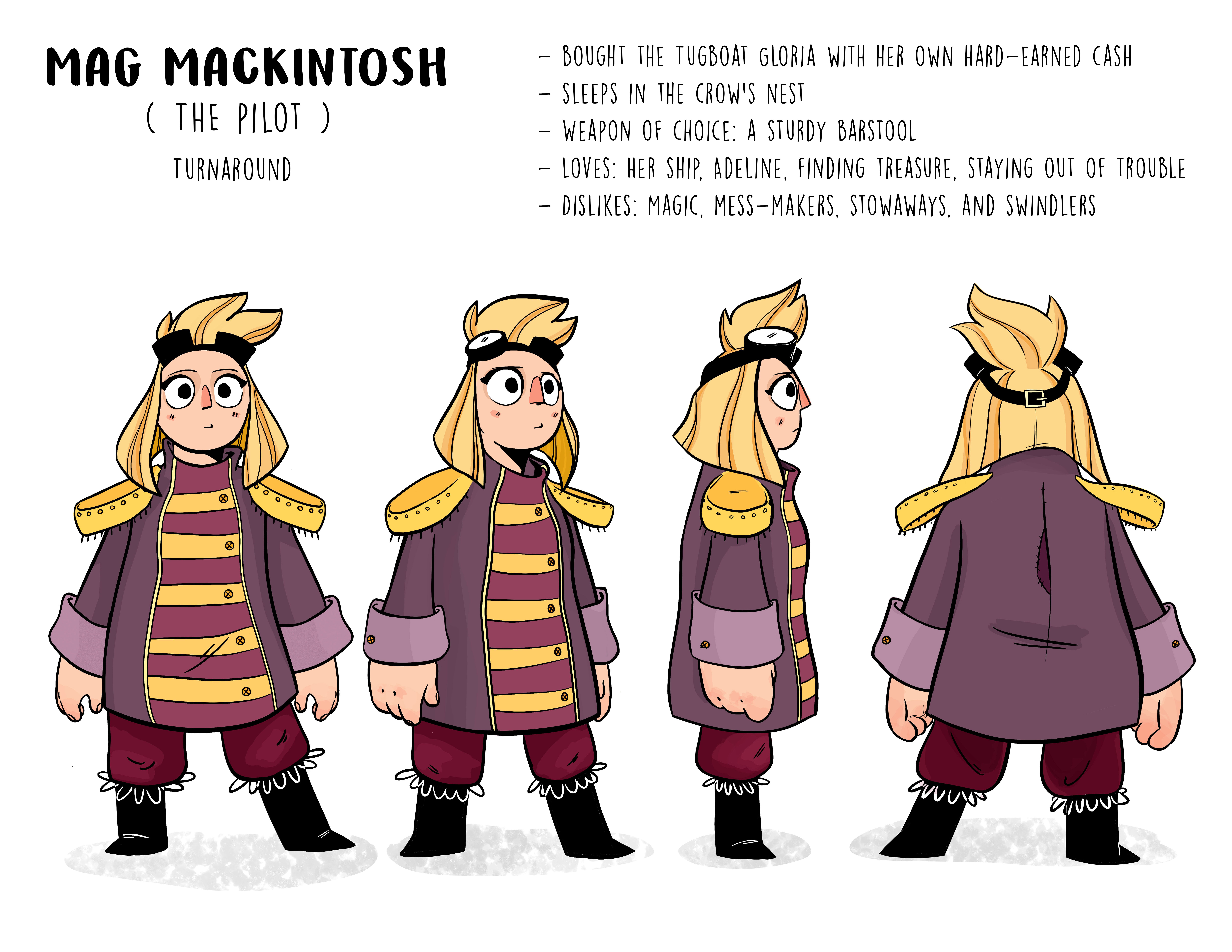
And that was the development of Mag, our pilot! Thanks for reading, hope you enjoyed!
As always, you can read the comic from the beginning at this website: https://zserbin.wixsite.com/tugboat
I love your style and the energy.
reminds me of Curse of Monkey Island :)
I really like your art, and hope be like you.
if you do not mind, please visit and advise my art blog.
Thank you! I will check it out :)
That is such a cool character and also you give an insight how one develops a comic character. All the things one has to think about, like the age thing!
I have tried so many times to develop comic characters but always have the problem that they don't look the same, like no consistency.Any tips?
Thanks for your kind words! I'm glad this was helpful. As for the consistency thing, my biggest tip would be to make strong, clear, conscious design choices from the beginning. Silhouette and proportions are so important when designing a character, and once you establish something that works, these will help you have something to refer to if the character looks off-model. After that, it's just practice, which is a vague and unhelpful answer, but unfortunately is how most of drawing goes! You just have to do it a lot for your hand and brain to get comfortable. Hope this helps, thanks for stopping by!
No indeed a very helpful answer! I never really thought about silhouette and proportions and made my characters all with 'average' outlines and focused more on facial features but now I realise that these are not distinct enough for a comic character to make it unique! Thank you so much for this advice. Sometimes the simplest things don't occur to me.
Glad this helped! There are a lot of tutorials online that can give great tips on general design Do's and Don'ts. Check those out and see if they are helpful to you!
@zoeserbin again ..awesome !
this one is damn cute as well.
I am super intrigued by your work.
what softwares do you use ?
and do you always first sketch and then translate it to digital art ?
Thanks so much! I am so glad that you like it, she's a cutie isn't she? I use Adobe Photoshop, and I do always do some form of sketch. Sometimes it's digital, sometimes the sketch is on pencil and paper. After I'm happy with the design, I finalize it digitally.
@zoeserbin Yes she is. Actually all of them are !
:)
I am definitely sharing or showing my niece the next time i meet her, she would adore your work.
Do check out my blog as well, i think you might enjoy the red aesthetic series.
:D
really cool character concept and creation :)